import pandas as pd
import matplotlib.pyplot as plt
import matplotlib as mpl
import seaborn as sns
import seaborn.objects as so
import numpy as npThemes in data visualization (Python)
Styling static visualizations in Python
Introduction
Static data visualizations in Python have traditionally been built using the matplotlib package. This package provides quite granular control over data visualizations and hence can often result in longer, complex code. Over time, various other packages, like seaborn, networkx.draw, and others, have been built on top of matplotlib to provide a higher-level interface that makes several choices for the user, and allows easier code expression of complex visualizations.
In this document, we will primarily look at seaborn and matplotlib. We will take the approach that the first pass at a data visualization should be done with seaborn, and then finer control and functionality can be implemented by dropping down to matplotlib. Seaborn can get you 80% to a final product, but you often need matplotlib to finalize the product. As such, it is important to not only be adept at seaborn, but also gain mastery of matplotlib, especially for customization.
Import packages
Tip
In version 0.12, seaborn introduced the seaborn.objects module, which provides an API closely aligned with the Grammar of Graphics. This allows us to build visualizations by layers much as users can using ggplot2. We will explore this new API in this document as well as the more traditional API.
A brief review of matplotlib
Note
Much of this material is covered in the DSAN bootcamp, and is provided here as a refresher.
Pyplot
- matplotlib.pyplot is a collection of functions that make matplotlib work like MATLAB.
- Each pyplot function makes some change to a figure: e.g.,
- creates a figure, creates a plotting area in a figure, plots some lines in a plotting area, decorates the plot with labels, etc.
- In matplotlib.pyplot states are preserved across function calls.
- This means it keeps track of things like the current figure and plotting area
- The plotting functions are directed to the current axes
Figures and axes
In matplotlib there are two important object types, the Figure object and the Axes object.
So what is the difference between these two objects?
Figures (think of this as your “canvas”)
- Think of figures as the blank canvas (or paper) on which you are going to put your plots (i.e. the whole figure).
- The Figure keeps track of all the child Axes, a group of attributes (titles, figure legends, colorbars, etc), and even nested subfigures.
- It is often convenient to create the Axes together with the Figure, but you can also manually add Axes later on.
- When you modify the figure attribute you are modifying the canvas rather than the subplots
Axes (individual plots)
- Think of axes as the individual plots that go on the canvas.
- Each figure (canvas) can contain one or more Axes.
- Just like with pen and paper, you can put one plot on the paper or many (i.e. subplots)
- The axes are areas where visual encodings from data are displayed, e.g. coordinates, points, lines, etc.
- The simplest way of creating a Figure with an Axes is using
pyplot.subplots. - The Axes class and its member functions are the primary entry point to working with the matplotlib interface
- They have most of the plotting methods defined on them
- Each figure (canvas) can contain one or more Axes.
- Think of axes as the individual plots that go on the canvas.
The following figure exemplifies the difference between the two types of objects.
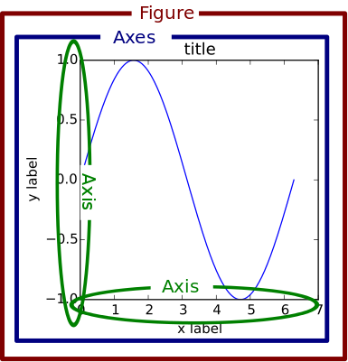
Notice that we can have multiple axes objects per figure.
![]()
Because of these two object types, there are essentially two ways to use Matplotlib:
- Method 1: Rely on pyplot to automatically create and manage the Figures and Axes, and use pyplot functions for plotting. This is the original approach that mimics MATLAB.
- Method 2: Explicitly create Figures and Axes, and call methods on them. This is considered the object-oriented programming (OOP) style, and is today (2020s) the preferred way to create matplotlib visualizations.
Method 1
- The Figure and Axes objects are not defined, but are defined implicitly in the background.
import matplotlib.pyplot as plt
import numpy as np

# DEFINE DATA
x = [1, 2, 3, 4]
y = [1, 2, 3, 4]

# PLOT
plt.plot(x, y, "o")  # 'o' makes a scatterplot or point plot
plt.show()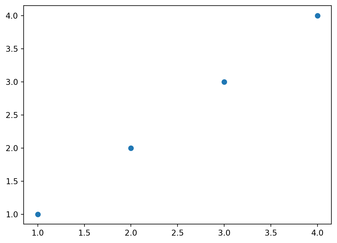
Method 2
- This method creates more explicit code, and hence allows more explicit control over the visualization. All parts of the visualization are accessible using this API.
- You always start by defining the Figure (canvas) and Axes (coordinates) for each visualization, and then build the visualization up by calling various methods on (primarily) the Axes object.
import matplotlib.pyplot as plt
import numpy as np

# DEFINE DATA
x = [1, 2, 3, 4]
y = [1, 2, 3, 4]

# DEFINE OBJECTS
1fig, ax = plt.subplots()

# PLOT
2ax.plot(x, y, "o")
#plt.show()- 1
-
Here the
plt.subplotsfunction generates both the Figure and the default Axes. This code is typical, in that it uses syntactical sugar to store both the Figure and Axes objects infigandaxusing the,notation. - 2
-
The plotting method
plotis part of the Axes object, and generates (in this case) a scatter plot.
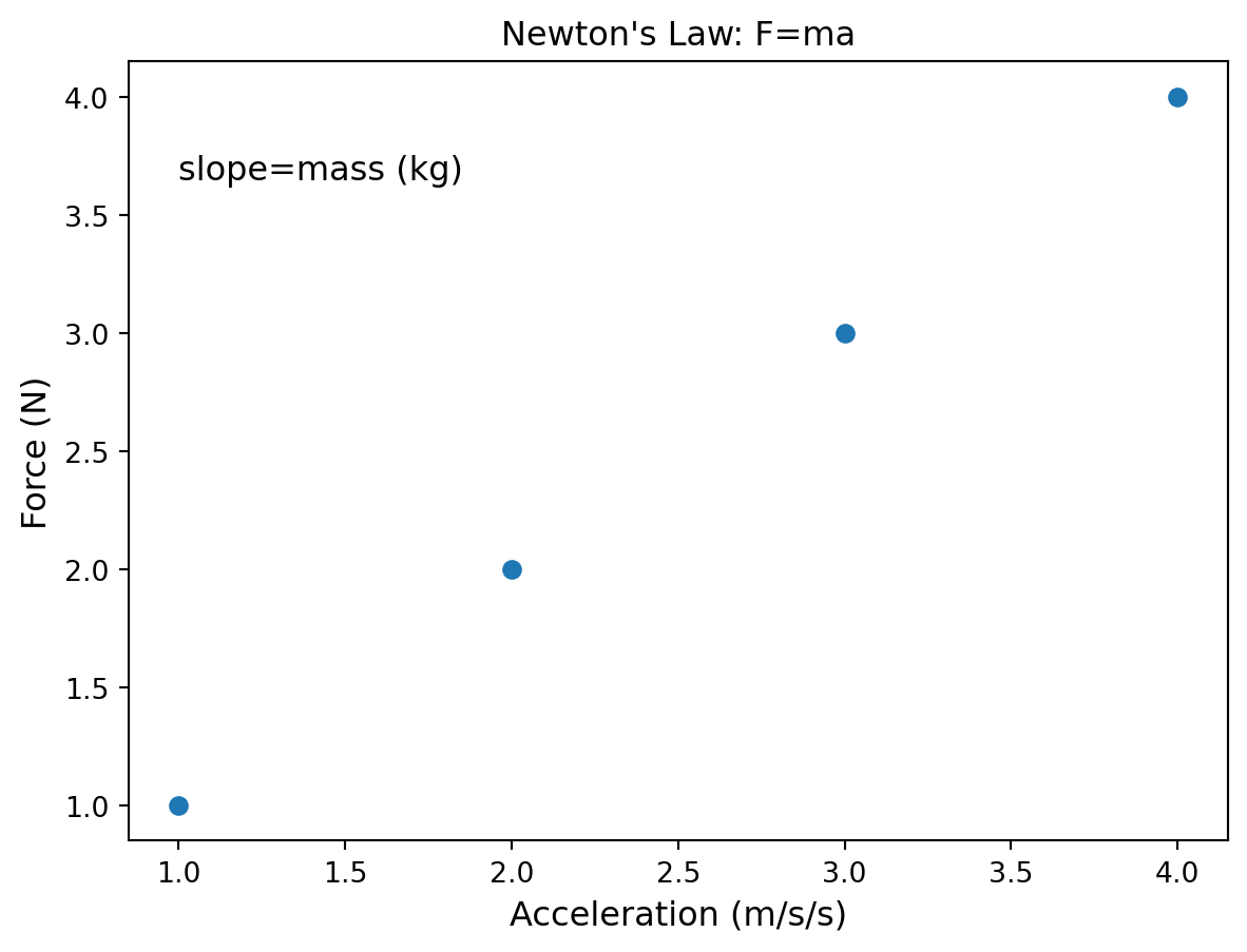
Basic customization
# DEFINE DATA
x = [1, 2, 3, 4]
y = [1, 2, 3, 4]

# DEFINE OBJECTS
fig, ax = plt.subplots()

# PLOT
ax.plot(x, y, "o")

# CUSTOMIZE
FS = 12
1ax.set_title("Newton's Law: F=ma", fontsize=FS)
ax.set_xlabel("Acceleration (m/s/s)", fontsize=FS)
ax.set_ylabel("Force (N)", fontsize=FS)
2ax.annotate("slope=mass (kg)", (1, 3.65), fontsize=FS)
plt.show()- 1
- Set various labels, and provide some customization
- 2
- Add an annotation at a specific position on the graph

Seaborn fundamentals (review)
This section content was also covered in bootcamp, however, it is included for completeness and you should review it if you are unfamiliar with it. We will run through it quickly, to refresh your memory.
Overview
Seaborn is a library for making statistical graphics in Python. It provides a high-level interface for drawing attractive and informative statistical graphics. It builds on top of matplotlib and integrates closely with pandas data structures.
Its plotting functions operate on pandas.DataFrame objects and arrays containing whole datasets and internally performs the necessary semantic mapping and statistical aggregation to produce informative plots.
Its dataset-oriented, declarative API lets you focus on what the different elements of your plots mean, rather than on the details of how to draw them.
For more see: https://seaborn.pydata.org
Matplotlib inheritance
Seaborn is built on top of Matplotlib. Therefore, depending on the plotting command, it will return either a Matplotlib axes or figure object.
You can determine what is returned using the Python type() function
# LOAD THE DATA-FRAME (REQUIRES INTERNET)
df = sns.load_dataset("tips")
df.head()| total_bill | tip | sex | smoker | day | time | size | |
|---|---|---|---|---|---|---|---|
| 0 | 16.99 | 1.01 | Female | No | Sun | Dinner | 2 |
| 1 | 10.34 | 1.66 | Male | No | Sun | Dinner | 3 |
| 2 | 21.01 | 3.50 | Male | No | Sun | Dinner | 3 |
| 3 | 23.68 | 3.31 | Male | No | Sun | Dinner | 2 |
| 4 | 24.59 | 3.61 | Female | No | Sun | Dinner | 4 |
We’re creating a figure using seaborn, but we’re using several matplotlib functions to help with some customization of the axes. This isn’t styling per se, but formatting of some data encoding elements.
sns_plt = sns.scatterplot(data=df, x="total_bill", y="tip")
1xlabels = [f"${x:.0f}" for x in sns_plt.get_xticks()]
sns_plt.set_xticklabels(xlabels)
sns_plt.set_yticklabels(
  [f"${x:.0f}" for x in sns_plt.get_yticks()]
)
2sns_plt.set(xlabel = "Total bill", ylabel = "Tip",
  title = "Relation between tips and the total bill")
3print(type(sns_plt))
plt.show()- 1
- We’re customizing the tick labels using f-strings
- 2
- We’re setting labels and titles
- 3
- Notice, that the sns.scatterplot() function returns a MPL axes object. Therefore, we can use various MatplotLib axes commands to modify the Seaborn figure.
<class 'matplotlib.axes._axes.Axes'>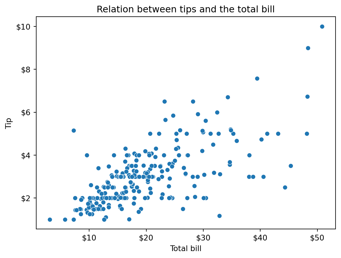
Also notice that we’re closer to a Grammar of Graphics model here, where we are specifying the data and the visual encodings in the seaborn function as arguments.
The objects interface
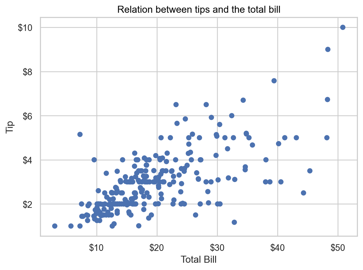
The same plot as above can be generated using the newer seaborn.objects API.
sns_plt2 = (so.Plot(df, x = "total_bill", y = "tip")
    .add(so.Dot())
    .label(x = "Total Bill", y = "Tip",
      title = "Relation between tips and the total bill"))
sns_plt2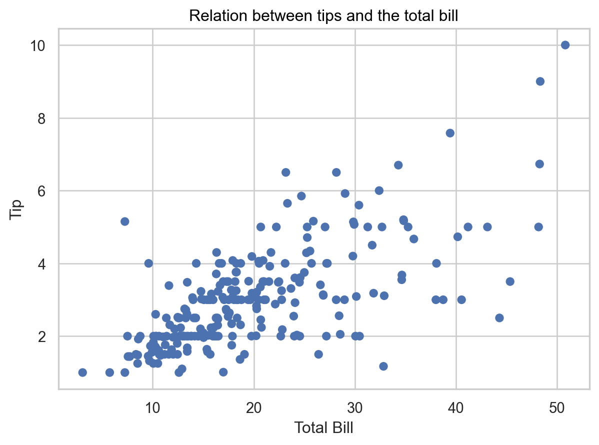
print(type(sns_plt2))<class 'seaborn._core.plot.Plot'>This results in a seaborn Plot object, not MPL axes. However, as we’ll see, we can still customize this using the MPL tools as well as some seaborn tools.
We’re going to format the tick labels in the plot.
from matplotlib.ticker import FuncFormatter
(sns_plt2.
  scale(
    x = so.Continuous().label(FuncFormatter(lambda x, pos: f"${x:.0f}")),
    y = so.Continuous().label(FuncFormatter(lambda x, pos: f"${x:.0f}"))
  ))
We can also leverage the MPL API. Let’s try to drop down to matplotlib to format these labels. Note that this method will use the matplotlib theme in use, rather than the seaborn.objects default theme.
from matplotlib import ticker
fig,ax = plt.subplots()
1res = sns_plt2.on(ax).plot()
2ax.xaxis.set_major_formatter(
  ticker.FuncFormatter(lambda x,pos: f"${x:.0f}")
)
ax.yaxis.set_major_formatter(
  ticker.FuncFormatter(lambda x,pos: f"${x:.0f}")
)
res- 1
-
Compile the
seaborn.objects.Plotobject to allow modification within the matplotlib system. - 2
- Update the tick labels with a f-string. Many other formatters are available (link)
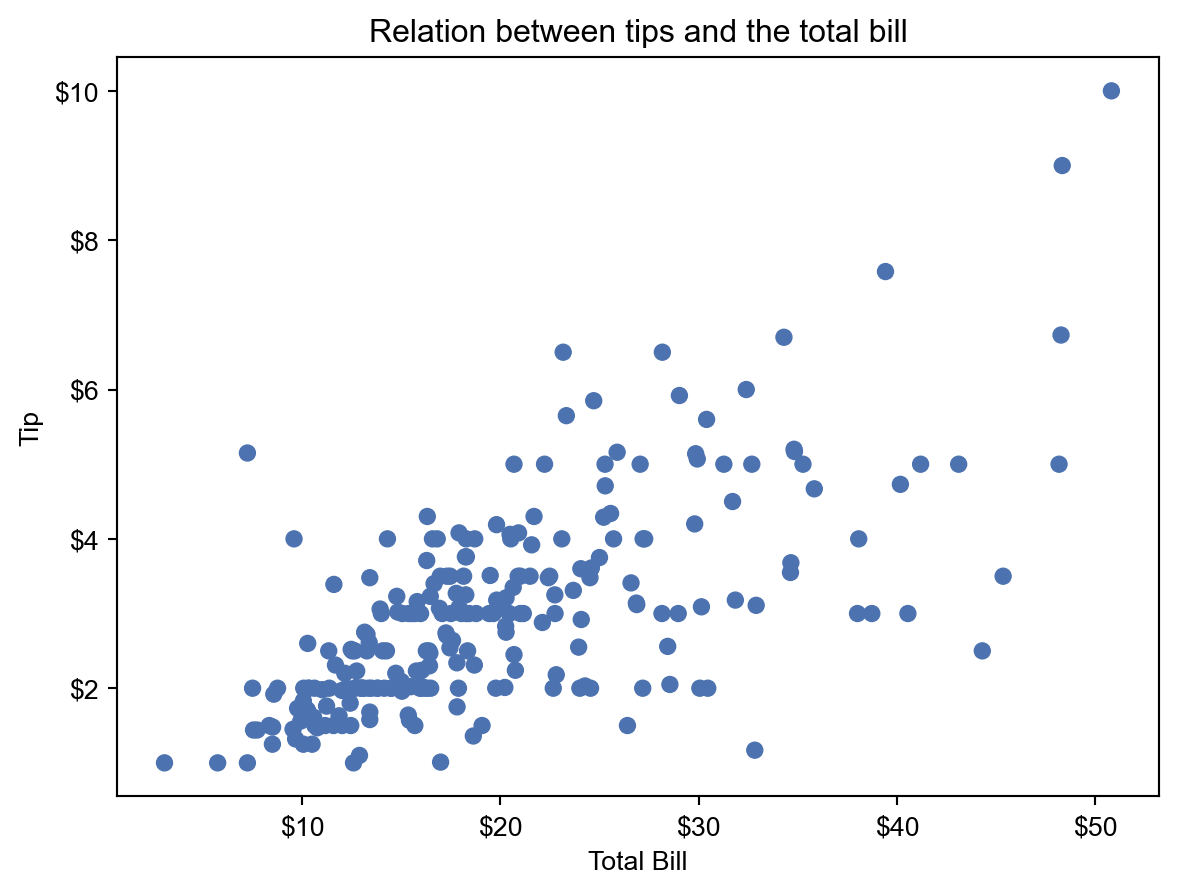
The objects interface is closely aligned with the Grammar of Graphics approach, and allows us to build visualizations in a systematic manner, much as users can using ggplot2. We will also see a similar syntax when we visit Altair.
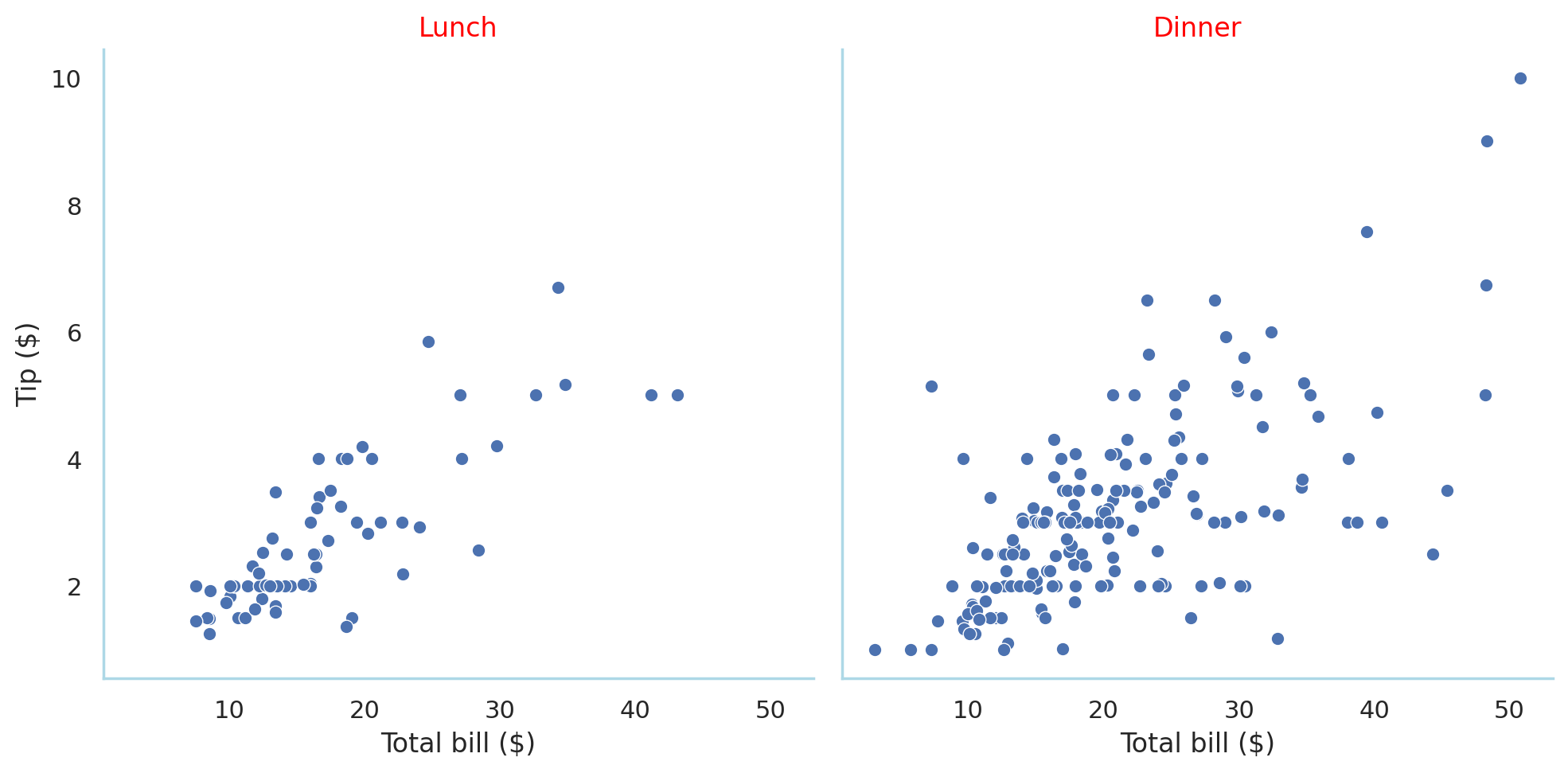
Facets
One of the advantages of seaborn is the ability to create facets (or trellis graphics) that split the data up by values of categorical variable(s) and create a panel of subplots, one of each level of the splitting variable.
my_plot = sns.relplot(data=df, x="total_bill", y="tip", col="time")
my_plot.set(xlabel = "Total bill ($)", ylabel = "Tip ($)",
  title="Test")
1my_plot.set_titles("{col_name}")
print(type(my_plot))
plt.show()- 1
- Format the facet titles’ content
<class 'seaborn.axisgrid.FacetGrid'><Figure size 672x480 with 0 Axes>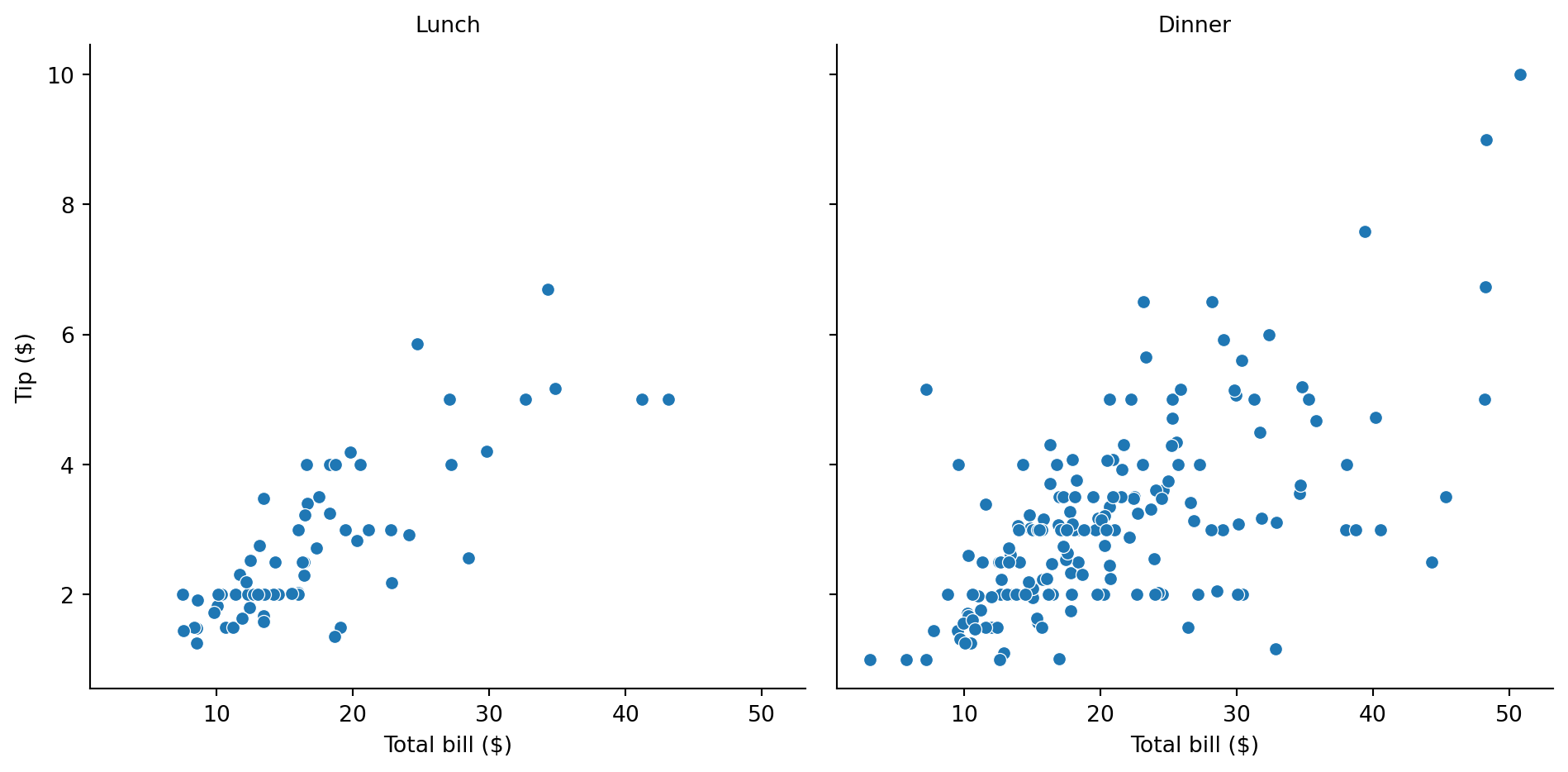
Note that, like for the object interface, the FacetGrid object is not of the matplotlib.Axes class.
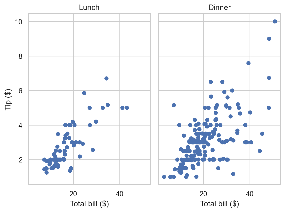
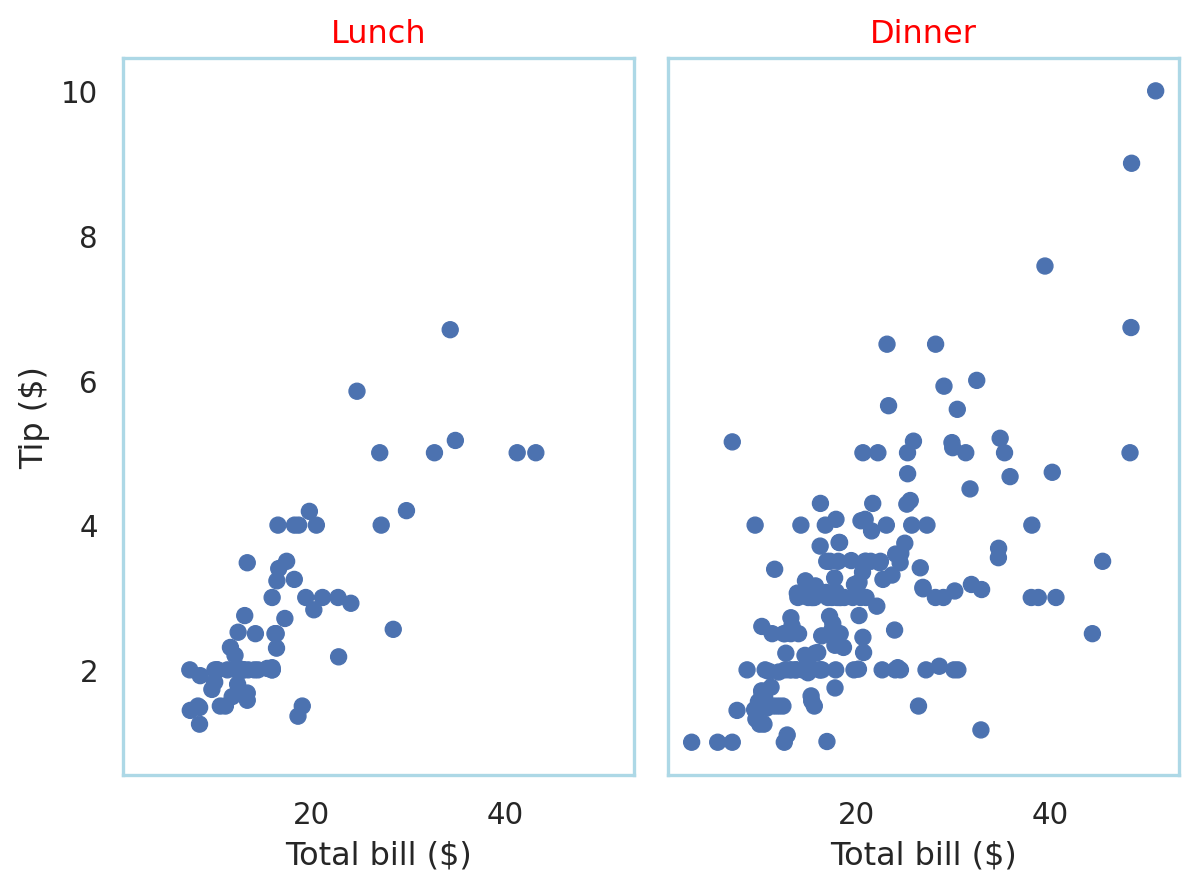
This plot can also be generated with the object interface.
sns_plt = (so.Plot(df, x = "total_bill", y = "tip")
    .add(so.Dot())
    .facet("time")
    .label(x = "Total bill ($)", y = "Tip ($)"))
print(type(sns_plt))
sns_plt.show()
<class 'seaborn._core.plot.Plot'>
Two things stand out here. One, the type of object is still a seaborn Plot object, so we can deal with the plot the same way as we would a singular plot, while in the traditional method, a different type of object is generated, requiring a different set of methods. Second, we see that better default aesthetics are used in the object interface.
Customization
Specifying colors in matplotlib/seaborn
We can specify colors in several ways in the matplotlib ecosystem. These are:
- By name, e.g., ‘red’,‘blue’, or shorthand names like ‘r’, ‘b’.
- By hex value, following the red-green-blue pattern,
#rrtggbb. Since these are hexidecimal values running from 0 to F, the two-digit hex values determine 256 unique values for each of red, green and blue. You can also specify two more digits in decimal (0-9) to specify the alpha value, i.e., the transparency level, which defaults to 100 (this is called RGBA). So a 50% transparent red would be#ff000050. To calibrate,#000000is white, and#ffffffis black. Matplotlib is case-insensitive regarding this specification, so#FF0000and#ff0000produce the same color. - You can also specify Tableau colors by name.
Full specification is described here.
Styles in seaborn: easy wins
Seaborn has a set_theme function that allows you to specify default styles and color palettes as well as add MPL-based specifications. See the documentation.
Seaborn has several built-in styles, namely, darkgrid, whitegrid, dark, white, and ticks. More importantly it has a function set_style that allows you to set the style for subsequent visualizations in your code, and axes_style which (a) will display the specification for the current style and (b) allow you to modify aspects of it. The axes_style function produces a Python dictionary of specifications.
sns.set_theme(style = "whitegrid")
def sns_plot2():
  my_plot=sns.relplot(data=df, x="total_bill", y="tip", col="time")
  my_plot.set(xlabel = "Total bill ($)", ylabel = "Tip ($)",
  title="Test")
  my_plot.set_titles("{col_name}")
  plt.show()

sns_plot2()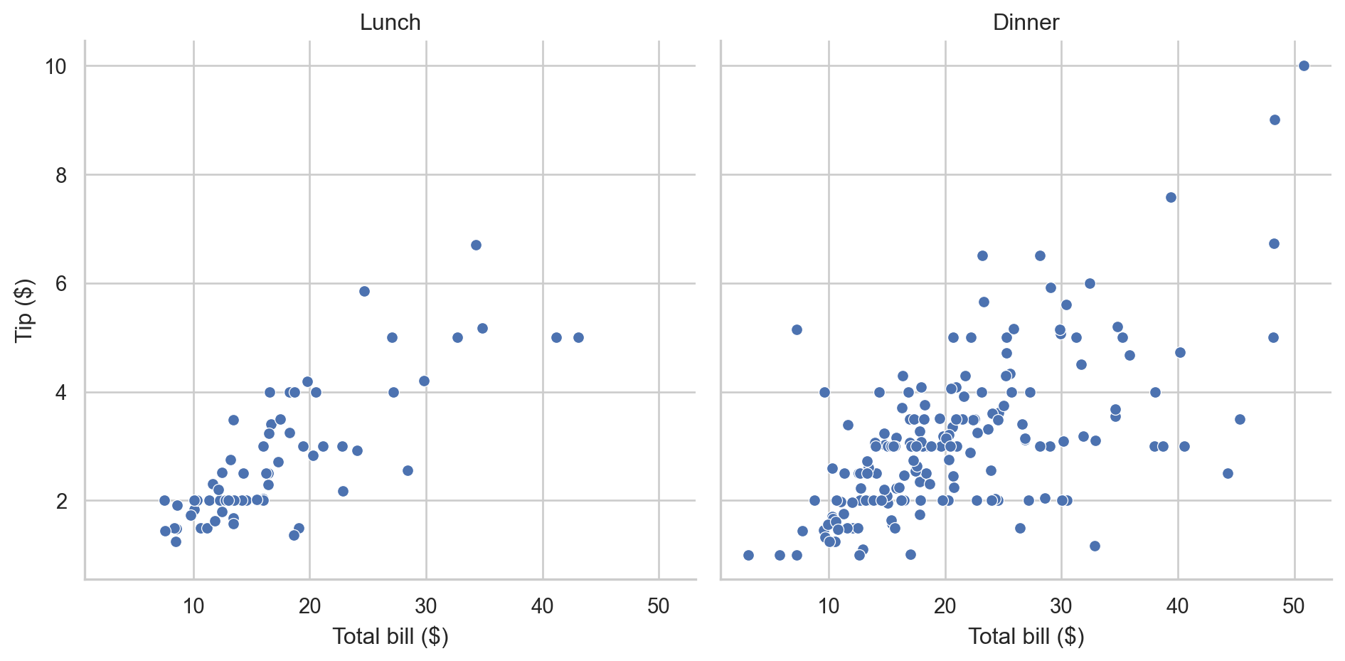
Caution
With matplotlib and traditional seaborn, which produces matplotlib axes, the objects don’t persist once they have been printed via plt.show(); they must be regenerated. With the object interface, seaborn objects do persist after being printed, and so can be built sequentially.
The object interface requires a slightly different syntax.
1sns_plt.theme(sns.axes_style("whitegrid"))- 1
-
seaborn.objects.Plot.themerequires a dictionary of parameters, intended to be some form ofmatplotlib.rcParams, as its argument. This is whyseaborn.axes_styleis needed rather thanseaborn.set_style.
A default style can be set for the object interface as well.
so.Plot.config.theme.update(sns.axes_style("whitegrid"))
sns_plt.show()
Warning
The function sns.set_style does work for traditional seaborn, but not for the objects interface
To modify some aspects of the current style, we can use set_style for traditional seaborn, and a dictionary of parameters for the object interface.
sns.set_style({"axes.facecolor": "w", "axes.edgecolor": "blue"})
sns_plot2()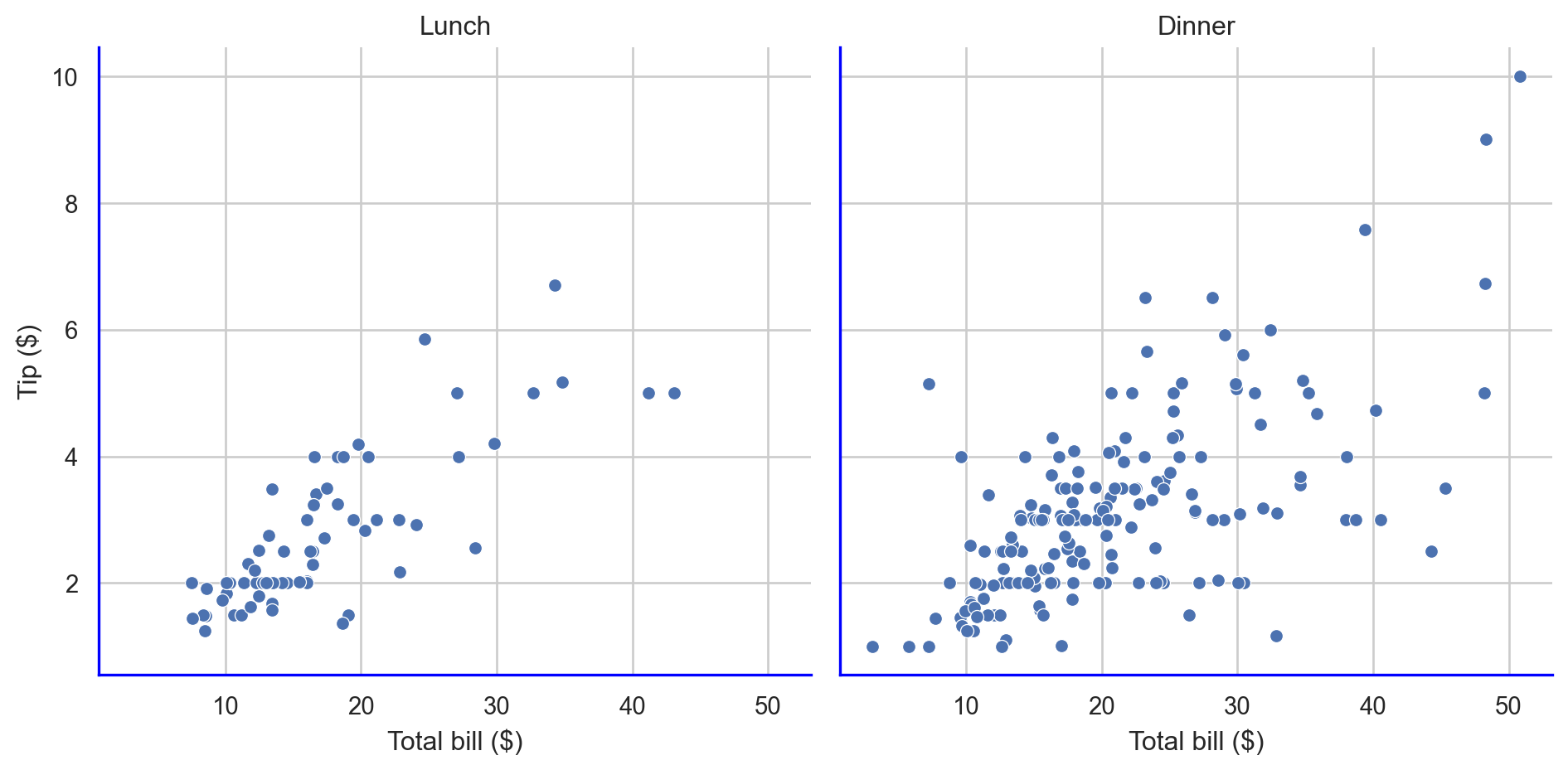
sns_plt.theme({"axes.facecolor": "w", "axes.edgecolor": "blue"})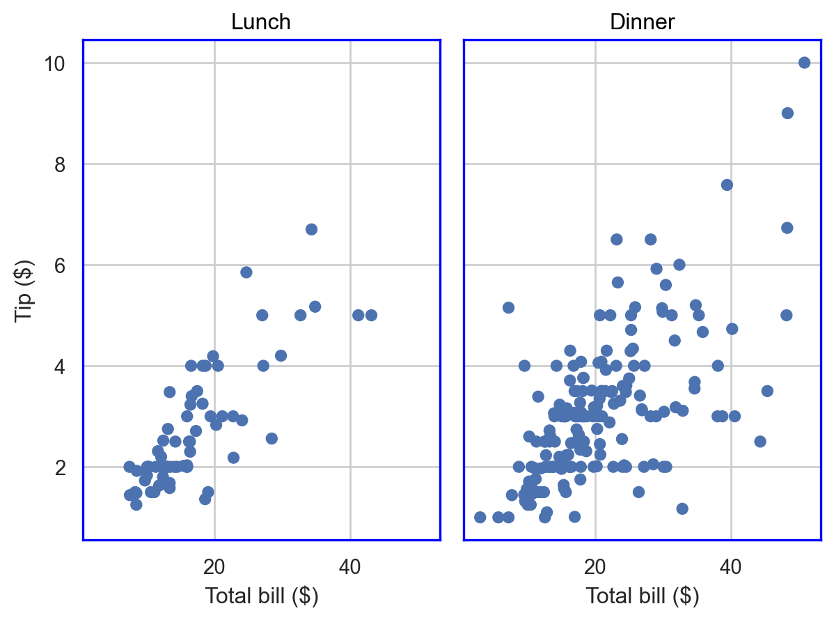
Caution
There are some differences between the two interfaces. This is expected since the objects interface is still experimental
The individual specifications seen above are based on matplotlib.rcParams, and an understanding of this is important to enable fine customization of your theme.
matplotlib and rcParams
matplotlib has a styling system using a construct called rcParams
When you use a style in matplotlib, what happens under the hood is that various elements of matplotlib.rcParams are changed to meet the specifications.
You can manipulate matplotlib.rcParams yourself as well. This object is very granular, and you can see this for yourself.
# Run on your own machine; it's long.
mpl.rcParamsDefault
There are a lot of settings that are specified here:
print(len(mpl.rcParamsDefault))316However, we can manipulate this object since
isinstance(mpl.rcParamsDefault, dict)Trueso we can, if we want, change the values of some keys in rcParams to change the style of our visualizations.
There are essentially four ways to customize Matplotlib:
- Modifying rcParams at runtime.
- Using style sheets, which are stored in
*.mplstylefiles in a special location on your computer. - Changing your matplotlibrc file.
- Manually modifying attributes of your plot when you create it
Note
Setting rcParams at runtime takes precedence over style sheets, style sheets take precedence over matplotlibrc files.
If you change the parameters in rcParams during your session, they will be re-set when you restart the python kernel.
Plot with default rcParams
Let’s start with a default mpl plot
def mpl_plot():
    # DATA FOR PLOTTING
    t = np.arange(0.0, 2.0, 0.01)
    s = 1 + np.sin(2 * np.pi * t)

    # INITIALIZE
    fig, ax = plt.subplots()

    # PLOT
    ax.plot(t, s)
    plt.show()


mpl_plot()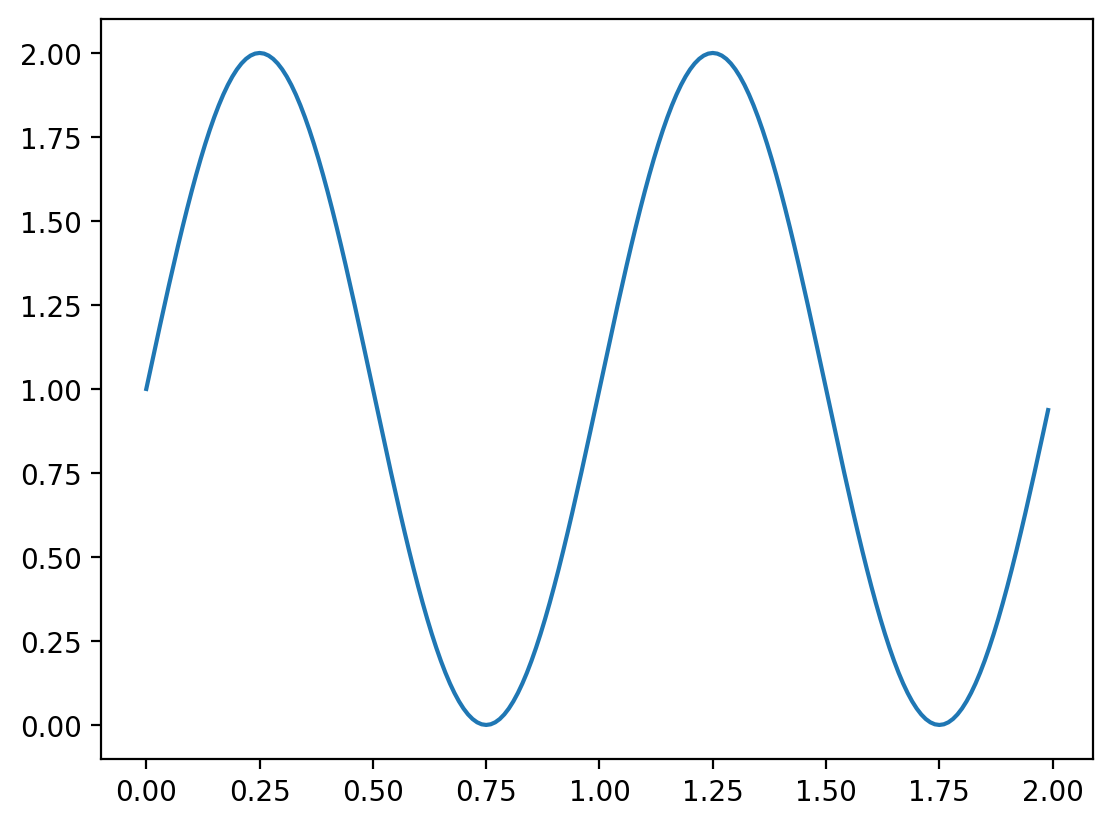
and a generic default seaborn plot (using the traditional API)
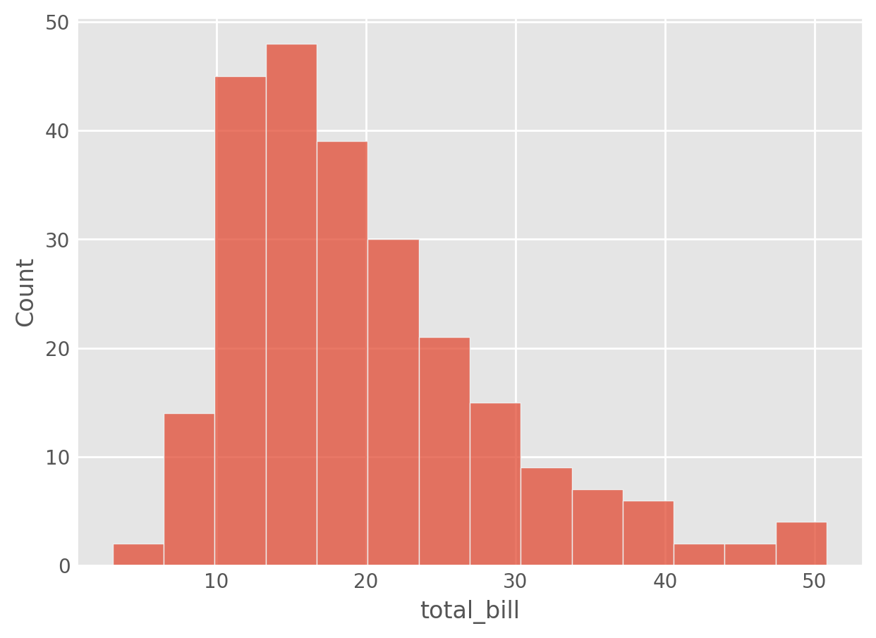
def sns_plot():
    tips = sns.load_dataset("tips")
    sns.histplot(tips["total_bill"])
    plt.show()
sns_plot()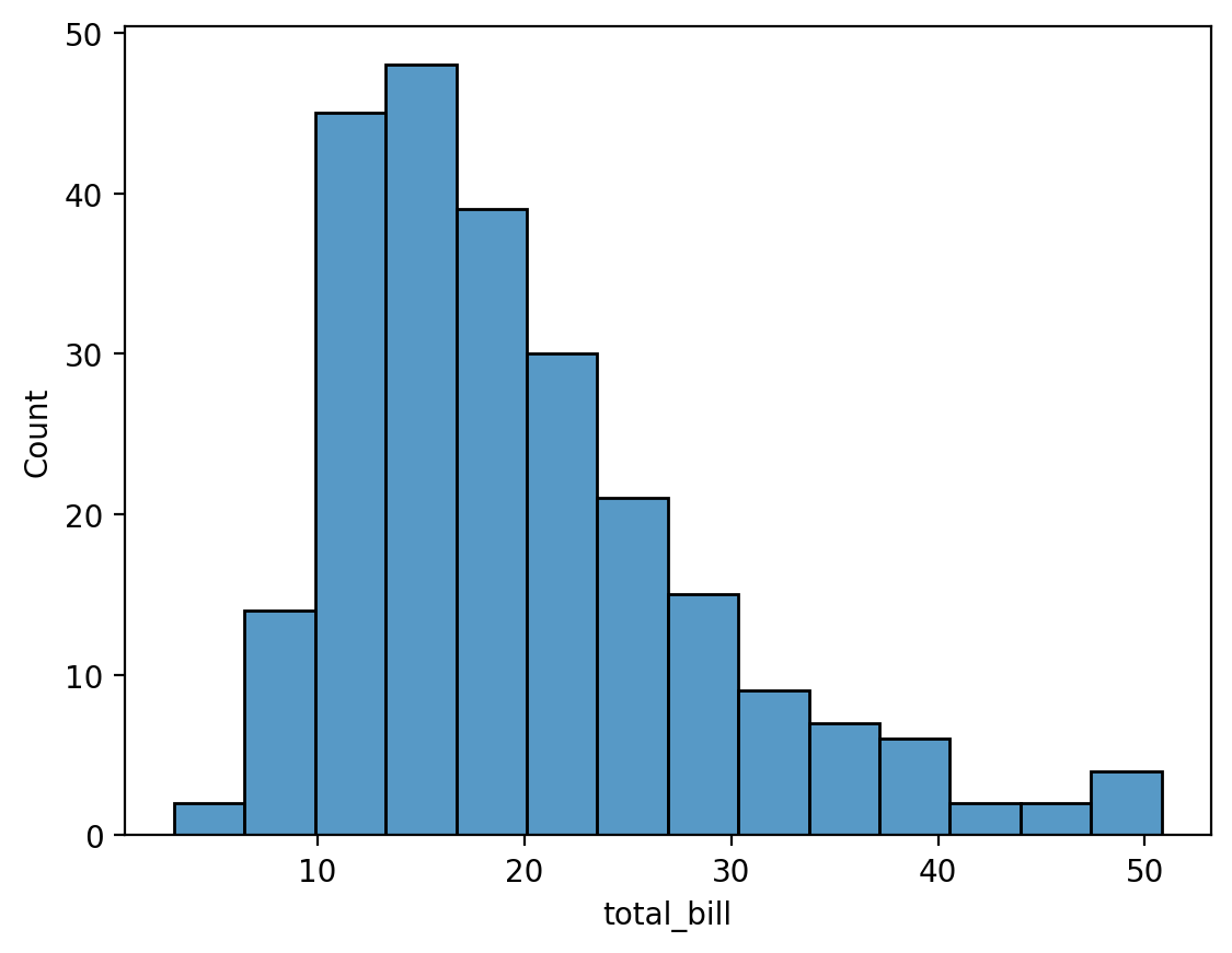
Customizing the rcParams during runtime
You can edit the rcParams during your session, which will affect all subsequently rendered plots. However, these changes are fleeting, and will be reset to the default values once you re-start your Python session.
# print(type(plt.rcParams))
plt.rcParams.update(plt.rcParamsDefault)

print("BEFORE:", plt.rcParams["figure.figsize"])

# YOU CAN ALSO MODIFY THESE ATTRIBUTES
plt.rcParams["figure.figsize"] = (
    10,
    10,
)  # change the default figure size to a 10in x 10in resolution
print("AFTER:", plt.rcParams["figure.figsize"])

plt.rcParams["axes.grid"] = True
plt.rcParams["axes.linewidth"] = 2
plt.rcParams["lines.linewidth"] = 4
plt.rcParams["lines.linestyle"] = "dotted"
# change the order in which colors are chosen
plt.rcParams["axes.prop_cycle"] = plt.cycler(color=["#32a852", "r", "b", "y"])
plt.rcParams["font.size"] = 16
plt.rcParams["axes.facecolor"] = "f0f0f0"
plt.rcParams["font.family"] = "serif"
plt.rcParams["lines.linewidth"] = 5
plt.rcParams["xtick.labelsize"] = 24
plt.rcParams["ytick.labelsize"] = 24
BEFORE: [6.4, 4.8]
AFTER: [10.0, 10.0]mpl_plot()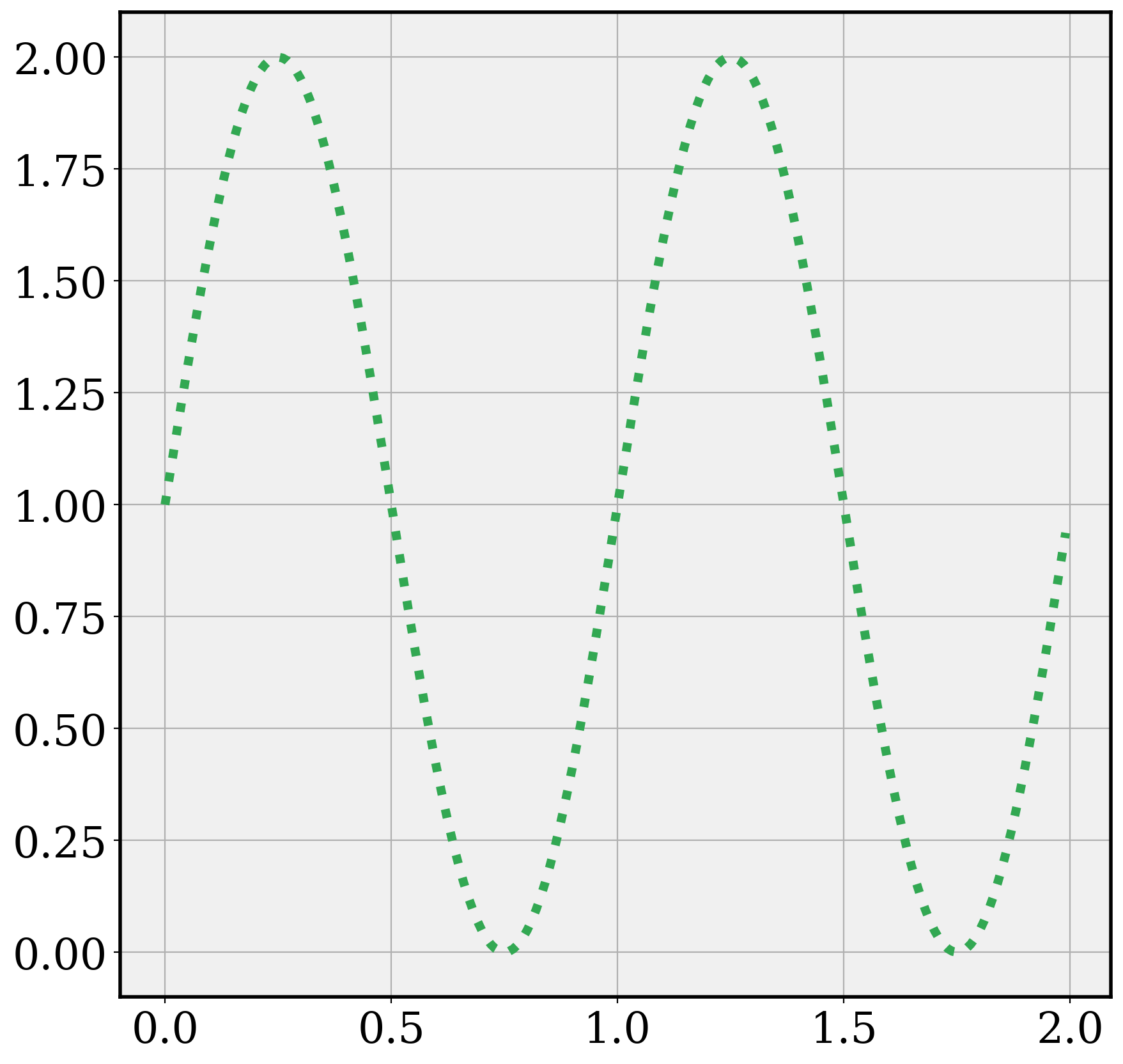
Notice that the changes happen in seaborn too, since seaborn is based on matplotlib and uses the same style parameters, which have been changed for the session in the chunk above.
sns_plot()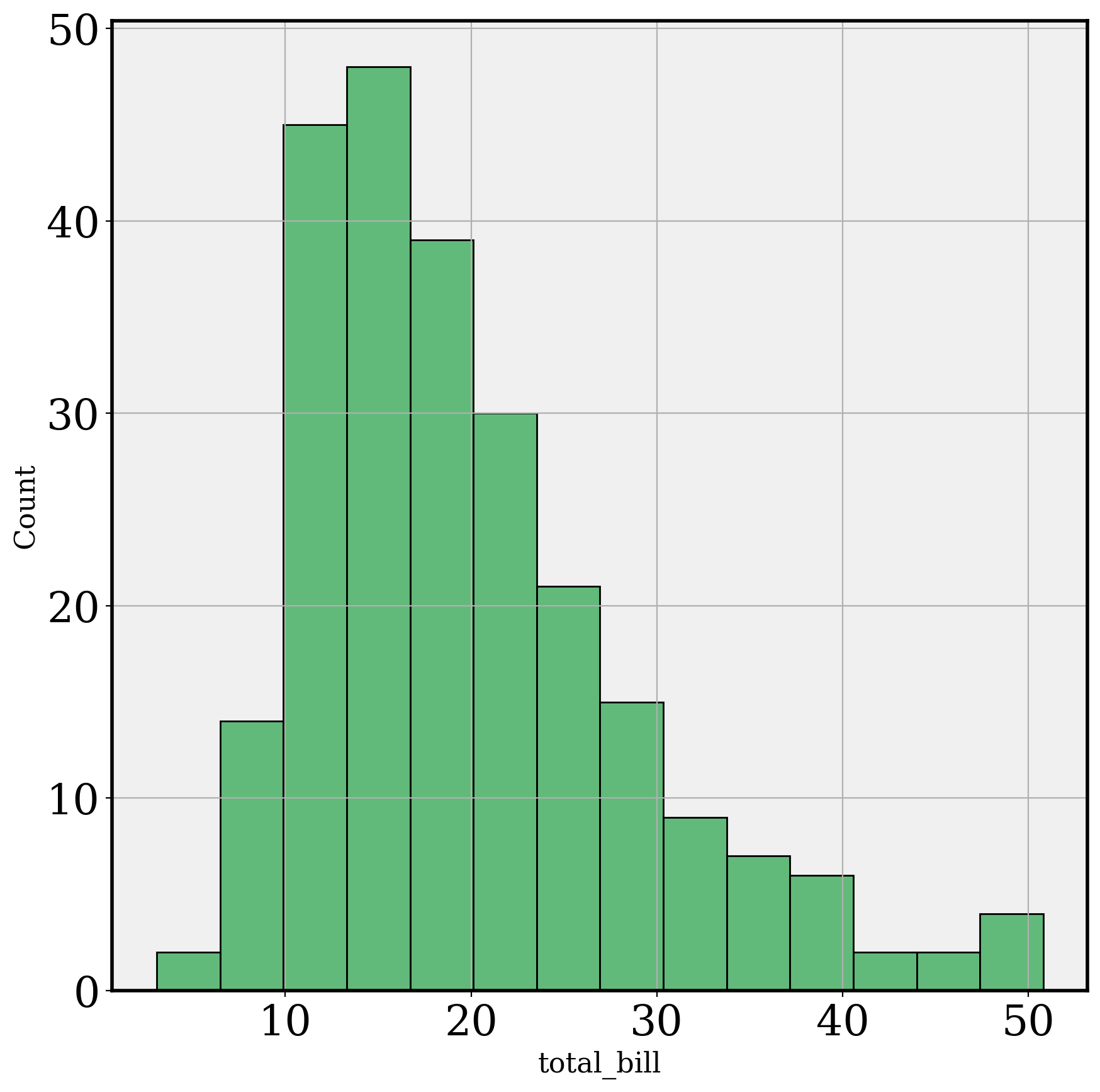
# RESET BACK TO DEFAULTS
plt.rcParams.update(plt.rcParamsDefault)
# or
# sns.reset_defaults()
Modifying Matplotlib and seaborn themes
There are several themes available in MPL and seaborn for generating the look and feel of your visualizations.
mpl.style.available['Solarize_Light2',
'_classic_test_patch',
'_mpl-gallery',
'_mpl-gallery-nogrid',
'bmh',
'classic',
'dark_background',
'fast',
'fivethirtyeight',
'ggplot',
'grayscale',
'mpl_custom',
'mucustomstyle',
'my_style',
'mycustomstyle',
'seaborn-v0_8',
'seaborn-v0_8-bright',
'seaborn-v0_8-colorblind',
'seaborn-v0_8-dark',
'seaborn-v0_8-dark-palette',
'seaborn-v0_8-darkgrid',
'seaborn-v0_8-deep',
'seaborn-v0_8-muted',
'seaborn-v0_8-notebook',
'seaborn-v0_8-paper',
'seaborn-v0_8-pastel',
'seaborn-v0_8-poster',
'seaborn-v0_8-talk',
'seaborn-v0_8-ticks',
'seaborn-v0_8-white',
'seaborn-v0_8-whitegrid',
'tableau-colorblind10',
'white_custom']Seaborn has 5 available styles: darkgrid, whitegrid, dark, white, and ticks.
To specify a style to use, you can use mpl.style.use
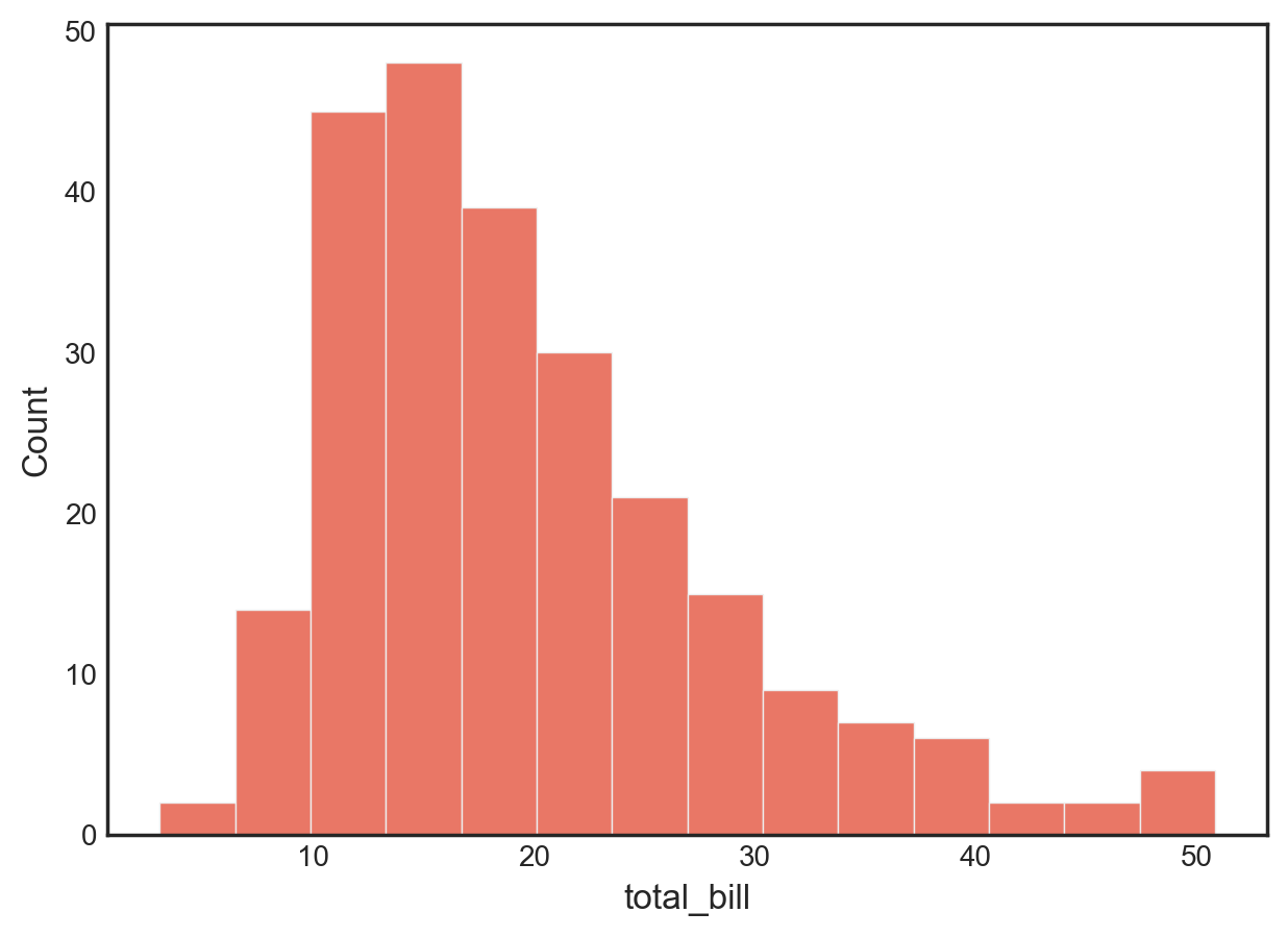
plt.style.use("fivethirtyeight")
sns_plot()

plt.style.use("ggplot")
sns_plot()

plt.style.use("seaborn-v0_8-white")
sns_plot()

plt.style.use("default")  # revert to default
sns_plot()

Let’s see if we can extract the rcParams that are changed for a pre-built MPL style.
def changed_rcParams(style):
  if style not in mpl.style.available:
    raise ValueError("This function only works with pre-built MPL styles")
  rc_orig = mpl.rcParamsDefault # default
  plt.style.use(style)
  rc_style = mpl.rcParams
  output = {k: rc_style[k] for k in rc_style if rc_style[k] != rc_orig[k]}
  return output

changed_rcParams('ggplot')
{'axes.axisbelow': True,
'axes.edgecolor': 'white',
'axes.facecolor': '#E5E5E5',
'axes.grid': True,
'axes.labelcolor': '#555555',
'axes.labelsize': 'large',
'axes.linewidth': 1.0,
'axes.prop_cycle': cycler('color', ['#E24A33', '#348ABD', '#988ED5', '#777777', '#FBC15E', '#8EBA42', '#FFB5B8']),
'axes.titlesize': 'x-large',
'figure.edgecolor': '0.50',
'grid.color': 'white',
'patch.edgecolor': '#EEEEEE',
'patch.facecolor': '#348ABD',
'patch.linewidth': 0.5,
'xtick.color': '#555555',
'ytick.color': '#555555'}We can do something similar for seaborn styles.
def changed_sns_style(style):
  if style not in ['darkgrid', 'whitegrid', 'dark', 'white', 'ticks']:
    raise ValueError("This function only works with pre-built seaborn styles")
  rc_orig = mpl.rcParamsDefault
  sns.set_style(style)
  rc_style = sns.axes_style()
  output = {k: rc_style[k] for k in rc_style if rc_style[k] != rc_orig[k]}
  return output

changed_sns_style("white")
{'axes.edgecolor': '.15',
'axes.axisbelow': True,
'axes.labelcolor': '.15',
'grid.color': '.8',
'text.color': '.15',
'xtick.color': '.15',
'ytick.color': '.15',
'lines.solid_capstyle': <CapStyle.round: 'round'>,
'patch.edgecolor': 'w',
'patch.force_edgecolor': True,
'image.cmap': 'rocket',
'font.sans-serif': ['Arial',
'DejaVu Sans',
'Liberation Sans',
'Bitstream Vera Sans',
'sans-serif'],
'xtick.bottom': False,
'ytick.left': False}You can also search for keywords in rcParams keys to help identify keys and values.
mpl.rcParams.find_all('title')RcParams({'axes.titlecolor': 'auto',
'axes.titlelocation': 'center',
'axes.titlepad': 6.0,
'axes.titlesize': 'x-large',
'axes.titleweight': 'normal',
'axes.titley': None,
'figure.titlesize': 'large',
'figure.titleweight': 'normal',
'legend.title_fontsize': None})Now, let’s see how we can modify an existing theme to customize elements.
sns.set_theme(style='white')
mpl.rcParams['text.color'] = 'red'
mpl.rcParams['font.sans-serif'] = 'DejaVu Sans'
mpl.rcParams['axes.edgecolor'] = "lightblue"
sns_plot2()
Alternatively,
sns.set_style(
1    style='white',
2    rc = {
      'text.color': 'red', 'font.sans-serif': 'DejaVu Sans',
      'axes.edgecolor': 'lightblue'
      }
)
sns_plot2()- 1
- Set a base style
- 2
- Update elements to customize in the specified base style
In the objects interface
sns_plt.theme(
    sns.axes_style(
      style='white',
      rc = {
        'text.color': 'red', 'font.sans-serif': 'DejaVu Sans',
        'axes.edgecolor': 'lightblue'
      }
  )

)
# RESET BACK TO DEFAULTS
plt.rcParams.update(plt.rcParamsDefault)
Create a new style and save to a file
Matplotlib can read style specifications from files stored in a location specified by mpl.get_configdir(). These files wll have the suffix mplstyle. If you know the base theme you’re going to use, you only need to store the customized bits in the file. You can of course store the full rcParams specification of your customized specification if you like.
Here we’re manually storing the customization og the ggplot style.
from pathlib import Path

cfgdir = mpl.get_configdir()  # find your configuration folder
p = Path(cfgdir)
stylelib = p / "stylelib"
stylelib.mkdir(exist_ok=True)
path = stylelib / "mycustomstyle.mplstyle"  # create paths
path.write_text(
    """ # write into the file
axes.facecolor : f0f0f0
font.family : serif
lines.linewidth : 5
xtick.labelsize : 24
ytick.labelsize : 24
"""
)129This creates a new file mycustomstyle.mplstyle.
Reload the matplotlib style library and you’ll see this style appear as mycustomstyle
# BEFORE
sns_plot()
# LOAD STYLE
plt.style.reload_library()
print("mycustomstyle" in plt.style.available)True# AFTER
plt.style.use(["ggplot", "mycustomstyle"])
sns_plot()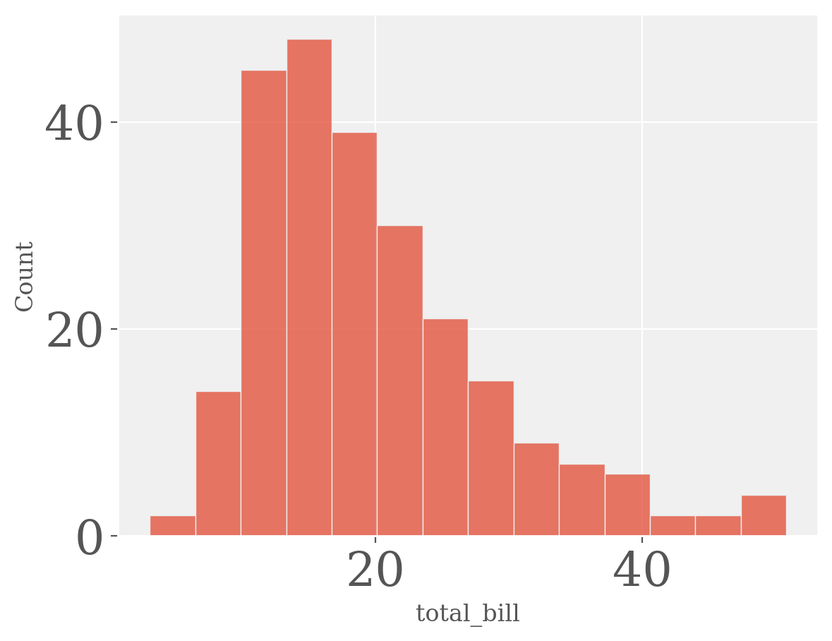
You will see that there is a hierarchy of customization parameters, for example, under grid you have
mpl.rcParams.find_all("^grid")RcParams({'grid.alpha': 1.0,
'grid.color': 'white',
'grid.linestyle': '-',
'grid.linewidth': 0.8})You can also use plt.rc to change multiple aligned parameters in one go. For example,
plt.rc('grid', edgecolor = 'blue', alpha = 0.5,
linestyle = 'dashed')plt.rcParams.update(plt.rcParamsDefault)Creating custom style files programmatically
Let’s create a custom style file programmatically
1white_style=dict(
  sns.axes_style(
    style='white',
    rc = {
      'text.color': 'red', 'font.sans-serif': 'DejaVu Sans',
      'axes.edgecolor': 'lightblue'
      }
  )
)
path = stylelib / "white_custom.mplstyle"
2with open(path, 'w') as f:
  for key, value in white_style.items():
    f.write("%s : %s\n" % (key, value))

plt.style.reload_library()
print('white_custom' in plt.style.available)- 1
- Define a custom style
- 2
- Save it to a mplstyle file
Trueplt.style.use('white_custom')
sns_plot2()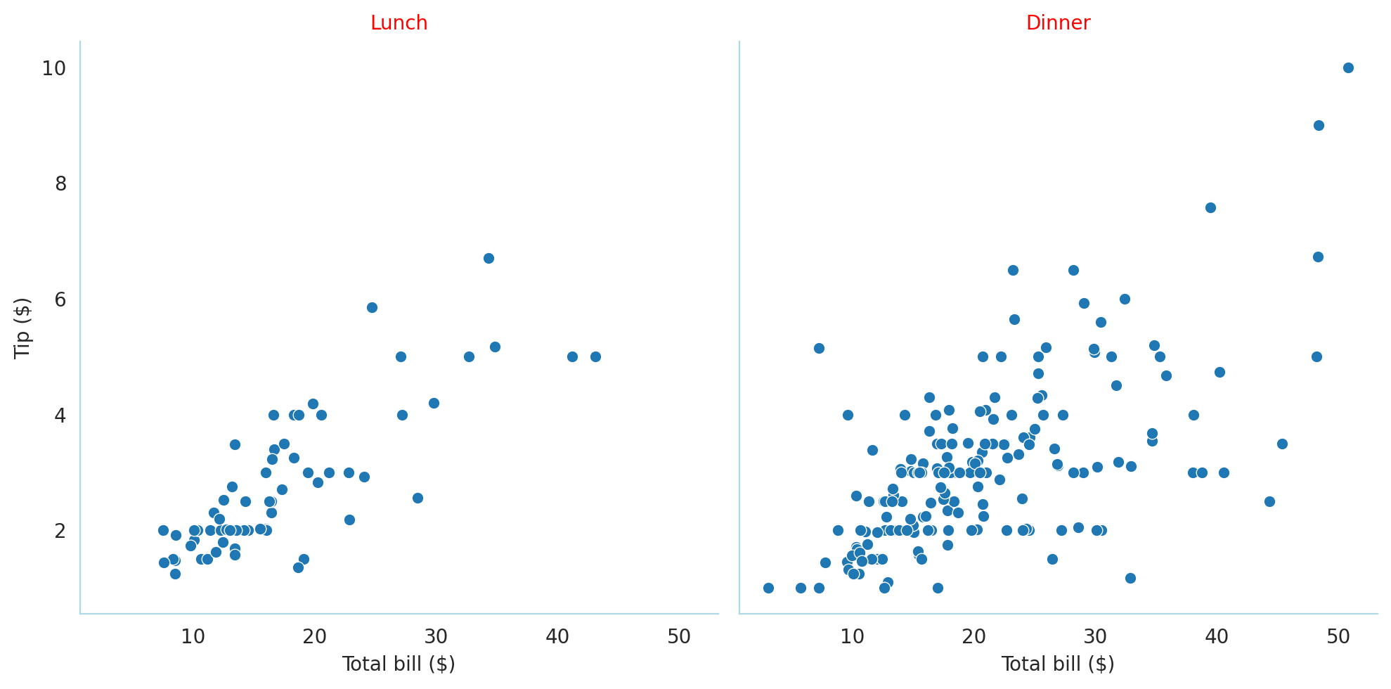
sns_plt.theme(mpl.style.library['white_custom'])
Let’s try to do a more complex one – the customization of the mpl_plot done earlier.
d = dict()
d["axes.grid"] = True
d["axes.linewidth"] = 2
d["lines.linewidth"] = 4
d["lines.linestyle"] = "dotted"
# change the order in which colors are chosen
d["axes.prop_cycle"] = plt.cycler(color=["#32a852", "r", "b", "y"])
d["font.size"] = 16
d["axes.facecolor"] = "f0f0f0"
d["font.family"] = "serif"
d["lines.linewidth"] = 5
d["xtick.labelsize"] = 24
d["ytick.labelsize"] = 24


path = stylelib / "mpl_custom.mplstyle"
with open(path, 'w') as f:
  for key, value in d.items():
    f.write("%s : %s\n" % (key, value))

plt.rcParams.update(plt.rcParamsDefault)
plt.style.reload_library()
print('mpl_custom' in plt.style.available)

plt.style.use('mpl_custom')
mpl_plot()
True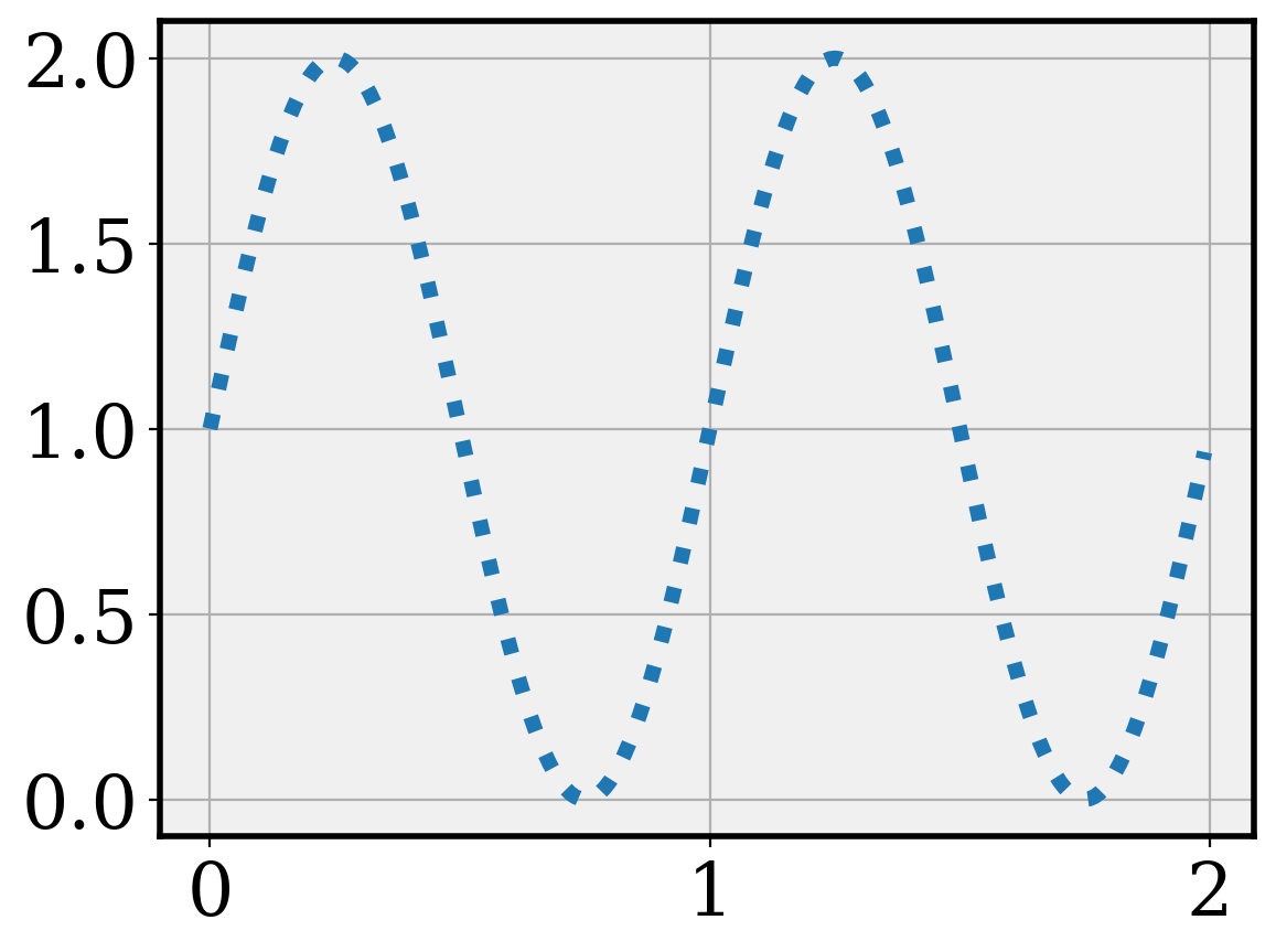
The matplotlibrc file
You can save your configuration (going into rcParams) in a file named matplotlibrc.
You can have a global one, stored in mpl.get_configdir()
You can also have separate ones per project or folder.
Advantage: You can put the configuration under version control and maintain its provenance.
The matplotlibrc file would look something like this, similar to a python dictionary
axes.axisbelow : True       # Draw axis grid lines and ticks below patches (True); above
                            # patches but below lines ('line'); or above all (False).
                            # Forces grid lines below figures.
font.size : 12              # Font size in pt.
grid.linewidth : 1.2        # In pt.
legend.framealpha : 1       # Legend patch transparency.
legend.scatterpoints : 3    # Number of scatter points in legend.
lines.linewidth : 3         # line width in pt.
Notice that the tags are the same as in rcParams, so you can edit the file in a similar way.
Customize subplots/panels
Creating subplots is quite easy in matplotlib using the subplots function
You can add a title or other customization to just one of the panel
x = np.linspace(0, 100, 50)
y = np.random.uniform(low=0, high=10, size=50)
fig, (ax1, ax2) = plt.subplots(1, 2, figsize=(10, 10 / 1.618))
ax1.scatter(x, y, c="red", marker="+")
ax2.bar(x, y)
plt.show()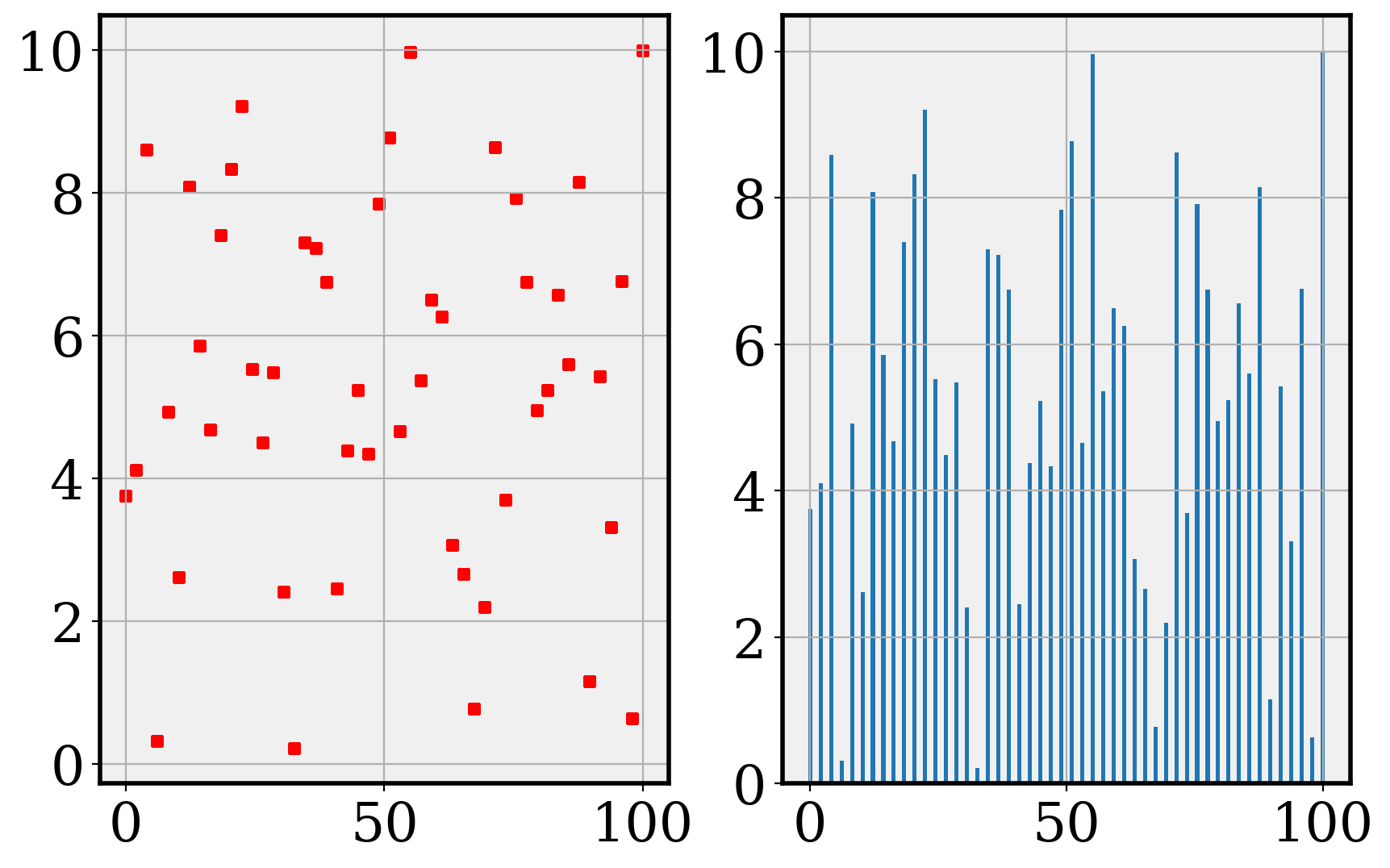
fig, ax = plt.subplots(2, 2, figsize=(10, 12))
ax[0, 0].bar(x, y)
ax[1, 0].bar(x, y)
ax[0, 1].scatter(x, y)
ax[1, 1].plot(x)
ax[1, 1].set_title("Plot 4")
plt.show()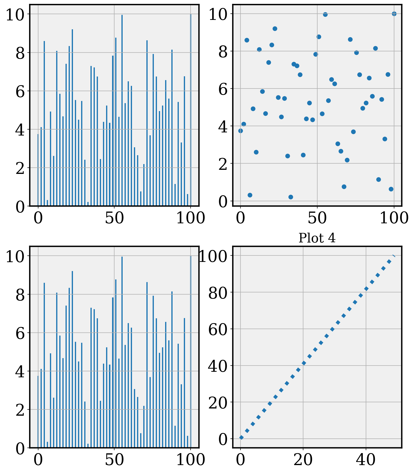
You can also change the padding between the plots
fig, ((ax1, ax2), (ax3, ax4)) = plt.subplots(2, 2, figsize=(10, 12))
ax1.scatter(x, y, c="red", marker="+")
ax2.bar(x, y)
ax3.scatter(x, y, marker="x")
ax4.barh(x, y)
ax4.set_title("Plot 4")
plt.subplots_adjust(wspace=0.5, hspace=1.0)
plt.show()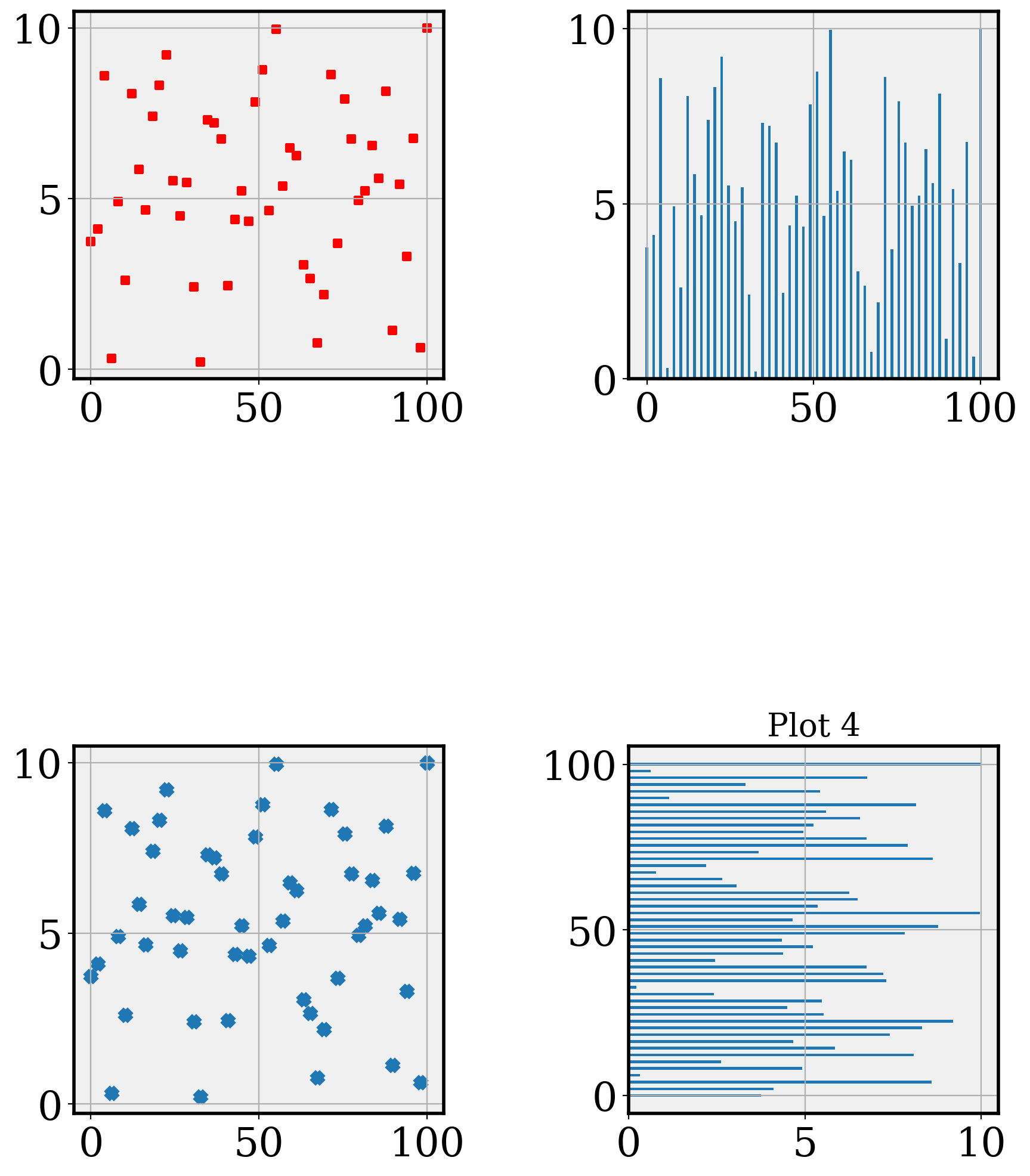
Axis alignment
It is often important for comparison purposes that the axes in a panel be on the same scale. This can be achieved by setting the sharex and sharey parameters in subplots, as needed
x = np.linspace(0, 100, 50)
y1 = np.random.normal(loc=10, scale=2, size=10)
y2 = np.random.normal(loc=20, scale=2, size=10)
fig, ((ax1, ax2)) = plt.subplots(1, 2, figsize=(10, 7))
ax1.plot(y1)
ax2.plot(y2)
plt.show()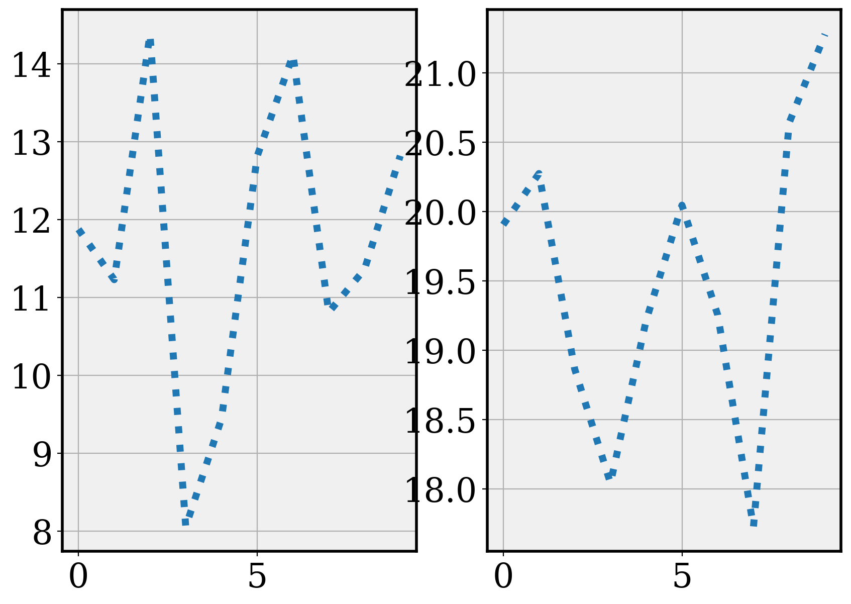
fig, ((ax1, ax2)) = plt.subplots(1, 2, figsize=(10, 7), sharey=True)
ax1.plot(y1)
ax2.plot(y2)
plt.show()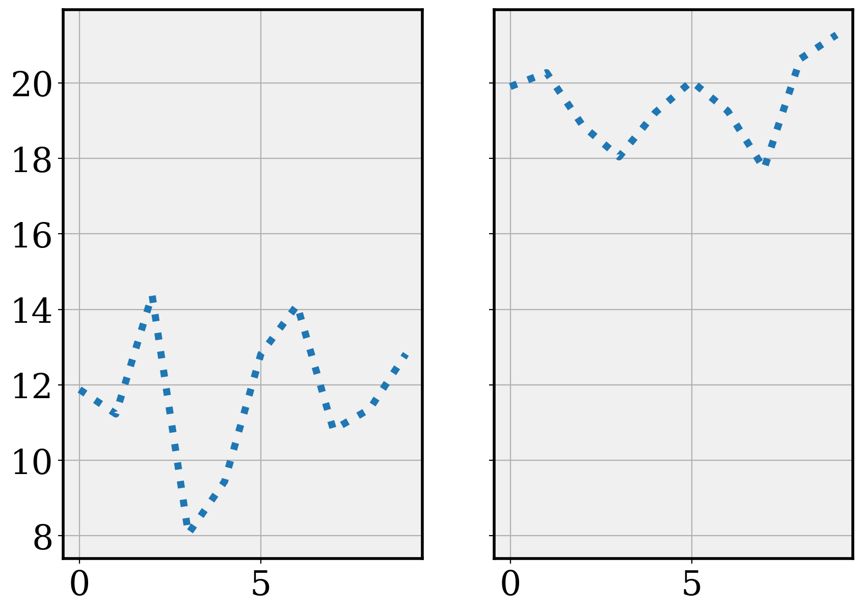
Size considerations
The size of a plot on your publication is often central to its aesthetics. This size can be specified in each matplotlib plot.
An aesthetically pleasing ratio of with to height is the Golden Ratio, which is approximately 1.618. We can write a function to ensure that for any particular width we desire, we can set the height to meet the Golden ratio.
def set_size(width):
    """Set aesthetic figure dimensions following golden ratio
    Args:
        width (float): width of the figure in inches (what matplotlib uses)
    Returns:
        fig_dim (tuple): Dimensions of the figure in inches
    """
    golden_ratio = (5**0.5 - 1) / 2
    fig_height = width * golden_ratio
    return width, fig_height
x = np.linspace(0, 10, num=1000)
fig, ax = plt.subplots(figsize=set_size(10))
ax.plot(x, np.sin(x))
plt.show()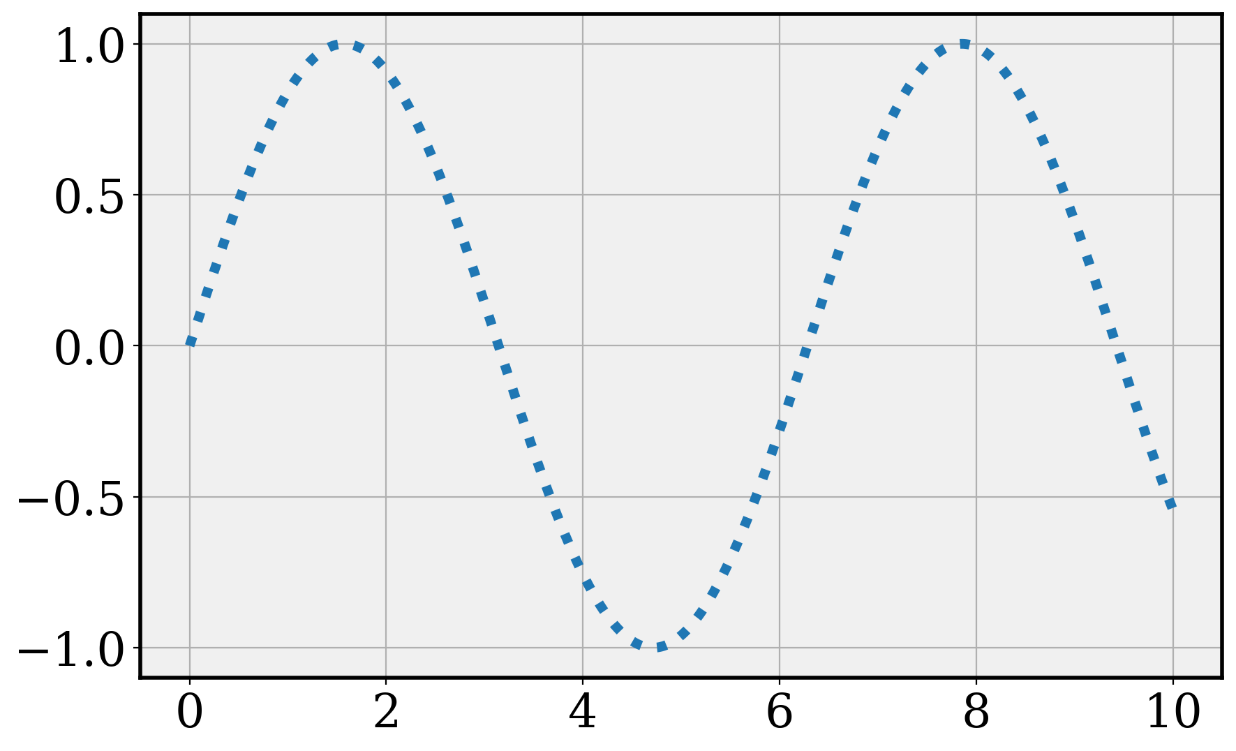
The seaborn.objects interface
The seaborn.objects interface provides two methods to customize plots, quite similar to the ggplot2 approach in . The data-driven components are customized using seaborn.objects.Plot.scale and the stylistic components with seaborn.objects.Plot.theme. We’ll just look at seaborn.objects.Plot.theme here. The one piece of the customization that will go into the seaborn.objects.Plot.scale is the color palette you might use for data-driven groups (documentation).
Let’s start with an example using the standard penguins dataset.
plt.rcParams.update(plt.rcParamsDefault) # reset parameters
penguins = sns.load_dataset("penguins")
penguins.head()| species | island | bill_length_mm | bill_depth_mm | flipper_length_mm | body_mass_g | sex | |
|---|---|---|---|---|---|---|---|
| 0 | Adelie | Torgersen | 39.1 | 18.7 | 181.0 | 3750.0 | Male |
| 1 | Adelie | Torgersen | 39.5 | 17.4 | 186.0 | 3800.0 | Female |
| 2 | Adelie | Torgersen | 40.3 | 18.0 | 195.0 | 3250.0 | Female |
| 3 | Adelie | Torgersen | NaN | NaN | NaN | NaN | NaN |
| 4 | Adelie | Torgersen | 36.7 | 19.3 | 193.0 | 3450.0 | Female |
We can create a plot using this data.
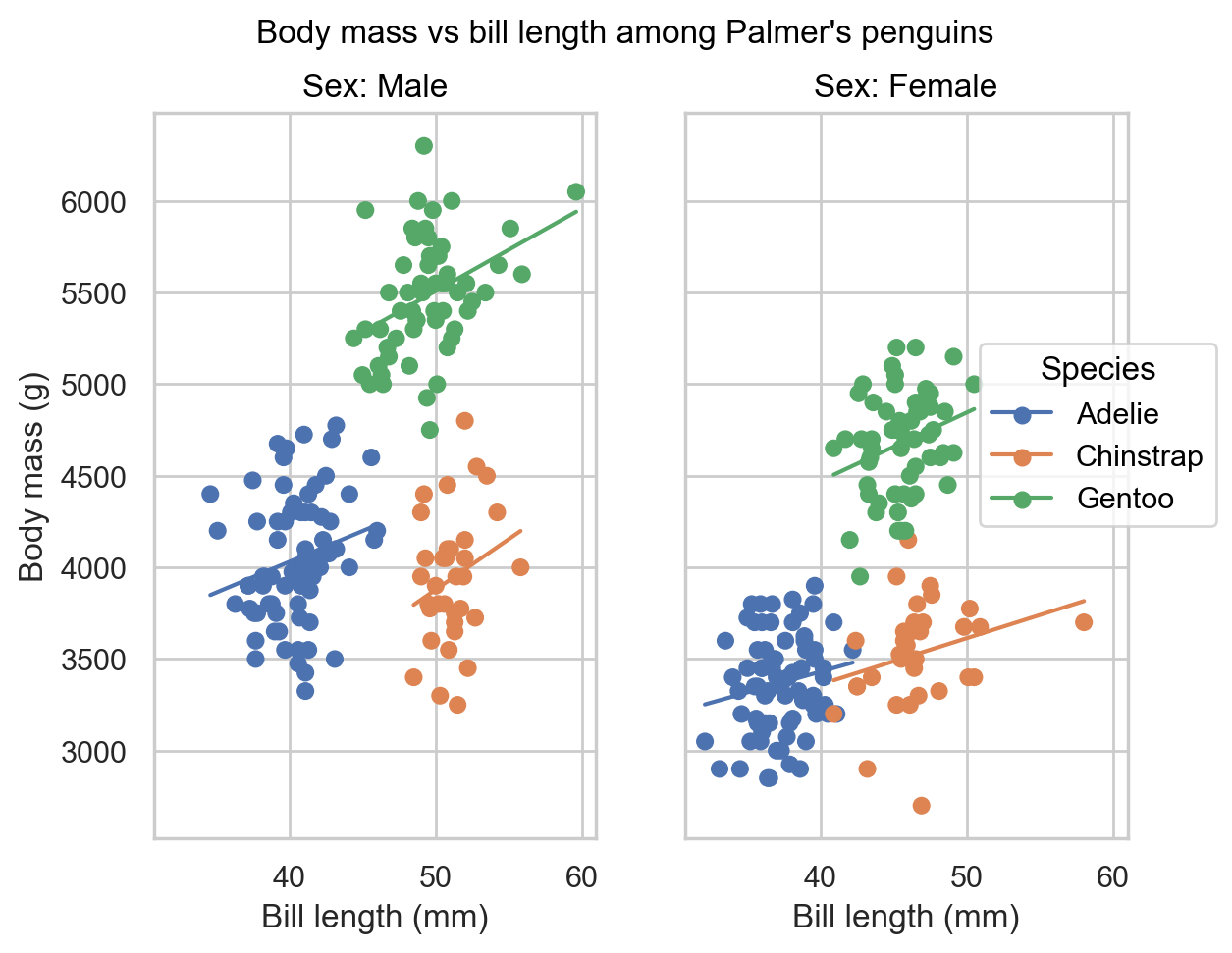
peng_plot = (
  so.Plot(penguins, x = "bill_length_mm", y = "body_mass_g", color = "species")
  .add(so.Dot())
  .add(so.Line(), so.PolyFit(1))
  .facet("sex")
  .label(
    x = "Bill length (mm)",
    y = "Body mass (g)",
    color = "Species",
    col = "Sex:",
    # title = "Bill length vs Body mass among Palmer's penguins"
  )
)
peng_plot
Updating the theme involves the theme method.
peng_plot.theme(sns.axes_style("white")) # setting a pre-built theme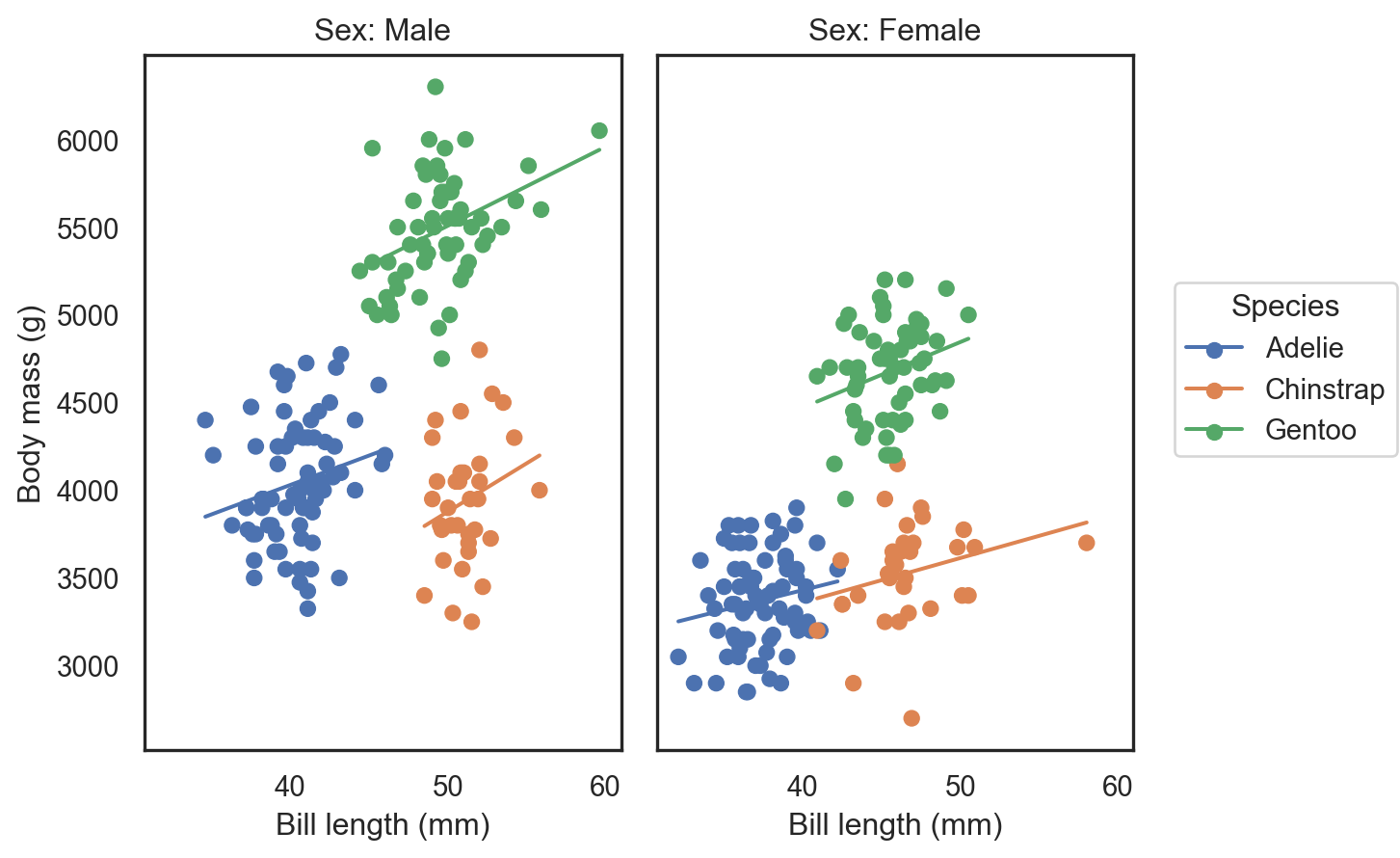
peng_plot.theme({
  'axes.facecolor': 'yellow',
  'axes.edgecolor': 'orange',
  'grid.color': 'orange'
  }) # changing particular rcParams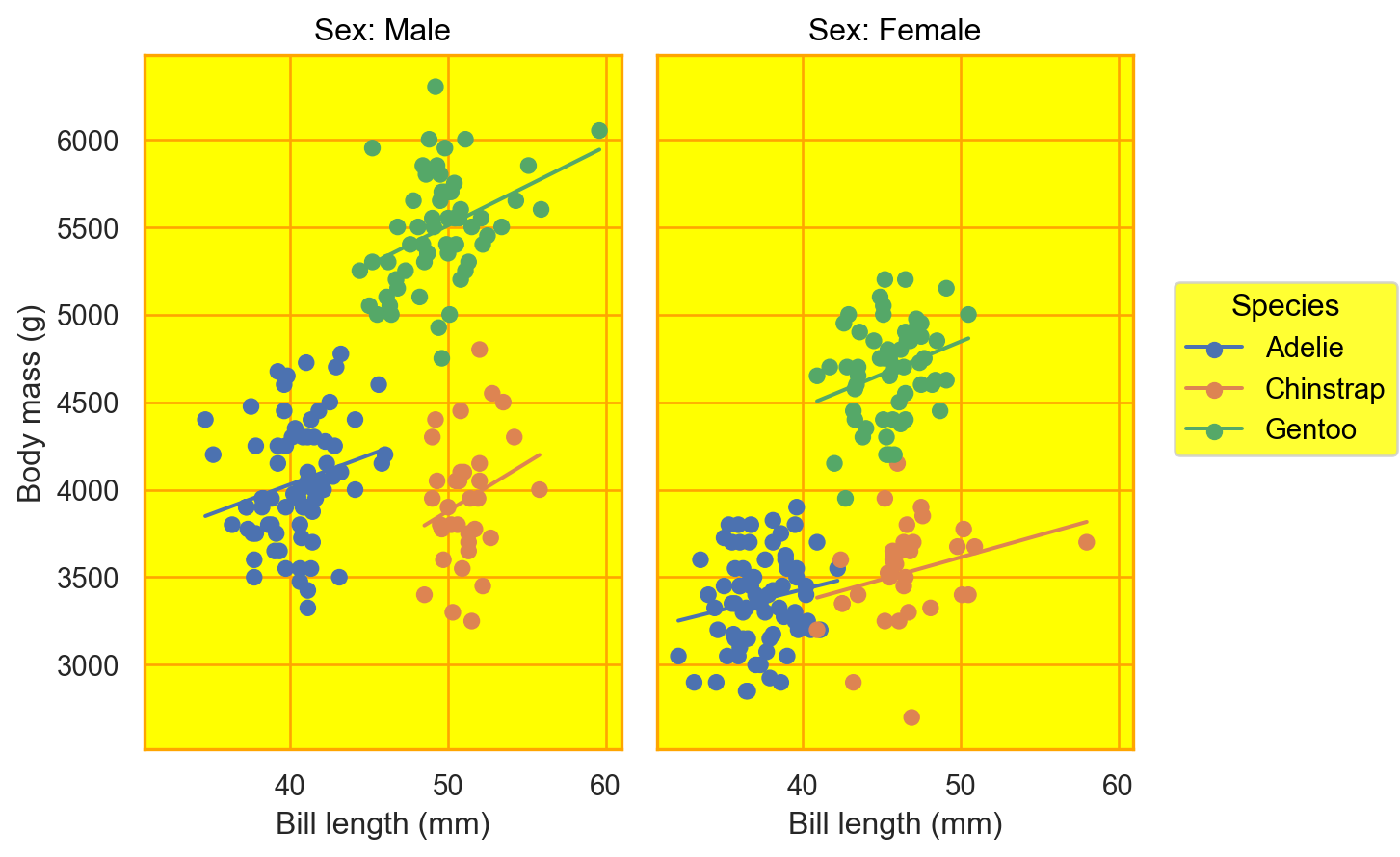
Note that this process is changing the theme at runtime. The original theme when the plot was created still is stored in the object.
peng_plot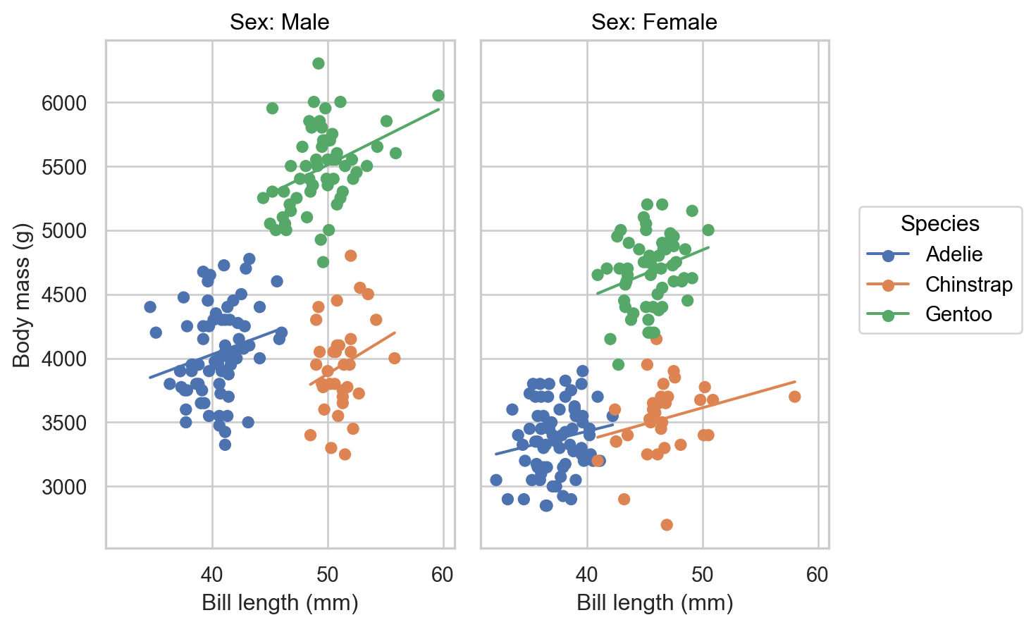
If we want to have an overall title for this figure, we need to drop down to matplotlib.
1fig = plt.figure()
2fig.suptitle("Body mass vs bill length among Palmer's penguins")
3peng_plot.on(fig).show()- 1
- Define a Figure (canvas)
- 2
- Specify a supertitle, which prints outside the axes in the figure
- 3
-
Put the seaborn figure in the canvas and display it. See here for more details on how
seaborn.objects.Plot.onworks.
Online resources
Documentation
Customization
The Python Data Science Handbook by Jake Vanderplas has chapters on creating stylesheets in matplotlib, customizing ticks, customizing colorbars and customizing plot legends
- He uses
plt.rcto modify multiple aligned parameters rather than individually changing items inplt.rcParams. For example,
plt.rc('grid', color='w', linestyle='solid')instead of
plt.rcParams['grid.color'] = 'w' plt.rcParams['grid.linestyle'] = 'solid'- He uses
[Matplotlib: Customizing | Tutorial
Style sheets
How to create and use custom matplotlib style sheet by Shan Dou
Colors
Acknowledgements
This material was developed by Prof. Hickman in 2023. This was edited, with additional material around seaborn.objects and customization approaches by Prof. Dasgupta in 2024.