Themes in data visualization
Elements
Themes and style guides
As we start our data visualization journey, we want to create visualizations that are stylistically distinctive. In the real world, the look and feel of data visualizations, a.k.a., the theme, is often driven by orgnizational brand specifications. This applies to not only corporations but also government entities, educational institutions, and even small businesses and singular consultants.
Often times, the theme of graphics are specified in a style guide. These style guides often include specifications for text and tables in addition to visualizations. Amy Cesal of the Data Visualization Society defines a style guide as follows:
Data visualization style guides are standards for formatting and designing representations of information, like charts, graphs, tables, and diagrams. They include what (e.g. types of charts) and why (e.g. reasons for using specific colors). Templates for various tools (like Excel, R, D3.js or Tableau) often accompany a guide to show the how and to make it easy for people to apply the standards from the guide.
Implementing a style guide allows an organization (and yourself) to unify the look of data products and lets you have one less thing to think about as you develop the content of the visualization. But what goes into a style guide?
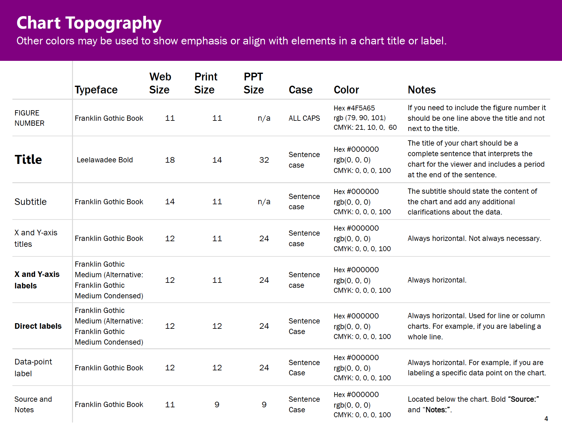
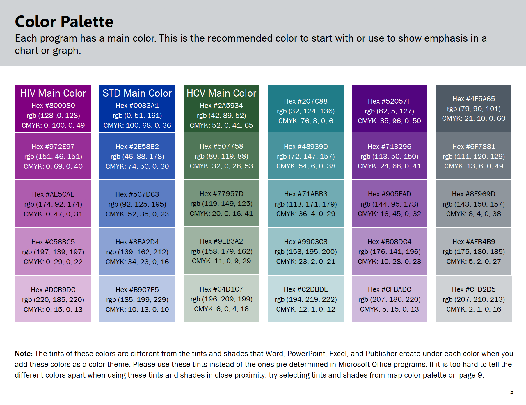
Sara Delong has some recommendations. Her blog is quite detailed, but the main elements that have to be addressed in your theme are the following.
Charts
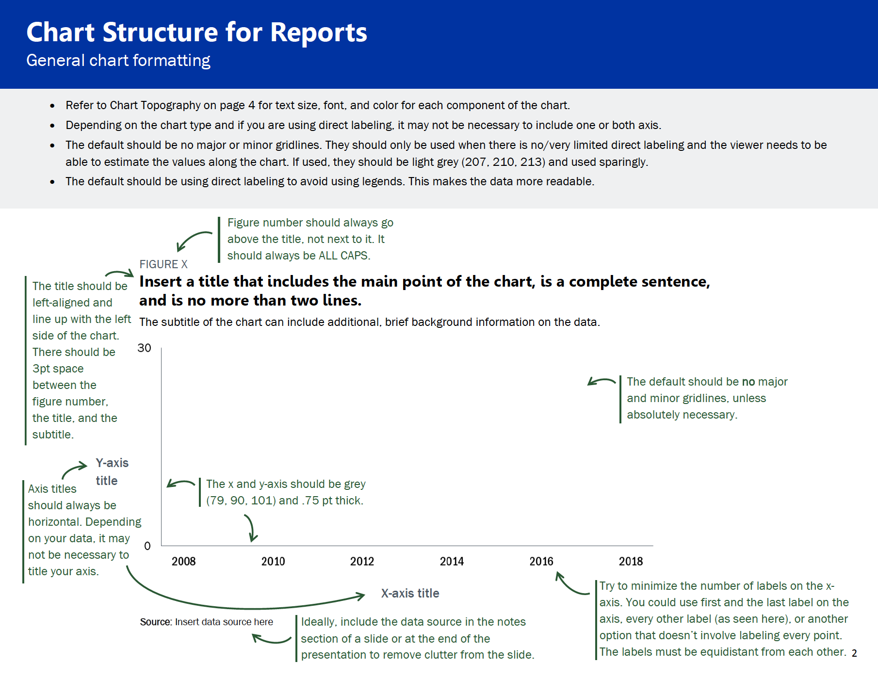
Typography
Color palettes
Why am I showing this to you
For DSAN 5200, you’re required to develop a theme that unifies all your visualizations that you develop (and submit) during this class. You are not allowed to use any pre-made theme available in ggplot2, matplotlib, seaborn or plotly (nor the default theme(s) of any tool you use for data visualization in this class).
As you can see, a theme is not just “throw some new color into the background and call it a day”. It requires, among other things,
- attention to detail,
- understanding readability,
- ensuring you have enough contrast in colors to highlight what you want to highlight,
- choosing readable typefaces and sizes
- making your visualizations accessible (paying attention to color-deficiency and other potential differences among your target readership)
- generally making a specification that makes your visualizations professional, easily consumable, and accessible to others.
It also requires iteration and revision, which we expect to occur over the course of the semester so that your final visualizations for your project are refined, professional and attractive.
Resources
There are several online resources that I would recommend you refer to as you develop your visualizations.
Colors
Typography
- Choosing fonts for your Data Visualization from Nightingale, Journal of the Data Visualization Society
- The main Google fonts suggested here are Lato, Assistant, Noto Sans, Source Sans Pro, Libre Franklin, PT Sans, Merriweather, Lora, but please understand the principles in the blog and choose your own.
Ideas for color themes
- A detailed guide to colors in data vis style guides from DataWrapper
Style guides
- There is a large collection of style guides linked from Jon Schwabish’s Policyviz blog
- Amy Cesal provides a large collection of examples in the blog from which I quoted the definition above.