Introducing Tableau
GUI tools for data visualization: Tableau
Motivation
Pros and cons
Getting access

Start Page

1 - Connecting to a File: This section on your start page indicates where you can connect to your data files saved on your computer
Start Page
2 - Connecting to a Server: You’ll usually use this section if you’re working for a company that uses specific servers. Tableau can connect to multiple different servers such as Oracle, PostgreSQL, Azure, Dropbox, and more.
Start Page
3 - Saved Data Sources: These are sample data sets that Tableau provides. When you download the software, Tableau also provides you a repository folder which also holds these clean sample data sets as excel files. When you click the samples, they will automatically load without you needing to find the files.
Start Page
4 - Open a Workbook: This area is where you can find recent workbooks opened and quickly load them in if you want to work on them.
Start Page
5 - Sample Workbooks: This section provides you with sample workbooks that you can open to play around in and see how they were built. Clicking on “More Samples” will lead you to a gallery of downloadable sample workbooks.
Start Page
6 - Discover: The Discover side bar provides you with links to the Tableau training videos, blog, forums, and Tableau Prep (a data cleaning and prepping software).
Data Source and Page and Workspace

1 - This shows you the data file you loaded. Here you can rename your data source or edit your connection to the source.
Data Source and Page and Workspace
2 - The Data Interpreter is a built-in data cleaner that Tableau provides. If you choose to use it, it can identify potential areas to clean and will re-format them and provide a log of the changes they made.
Data Source and Page and Workspace
3 - This area shows the “sheets/tabs” that are in your data source
Data Source and Page and Workspace
4 - If you want to use multiple sheets, you can drag them into the main space here to make a join or union connection.
Data Source and Page and Workspace
5 - Here you can choose the data connection you want your workbook to have. In the simplest terms, live connections have real-time updates when you’re connected to the database while an extract provides a snapshot of the data which can be refreshed at will.
Data Source and Page and Workspace
6 - Here is where you can view your data which needs be in a tabular format, with clean headers. Tableau will analyze your data and automatically assign data types to them. You can change the data types. Tableau does not change you original data source!
- This little Tableau icon will bring you back to the start page.
- The holy grail of Tableau and probably the most used part of Tableau. These are unlimited undo and redo buttons!
- These icons here are the flip and sort buttons. The flip button will switch your columns and rows back and forth. The sort buttons will quickly sort your view (like a bar chart) in ascending or descending order
- This will fit your charts to either standard size, fit width, fit height, or fit entire view
- Show Me is a handy tool for beginners to help you build quick charts and graphs

6 - In the data tab you can find all measures. In the analytics tab you can supplement your views with reference bands, forecasts, trend lines, and more.
7 - This is a very handy little button that shows you a quick look into your data table. Instead of switching back and forth from your workspace to the Data Source page to look at your data, you can just click that button to quickly see your data.
8 - The Dimensions tab is where you can find all your categorical fields
9 - The Measures tab is where you can find all your numerical measures
10 - You can click these little tabs to open a new Sheet, Dashboard, or Story.
11 - The Filters card is where you can drag various fields to filter your view.
12 - This bar in the marks card is a drop down menu of different chart and graph types you can use, like bar, area, gantt, pie chart and more.
13 - These cards in the marks card is used if you want to add color, sizes, text, tooltips, or more to your visualizations.
14 - The Columns and Rows section is how you build your views. You can drag various fields to this area to make your visualizations.
15 - This is where your visualizations will appear. You can also drop fields there to let Tableau automatically choose how to visualize it.
Connecting to analytic back ends
- Tableau provides an open-source API that can be used to extend Tableau. Default services that connect are R, Python and MATLAB
- Tableau actually connects with these back ends using
SCRIPTfunctions
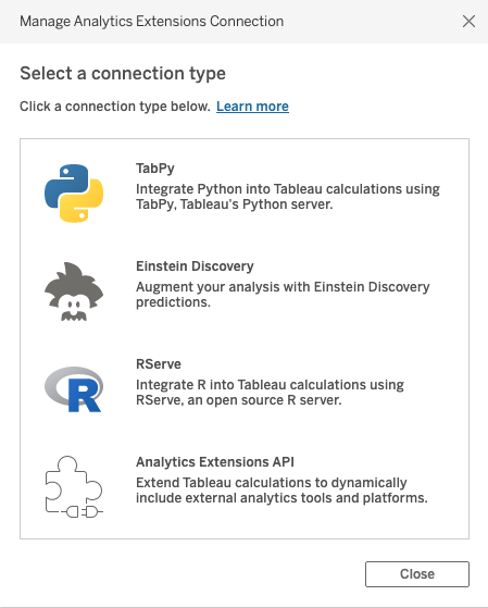
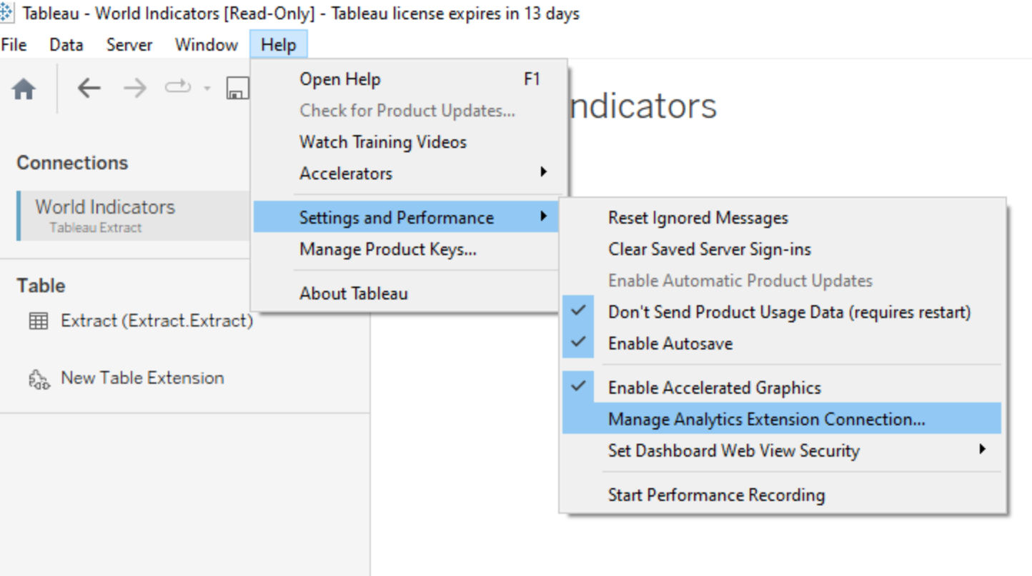
Where do you find the Extensions Manager?
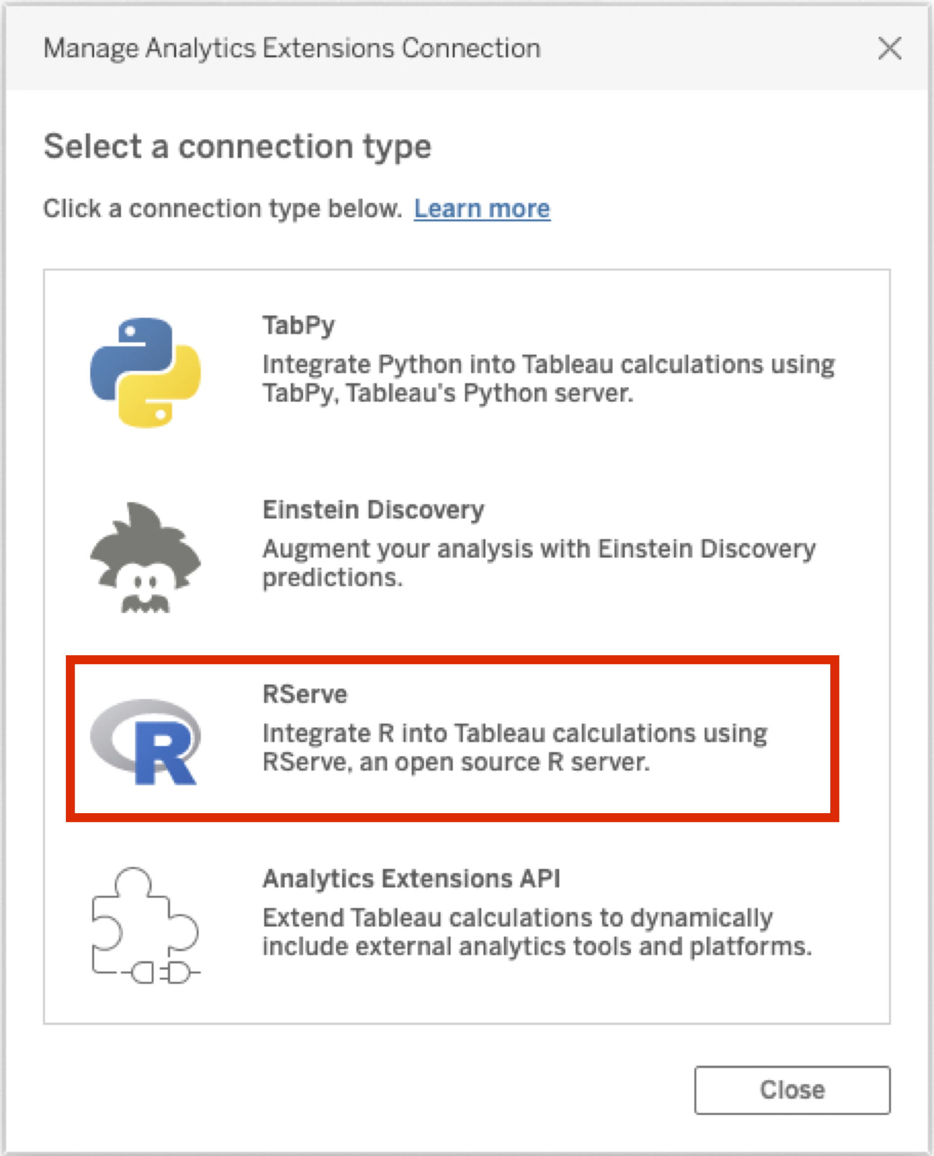
Configure R and Rserve for Tableau use
3. Now, create the connection in Tableau


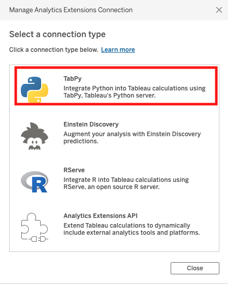
Configure Python and TabPy for Tableau use
In Tableau, we can configure this from the same dialog we used for Rserve, except we’ll choose the TabPy option

A basic visualization
We’ll use an AirBNB dataset composed of all AirBNB properties in New York City that were listed on 1 September, 2015.
- We will do a geospatial visualization by ZIP code
- including summary information on price, number of beds and reviews ratings
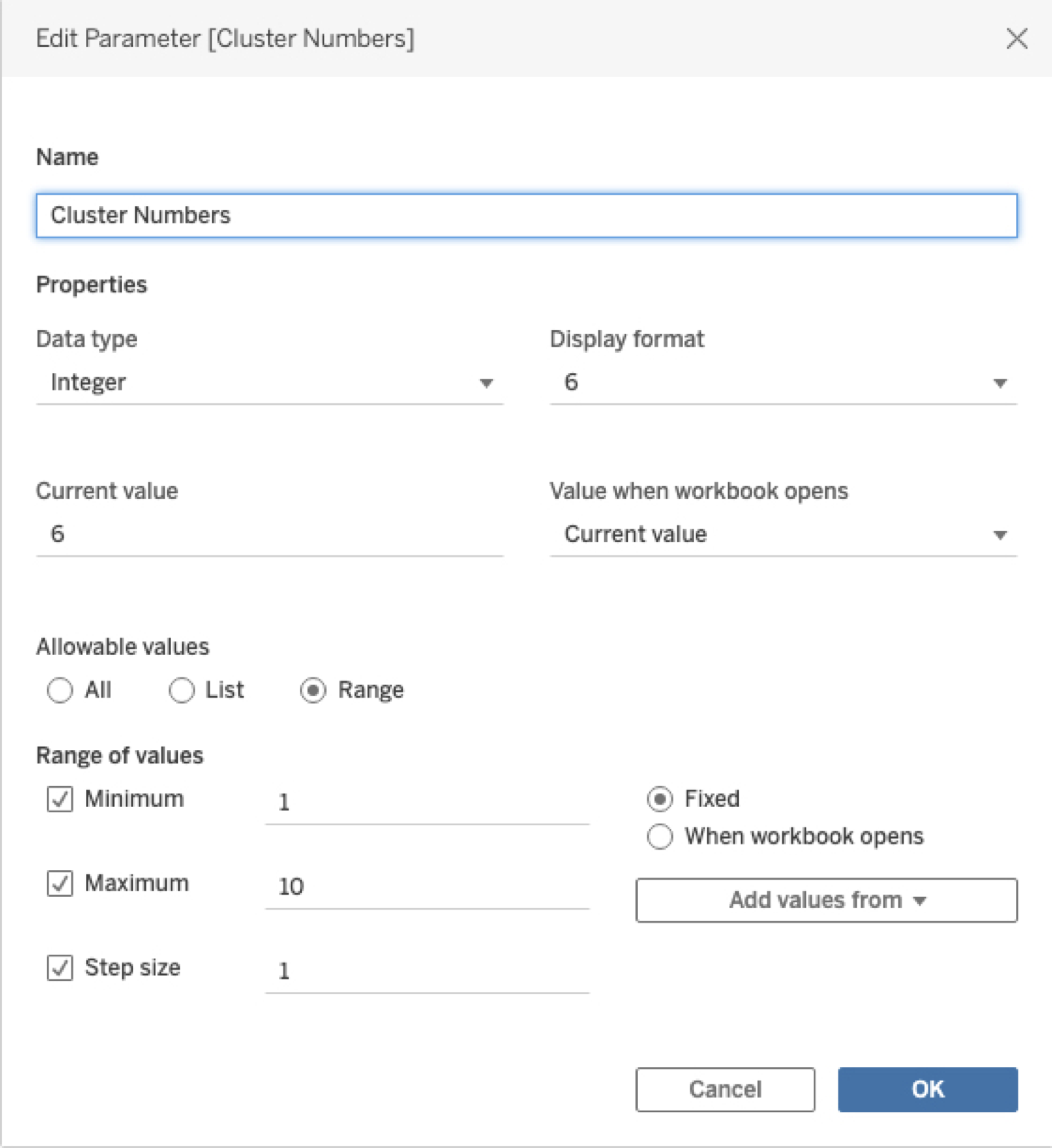
Creating a Parameter
Create parameters for the cluster analysis
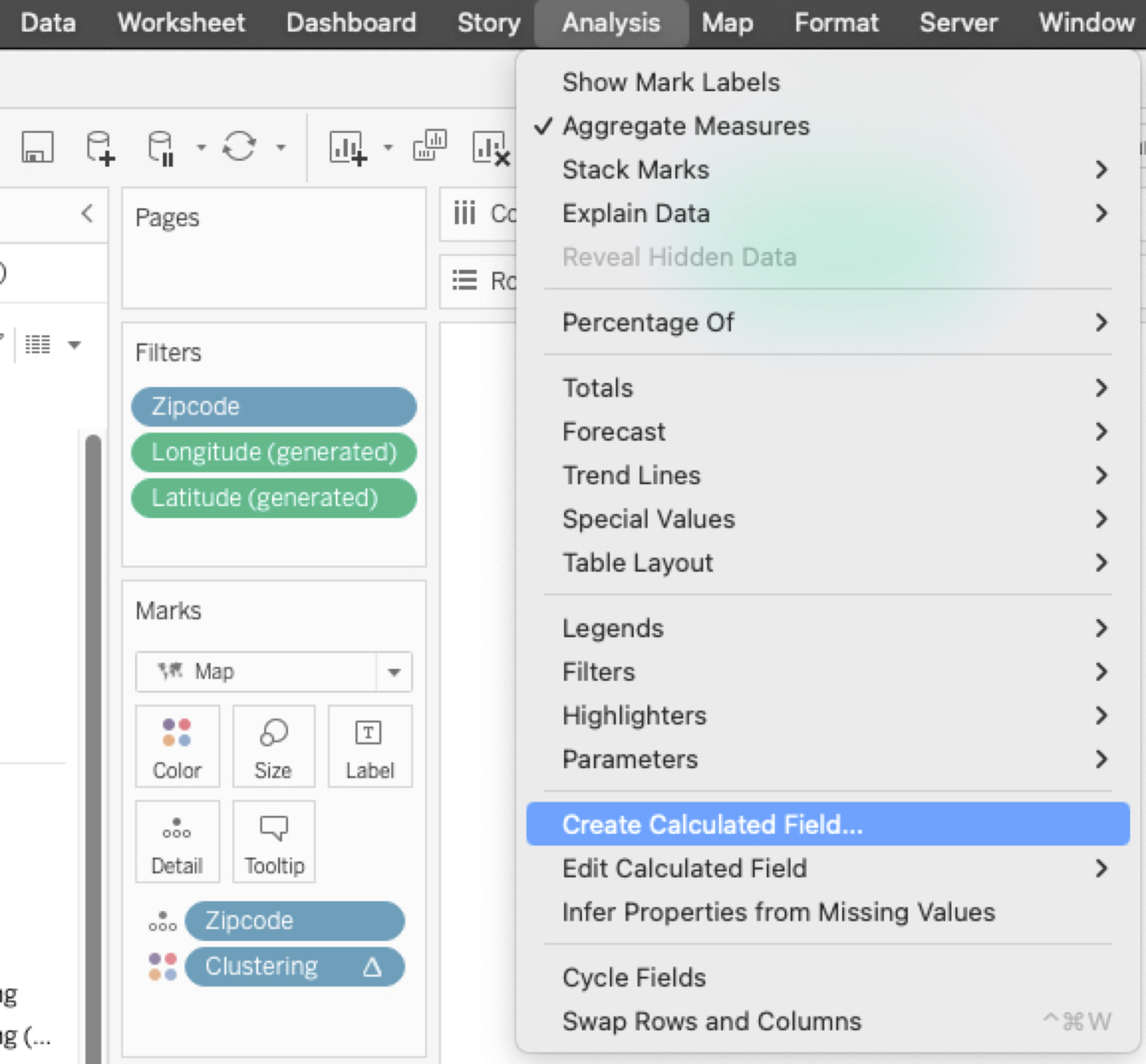
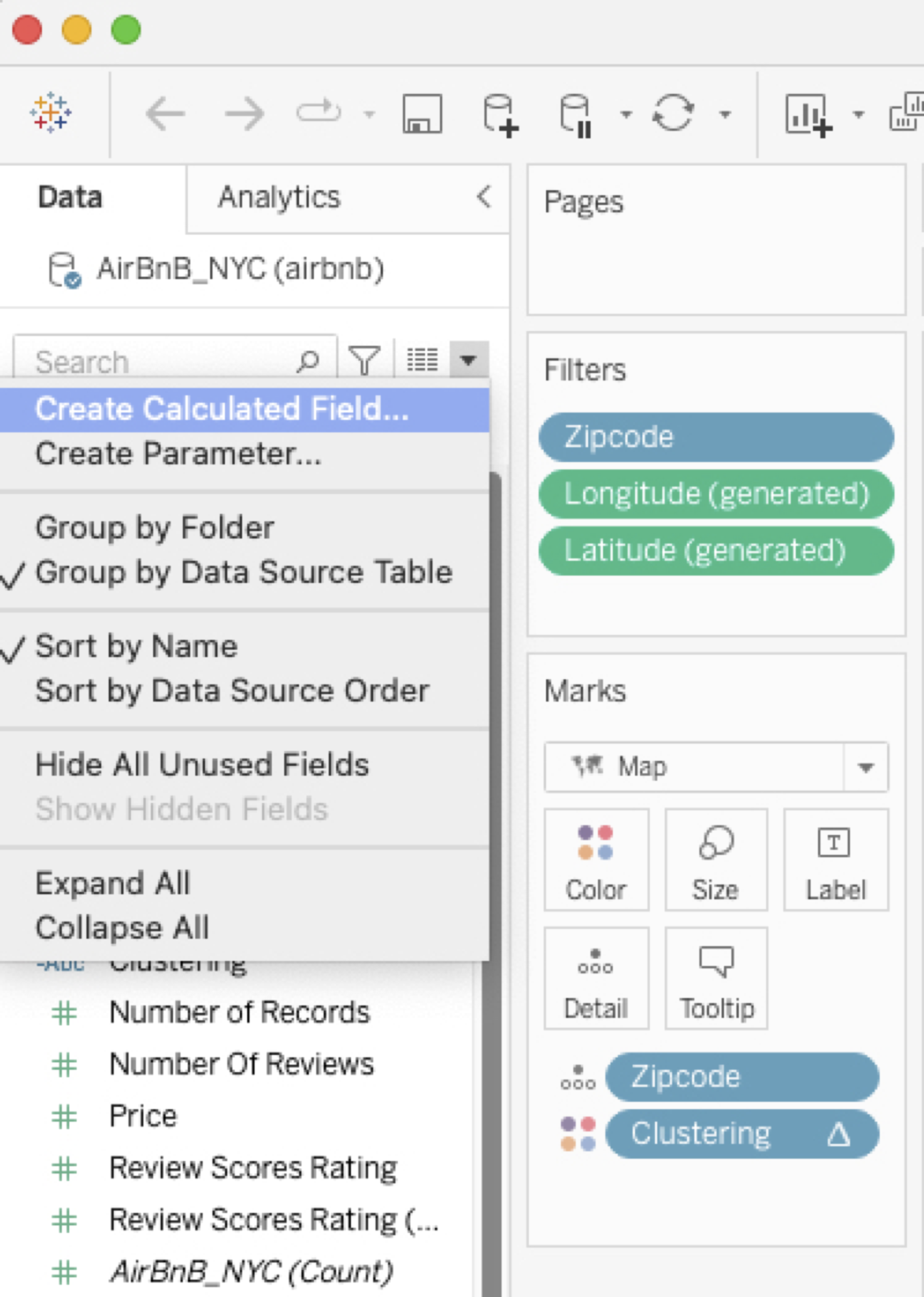
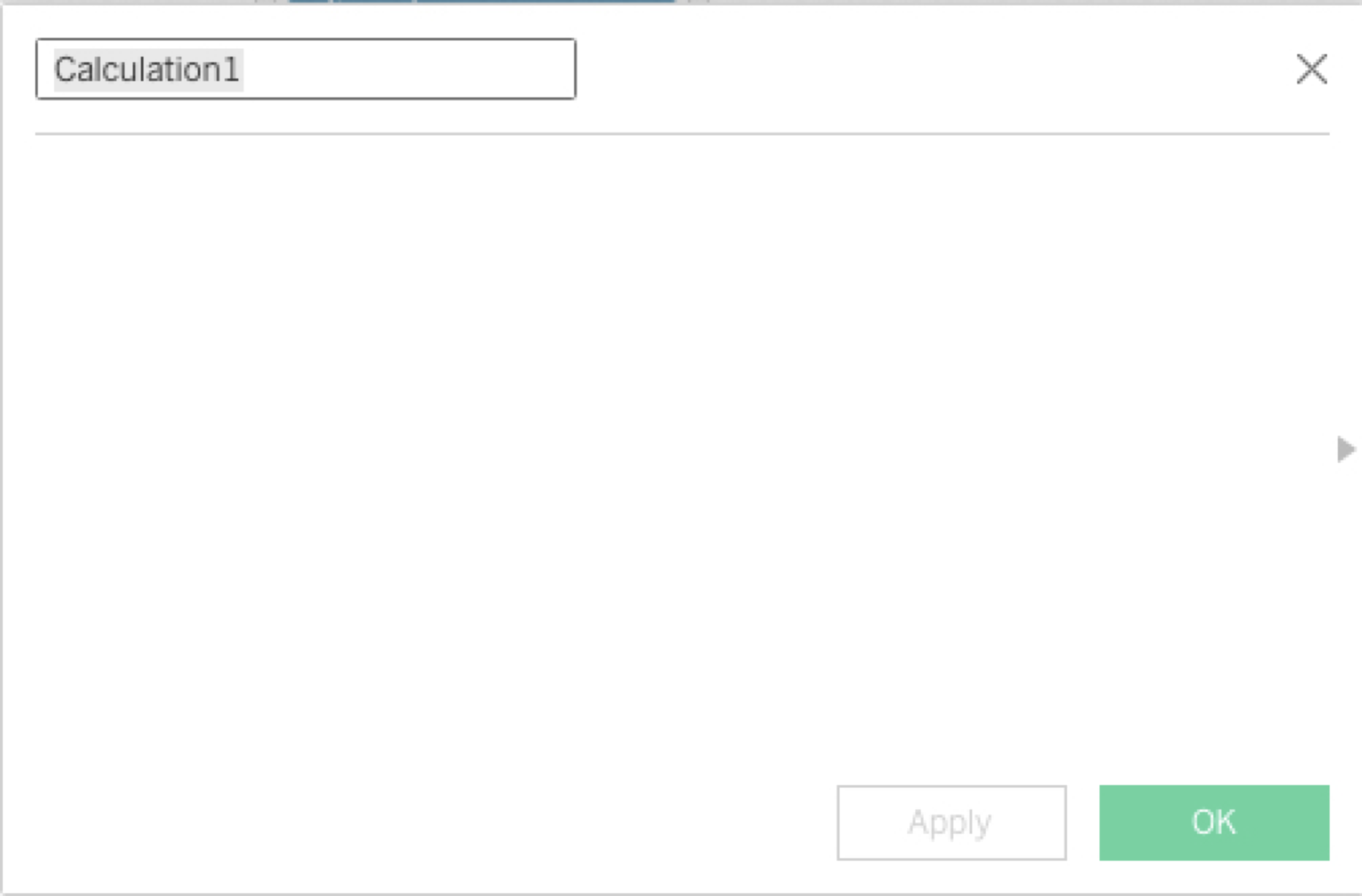
Creating a Calculated Field
Connecting with R
- Make sure
Rserveis running!!
We’re going to create a Calculated Field, where the calculation will be in
- We write R code directly in the Calculated Field window
- We wrap it in
SCRIPT_INT- The output of the R script is an array of integers (cluster ids)
- In
SCRIPT_INT, we specify the inputs from the Worksheet- If an input is a measure or continuous variable, it has to be input as an aggregate
- The inputs are denoted in the R script as
.arg1,.arg2, etc
Useful resource!
Using R
You can now select the linkage and number of clusters in a hierarchical clustering (hclust) in Tableau and see the visualization update
Using Python
Make sure that tabpy is running!!
We create a new Parameter, called “Clustering Algorithm”
Using Python
We create a Calculated Field called “Clustering” here, too
- Note that for Python, the arguments are entered as
_arg1,_arg2, etc
Using Python