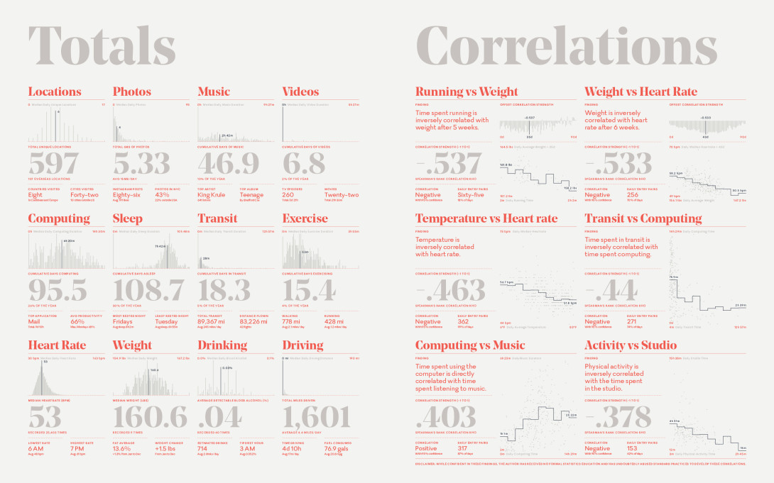
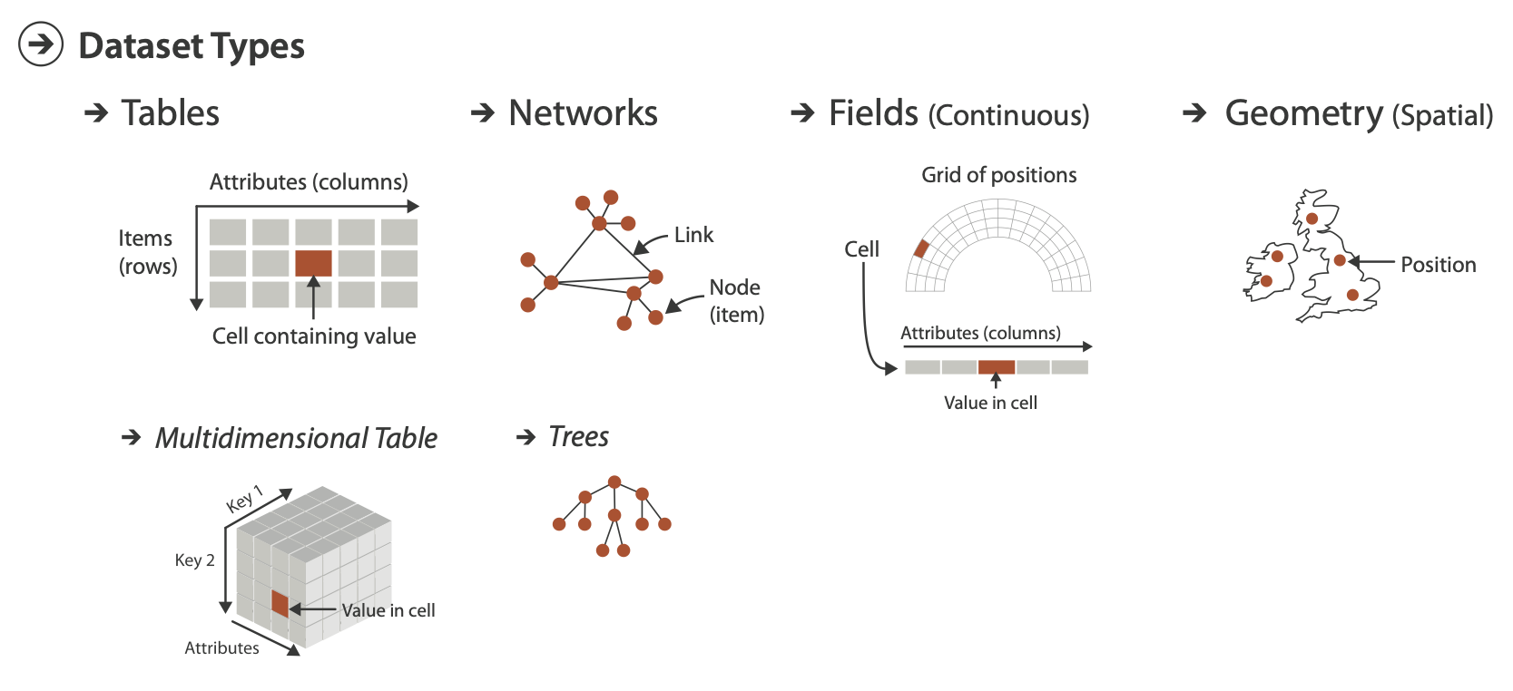
Visual encodings, visualization integrity, color theory, elements of a theme

For example: what scale are you using? What does that color represent? Is this normal?
It’s better to err on the side of too much explanation than it is too little. At least with the former, people can gloss over the details if they’re already familiar. They can still read the chart. With the latter, people who are unfamiliar with the visual encodings will get stuck.
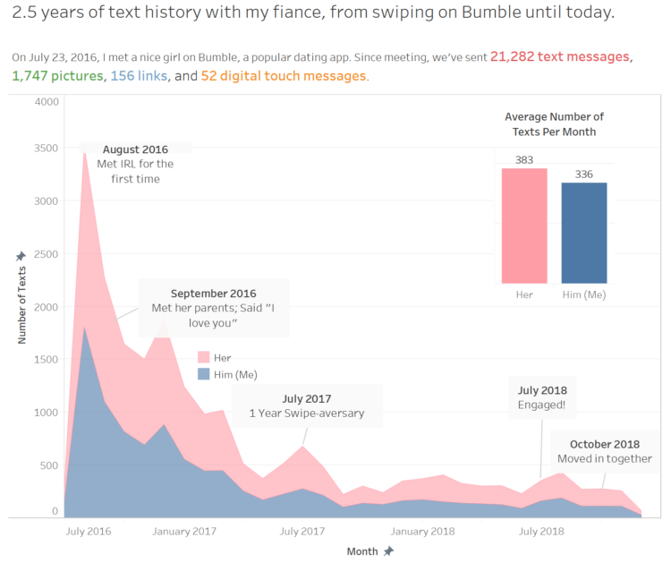
![]()
When readers can decode the shapes, colors and geometries on your chart, you are more than half way there to producing an awesome chart.
However, readers also need to understand the context of the data.
Charts should read like text. At the most basic level, it should be obvious what the chart is about and how to interpret it.
Default setting in the tools are generic and designed in such a way that they would work with many datasets and visualization types
You can (and should) develop aesthetics to make your charts less ugly
Note
In this context, aesthetics means a visual style. Do not confuse this with the aes() call in ggplot2.
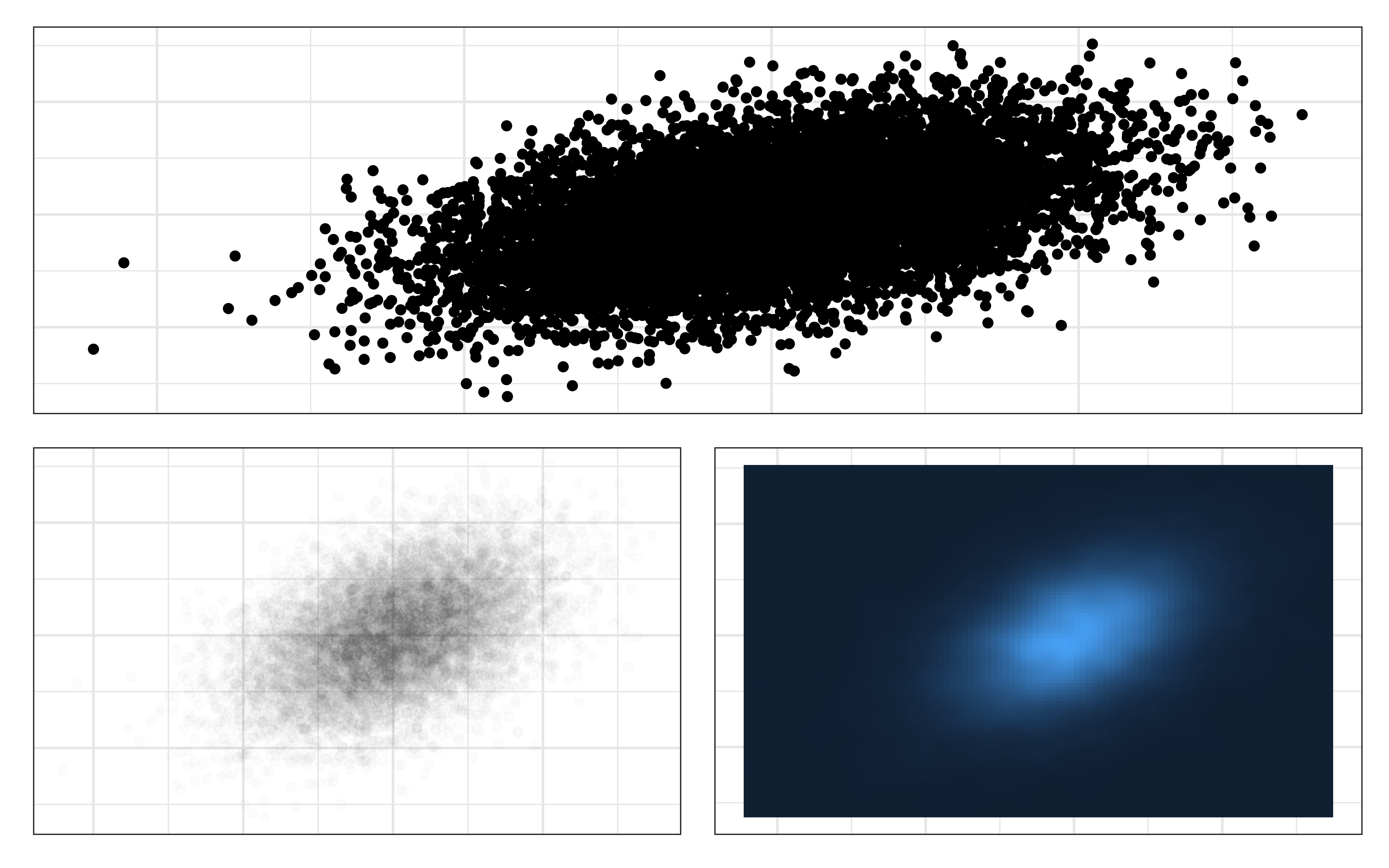
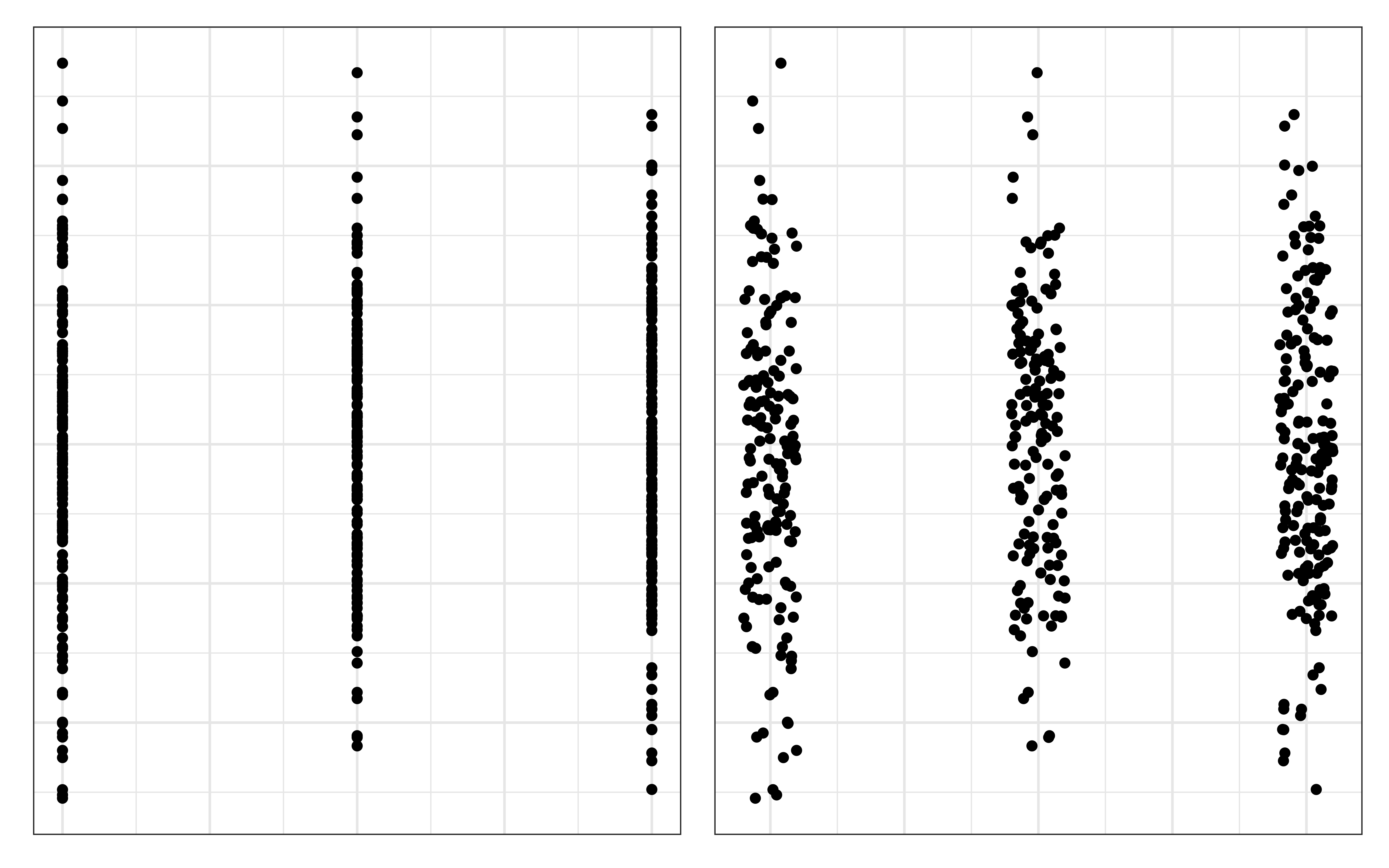
Pre-attentive processing: the ability of the low-level human visual system to effortlessly identify certain basic visual properties.
Example: let’s help our friend Homer find a donut that looks different!
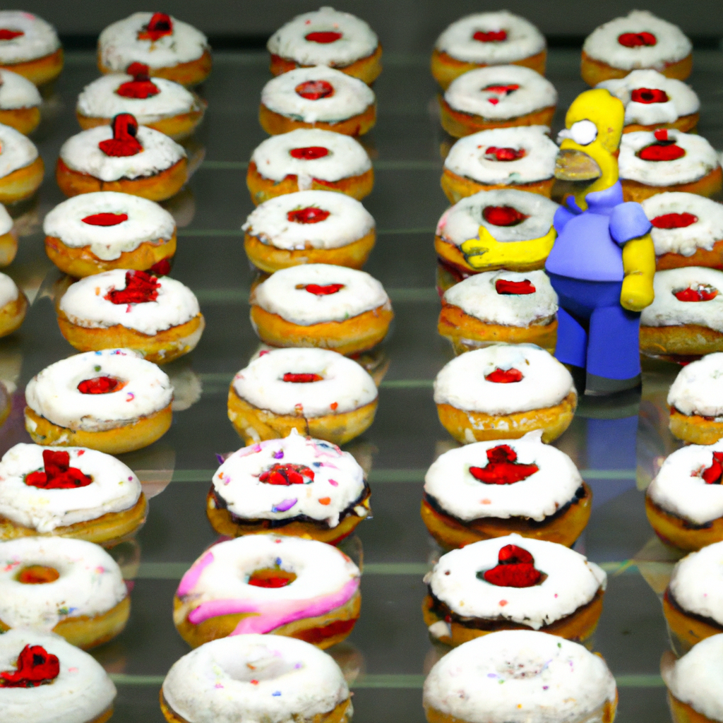
What stands out? This is pre-attentive processing in action!
Computer scientist, information visualization expert, and professor at University of British Columbia.

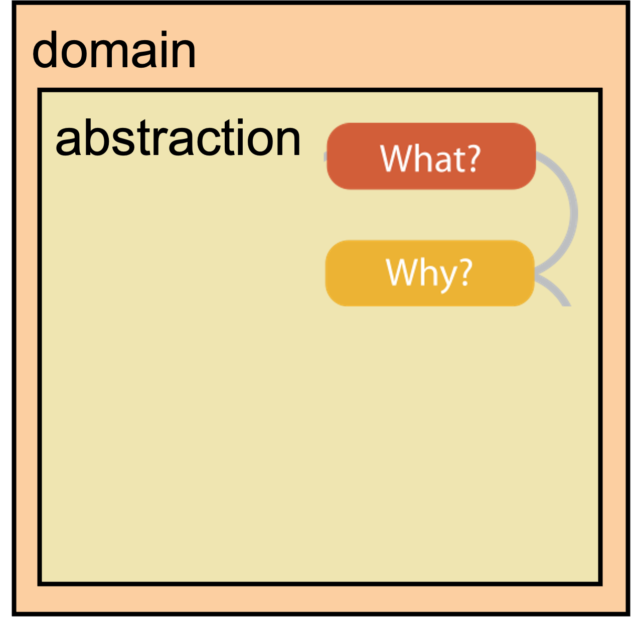
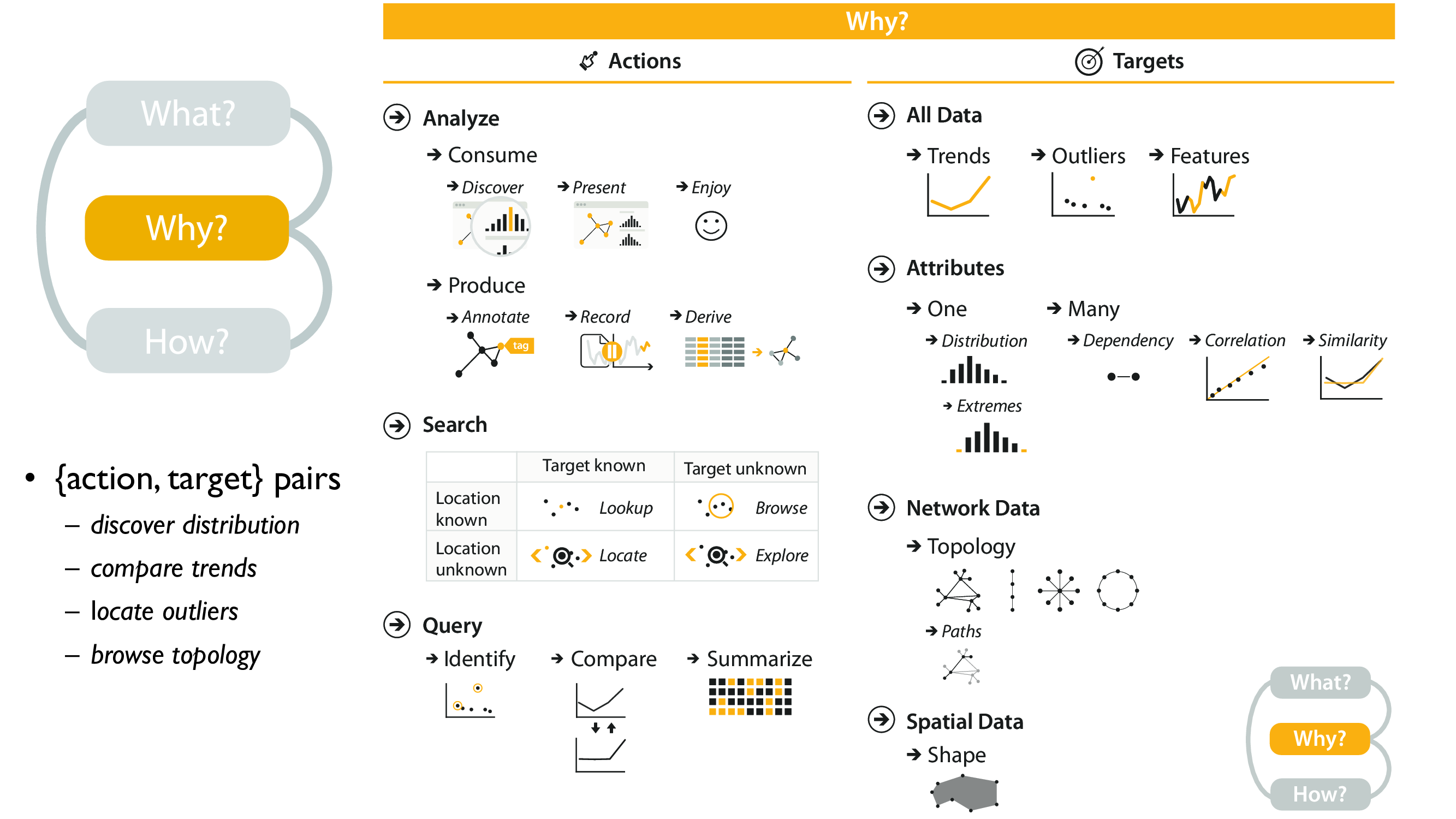
Four levels, three questions:
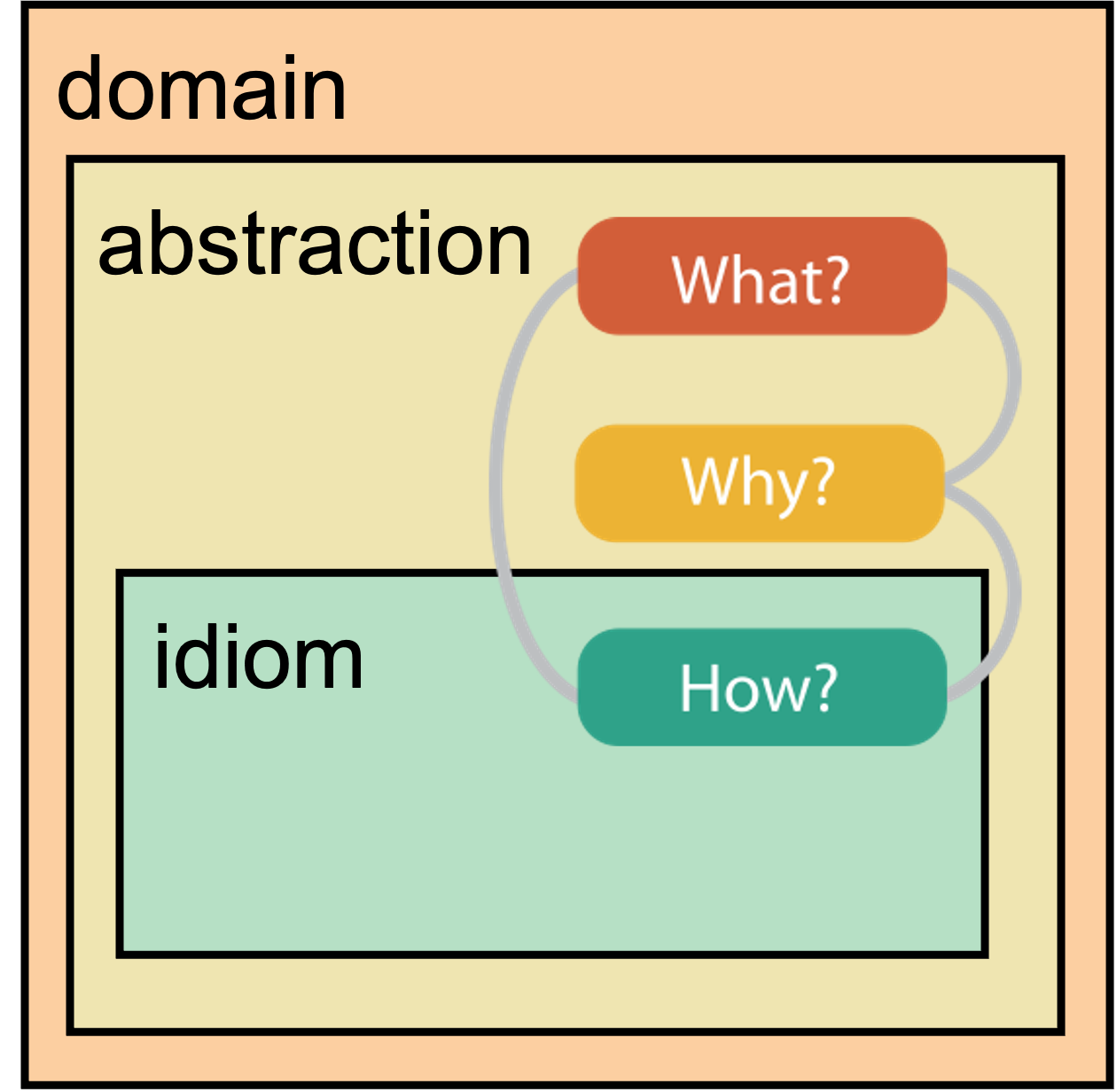
Four levels, three questions:
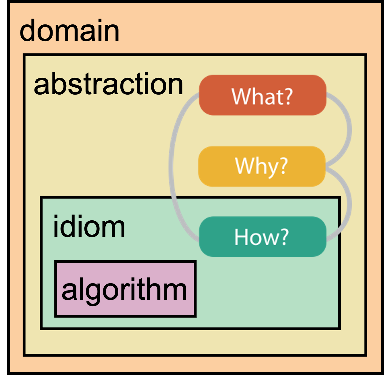
Four levels, three questions:
Four levels, three questions:
temporal!
Reminder of model
Reminder of model

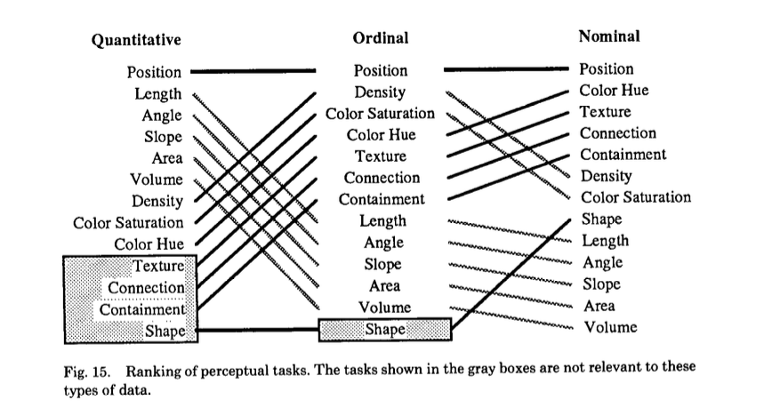
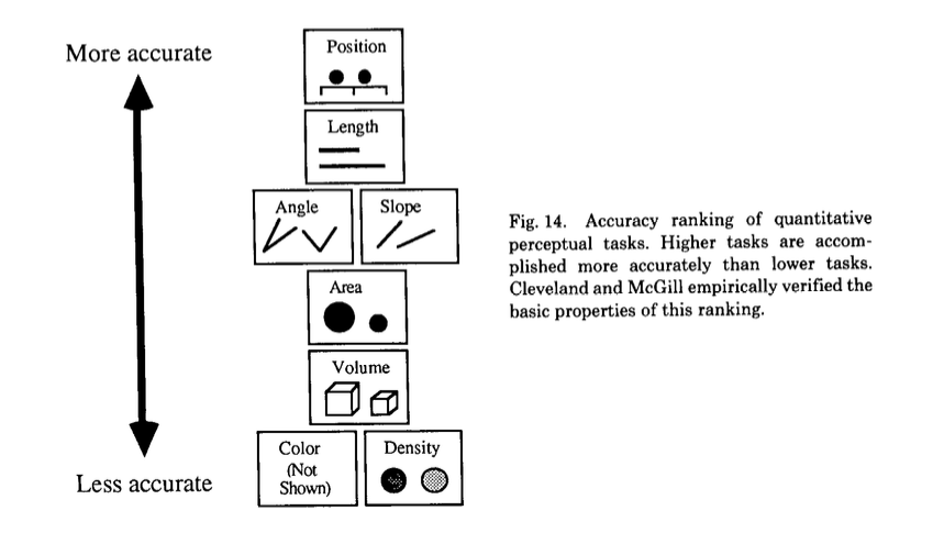
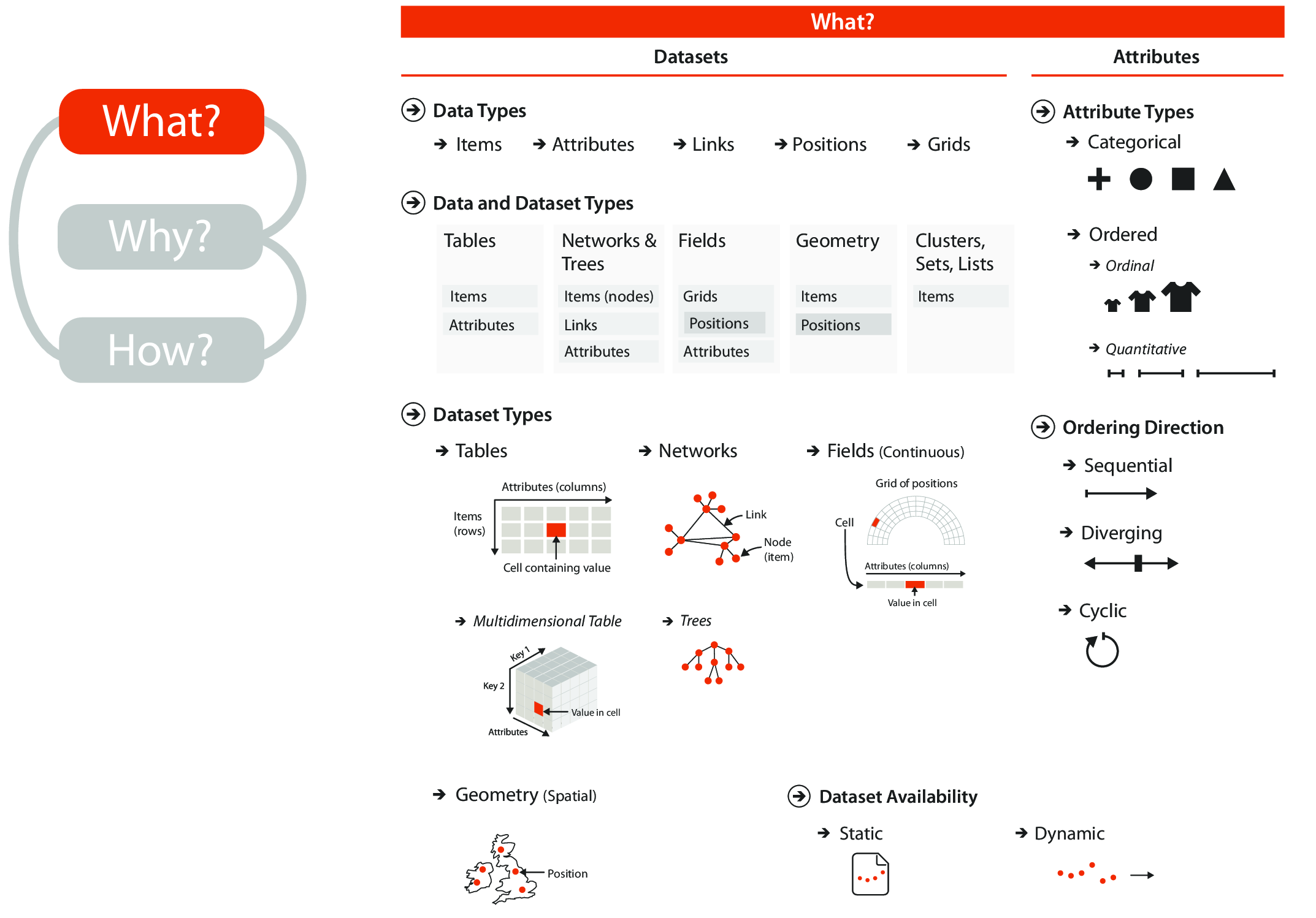
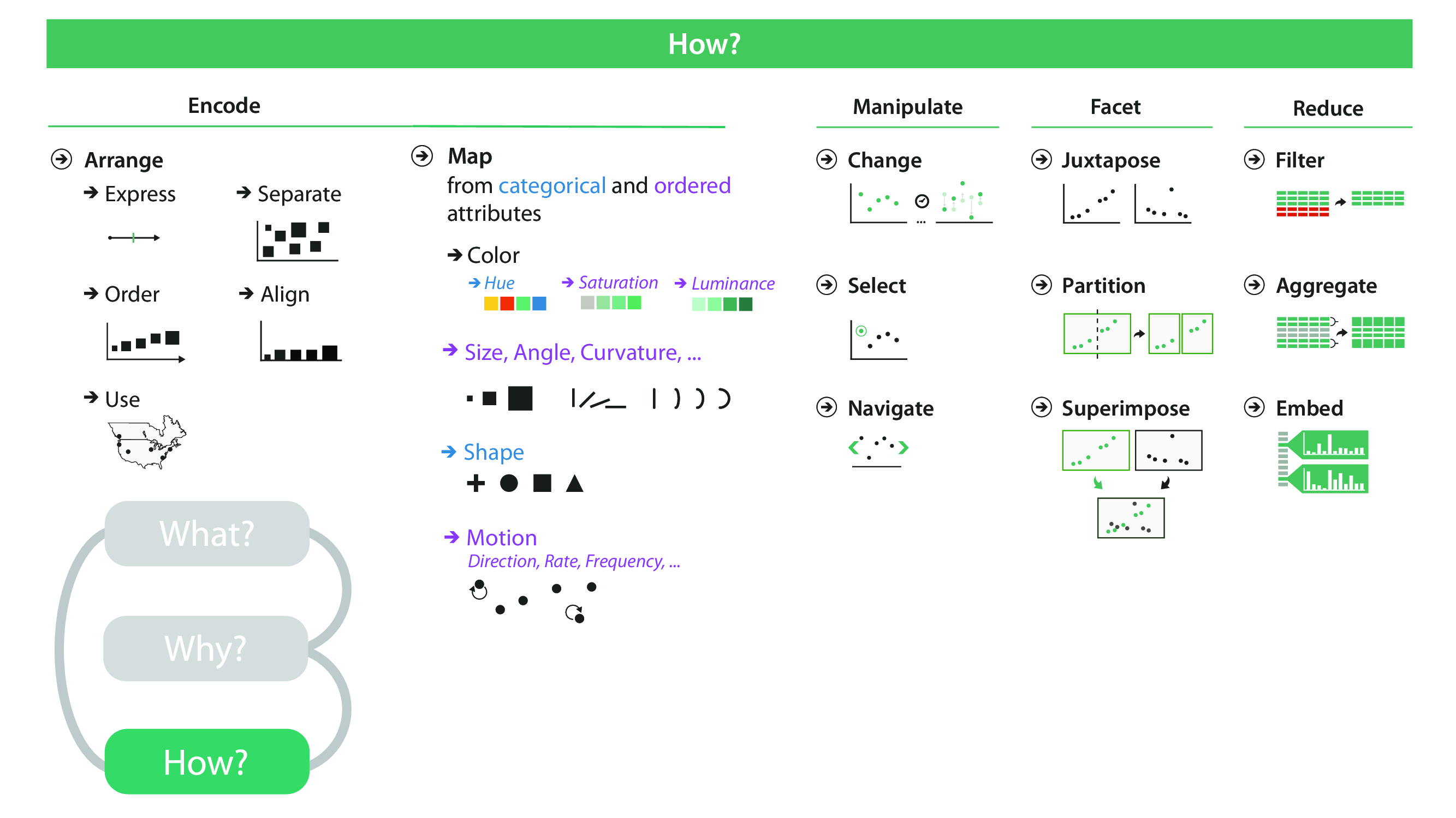
Although encoding is often undertaken without much intention or deeper consideration, it has significant impact on the ability of the visualization to communicate knowledge accurately and efficiently.
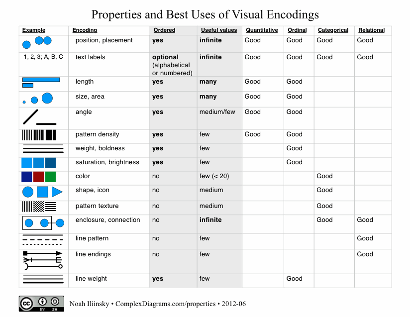
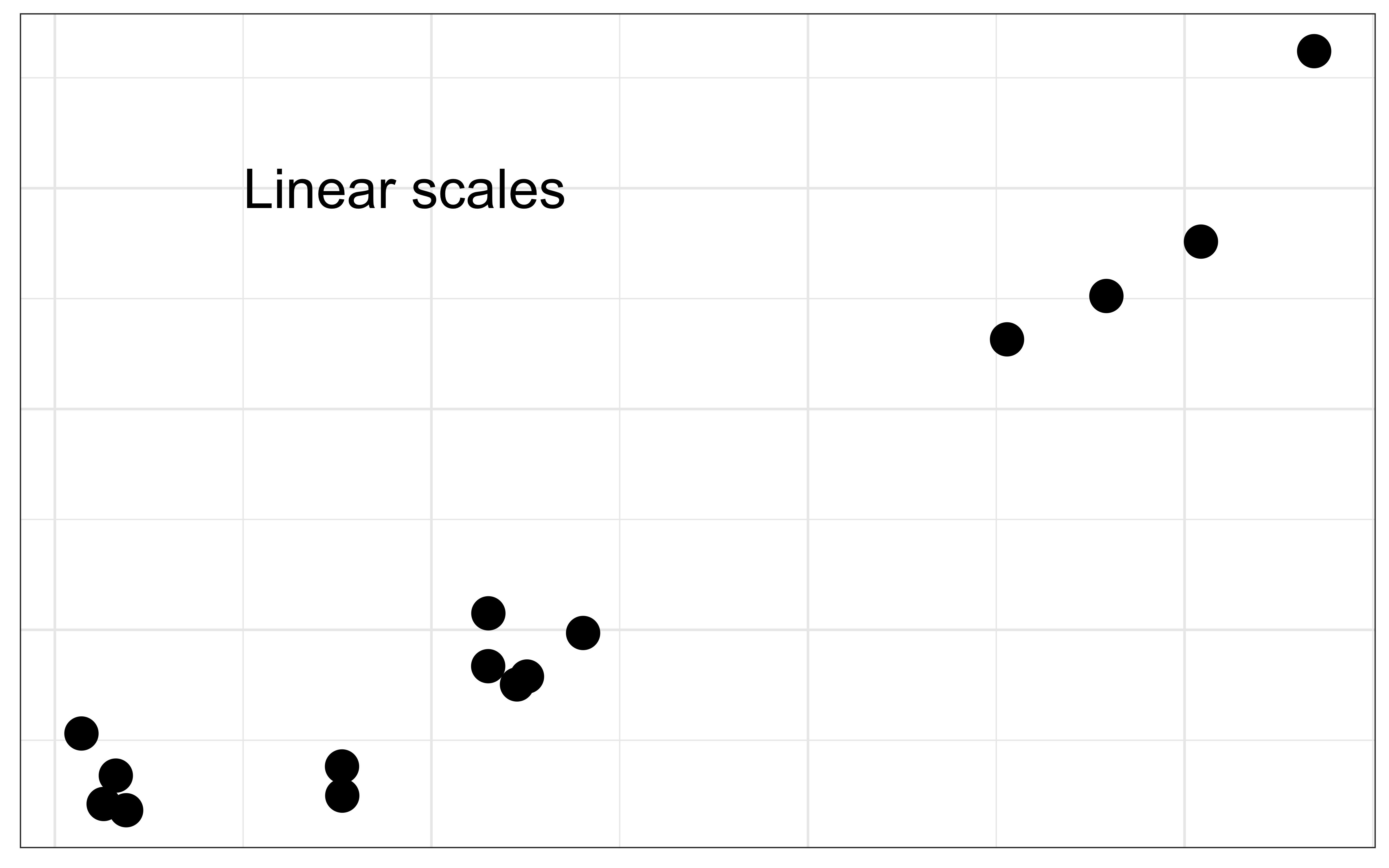
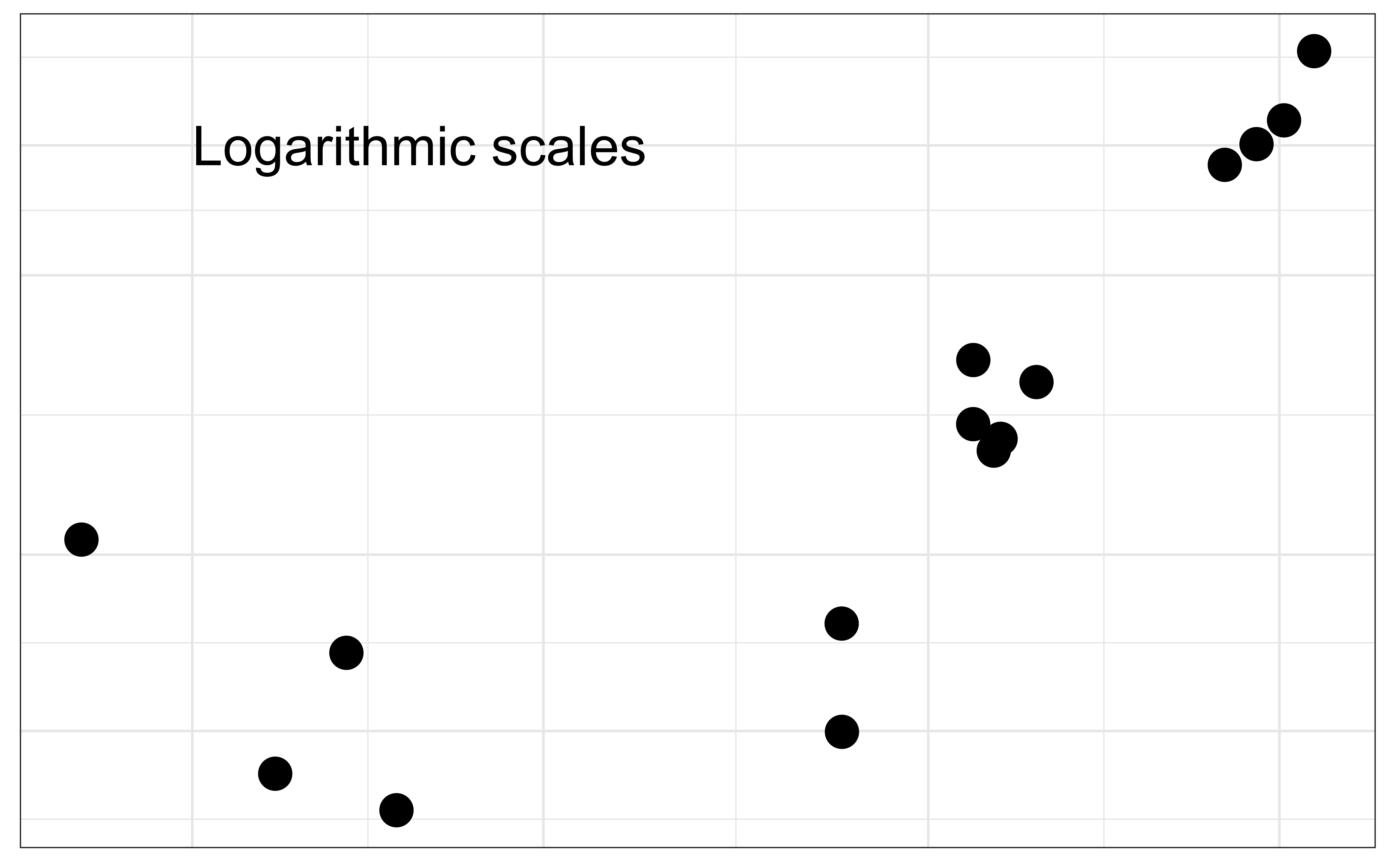
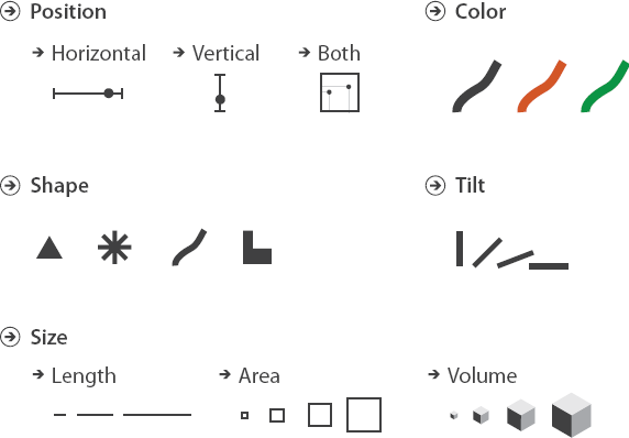
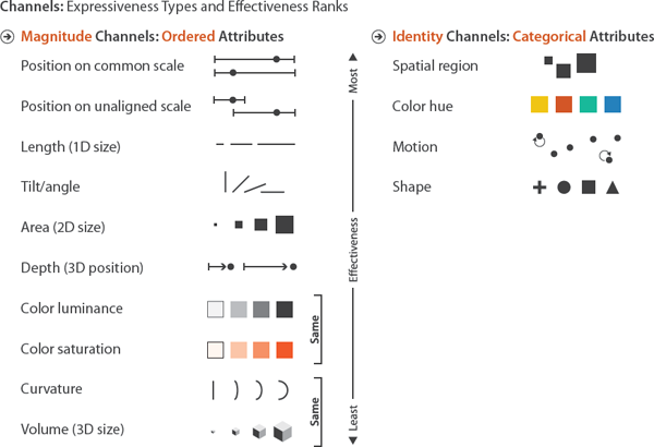
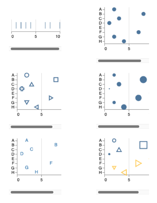
Position allows you to compare values based on where they are placed with reference to a coordinate system.
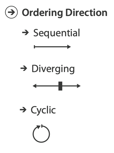
Be aware of the scales you are using (linear vs logarithmic)
Position allows you to compare values based on where they are placed with reference to a coordinate system.
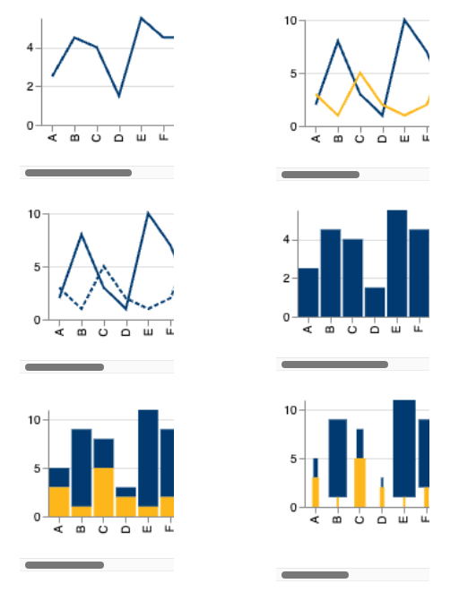
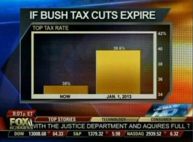
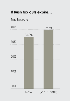
Length is most commonly used in the context of bar charts. The longer a bar is, the greater the value. Don’t truncate bar charts, use length in its entirety!
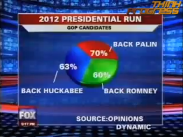
Angles range from 0 to 360 degrees in a circle.
![]()
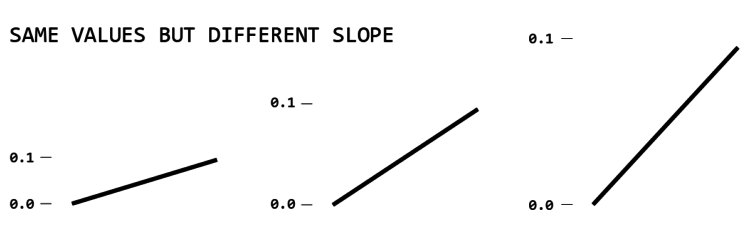
Slope is similar to angle. Line charts are the most common use of slope to encode data.
Cleveland, McGIll & McGill (1988) suggested that the average slope in a line chart should be \(45^o\), in order to make neutral comparisons between lines
This is still a good rule of thumb
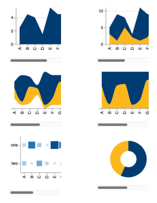
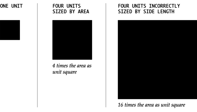
Like length, area can be used to represent data with size, but with two dimensions instead of one.
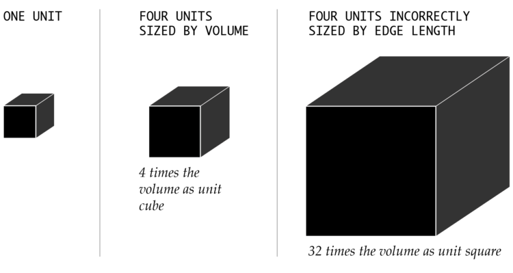
Volume can used in the same way as area but has one more dimension.
For 3-D encodings, you need to take the volume as proportional to the data
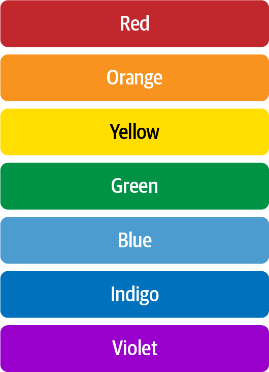
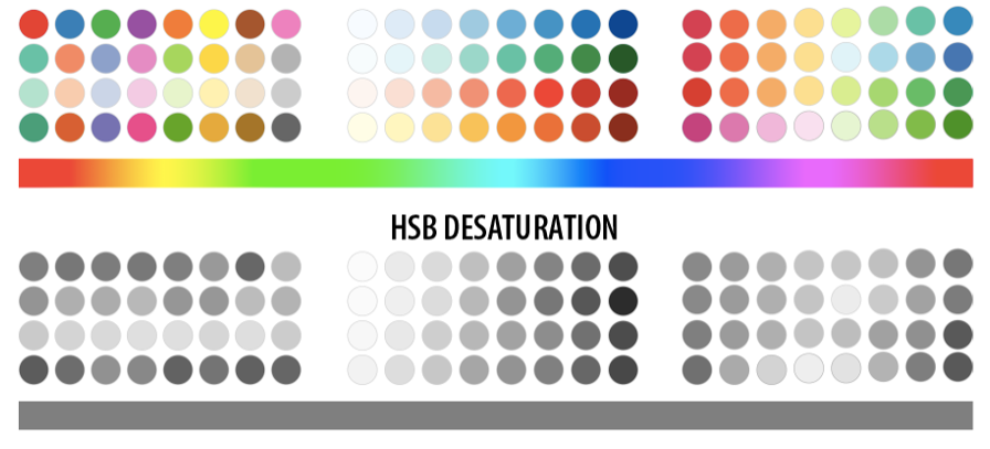
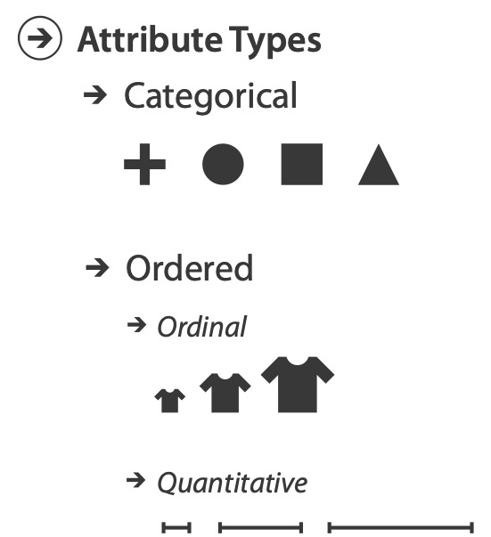
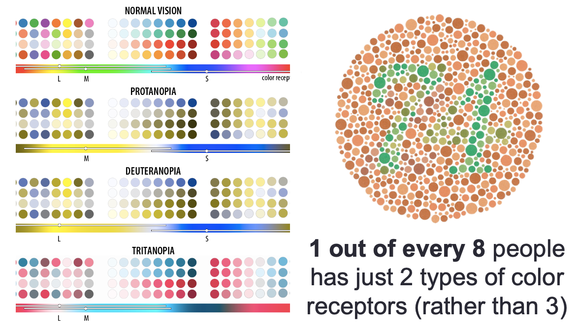
Color as a visual encoding can be split into two categories: hue and saturation. Hue is what most people refer to as color (red, green, blue, etc.) Saturation is the amount of hue in a color.
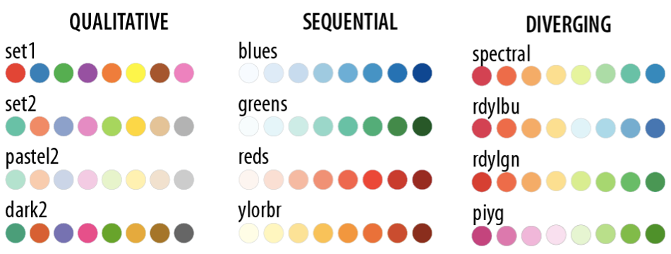
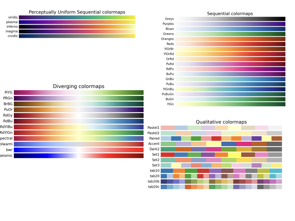
Most of these palettes are available to both ggplot2 and matplotlib. For R, you may have to load packages like RColorBrewer or viridis.
The incredibly challenging task of sorting colours
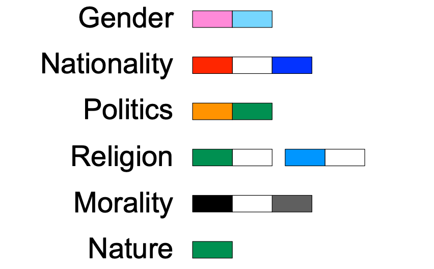
| Color | Positive Keywords | Negative Keywords |
|---|---|---|
| Blue | Life, survival, calm, cleansing, protection, divinity | Sadness, death, mourning |
| Red | Excitement, love, high fashion, glamour, strength, power, luck, prosperity | Danger, warning, death, aggression, mourning, communism |
| White | Purity, simplicity, innocence, weddings, sacred, sacrifice, equality | Death, bad luck, cowardice, surrender, cycle of death and rebirth |
| Black | Elegance, luxury, masculinity, maturity, age | Bad luck, death |
| Green | Environmentally friendly, good luck, nature, national color | Infidelity, jealousy, illness |
| Orange | Safety, sacred, fertility, love, health, happiness, bravery, innovation | Mourning |
| Purple | Magic, mystery, royalty, religious faith, ambiguity | Death, mourning |
| Pink | Femininity, love, romance, birth, tenderness, mentally stimulating, trust, architecture | Foreign color |
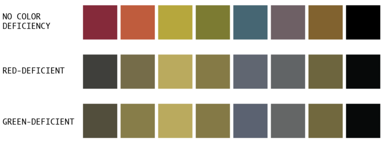
Most of the time your visualization will be displayed in full color. However, you may need to print sometimes and not have a color printer. Printed color reproduction may not be faithful to screen, but it’s another issue when printing in greyscale.