import plotly.io as pio
pio.renderers.default = "browser"Plotly Graph Objects
Motivation
Using plotly.express is generally easy and straightforward, but is limited to a large set of useful but standard visualizations. These might not be the best we can do for our data and story. plotly provides much more granular control over the visualizations via the plotly.graph_objects module. This module is very close to being a translation of the underlying JavaScript library that is running this show, and allows you to control almost all aspects of your visualization, along with adding multiple numerous interactive features.
Why use
plotly.graph_objects?
If you want graphs that are more customized, or that need more control structures for interactivity, you switch to plotly.graph_objects. There is no incompatibility between plotly.express and plotly.graph_objects, since the end product of plotly.express is a plotly.graph_objects.Figure object.
For example, sliders, maps, and drop-down menus are easy individually with plotly.express, however combining them on the same visualization is non-trivial and needs plotly.graph_objects is non-trivial.
Warning
Working on recreating this plot. Link below doesn’t work
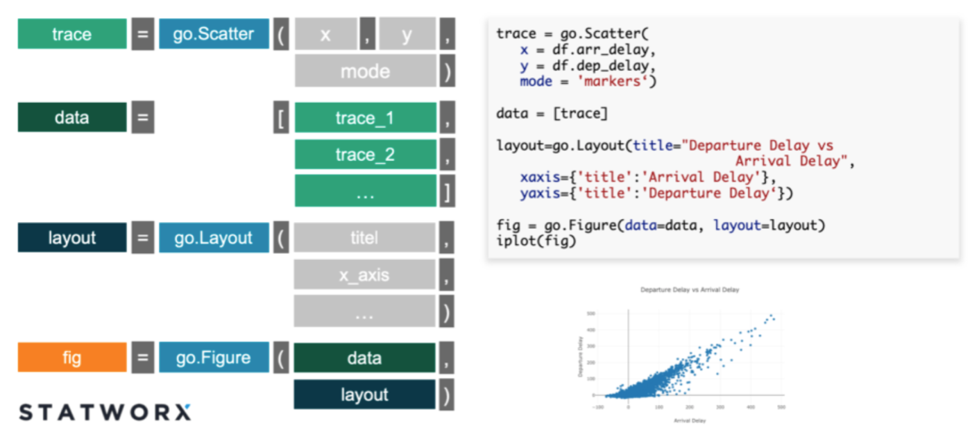
Structure of a graph object
- Plotly figures (
plotly.graph_object.Figureobjects) are represented as hierarchical trees, withgraph_objectbeing the root note, and child-nodes calledattributes. - Graph_objects have three top-level attributes:
data,layout, andframes(frames are only needed for animated plots)- Notice the connection of these attributes to pure
JavaScript.
- Notice the connection of these attributes to pure
- Data: This is a list of dictionaries referred to as “traces”
- The
tracerepresents a set of related graphical marks in a figure. - Each trace must have a
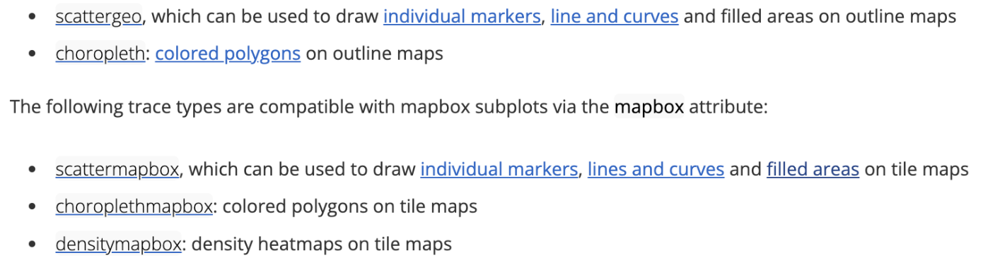
typeattribute which defines the other allowable attributes. - Each trace has one of more than 40 possible types (see below for a list organized by subplot type, including e.g.
scatter,bar,pie,surface,choroplethetc)
- The
- Layout: Controls various structural and stylistic components (e.g. title, font, size, etc)
Sources: figure structure Graph objects
This structure of the plotly.graph_objects.Figure are directly parallel to the structure of the plotly.js figure Objects - The data object is a list of JSON objects, each of which defines a single trace - The layout object is a JSON object that defines the overall layout of the figure.
Graph_object Structure summary
Various available traces
- 2D Cartesian trace types, and Subplots.
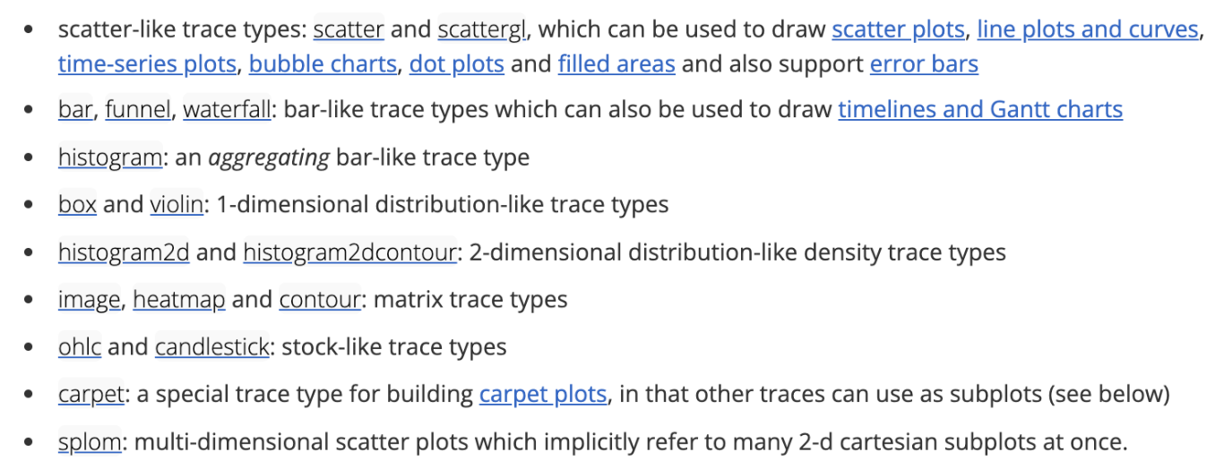
- Geo-spatial trace Types.
For more click here!
Looking under the hood
- Viewing the underlying data structure for any plotly.graph_objects.Figure object can be done via
print(fig)orfig.show("json"). - Figures also support
fig.to_dict()andfig.to_json()methods.
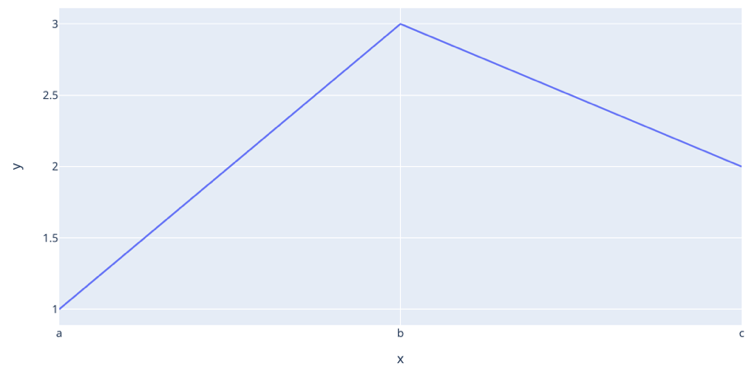
import plotly.express as pxfig = px.line(x=["a", "b", "c"], y=[1, 3, 2], title="sample figure")
print(fig)Figure({
'data': [{'hovertemplate': 'x=%{x}<br>y=%{y}<extra></extra>',
'legendgroup': '',
'line': {'color': '#636efa', 'dash': 'solid'},
'marker': {'symbol': 'circle'},
'mode': 'lines',
'name': '',
'orientation': 'v',
'showlegend': False,
'type': 'scatter',
'x': array(['a', 'b', 'c'], dtype=object),
'xaxis': 'x',
'y': array([1, 3, 2]),
'yaxis': 'y'}],
'layout': {'legend': {'tracegroupgap': 0},
'template': '...',
'title': {'text': 'sample figure'},
'xaxis': {'anchor': 'y', 'domain': [0.0, 1.0], 'title': {'text': 'x'}},
'yaxis': {'anchor': 'x', 'domain': [0.0, 1.0], 'title': {'text': 'y'}}}
})# fig.show()Graph_objects: Hello world
- When using graph objects (without animation), you typically do the following
(1)Initialize the figure(2)Add one or more traces(3)customize the layout
import plotly.graph_objects as go

# DATAFRAME
df = px.data.gapminder()

# INITIALIZE GRAPH OBJECT
fig = go.Figure()

# ADD TRACES FOR THE DATA-FRAME
fig.add_trace(  # Add A trace to the figure
    go.Scatter(  # Specify the type of the trace
        x=df["gdpPercap"],  # Data-x
        y=df["lifeExp"],  # Data-y
        mode="markers",
        # note the re-normalization of population to map to width to units of "pixels"
        marker=dict(
            size=50 * (df["pop"] / max(df["pop"])) ** 0.5,
            color=df["pop"],
            showscale=True,
            colorscale="Viridis",
            symbol="circle",
        ),
        opacity=1.0,
    )
)
# SET THEME, AXIS LABELS, AND LOG SCALE
fig.update_layout(
template="plotly_white",
xaxis_title="National GDP (per capita)",
yaxis_title="Life expectancy (years)",
title="Country comparison: color & size = population",
height=400,
width=800,
)fig.update_xaxes(type="log")fig.show()Basic charts with graph_objects
Additional charts with Graph objects
Subplots
A coding note: Notice that there are semi-colons (
;) at the end of most lines of code. This prevents the figure from printing out output of that line of code or that function, especially within a Quarto document. This is useful for not printing out intermediate steps and lets only the final figure be printed.With plotly.graph_objects we can finally combine figures in a subplot! source
from plotly.subplots import make_subplots
import plotly.graph_objects as go

1fig = make_subplots(rows=1, cols=2);

fig.add_trace(
    go.Scatter(x=[1, 2, 3], y=[4, 5, 6]),
2    row=1, col=1
);

fig.add_trace(
    go.Scatter(x=[20, 30, 40], y=[50, 60, 70]),
       row=1, col=2
);

fig.update_layout(height=500, width=700, title_text="Side By Side Subplots");
fig.show()- 1
- Specifying the arrangement of subplots
- 2
- Specifying the position of the first graph in the pre-specified subplot arrangement
Multiple Subplots
Here we show a 2 x 2 subplot grid with each subplot populated with a single scatter trace.
import plotly.graph_objects as go
from plotly.subplots import make_subplots

fig = make_subplots(rows=2, cols=2, start_cell="bottom-left");

fig.add_trace(
  go.Scatter(x=[1, 2, 3], y=[4, 5, 6], name = "Plot 1"),
  row=1, col=1
);

fig.add_trace(
  go.Scatter(x=[20, 30, 40], y=[50, 60, 70], name = "Plot 2"),
  row=1, col=2,
);

fig.add_trace(
  go.Scatter(x=[300, 400, 500], y=[600, 700, 800], name = "Plot 3"),
  row=2, col=1
);

fig.add_trace(
  go.Scatter(x=[4000, 5000, 6000], y=[7000, 8000, 9000], name = "Plot 4"),
              row=2, col=2,
);
fig.show()
Demonstration of more capabilities
Import
import plotly.graph_objects as go
import plotly.express as px
import plotly.io as pio
Data
- We can generate a graph similar to the motivating example, using the gap-minder dataset.
- Let’s briefly explore this.
# DATAFRAME
df = px.data.gapminder()
df = df.drop(['iso_num'], axis=1)   # DROP COLUMN
print("Shape =", df.shape)
Shape = (1704, 7)print(df) country continent year lifeExp pop gdpPercap iso_alpha
0 Afghanistan Asia 1952 28.801 8425333 779.445314 AFG
1 Afghanistan Asia 1957 30.332 9240934 820.853030 AFG
2 Afghanistan Asia 1962 31.997 10267083 853.100710 AFG
3 Afghanistan Asia 1967 34.020 11537966 836.197138 AFG
4 Afghanistan Asia 1972 36.088 13079460 739.981106 AFG
... ... ... ... ... ... ... ...
1699 Zimbabwe Africa 1987 62.351 9216418 706.157306 ZWE
1700 Zimbabwe Africa 1992 60.377 10704340 693.420786 ZWE
1701 Zimbabwe Africa 1997 46.809 11404948 792.449960 ZWE
1702 Zimbabwe Africa 2002 39.989 11926563 672.038623 ZWE
1703 Zimbabwe Africa 2007 43.487 12311143 469.709298 ZWE
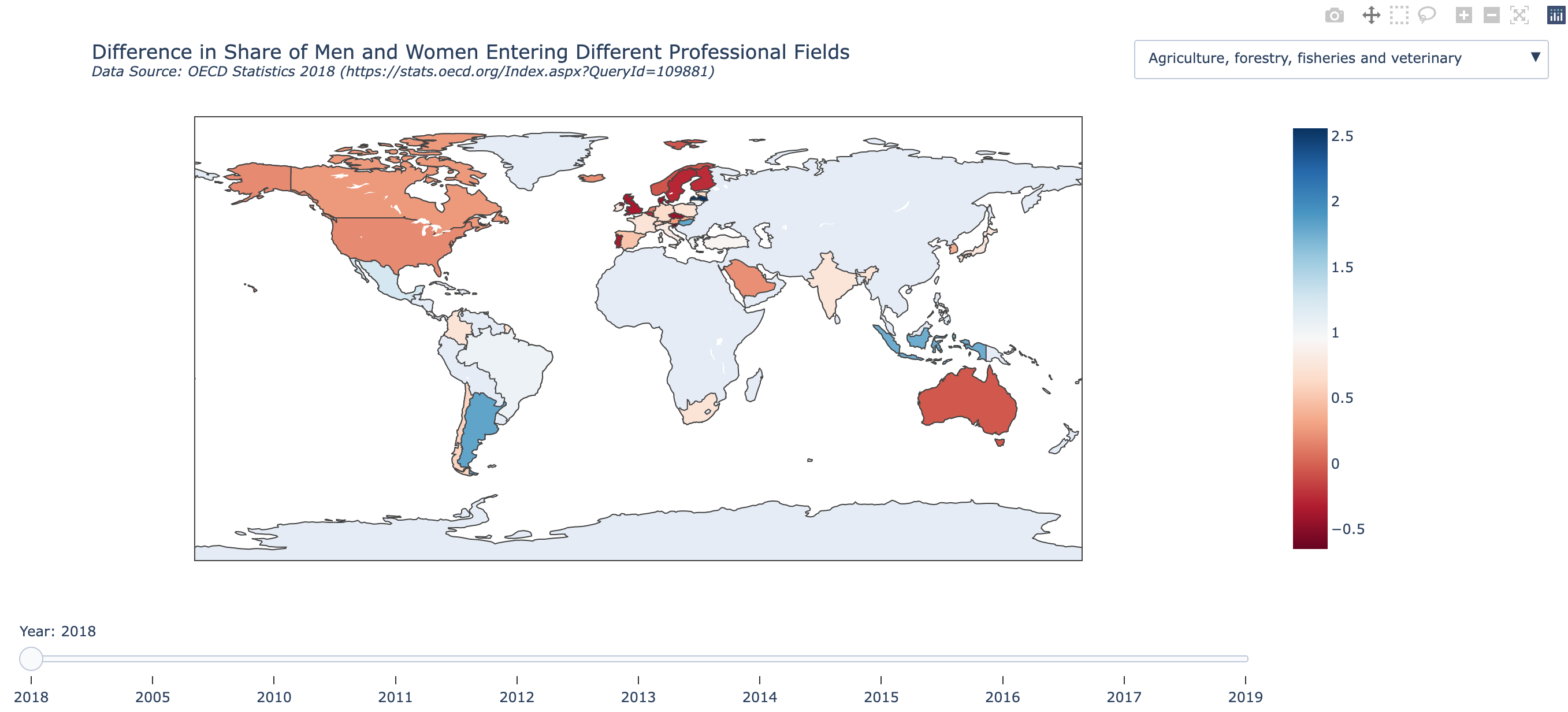
[1704 rows x 7 columns]Choropleth
We will cover
Choroplethsin more detail during theGeo-spatial module. However, for now, all you need to know is that a choropleth is a type of map that uses colors or shading to represent different values or levels of a particular data variable across a geographic area, such as a country, state, or city.The choropleth map divides the area into regions or polygons, usually based on administrative boundaries, and then assigns a color or shade to each region based on the value of the data variable being represented. For example, if the data variable is population density, then regions with higher population density would be shaded darker than regions with lower population density.
Plotly can internally create the map using location tags for countries, such as
USA.
# ISOLATE ONE YEAR OF DATA FOR PLOTTING
df = df.query("year==2007")

# INITIALIZE GRAPH OBJECT
fig = go.Figure();

# ADD A CHOROPLETH TRACES FOR THE DATA-FRAME
fig.add_trace(  # Add a trace to the figure
    go.Choropleth(  # Specify the type of the trace
        uid="full-set",  # uid=unique id (Assign an ID to the trace)
        locations=df["iso_alpha"],  # Supply location information tag for mapping
        z=df["lifeExp"],  # Data to be color-coded on graph
        colorbar_title="Life expectancy",  # Title for color-bar
        visible=True,  # <1> Specify whether or not to make data-visible when rendered
    )
);

# SHOW
fig.show()- The final input argument
visiblemay seem silly, obviously we want to see the data! However, this becomes quite important when you want to conditionally update different traces.
Sliders
Example 1
Sliders can be used in Plotly to change the data displayed (using multiple traces) or style of a plot.
#source: https://plotly.com/python/sliders/
import plotly.graph_objects as go
import numpy as np

# initialize figure
fig = go.Figure();

# Add traces, one for each slider step
for step in np.arange(0, 5, 0.1):
    fig.add_trace(
        go.Scatter(
            visible=False,
            line=dict(color="#00CED1", width=6),
            name="𝜈 = " + str(step),
            x=np.arange(0, 10, 0.01),
            y=np.sin(step * np.arange(0, 10, 0.01))));

# Make 10th trace visible
fig.data[10].visible = True

# Create and add slider
steps = []
for i in range(len(fig.data)):
    step = dict(
        method="update",
        args=[{"visible": [False] * len(fig.data)},
              {"title": "Slider switched to step: " + str(i)}],  # layout attribute
    )
    step["args"][0]["visible"][i] = True  # Toggle i'th trace to "visible"
    steps.append(step)

sliders = [dict(
    active=10,
    currentvalue={"prefix": "Frequency: "},
    pad={"t": 50},
    steps=steps
)]

fig.update_layout(
    sliders=sliders
);

fig.update_layout(template="plotly_white");


fig.show()
Example 2
Not surprisingly, sliders are trivial with Plotly express.
import plotly.express as px

df = px.data.gapminder()
fig = px.scatter(df, x="gdpPercap", y="lifeExp",
1                 animation_frame="year", animation_group="country",
                 size="pop", color="continent", hover_name="country",
                 log_x=True, size_max=55, range_x=[100,100000], range_y=[25,90]);

# SET THEME
fig.update_layout(template="plotly_white");

fig["layout"].pop("updatemenus");  # optional, drop animation buttons
fig.show()- 1
- These two arguments make the slider and animation work.
(layout.Updatemenu({
    'buttons': [{'args': [None, {'frame': {'duration': 500, 'redraw': False},
                          'mode': 'immediate', 'fromcurrent': True, 'transition':
                          {'duration': 500, 'easing': 'linear'}}],
                 'label': '▶',
                 'method': 'animate'},
                {'args': [[None], {'frame': {'duration': 0, 'redraw': False},
                          'mode': 'immediate', 'fromcurrent': True, 'transition':
                          {'duration': 0, 'easing': 'linear'}}],
                 'label': '◼',
                 'method': 'animate'}],
    'direction': 'left',
    'pad': {'r': 10, 't': 70},
    'showactive': False,
    'type': 'buttons',
    'x': 0.1,
    'xanchor': 'right',
    'y': 0,
    'yanchor': 'top'
}),)
You may remember this graph from the video we showed earlier in the semester … pretty neat!
Resources
- The documentation on the Plotly website is very good: https://plotly.com/python/
- This provides a massive collection of examples, for both
plotly.expressandplotly.graph_objects, which can get you started on almost any task.