Abhijit Dasgupta, Jeff Jacobs, Anderson Monken, and Marck Vaisman
Georgetown University
Spring 2024
What we’ve learned
Principles of visual design
Visual encodings and marks
Keeping the audience in mind
Better design choices
Using visualization for exploratory data analysis
Data wrangling for visualization and more
Visual narratives and the role of interactive graphics
Creating interactive visualizations using altair and plotly (which leverage JavaScript)
Exploring d3.js and its ability to provide granular control over interactive graphics
Efficient plotting for Big Data using rasterization, bin-summarize methods, and incorporation into interactive visualizations
Working with geospatial data
Working with network or graph data
Today
Modeling and visualizing results
Unsupervised learning
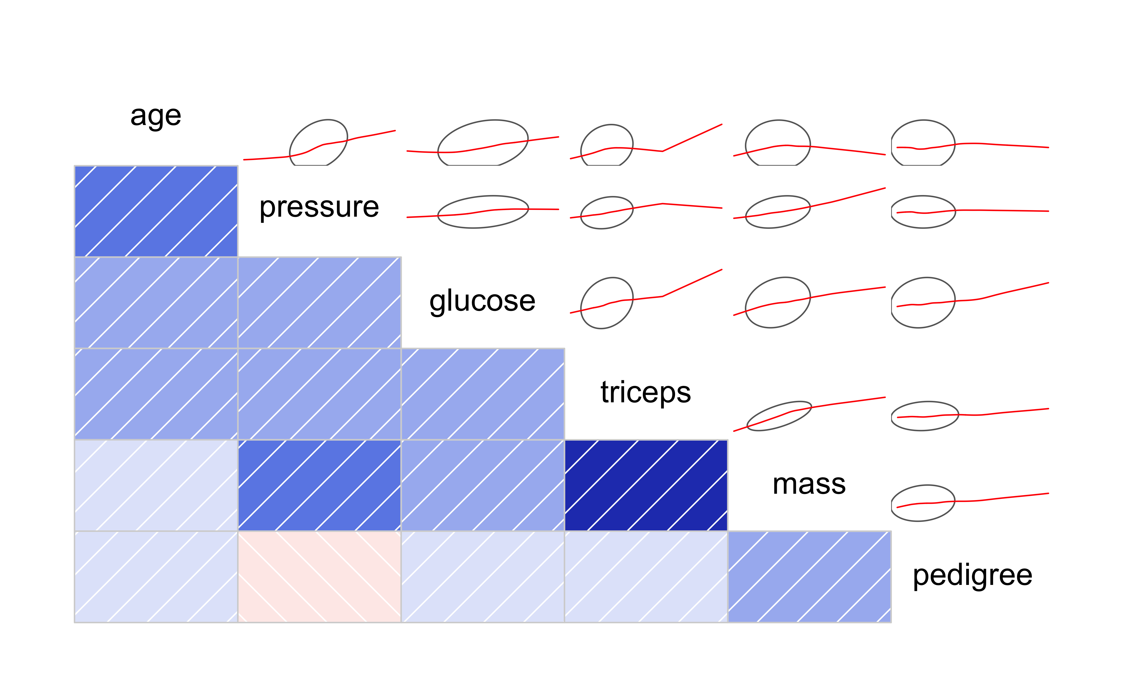
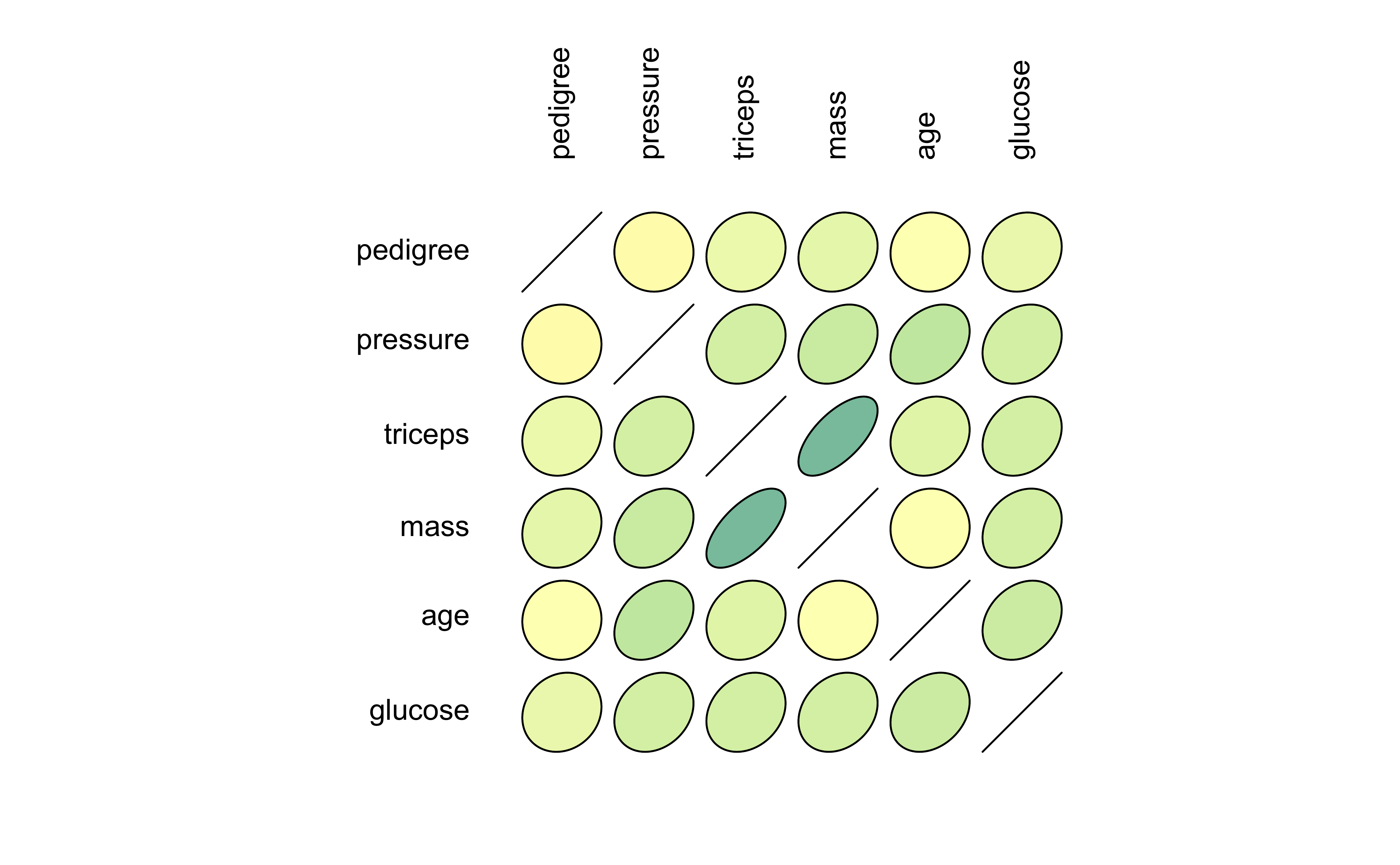
Correlograms
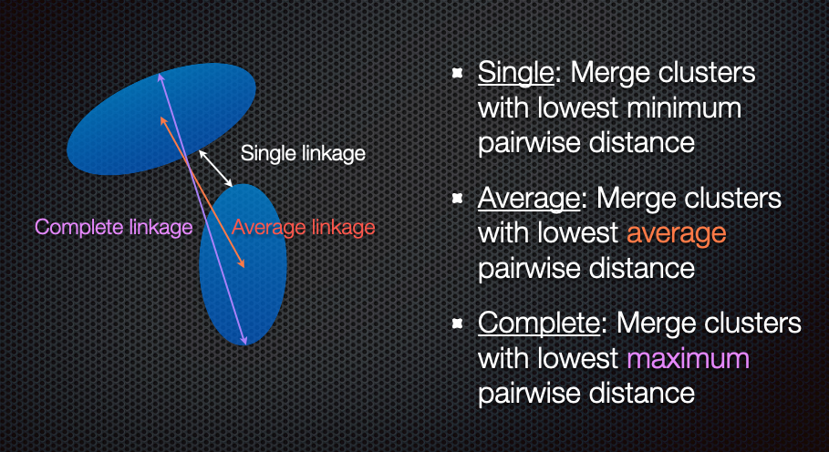
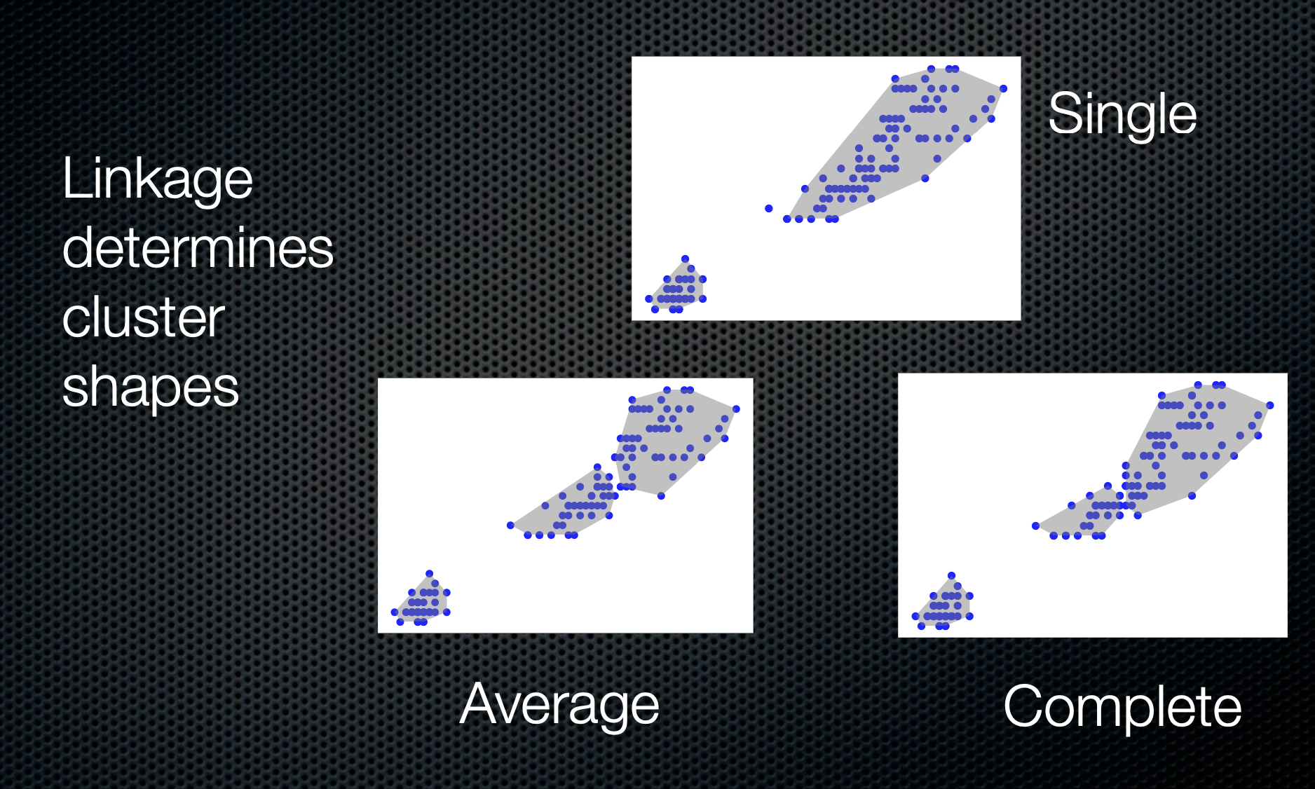
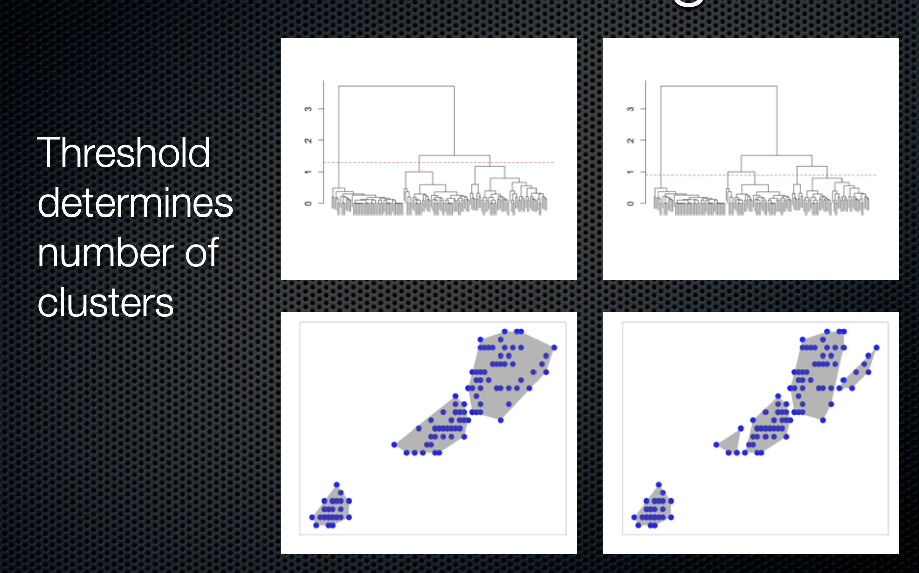
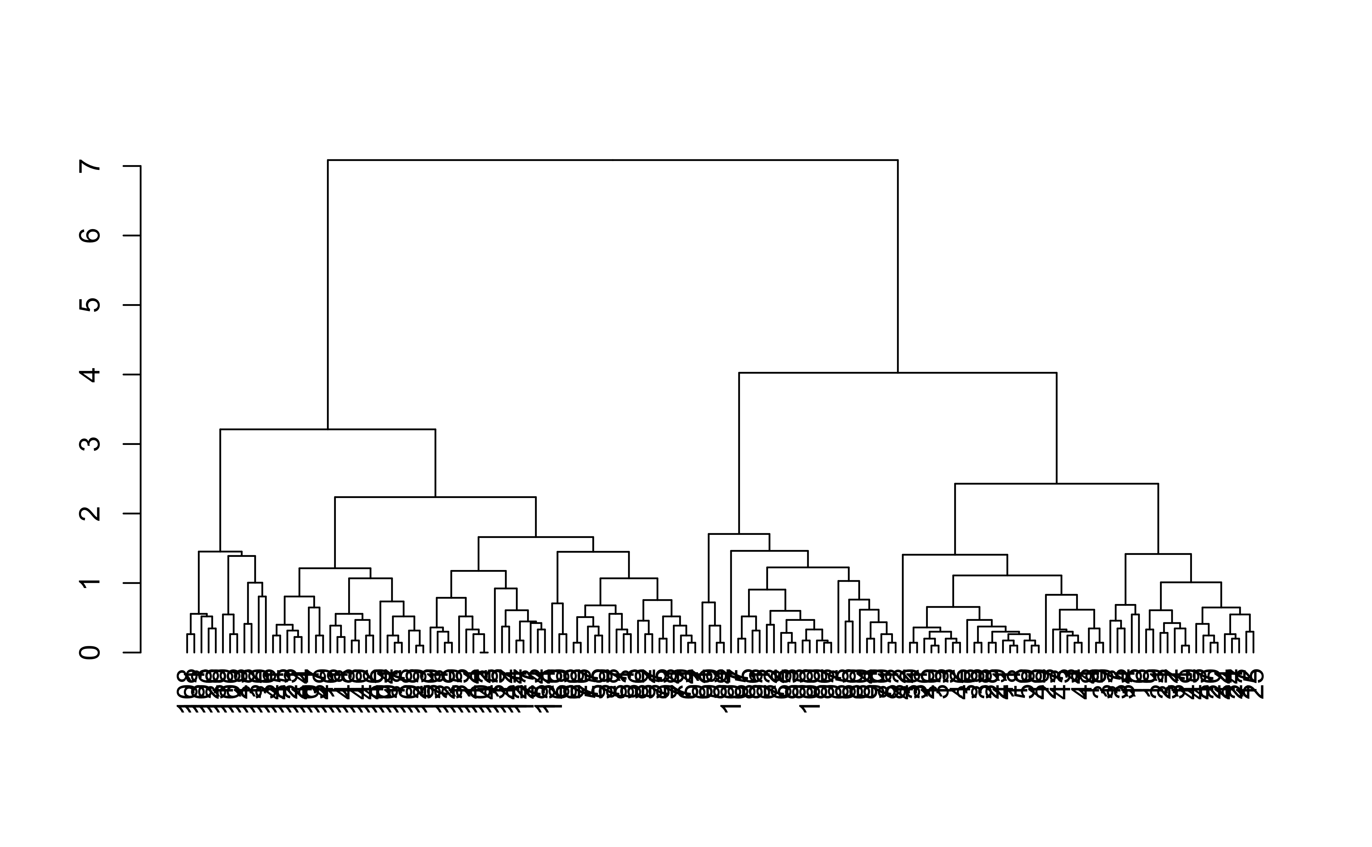
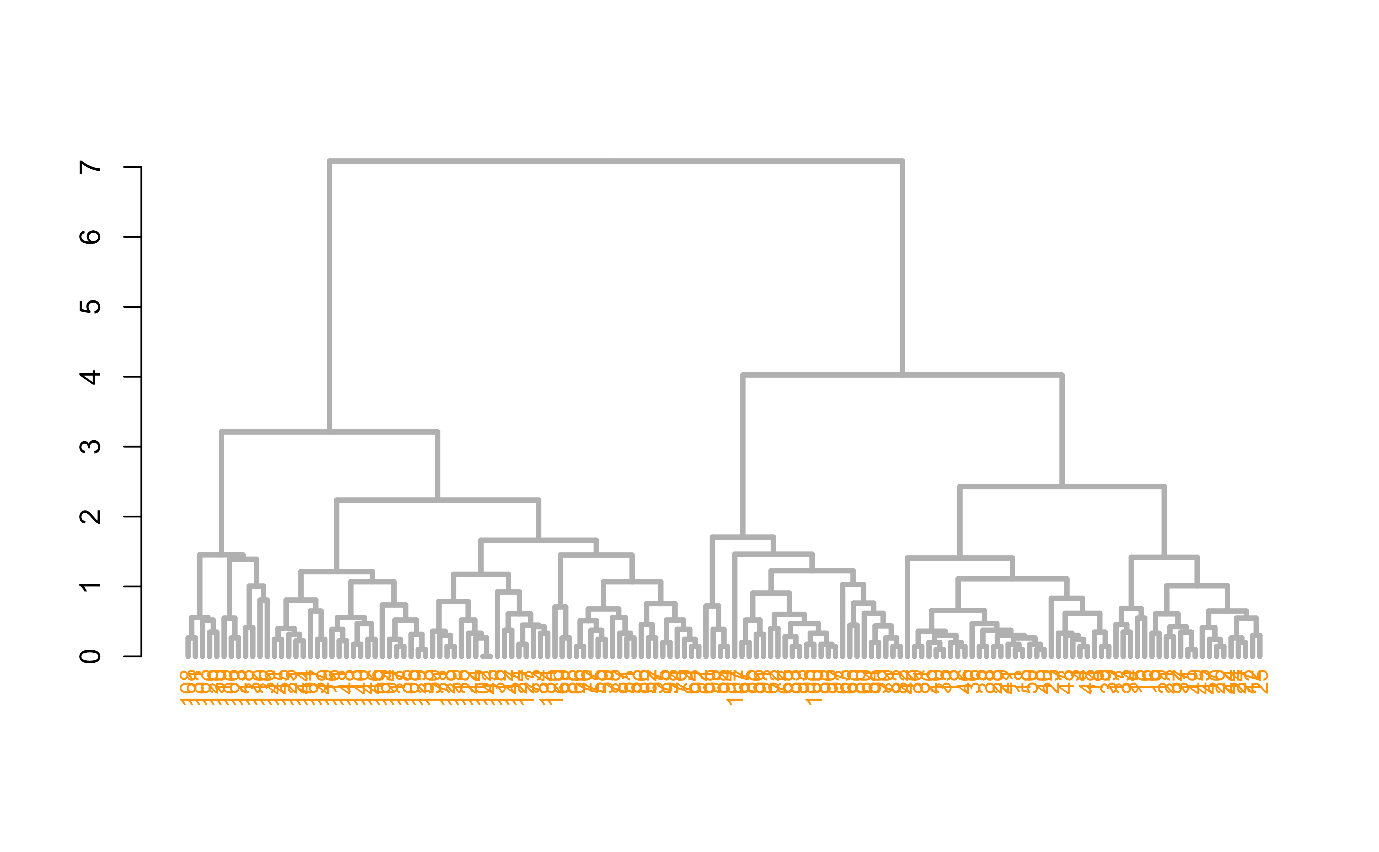
Hierarchical clustering
Heatmaps
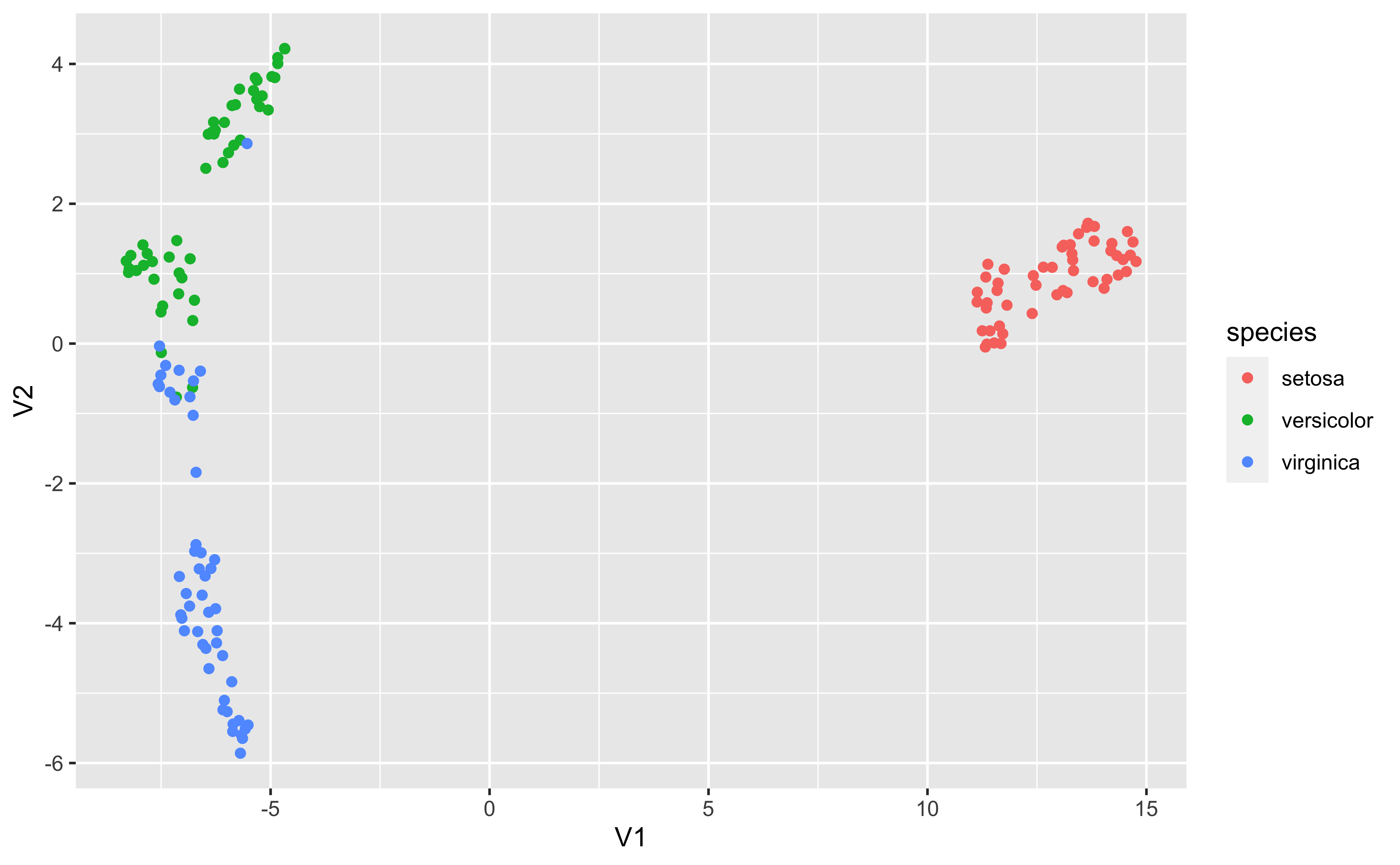
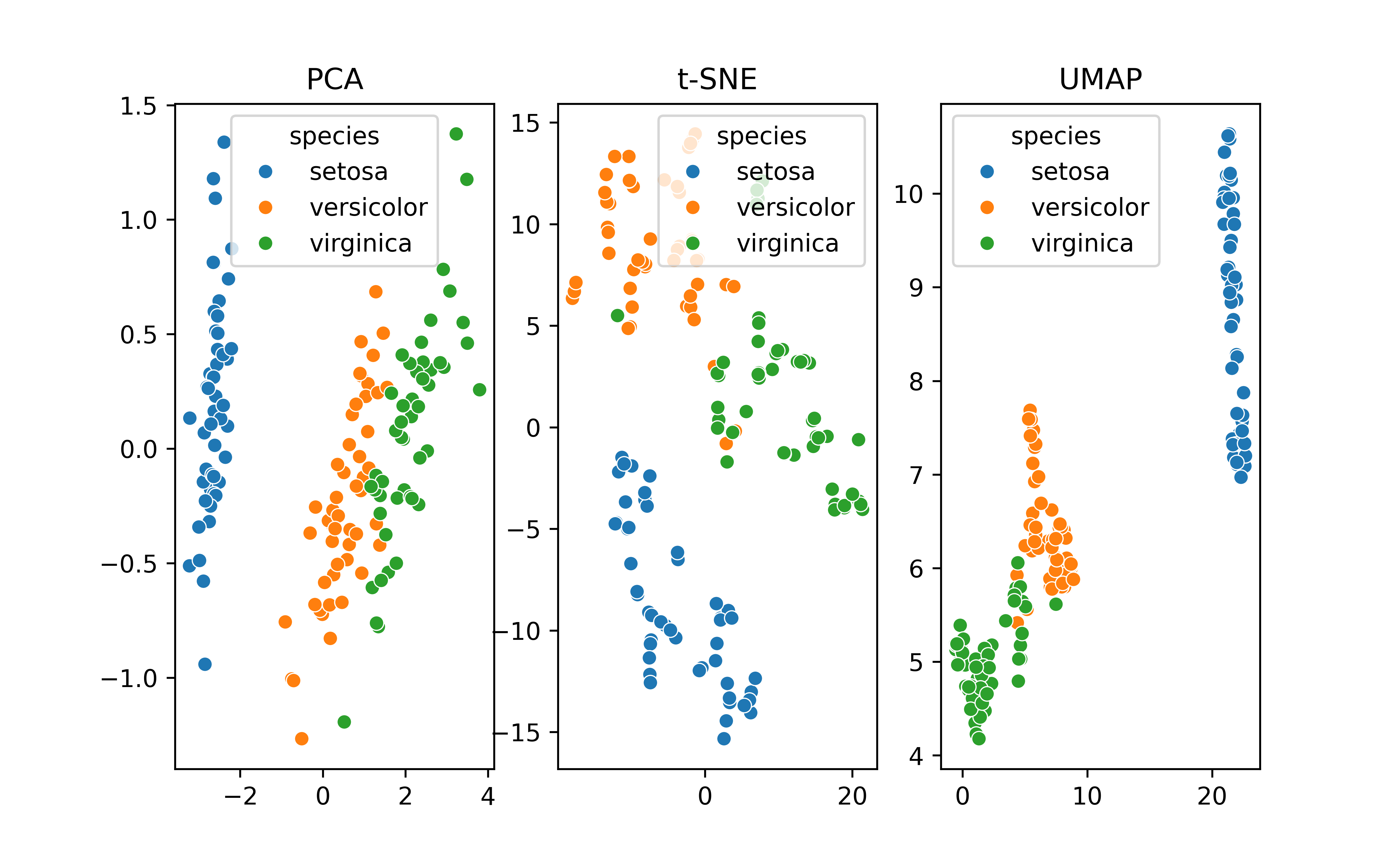
Dimension reduction and transformations (PCA, t-SNE, UMAP)
Supervised learning
Regression models
Decision trees
Model introspection
Model predictive performance
Survival/reliability models
Visualizing the results of models
We’ve talked a lot about exploratory and descriptive visualizations to understand the unprocessed data
Modeling is part of most insight strategies to understand patterns in the data. These are often the “end results” of a data science project and the “punch line” of what you’re presenting
Visualizing results rather than a tabular presentation can be more impactful
Take advantage of receivers’ innate pattern recognition capabilities
Ability to highlight main stories out of the models
Visualizing the results of models
Easier to not only show results but also highlight weaknesses
Fitting a straight line to a curvilinear relationship
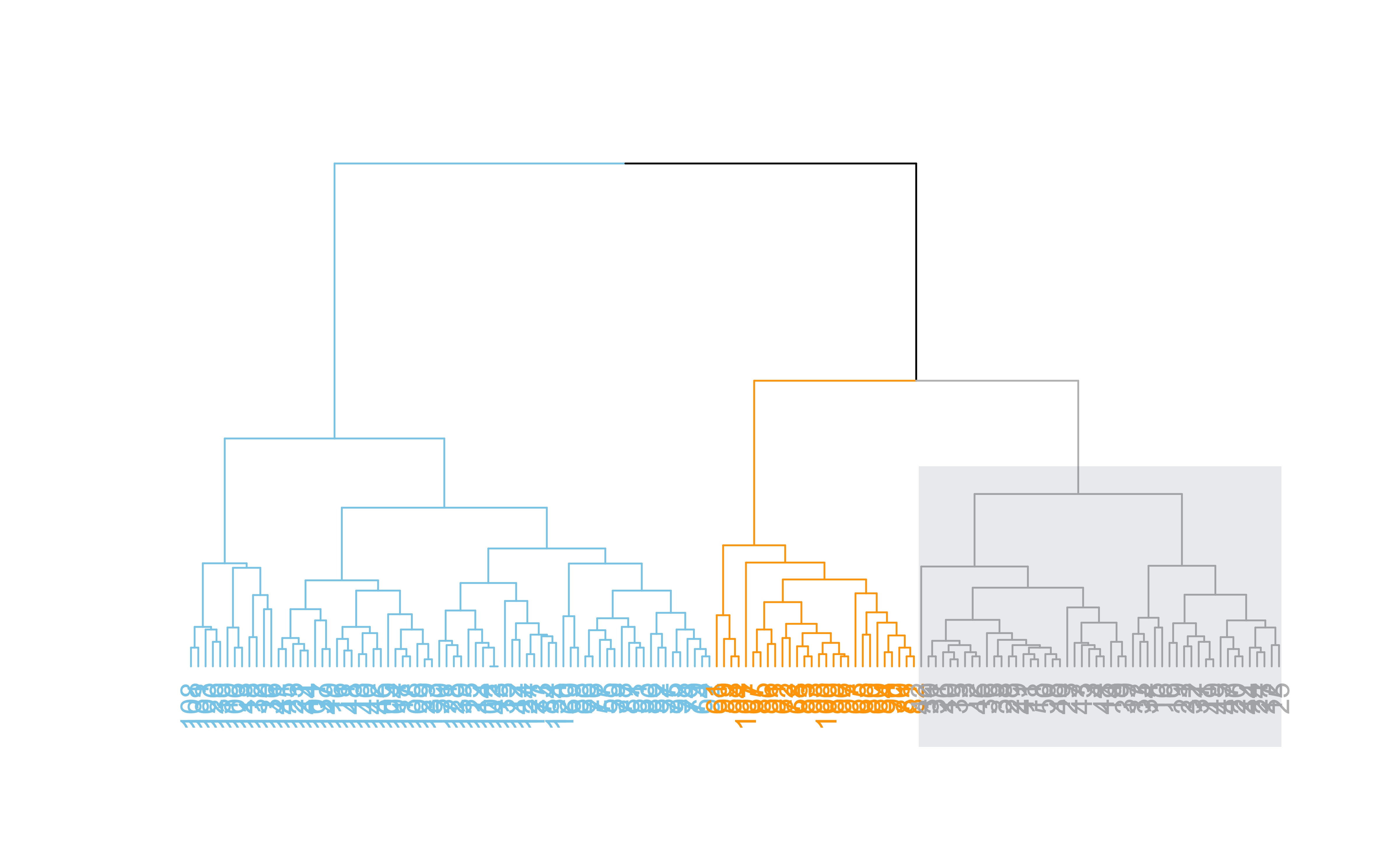
dend %>%set("labels_col", value =c("skyblue", "orange", "grey"), k=3) %>%set("branches_k_color", value =c("skyblue", "orange", "grey"), k =3) %>%plot(axes=FALSE)rect.dendrogram( dend, k=3, lty =5, lwd =0, which=3, col=rgb(0.1, 0.2, 0.4, 0.1) )
Code
# rgb(red,green,blue,alpha)
Code
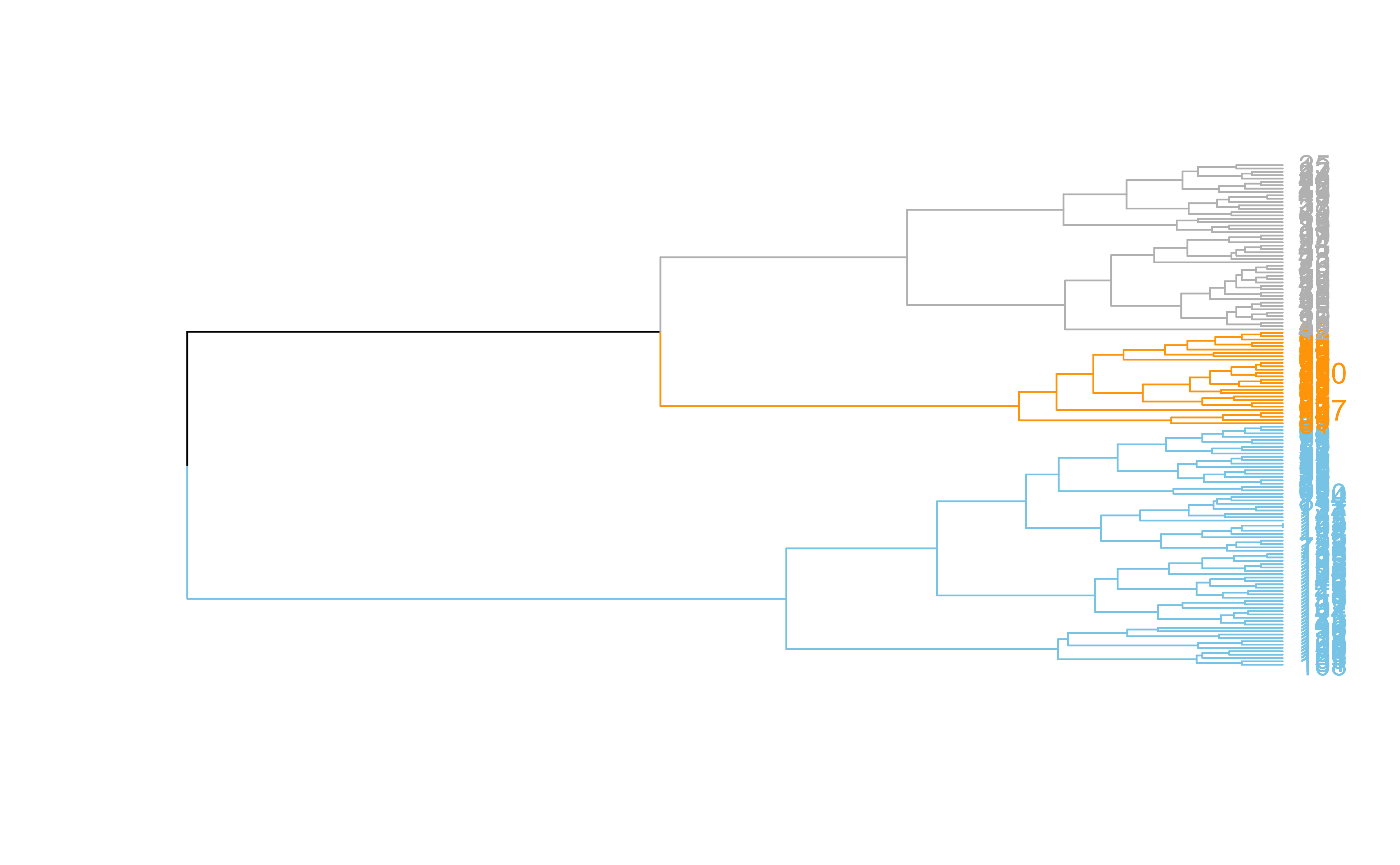
dend %>%set("labels_col", value =c("skyblue", "orange", "grey"), k=3) %>%set("branches_k_color", value =c("skyblue", "orange", "grey"), k =3) %>%plot(horiz=TRUE, axes=FALSE)abline(v =350, lty =2)
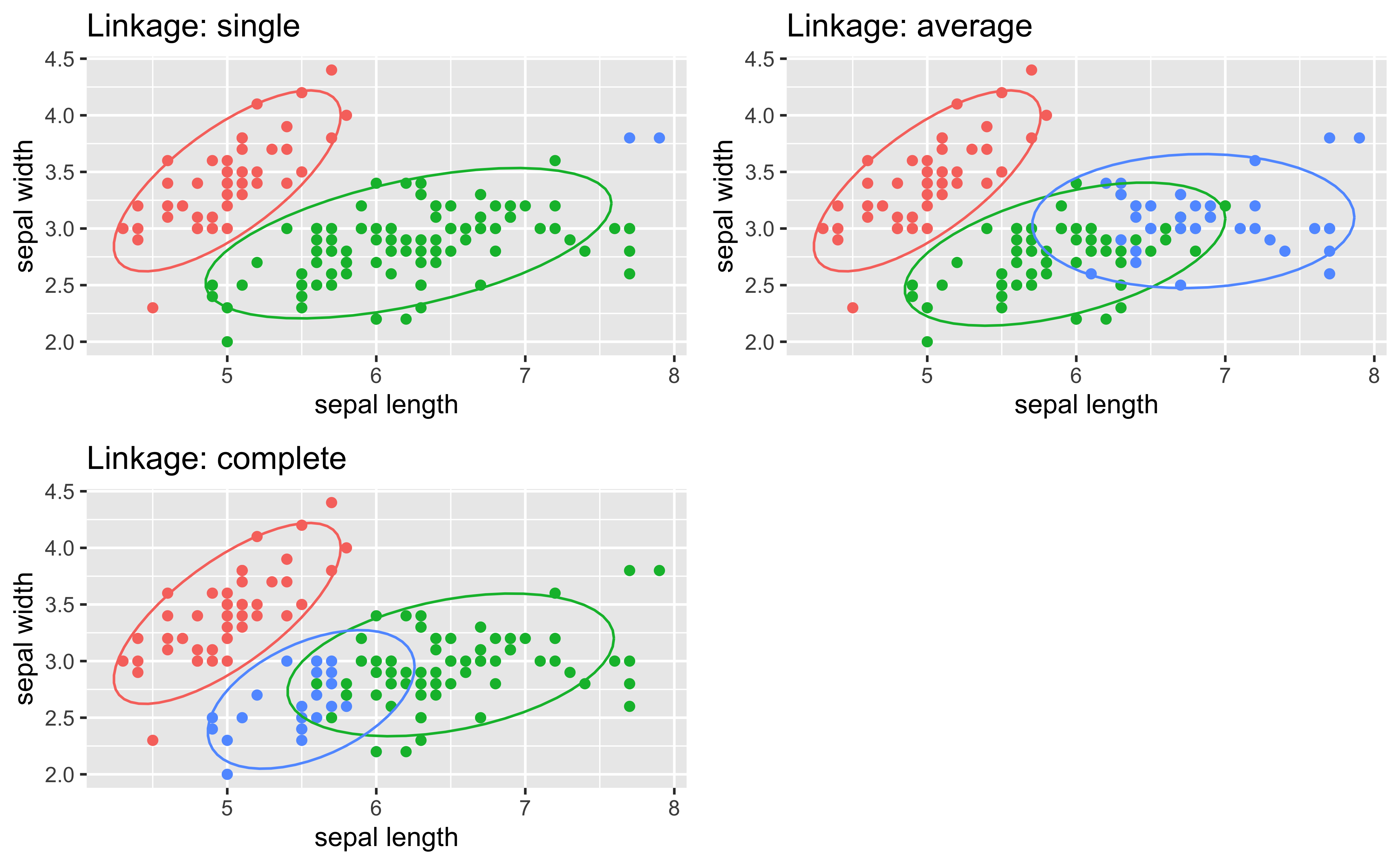
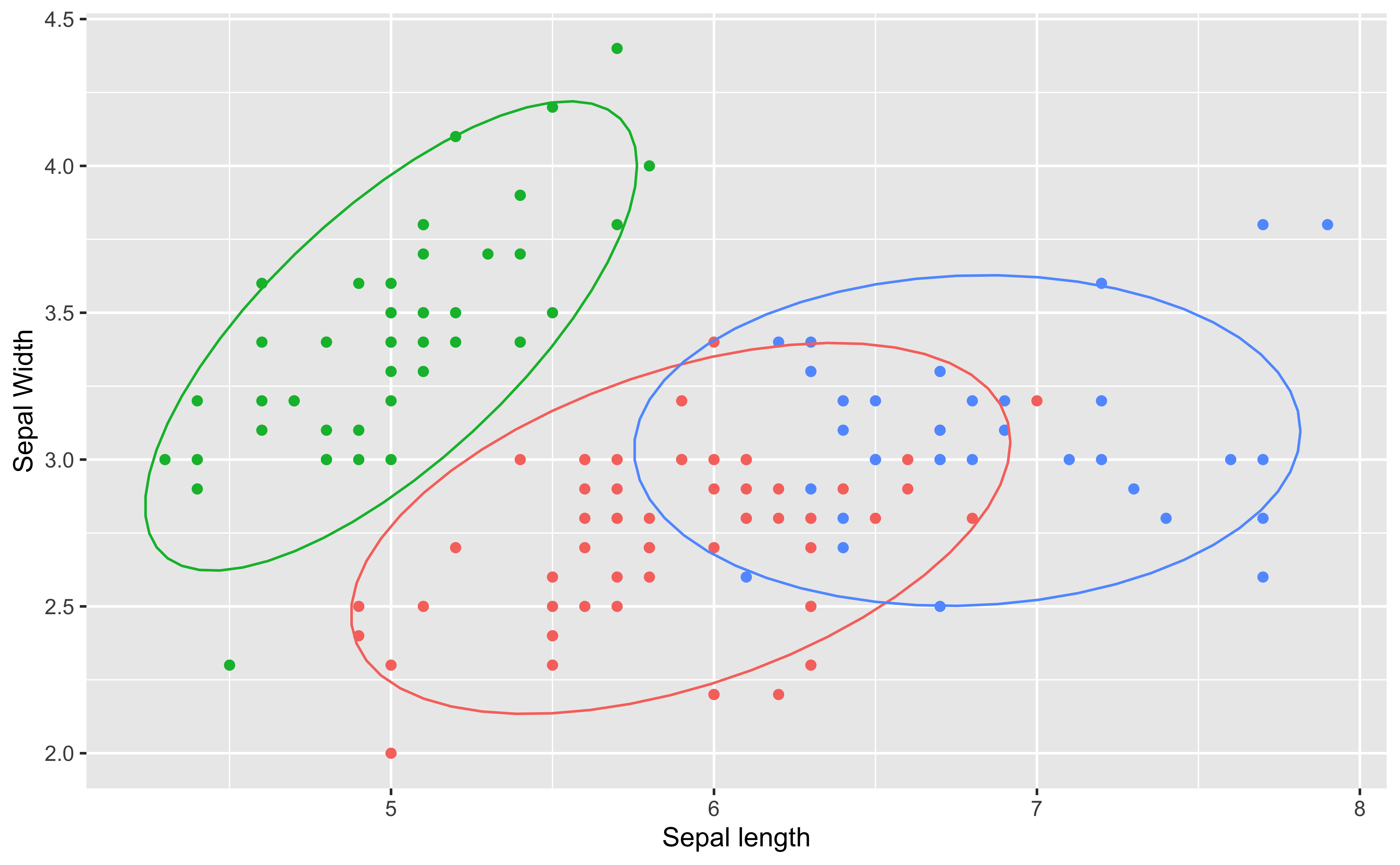
Hierarchical clustering ()
Code
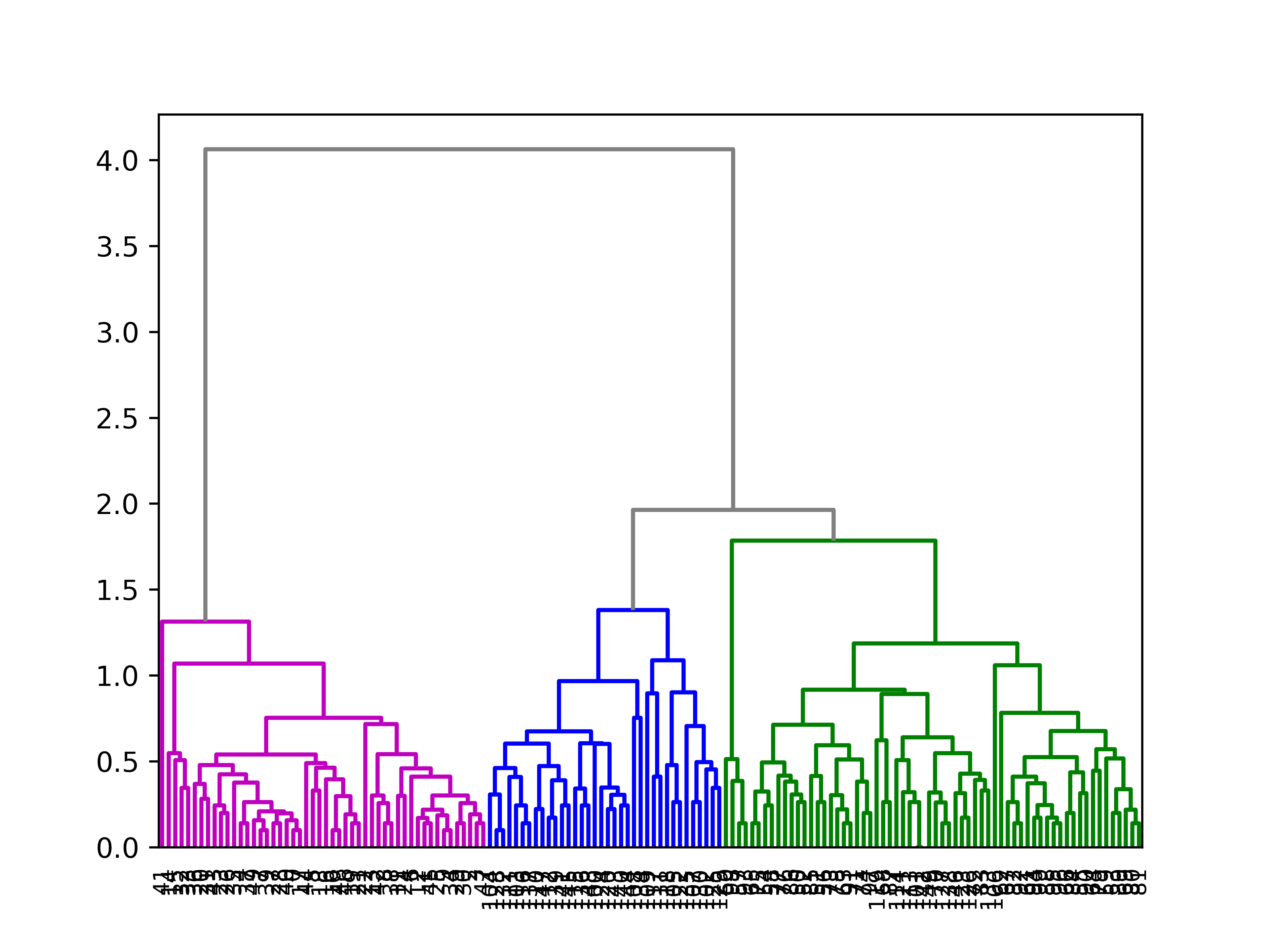
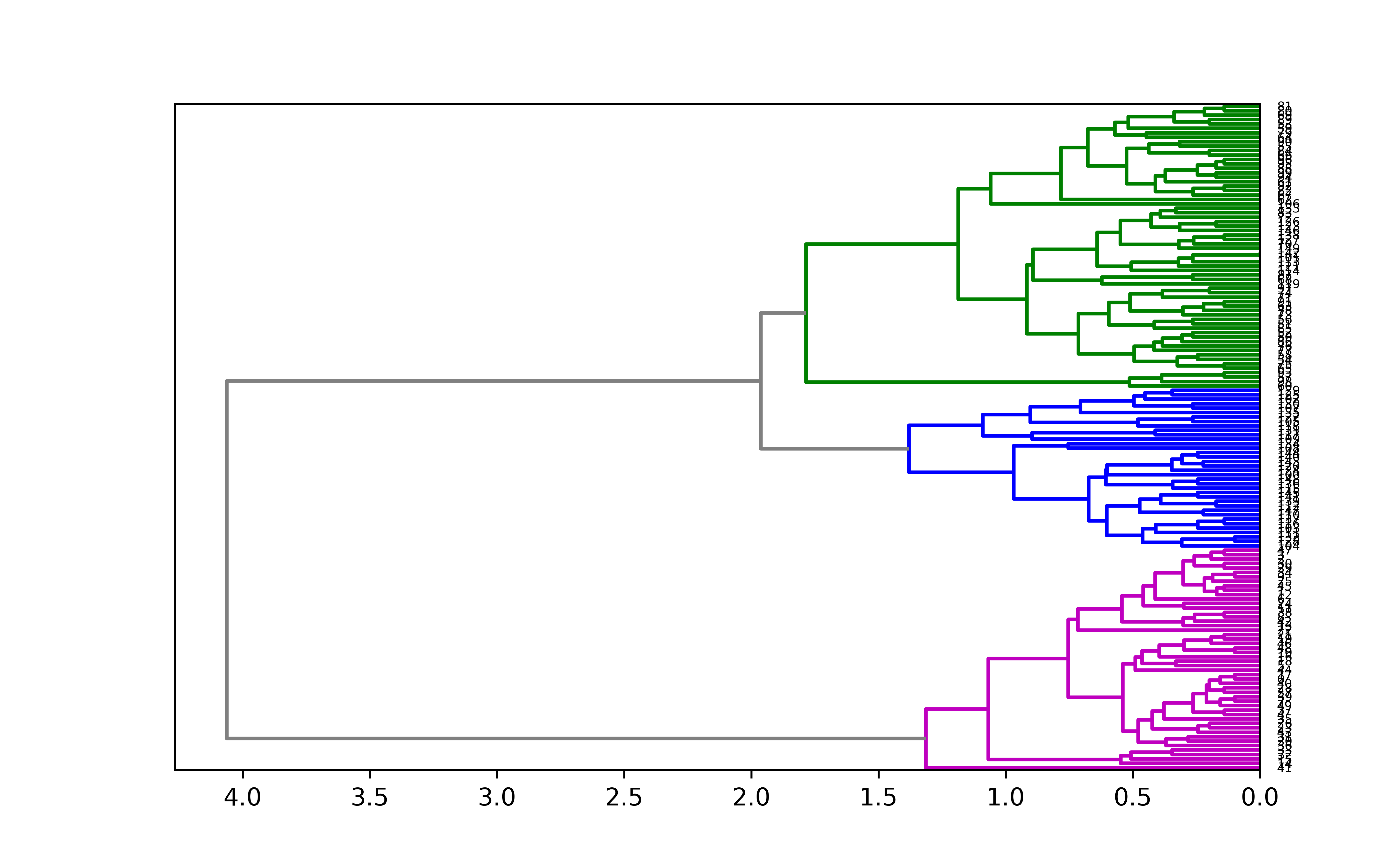
import pandas as pdfrom matplotlib import pyplot as pltfrom scipy.cluster import hierarchyimport numpy as npimport seaborn as sns# Data setiris = sns.load_dataset('iris')df = iris.iloc[:,:4]# Calculate the distance between each sampleZ = hierarchy.linkage(df, 'average')ind = hierarchy.cut_tree(Z,3)# Plot with Custom leaveshierarchy.set_link_color_palette(['m','b','g'])hierarchy.dendrogram(Z, leaf_rotation=90, leaf_font_size=8, color_threshold=1.8, above_threshold_color='grey');plt.show()
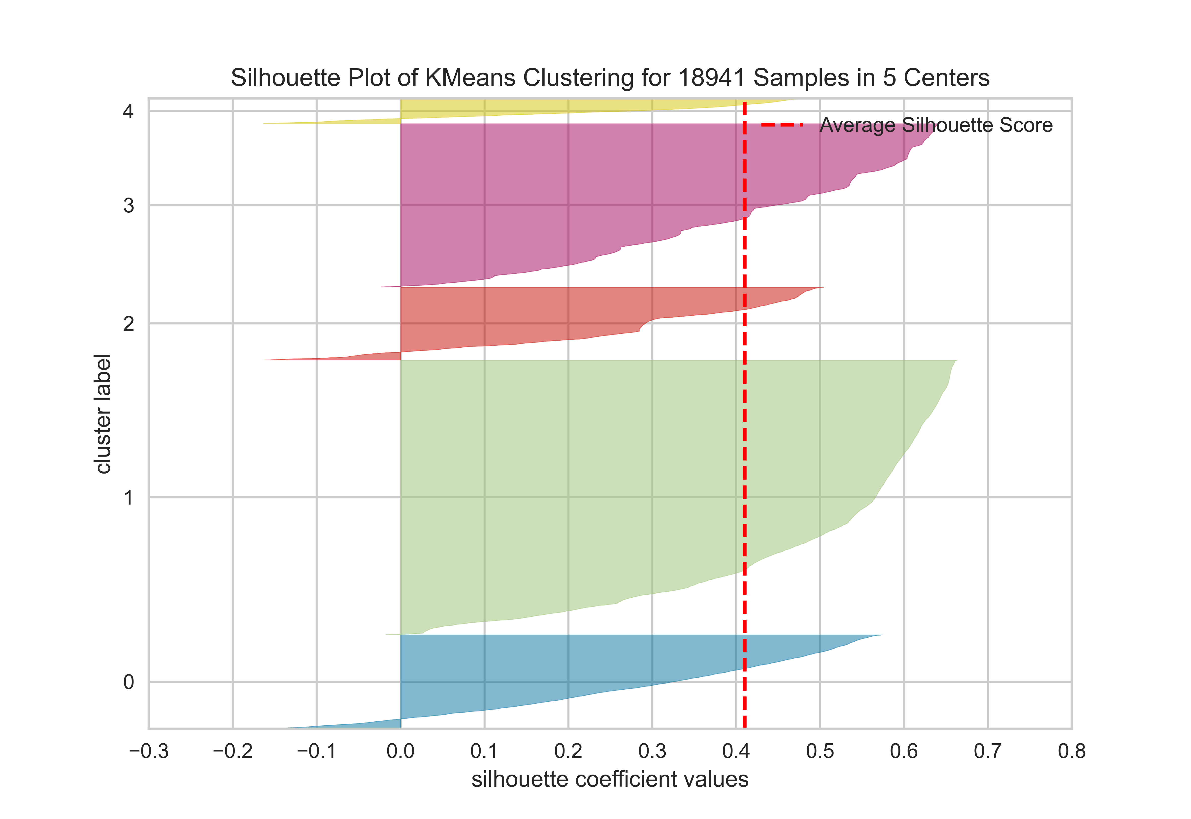
The silhouette value is a measure of how similar an object is to its own cluster (cohesion) compared to other clusters (separation). The silhouette ranges from −1 to +1, where a high value indicates that the object is well matched to its own cluster and poorly matched to neighboring clusters. If most objects have a high value, then the clustering configuration is appropriate. If many points have a low or negative value, then the clustering configuration may have too many or too few clusters. (Wikipedia)
from sklearn.cluster import KMeansfrom yellowbrick.cluster import silhouette_visualizerfrom yellowbrick.datasets import load_credit# Load a clustering datasetX, y = load_credit()# Specify rows to cluster: under 40 y/o and have either graduate or university educationX = X[(X['age'] <=40) & (X['edu'].isin([1,2]))]# Use the quick method and immediately show the figuresilhouette_visualizer(KMeans(5, random_state=42), X, colors='yellowbrick')
SilhouetteVisualizer(ax=<Axes: title={'center': 'Silhouette Plot of KMeans Clustering for 18941 Samples in 5 Centers'}, xlabel='silhouette coefficient values', ylabel='cluster label'>,
                     colors='yellowbrick',
                     estimator=KMeans(n_clusters=5, random_state=42))
In a Jupyter environment, please rerun this cell to show the HTML representation or trust the notebook. On GitHub, the HTML representation is unable to render, please try loading this page with nbviewer.org.
SilhouetteVisualizer(ax=<Axes: title={'center': 'Silhouette Plot of KMeans Clustering for 18941 Samples in 5 Centers'}, xlabel='silhouette coefficient values', ylabel='cluster label'>,
                     colors='yellowbrick',
                     estimator=KMeans(n_clusters=5, random_state=42))
KMeans(n_clusters=5, random_state=42)
KMeans(n_clusters=5, random_state=42)
More granular code (different data)
from sklearn.cluster import KMeansfrom yellowbrick.cluster import SilhouetteVisualizerfrom yellowbrick.datasets import load_nfl# Load a clustering datasetX, y = load_nfl()# Specify the features to use for clusteringfeatures = ['Rec', 'Yds', 'TD', 'Fmb', 'Ctch_Rate']X = X.query('Tgt >= 20')[features]# Instantiate the clustering model and visualizermodel = KMeans(5, random_state=42)visualizer = SilhouetteVisualizer(model, colors='yellowbrick')visualizer.fit(X) # Fit the data to the visualizervisualizer.show() # Finalize and render the figure
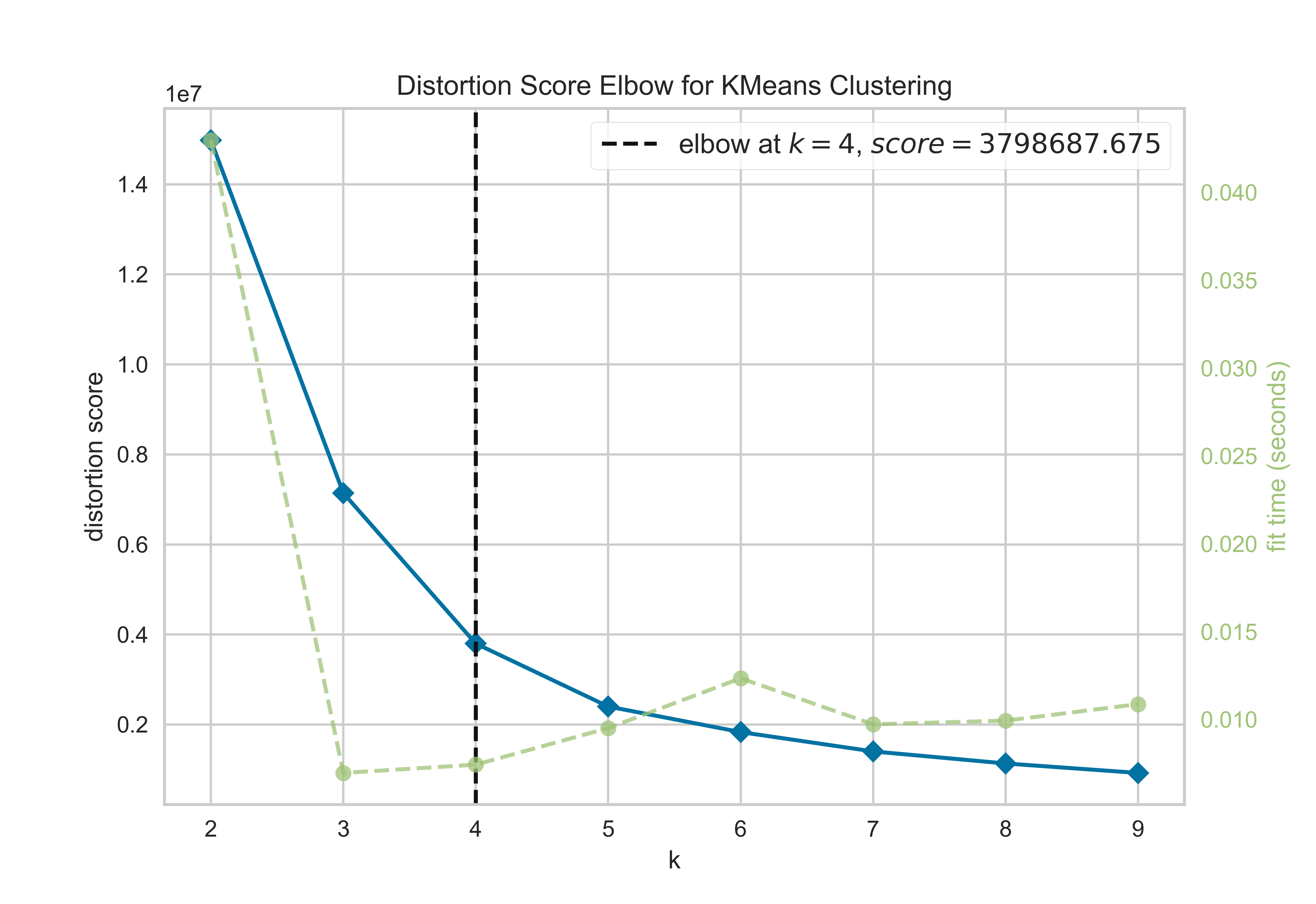
Evaluating cluster analysis: Elbow plot
from sklearn.cluster import KMeansfrom yellowbrick.cluster.elbow import kelbow_visualizerfrom yellowbrick.datasets.loaders import load_nflX, y = load_nfl()# Use the quick method and immediately show the figurekelbow_visualizer(KMeans(random_state=4), X, k=(2,10))
In a Jupyter environment, please rerun this cell to show the HTML representation or trust the notebook. On GitHub, the HTML representation is unable to render, please try loading this page with nbviewer.org.
from sklearn.cluster import KMeansfrom sklearn.datasets import make_blobsfrom yellowbrick.cluster import KElbowVisualizer# Generate synthetic dataset with 8 random clustersX, y = load_nfl()# Instantiate the clustering model and visualizermodel = KMeans()visualizer = KElbowVisualizer( model, k=(2,10), metric='calinski_harabasz', timings=False)visualizer.fit(X) # Fit the data to the visualizervisualizer.show() # Finalize and render the figure
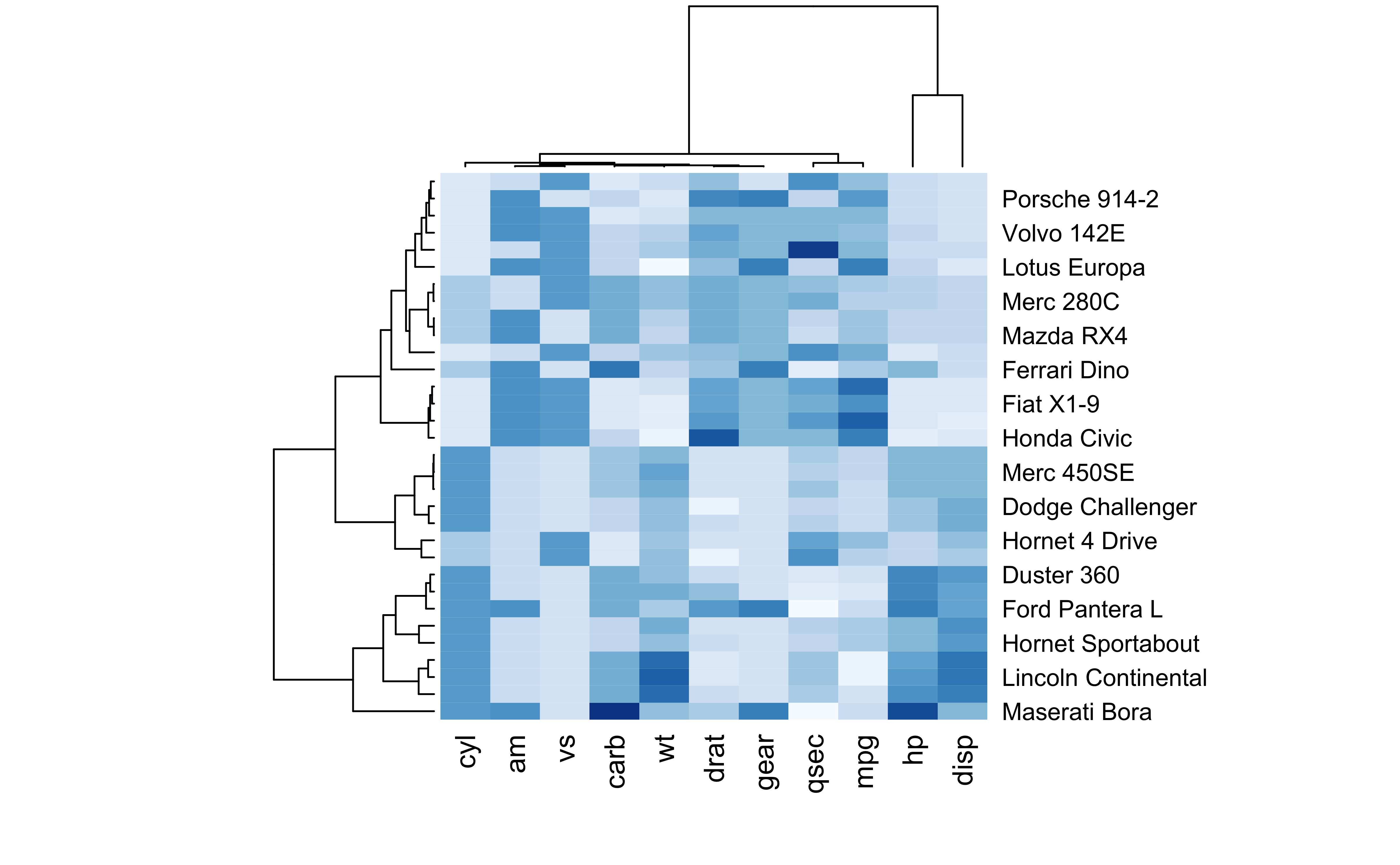
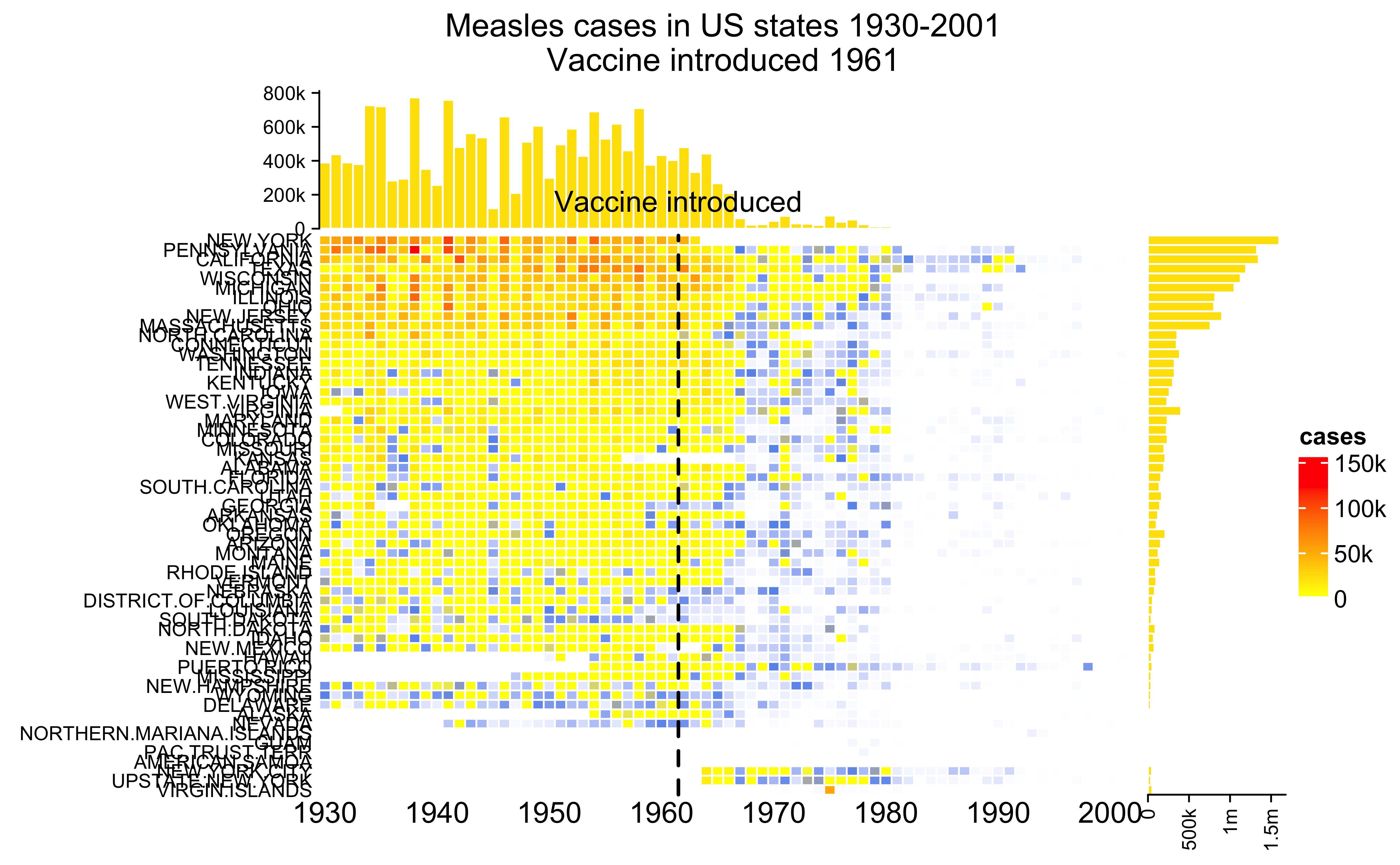
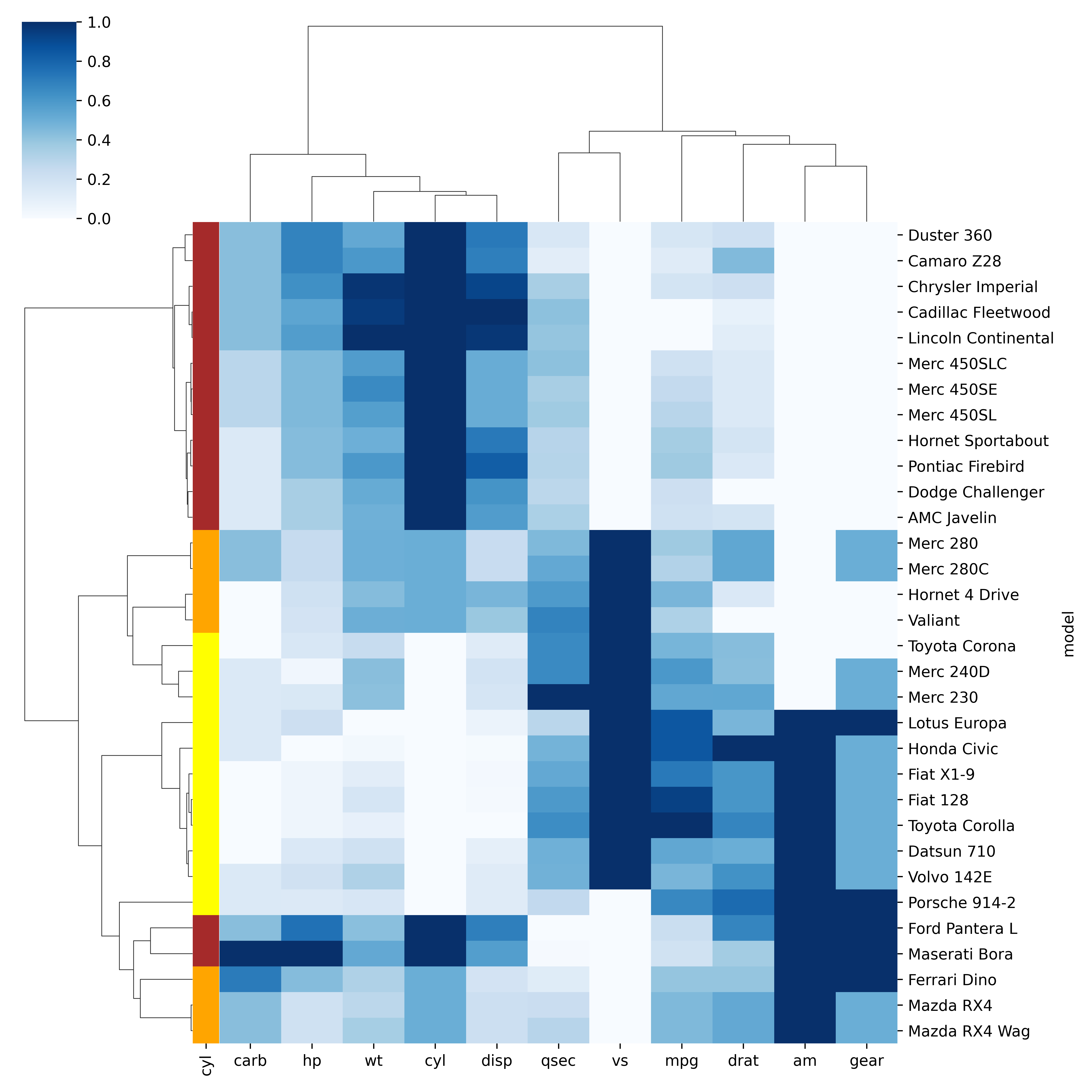
Heatmaps
Code
data <-as.matrix(mtcars)library(RColorBrewer)heatmap(data, scale='column', cexRow=1, col=colorRampPalette(brewer.pal(8,'Blues'))(25))
Heatmaps
Using a complex heatmap to understand the prevalence of measles in the US over time and the effect of introducing the vaccine.
Code
source('ml/complexhm.R')
Heatmaps ()
Code
# Librariesimport seaborn as snsimport pandas as pdfrom matplotlib import pyplot as plt# Data seturl ='https://raw.githubusercontent.com/holtzy/The-Python-Graph-Gallery/master/static/data/mtcars.csv'df = pd.read_csv(url)df = df.set_index('model')# Prepare a vector of color mapped to the 'cyl' columnmy_palette =dict(zip(df.cyl.unique(), ["orange","yellow","brown"]))row_colors = df.cyl.map(my_palette)# plotsns.clustermap(df, metric="correlation", method="single", cmap="Blues", standard_scale=1, row_colors=row_colors);
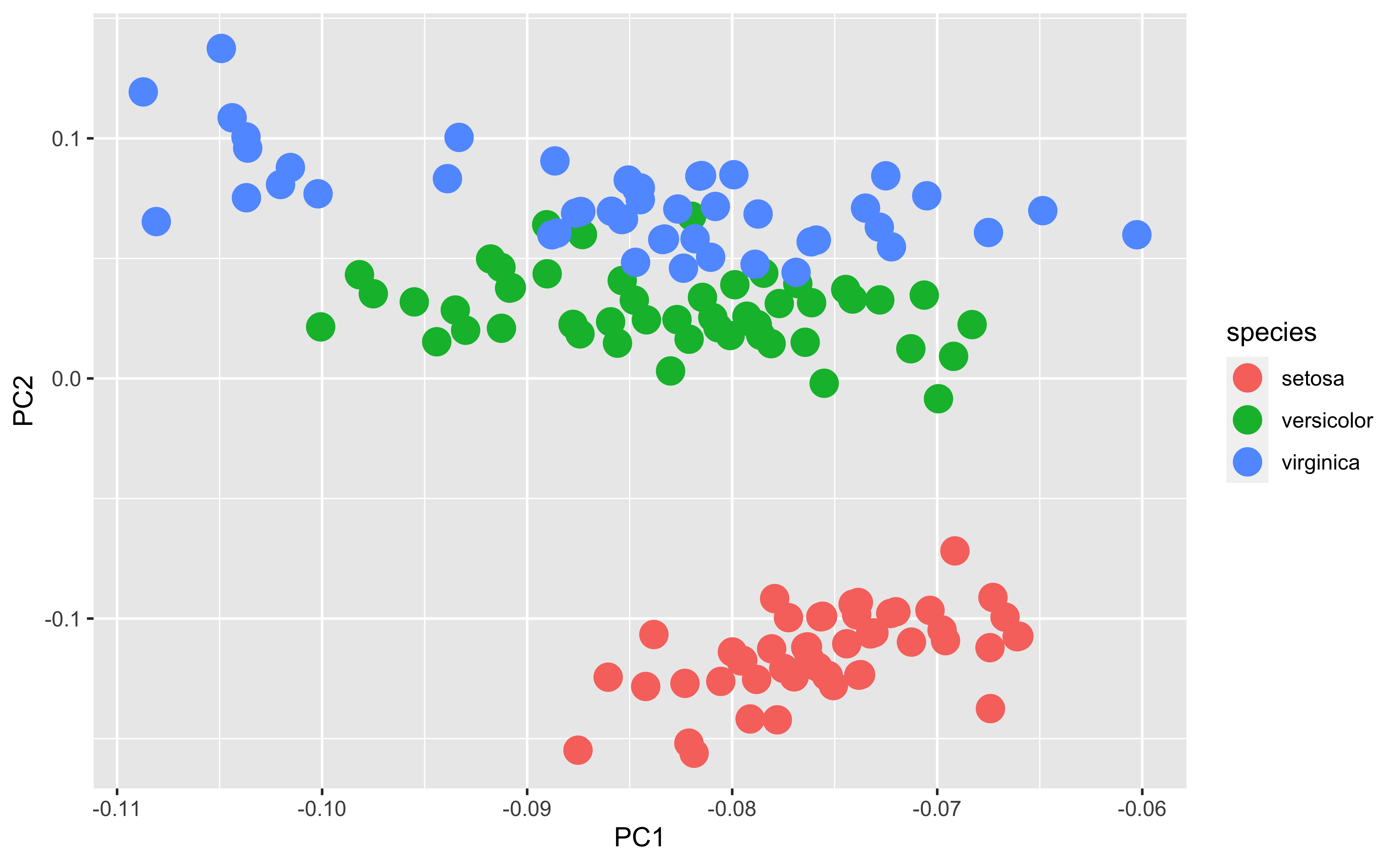
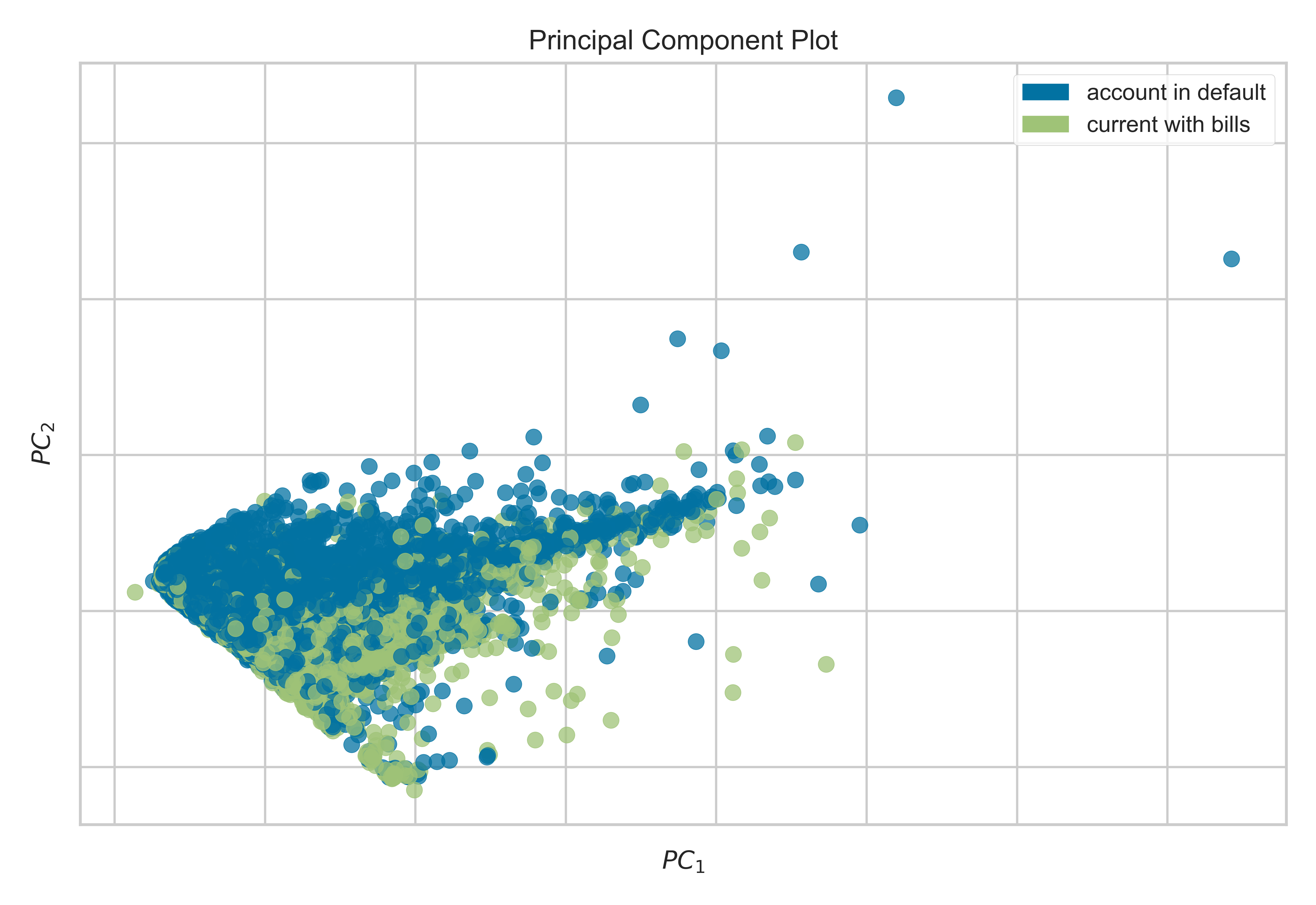
PCA
PCA (principal components analysis) is a method to “rotate” the data based on variability of the data cloud, resulting in fewer variables that capture the information in the data cloud. It’s a popular method of dimension reduction
PCA first finds the direction in which there is maximum variance
Then finds the directional orthogonal (uncorrelated) to the first direction with the most variance
And so on
In this case, these two new variables capture 99.7% of the variability in the iris measurements
It’s not uncommon that PCA separates groups along one of the axes
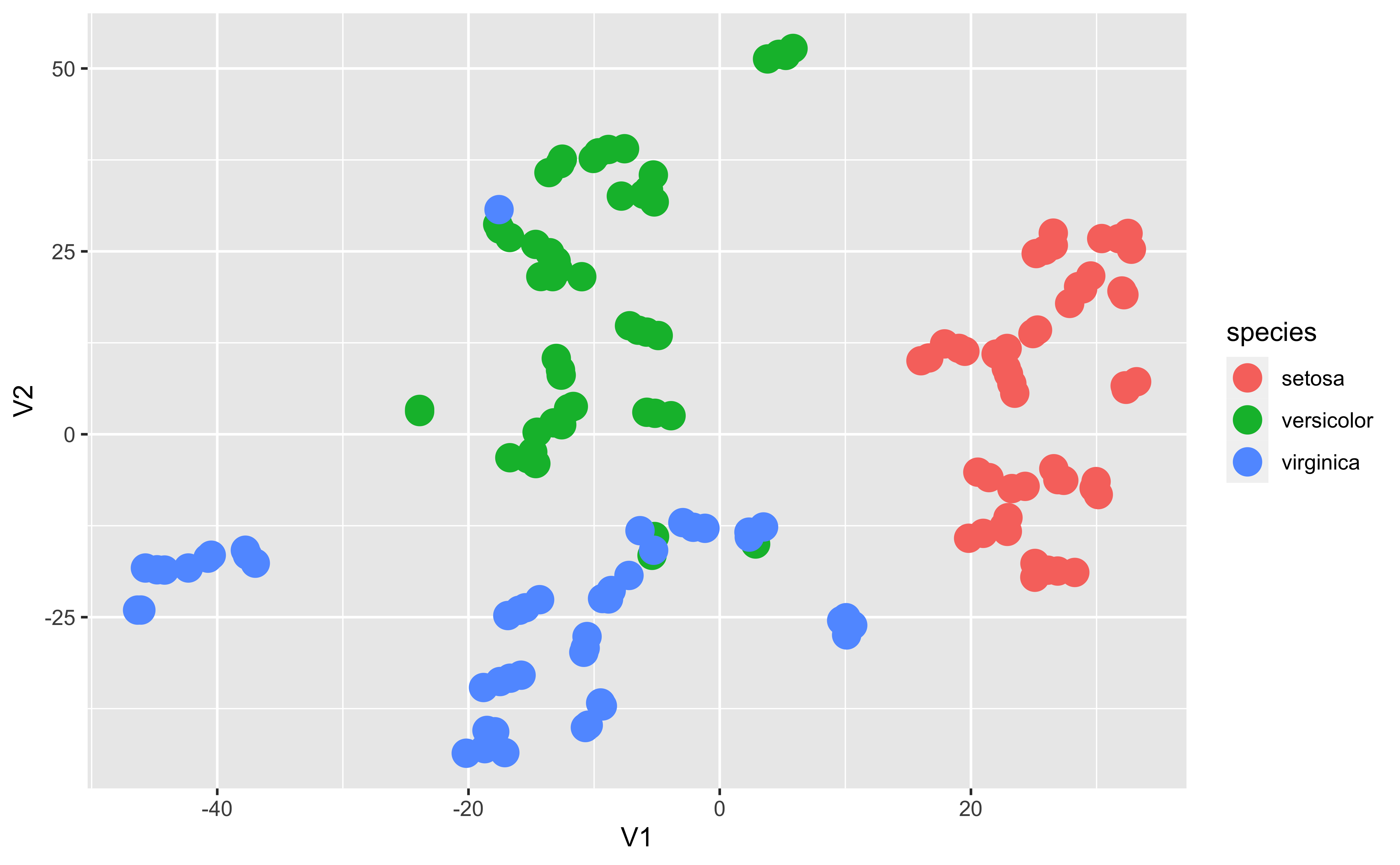
UMAP (uniform manifold approximation and projection) is another non-linear dimension-reduction technique that is increasingly used in bioinformatics to cluster high-dimensional data. It is believed to preserve both local and global structure and give a “fair” represenation of the data.
from yellowbrick.datasets import load_creditfrom yellowbrick.features import PCA# Specify the features of interest and the targetX, y = load_credit();classes = ['account in default', 'current with bills']visualizer = PCA(scale=True, classes=classes);visualizer.fit_transform(X, y);visualizer.show()
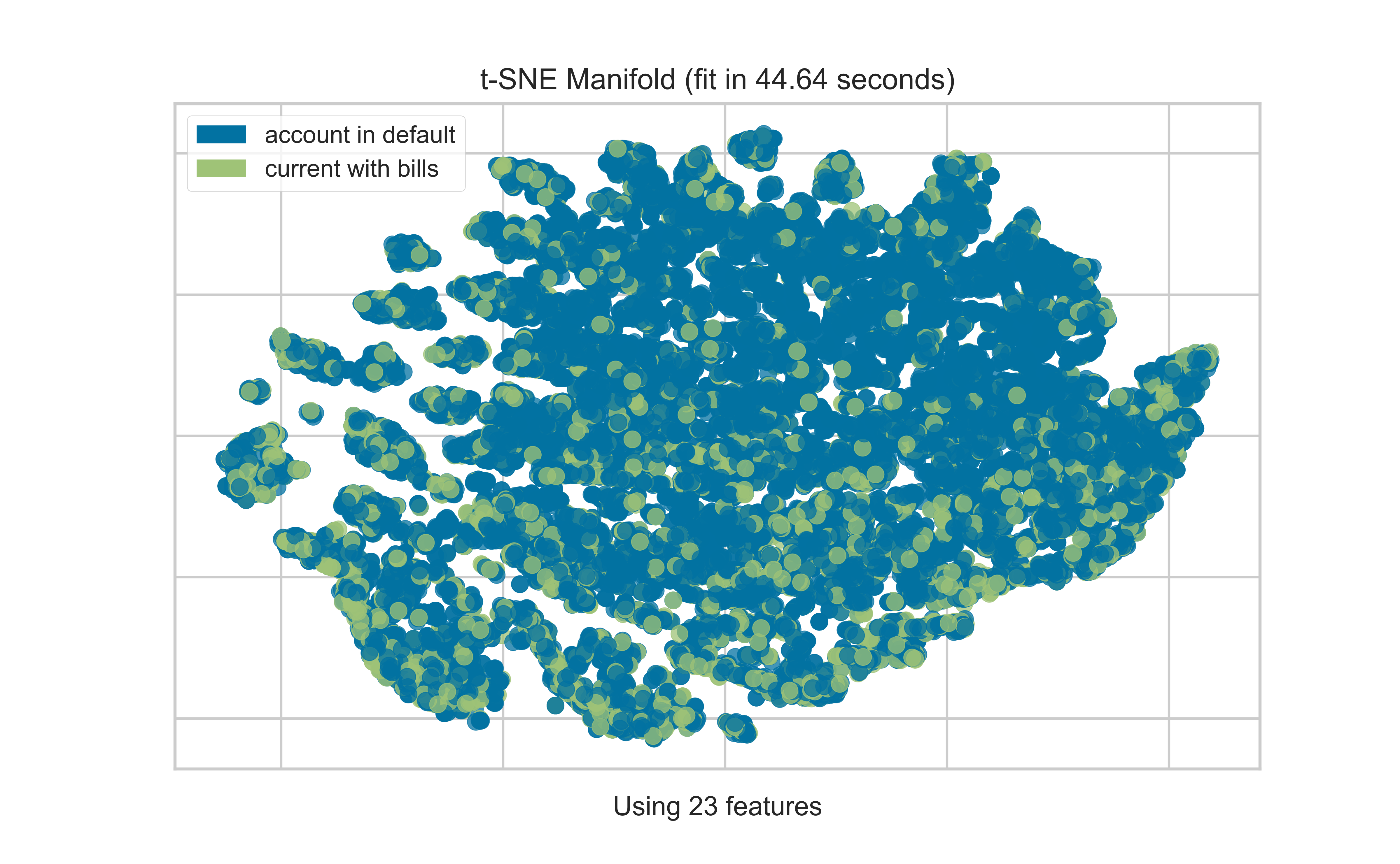
T-SNE
Code
from yellowbrick.datasets import load_creditfrom yellowbrick.features import Manifold# Specify the features of interest and the targetX, y = load_credit();classes = ['account in default', 'current with bills']visualizer = Manifold(manifold='tsne', classes = classes);visualizer.fit_transform(X, y);visualizer.show()
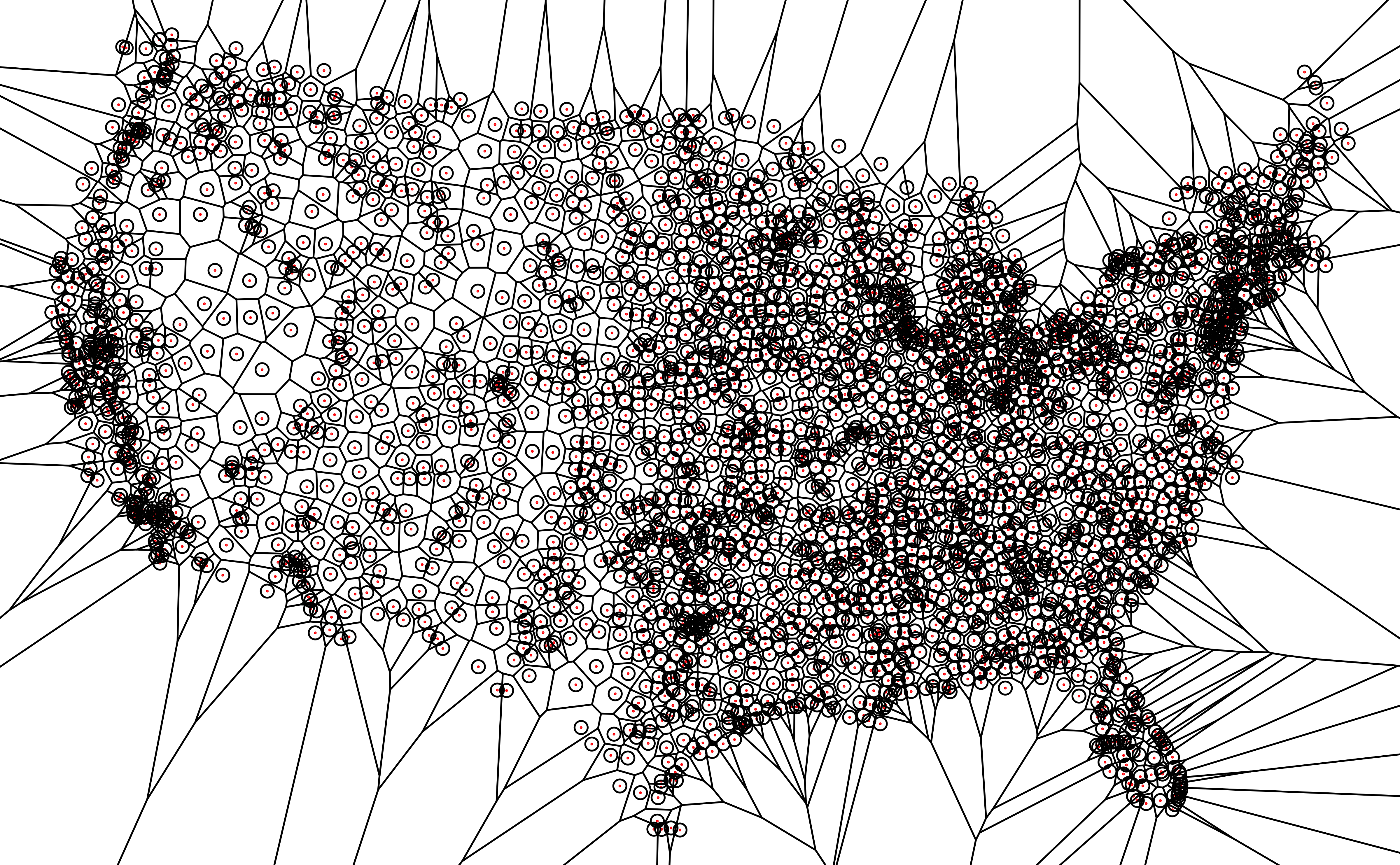
Voronoi diagrams
A Voronoi diagram splits up a plane based on a set of original points. Each polygon, or Voronoi cell, contains an original point and all areas that are closer to that point than any other.
This can be used in different contexts, but especially with geospatial data
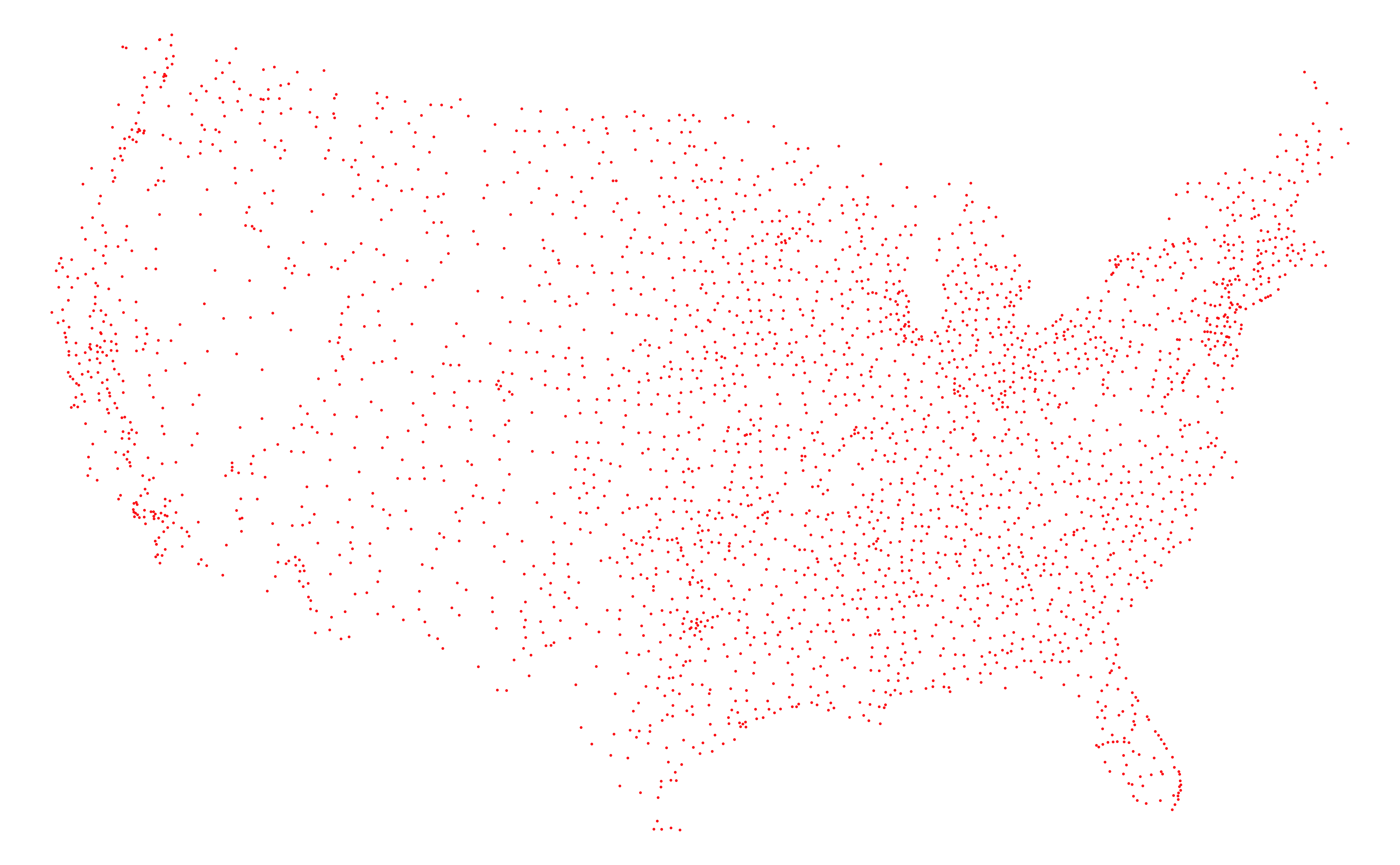
Here, we’re plotting the locations of airports in the USA
A Voronoi diagram splits up a plane based on a set of original points. Each polygon, or Voronoi cell, contains an original point and all areas that are closer to that point than any other.
This can be used in different contexts, but especially with geospatial data
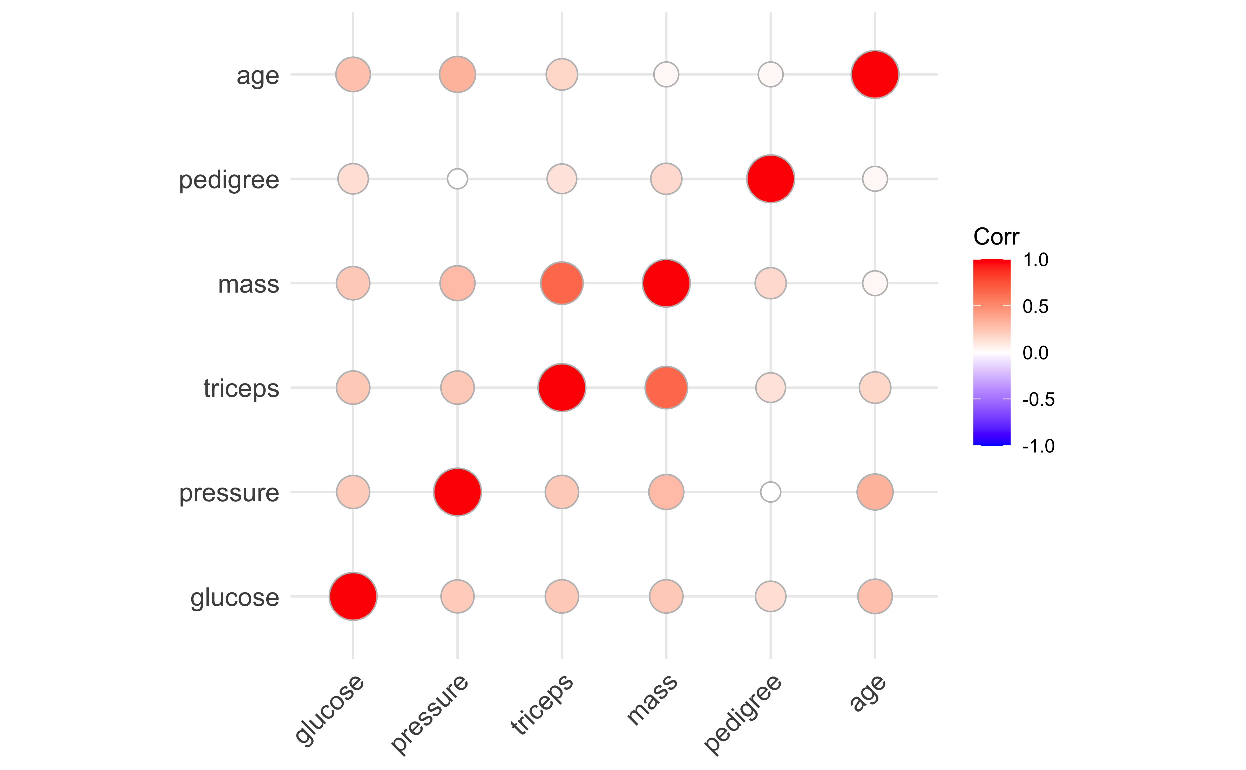
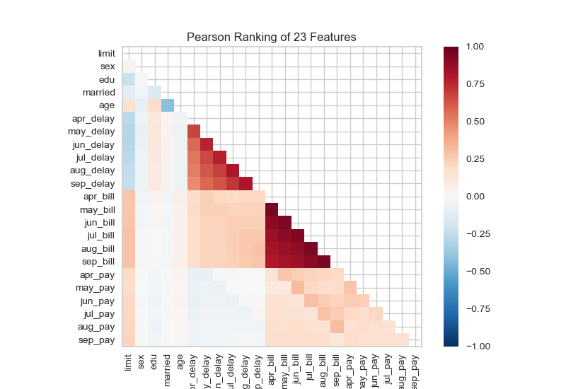
One of the things we need to understand (beyond patterns we may see in PCA and other dimension reduction methods) is whether we have sets of correlated features that are either explanatory or serendipitious. One way of visualizing this is using a two-dimensional ranking of features.
Code
from yellowbrick.datasets import load_creditfrom yellowbrick.features import Rank2D# Load the credit datasetX, y = load_credit()# Instantiate the visualizer with the Pearson ranking algorithmvisualizer = Rank2D()visualizer.fit(X, y) # Fit the data to the visualizervisualizer.transform(X) # Transform the datavisualizer.show() # Finalize and render the figure
Something quite similar is seen in genetics in a linkage disequilibrium or LD plot.
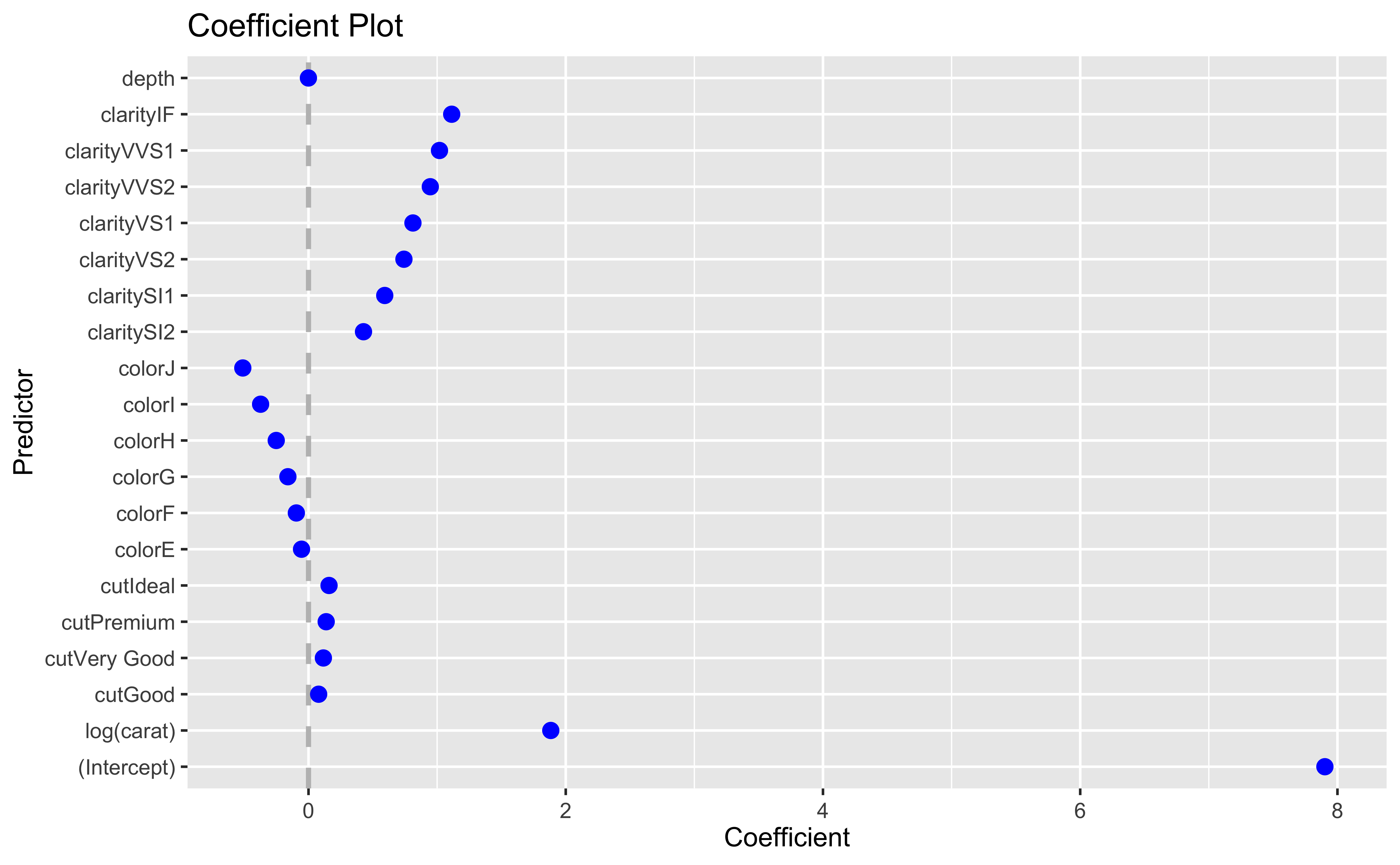
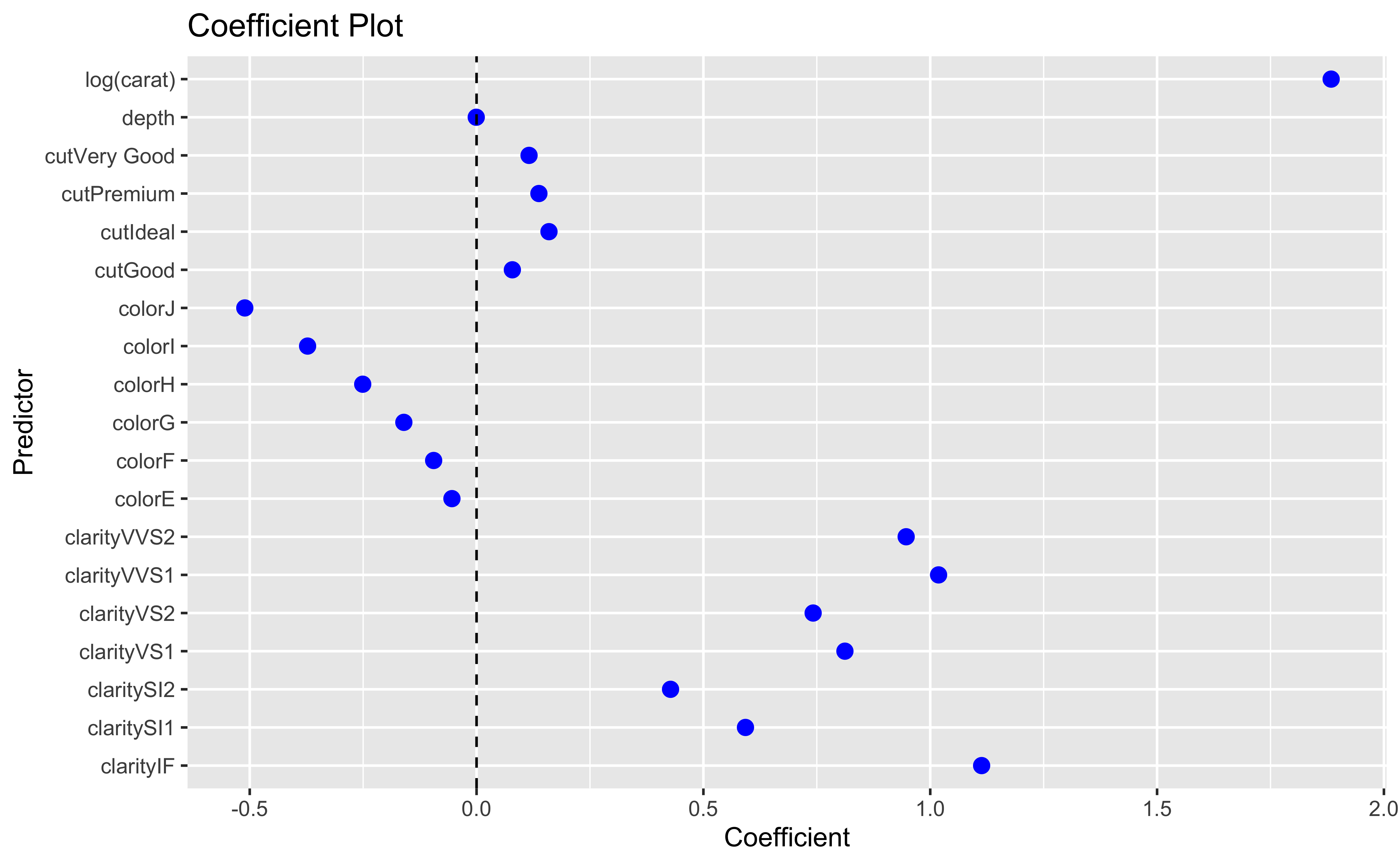
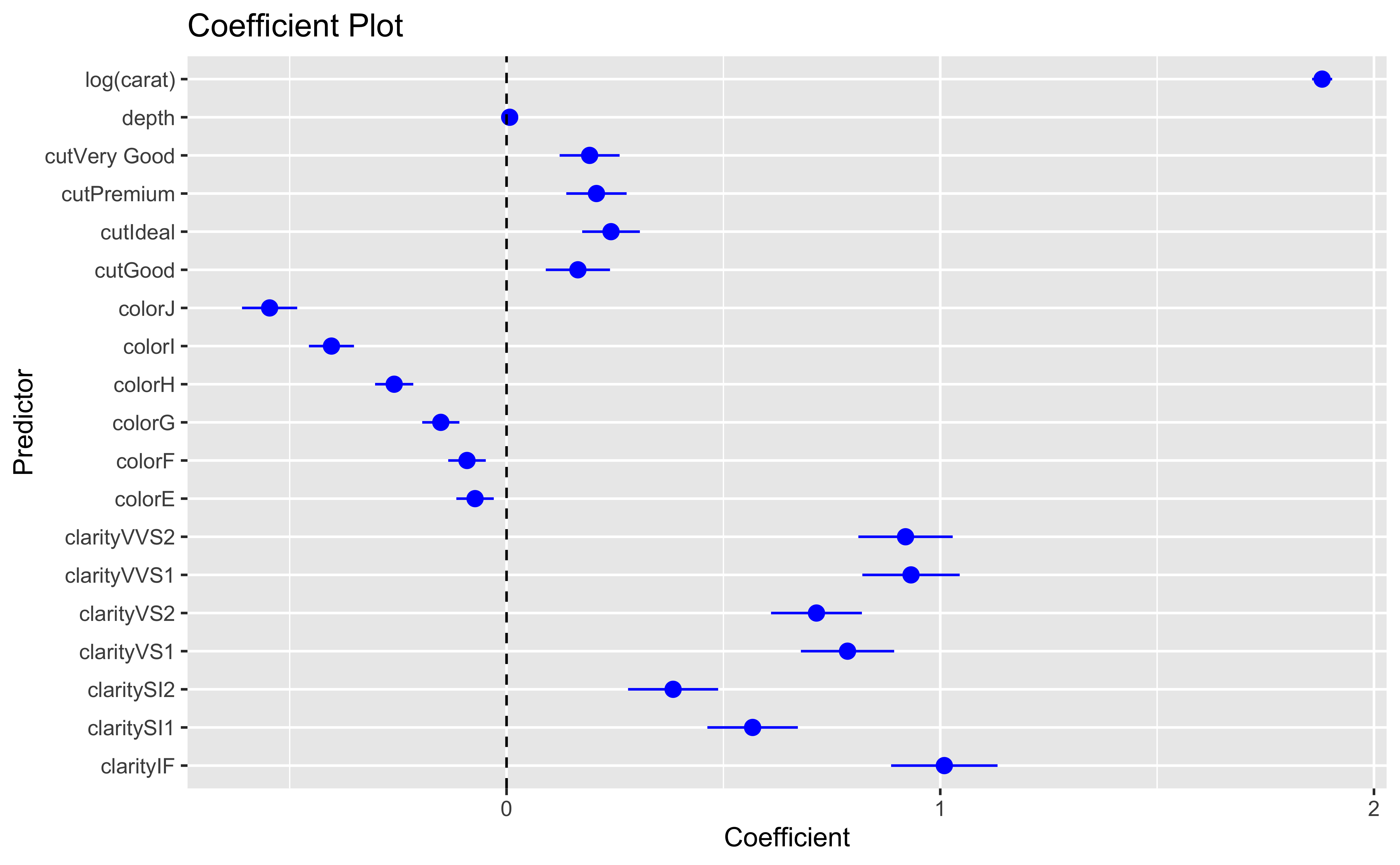
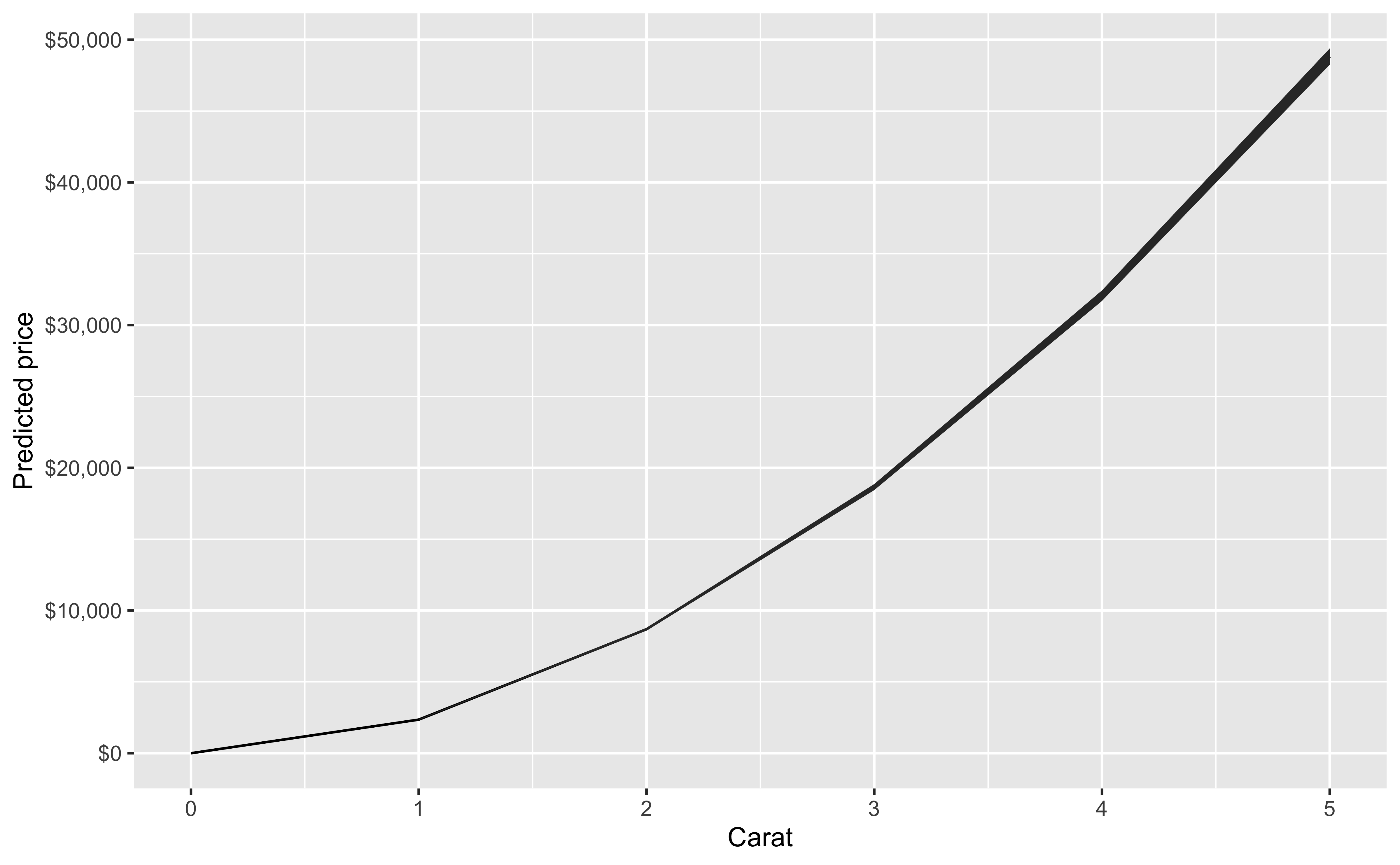
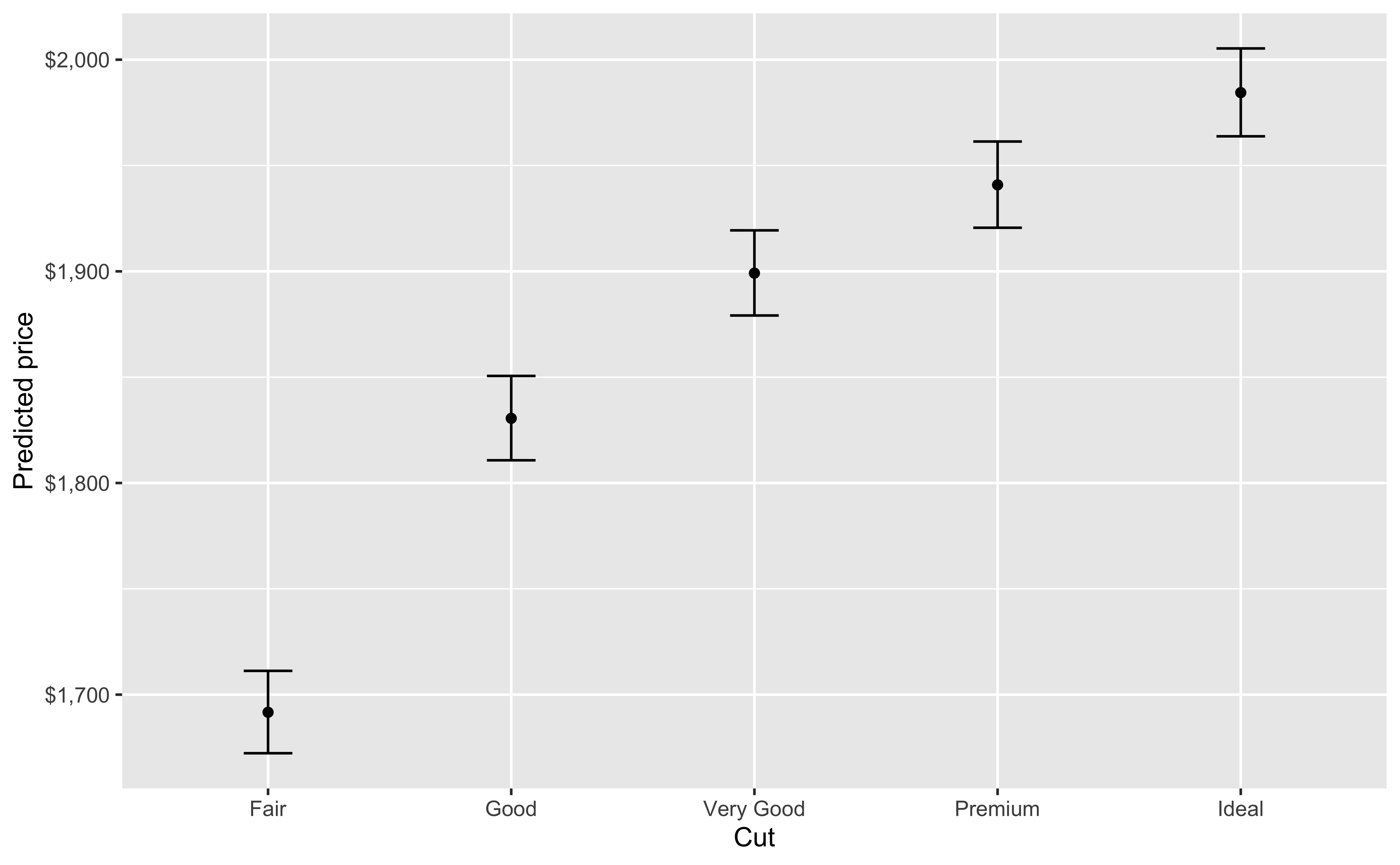
Regression models
We will use the diamonds dataset for the supervised learning section. This data is available in R by library(ggplot2); data(diamonds) and in Python by import seaborn as sns; diamonds = sns.load_dataset("diamonds").
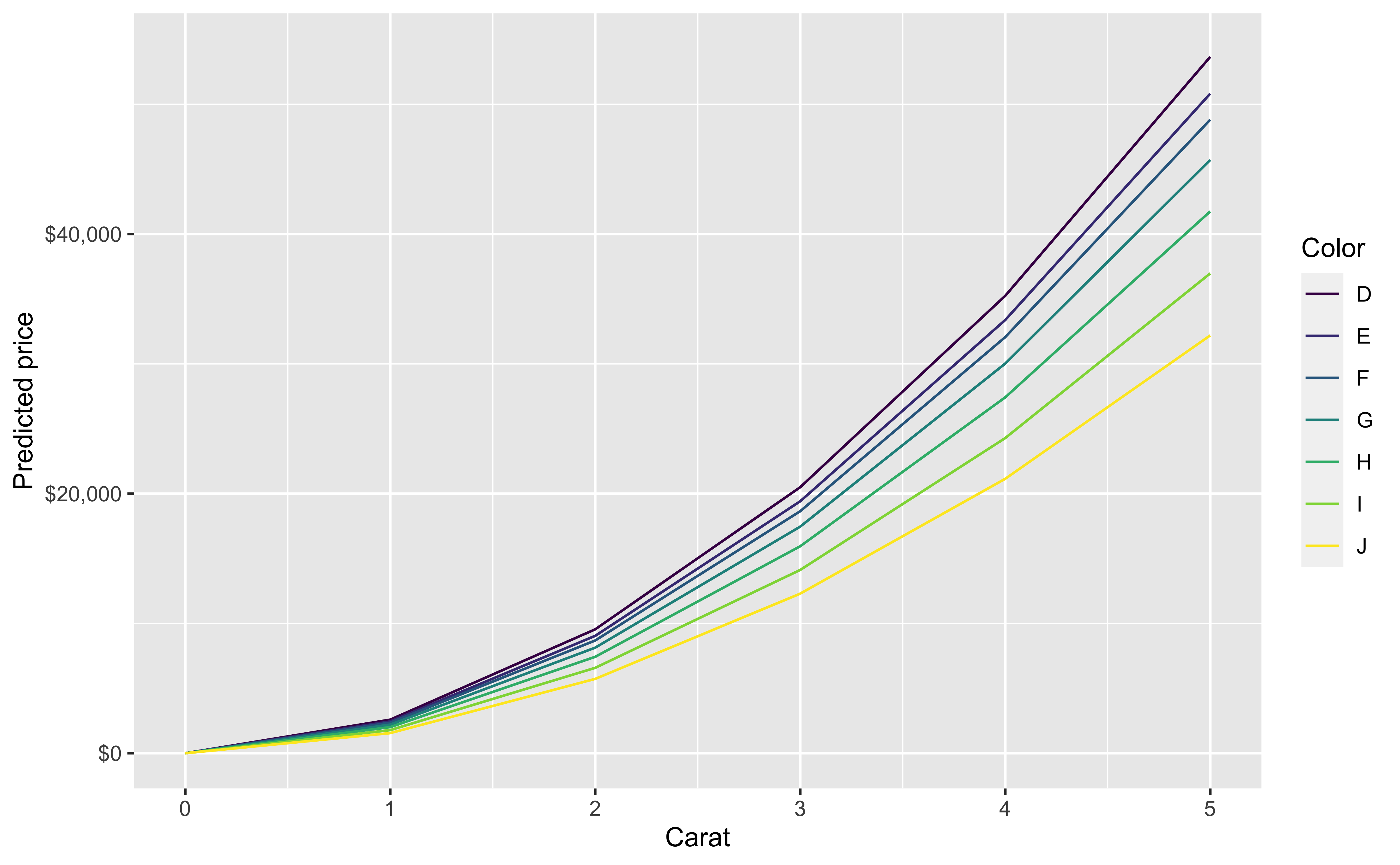
Our initial regression model will look at price as a function of carat, cut, color, clarity and depth.
You can also look at marginal effects for one variable conditional on one or more other variables
Model diagnostics
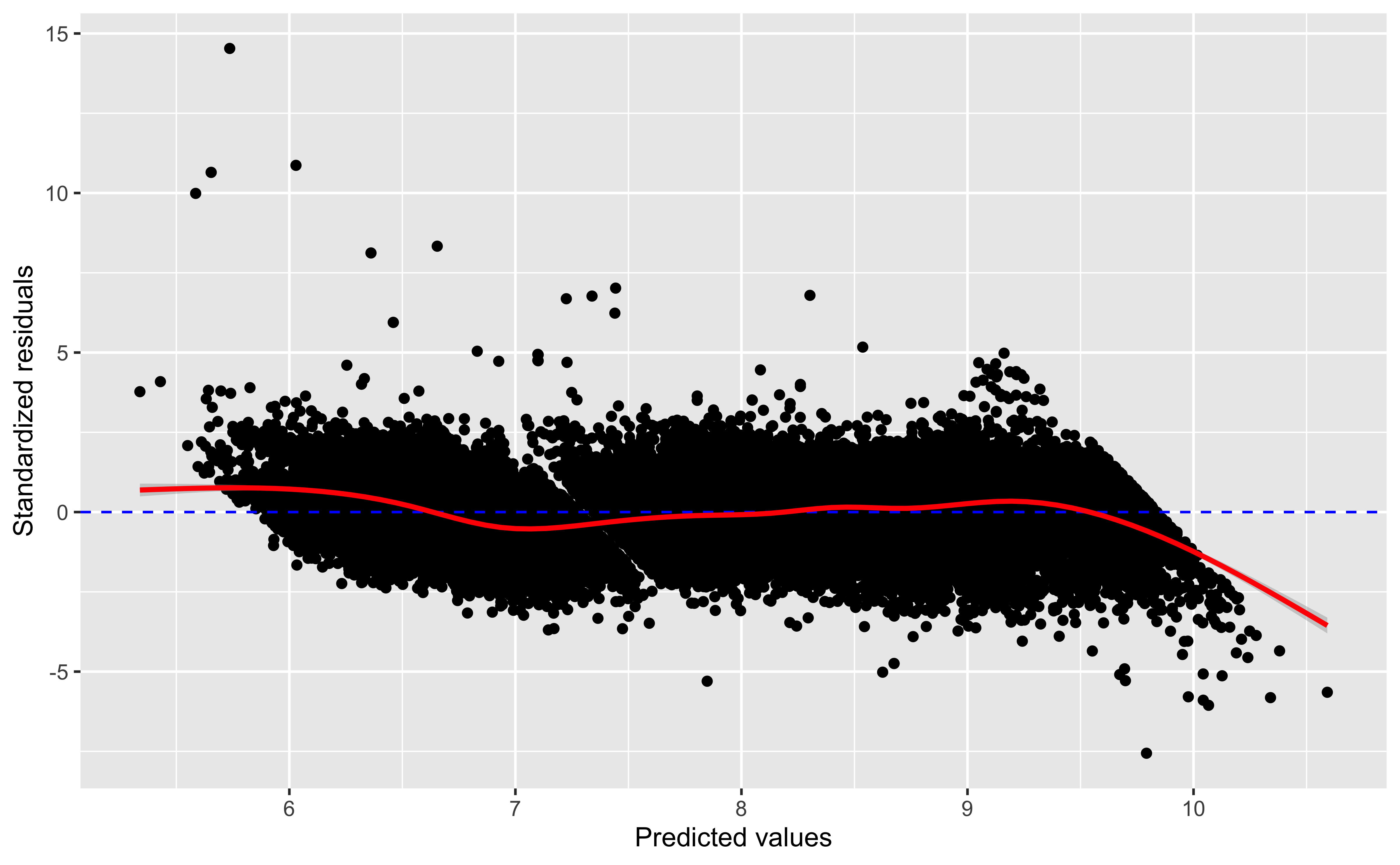
Residual plots
ggplot(mod_aug, aes(x=.fitted, y = .std.resid))+geom_point()+geom_hline(yintercept=0, linetype=2,color='blue')+geom_smooth(color='red')+labs(x='Predicted values', y ='Standardized residuals')
We expect, in well-fitting models, that the residuals are on average 0, and that they have no pattern with the predicted/fitted values
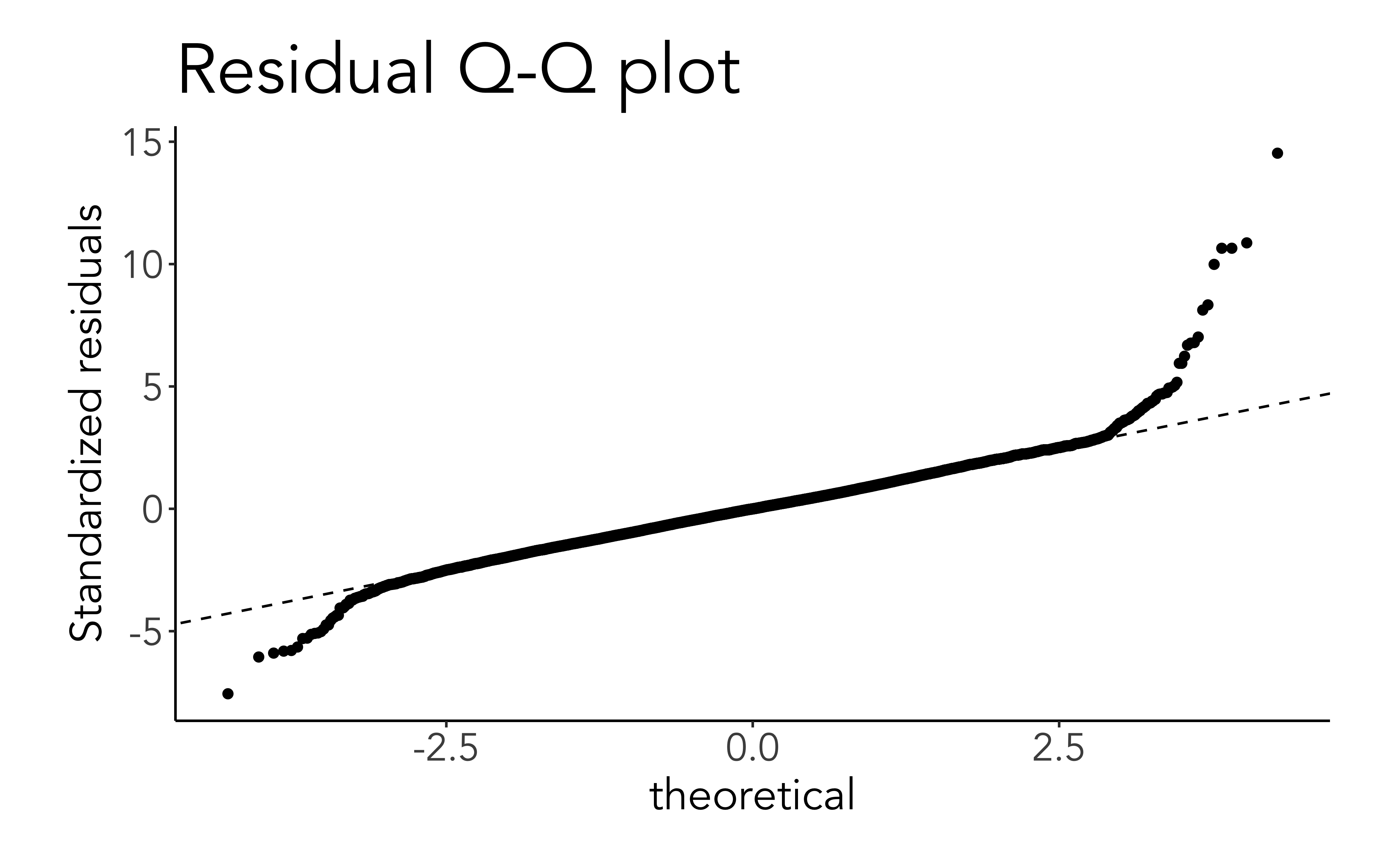
Q-Q plots for residuals
An assumption of linear (OLS) regression is that the errors are distributed as a Gaussian (normal) distribution.
This can be visually checked using a quantile-quantile (Q-Q) plot.
If the residuals follow a Gaussian distribution, this plot should be close to the diagonal line
Code
ggplot(mod_aug, aes(sample=.std.resid))+stat_qq()+geom_abline(linetype=2)+labs(title ='Residual Q-Q plot', y ='Standardized residuals')
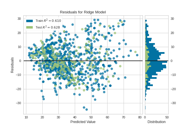
Residual plots (yellowbrick)
We can see both the pattern and histogram of residuals
Code
from sklearn.linear_model import LinearRegressionfrom sklearn.model_selection import train_test_splitfrom yellowbrick.datasets import load_concretefrom yellowbrick.regressor import ResidualsPlot# Load a regression datasetX, y = load_concrete()# Create the train and test dataX_train, X_test, y_train, y_test = train_test_split(X, y, test_size=0.2, random_state=42)# Instantiate the linear model and visualizermodel = LinearRegression()visualizer = ResidualsPlot(model, hist=False, qqplot=True)visualizer.fit(X_train, y_train) # Fit the training data to the visualizervisualizer.score(X_test, y_test) # Evaluate the model on the test datavisualizer.show() # Finalize and render the figure
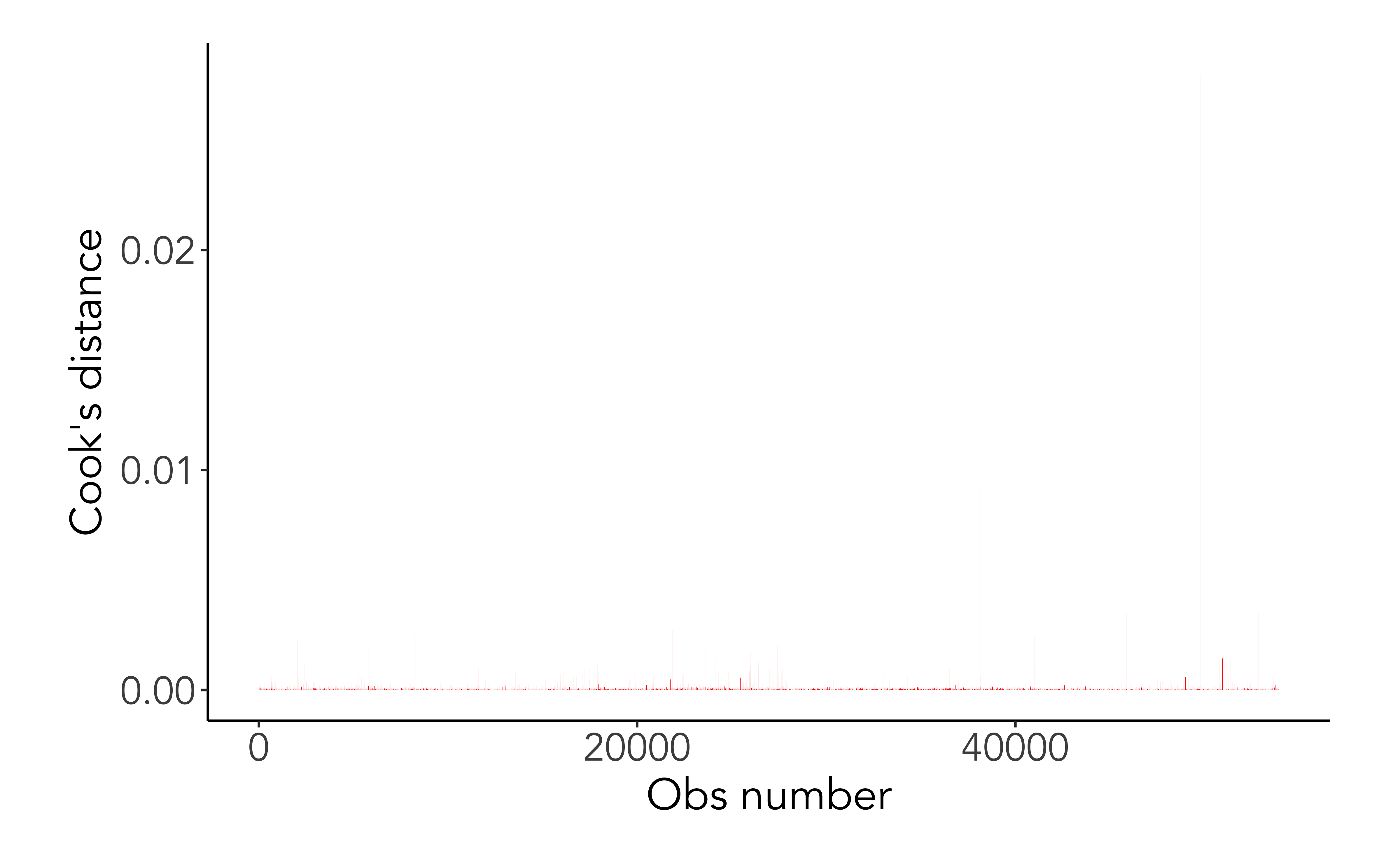
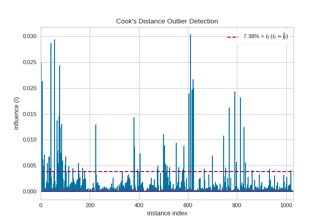
Cook’s distance
Cook’s distance or Cook’s D is a commonly used estimate of the influence of a data point when performing a least-squares regression analysis
Cook’s distance measures the effect of deleting a given observation. Points with a large Cook’s distance are considered to merit closer examination in the analysis.
ggplot(mod_aug, aes(x =seq_along(.cooksd), .cooksd))+geom_col(fill ='red') +labs(x='Obs number', y ="Cook's distance")
Code
from yellowbrick.regressor import CooksDistancefrom yellowbrick.datasets import load_concrete# Load the regression datasetX, y = load_concrete()# Instantiate and fit the visualizervisualizer = CooksDistance()visualizer.fit(X, y)visualizer.show()
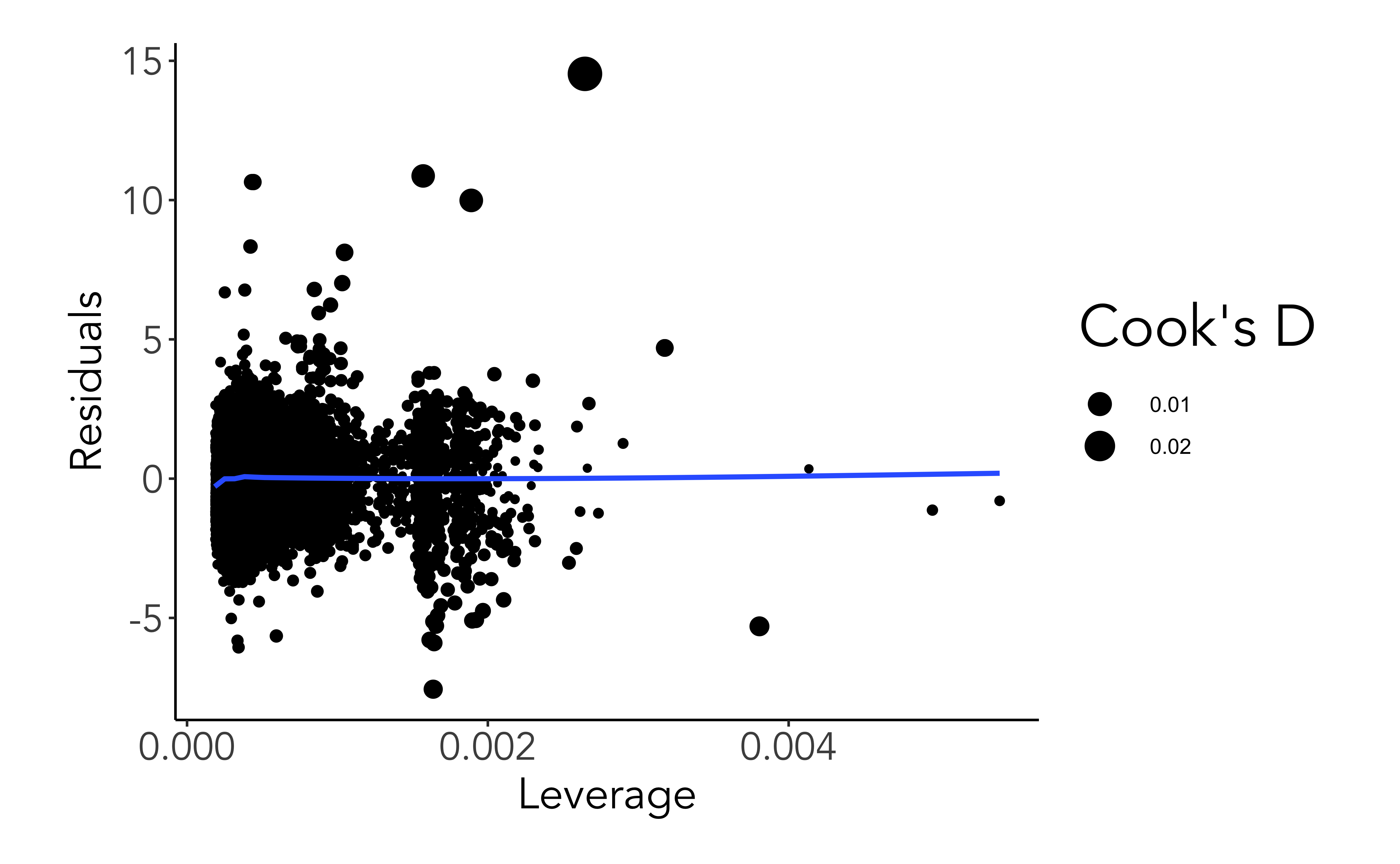
Leverage
Leverage is a measure of how far away the independent variable values of an observation are from those of the other observations.
High-leverage points are those observations, if any, made at extreme or outlying values of the independent variables such that the lack of neighboring observations means that the fitted regression model will pass close to that particular observation.
Code
ggplot(mod_aug, aes(.hat, .std.resid))+geom_point(aes(size=.cooksd))+geom_smooth(se=F) +labs(x ='Leverage', y ='Residuals', size="Cook's D")
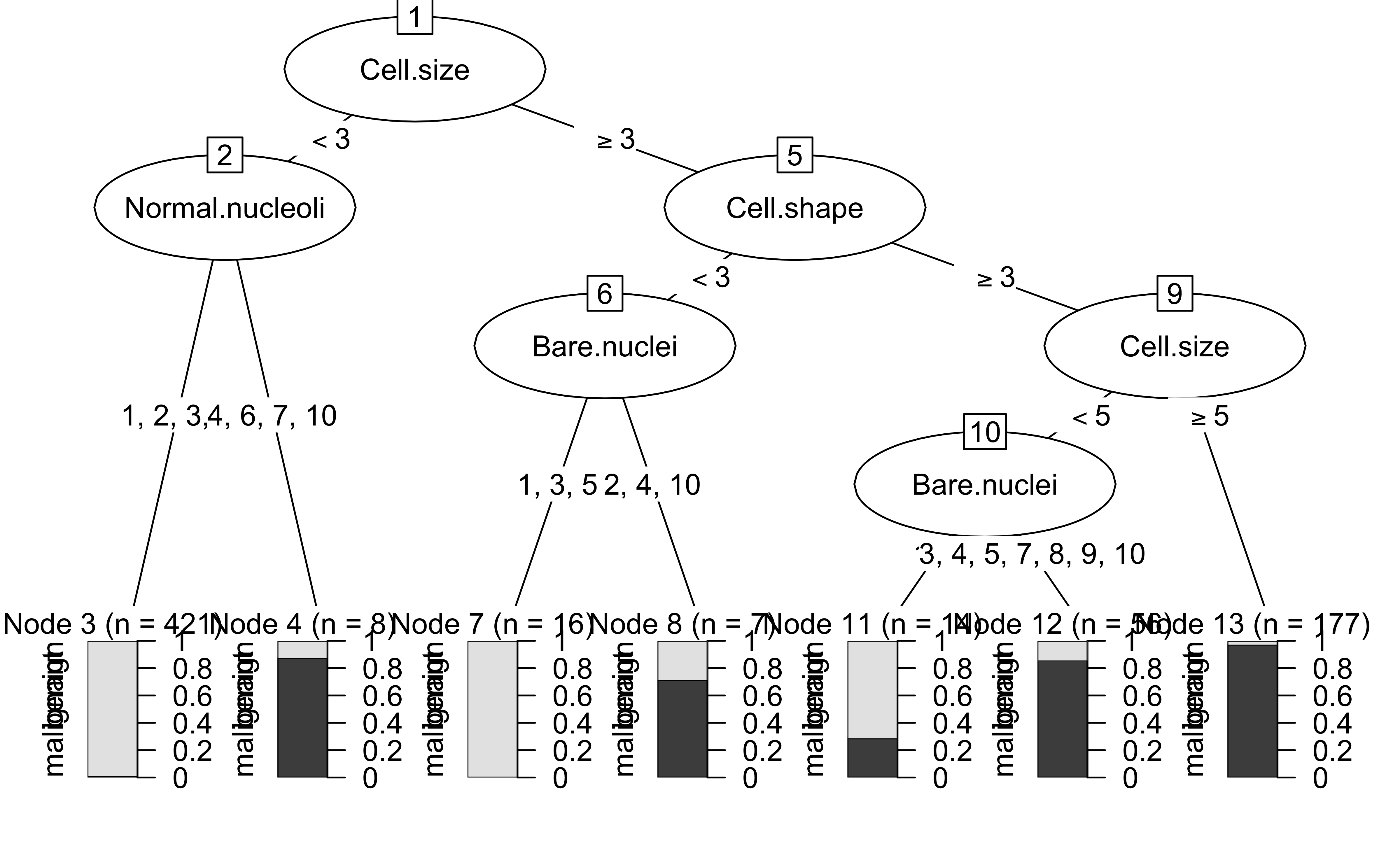
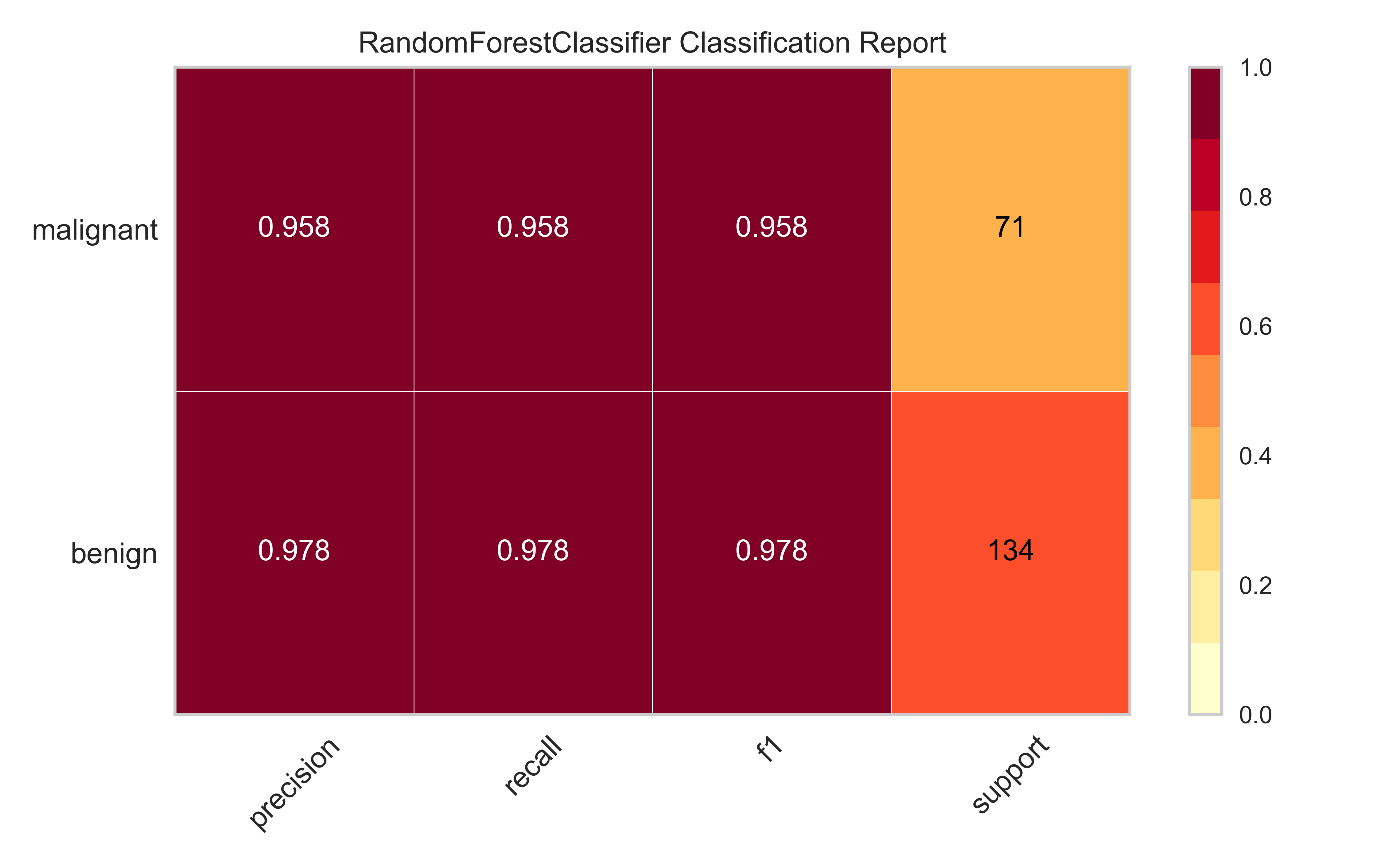
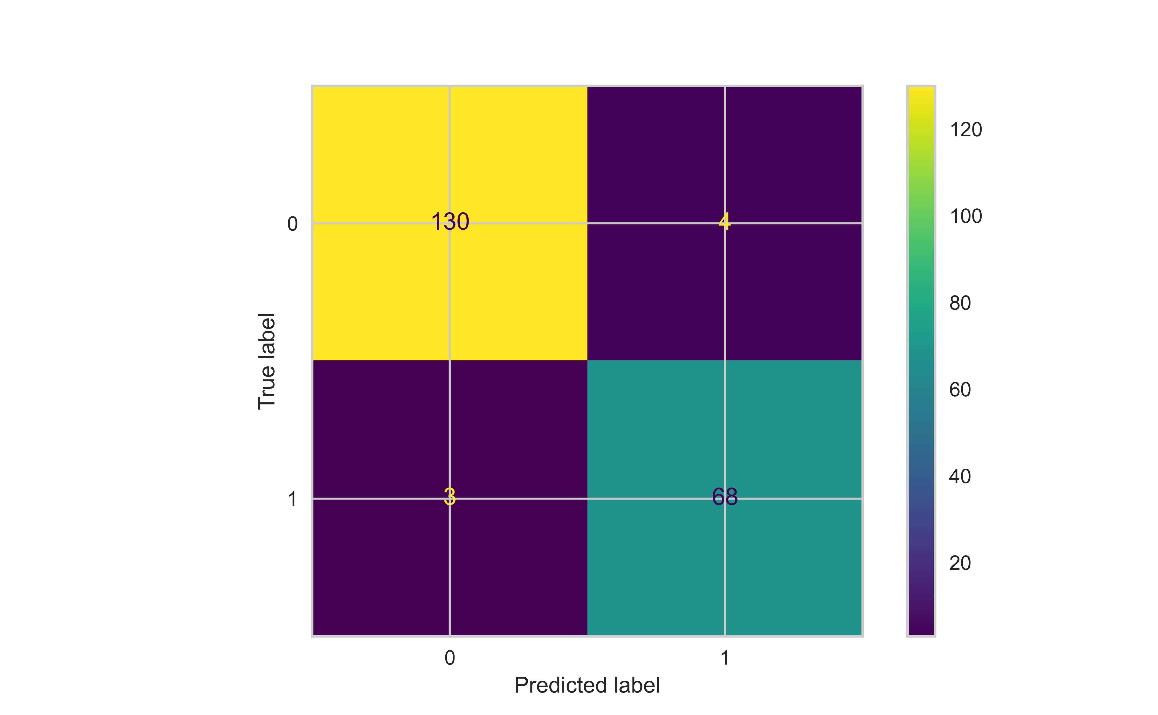
Machine learning models
Describing ML models
In this section, we will consider a classification machine learning model to predict breast cancer from various pathological variables, which is available as BreastCancer in the mlbench package in R
We will fit a Random Forest model to this data
Code
import pandas as pdimport numpy as npimport matplotlib.pyplot as pltimport seaborn as snsfrom sklearn.ensemble import RandomForestClassifierfrom sklearn.model_selection import train_test_splitfrom sklearn.metrics import ConfusionMatrixDisplay, PrecisionRecallDisplay, RocCurveDisplayfrom sklearn.inspection import PartialDependenceDisplayfrom sklearn.calibration import calibration_curvefrom yellowbrick.model_selection import FeatureImportancesbrca = pd.read_csv('ML/data/brca.csv').dropna()y = brca.pop('Class').astype('category').cat.codes.valuesX = brca.valuesrfc = RandomForestClassifier();X_train, X_test, y_train, y_test = train_test_split(X, y, test_size=0.3, random_state=44)rfc.fit(X_train, y_train);
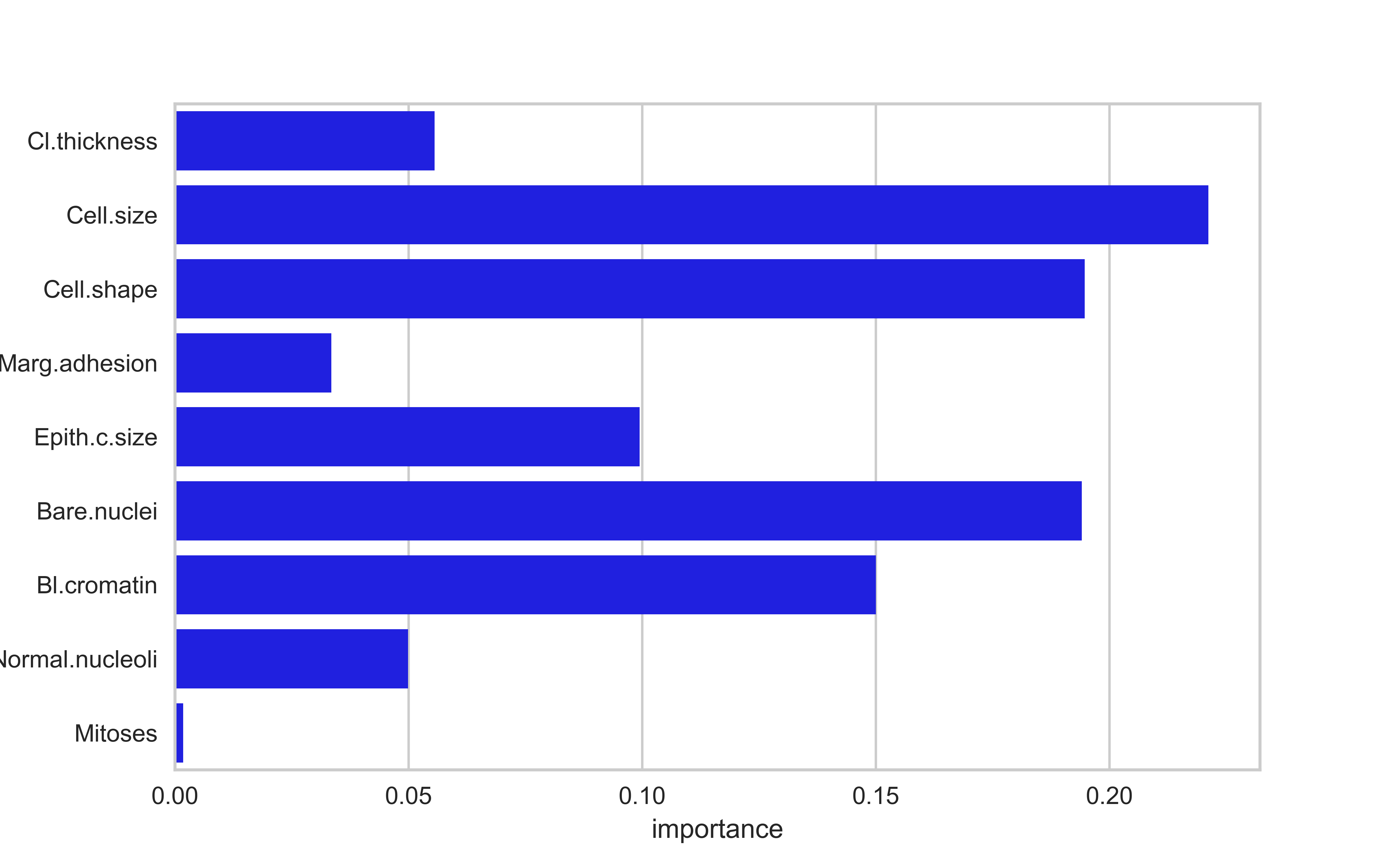
Feature importances are typically a measure of how much a predictive performance metric is reduced when the values of the a variable is scrambled (permuted). They represent the predictive power of a variable
Feature importances and p-values aren’t necessarily related; a variable can be predictive and not statistically significant and vice versa. The former depends on the size of the effect, and the latter depends on the signal-to-noise ratio
Code
fi = pd.DataFrame({'features': brca.columns, 'importance': rfc.feature_importances_})sns.barplot(data = fi, x ='importance', y ='features', color='blue')plt.show()
Feature importances
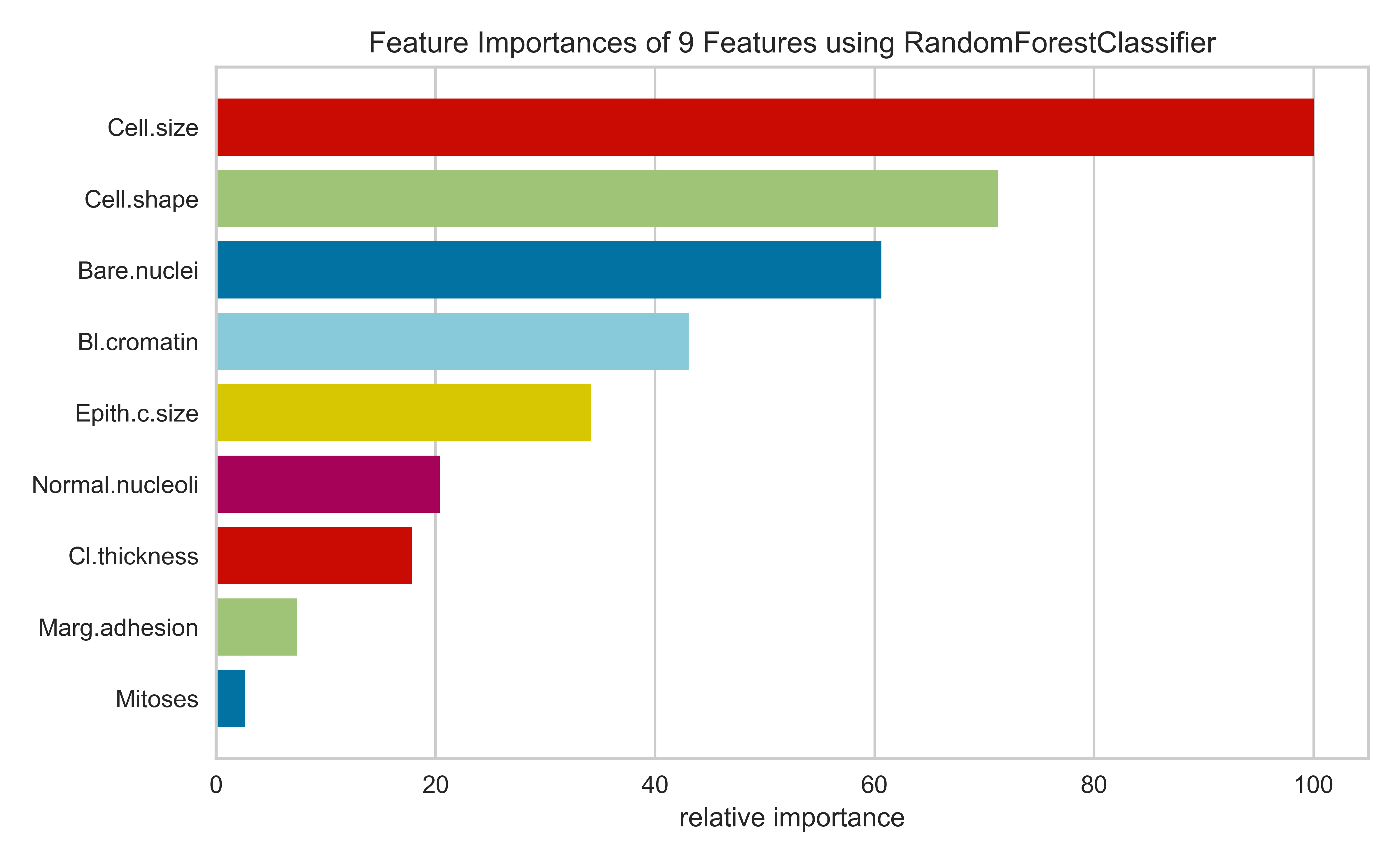
Feature importances are typically a measure of how much a predictive performance metric is reduced when the values of the a variable is scrambled (permuted). They represent the predictive power of a variable
Feature importances and p-values aren’t necessarily related; a variable can be predictive and not statistically significant and vice versa. The former depends on the size of the effect, and the latter depends on the signal-to-noise ratio
Code
viz = FeatureImportances(RandomForestClassifier());viz.fit(brca,y);viz.show();
Regularization (lasso/ridge/elastic net)
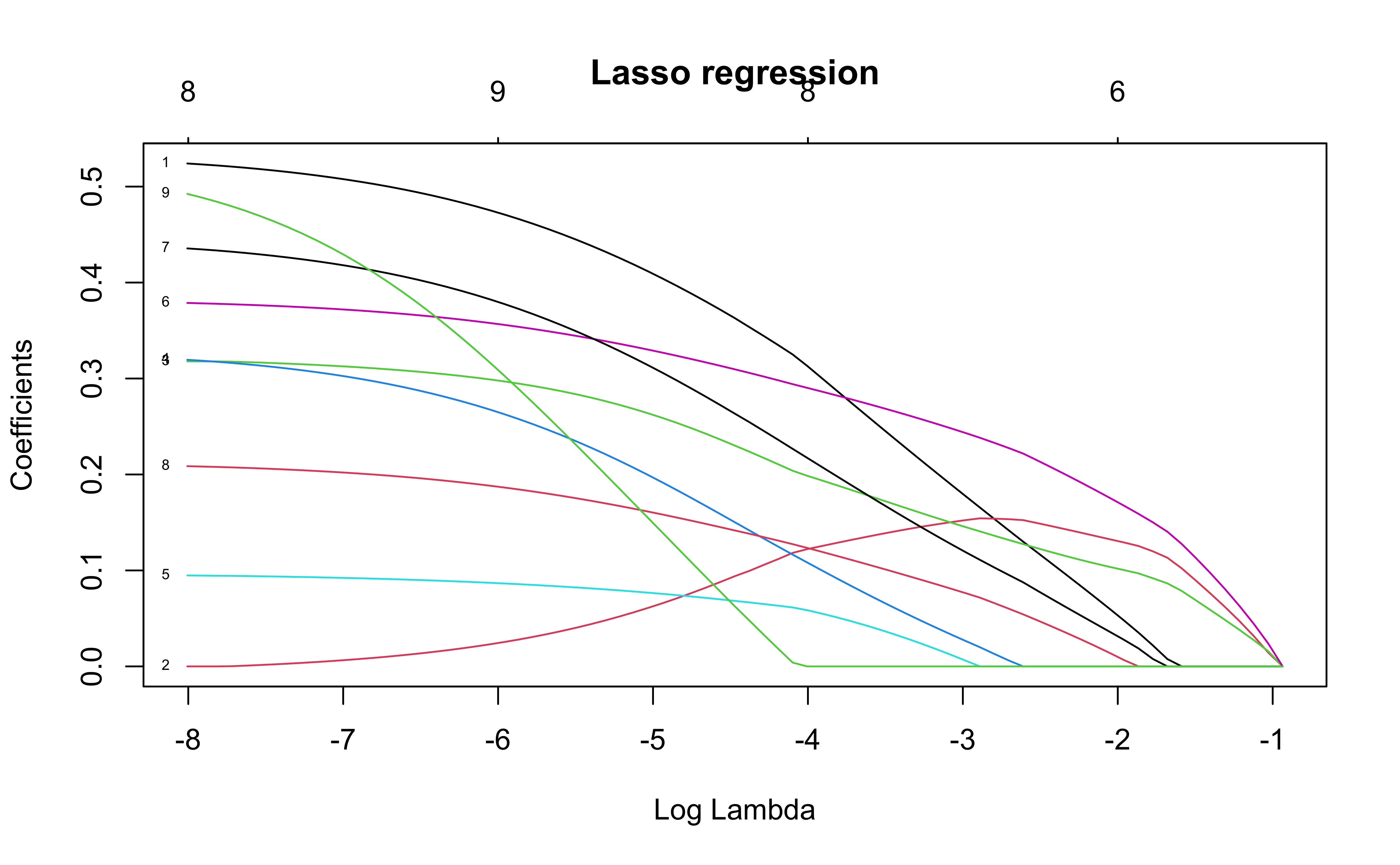
Lasso regression fits a penalized regression with \(L_1\) penalties on the coefficients. This model minimizes
\[
||y-X\beta||^2_2 + \lambda ||\beta||_1
\] where \(||x||_1 = \sum |x_i|/n\) and \(||x||_2 = \sqrt{\sum x_i^2/n}\)
This forces slope coefficients to 0 as the value of \(\lambda\) changes.
The plot shows the values of the slope coefficients for different values of \(\log(\lambda)\)
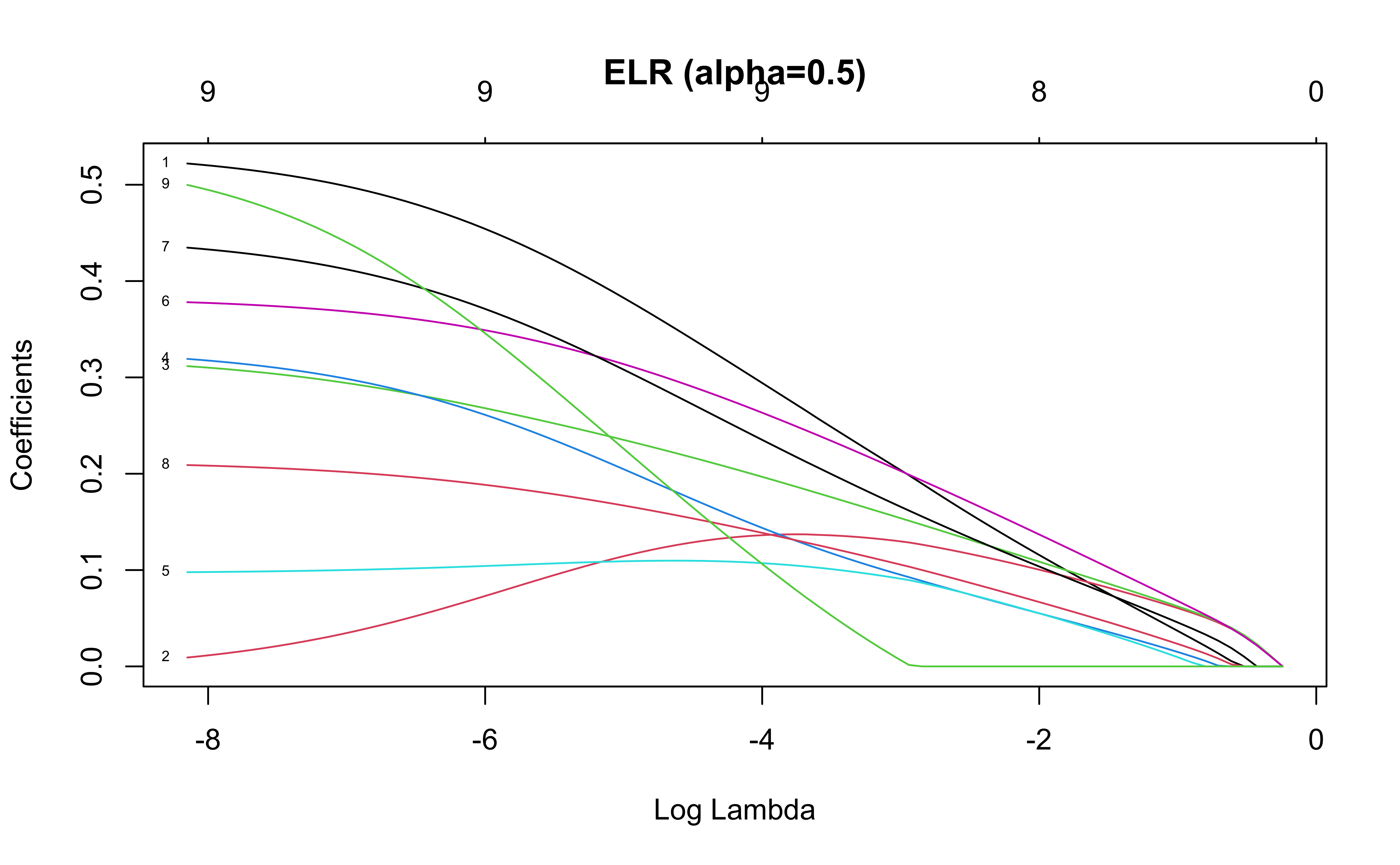
The elastic net regression (ELR) minimizes the penalized objective function
\[
||y-X\beta||^2_2 + \alpha\lambda ||\beta||_1 + \frac{(1-\alpha)\lambda}{2} ||\beta||_2^2
\] Notice that in ELR, the coefficients move to 0 at a slower rate than for lasso regression
\(\alpha=1\): Lasso regression
\(\alpha=0\): Ridge regression
Regularized regression is typically used for variable selection in regression models, where \(\lambda\) is estimated via cross-validation
Note that the actual coefficients are provably biased, so they are not interpreted.
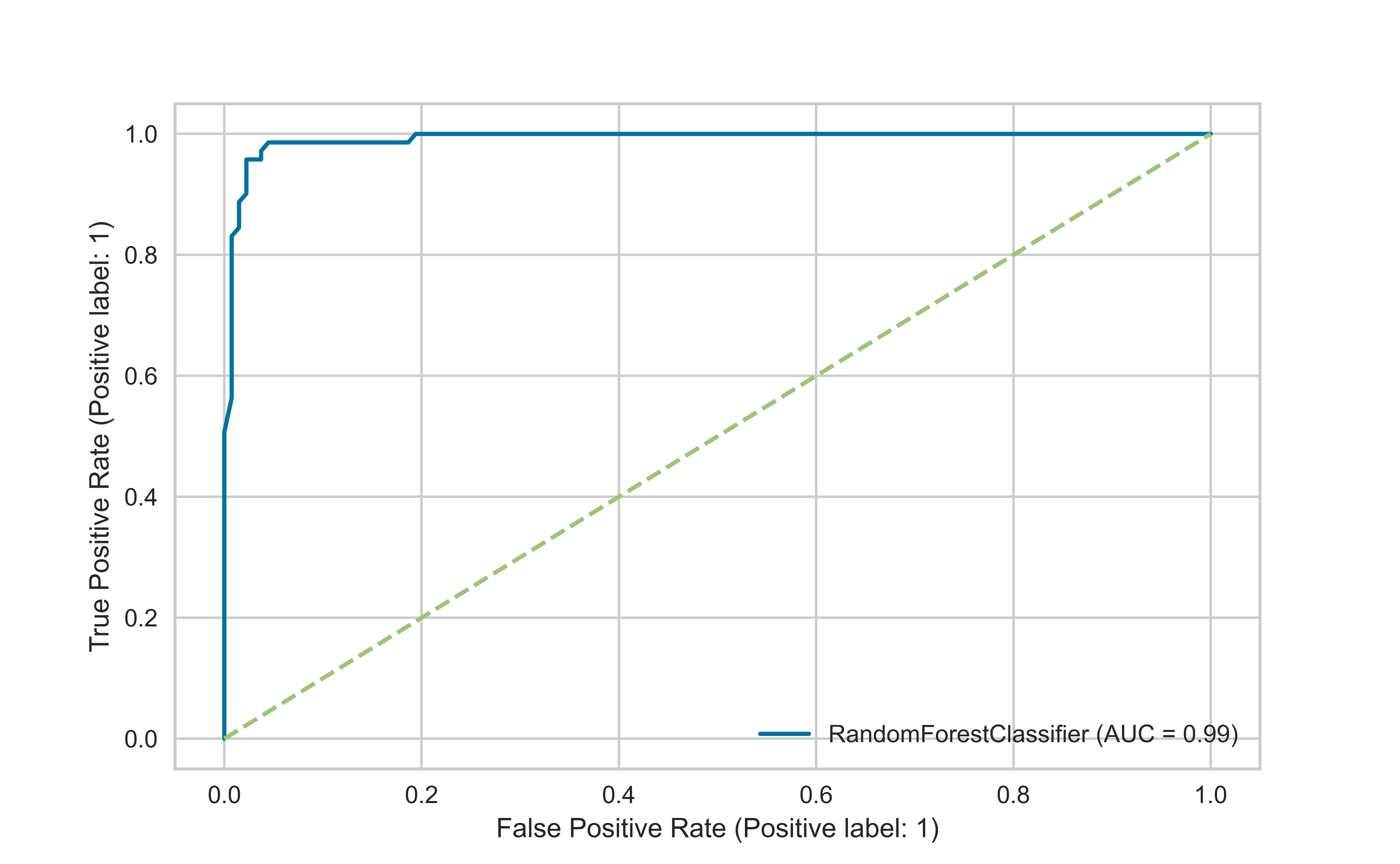
A receiver operating characteristic (ROC) curve is a graphical plot that illustrates the diagnostic ability of a binary classifier system as its discrimination threshold is varied.
The ROC curve is created by plotting the true positive rate (TPR) against the false positive rate (FPR) at various threshold settings. The true-positive rate is also known as sensitivity, recall or probability of detection in machine learning. The false-positive rate is also known as probability of false alarm and can be calculated as (1 − specificity).
A classifier no better than chance will have a ROC curve along the unit diagonal
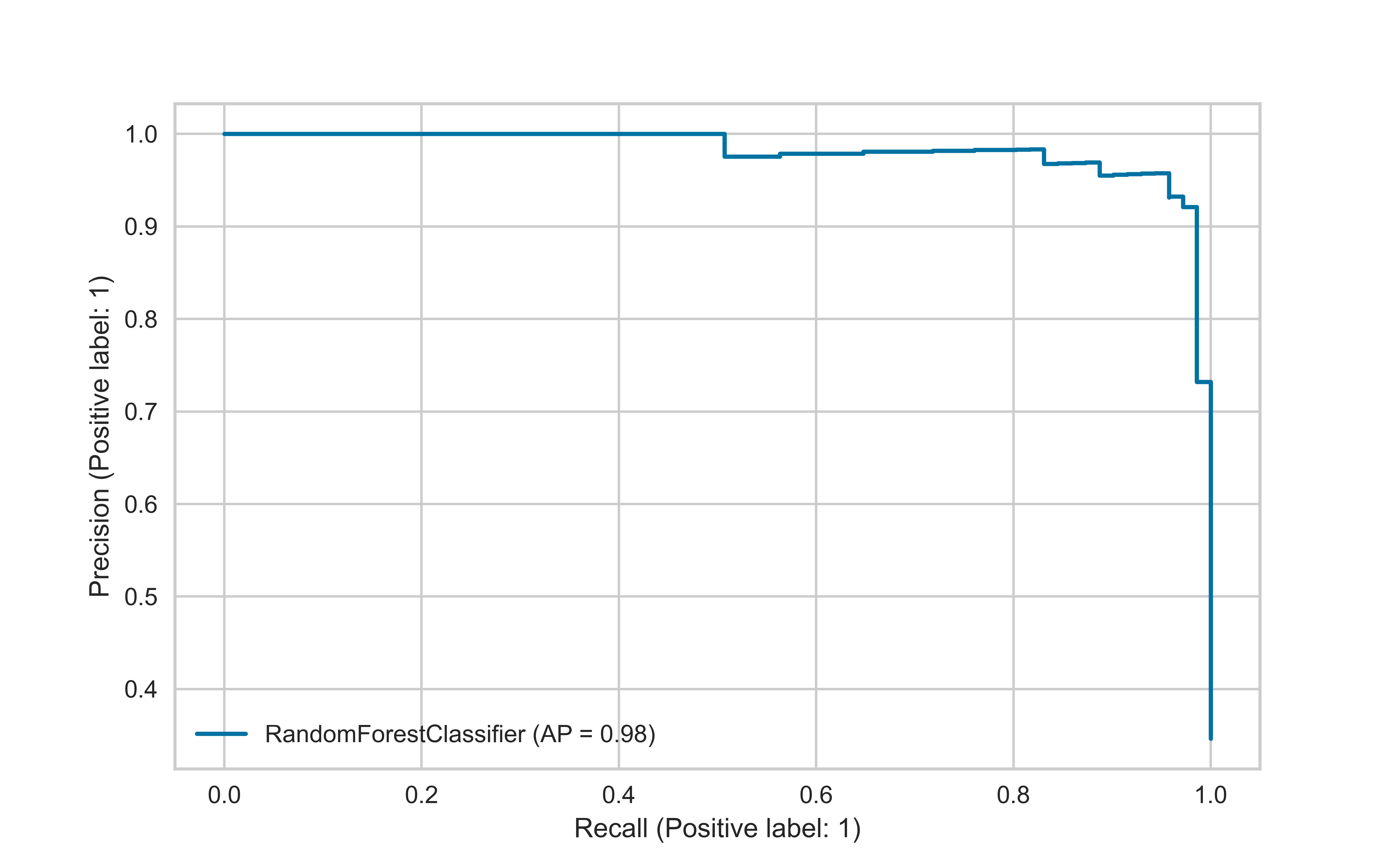
The precision-recall curve is used for evaluating the performance of binary classification algorithms. It is often used in situations where classes are heavily imbalanced.
A “good” classifier will have high precision and high recall throughout the graph, to be close to the upper right corner
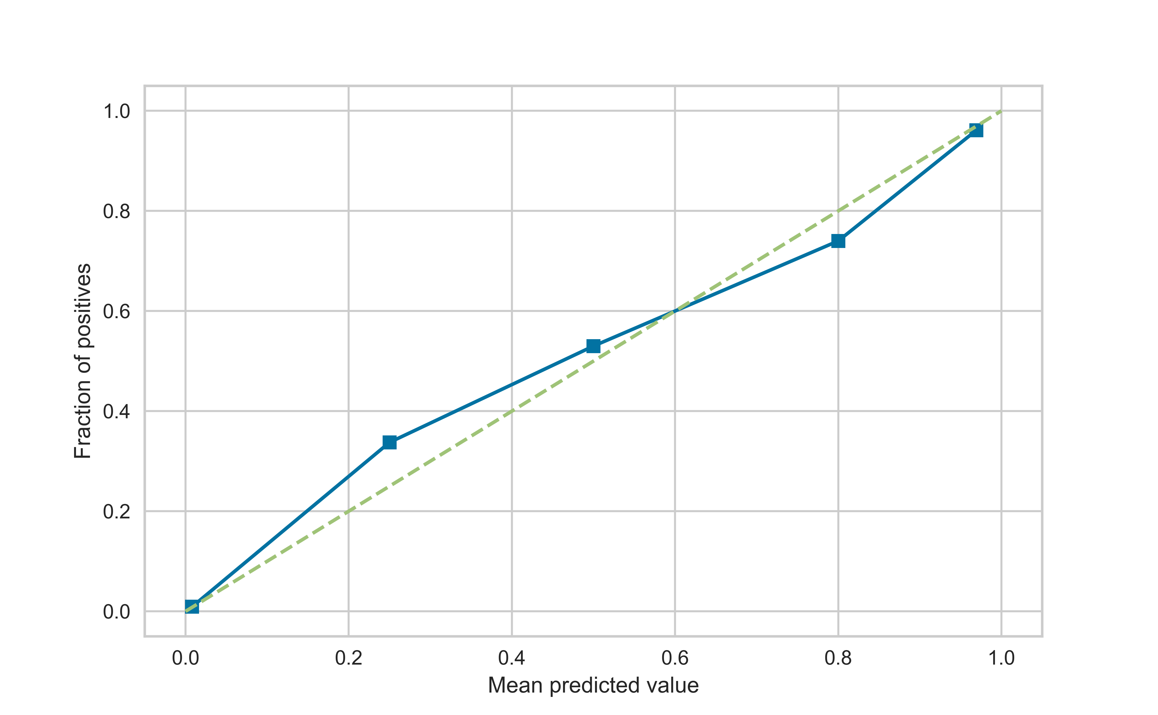
We can predict the probability that an individual is a member of a class, rather than the predicted class. One property of the learning methods we can then assess is calibration.
Calibration curves are used to evaluate how calibrated a classifier is i.e., how the probabilities of predicting each class label differ. We bin the data, and for each bin we compute the average predicted probability (x-axis) and the proportion of positives (y-axis).
We expect bins with low proportion of positives to also have low average probability of being in the positive class, and vice versa
Code
from sklearn.calibration import calibration_curvec1,c2 = calibration_curve(y_test, rfc.predict_proba(X_test)[:,1])plt.plot(c1,c2, 's-')plt.plot([0,1],[0,1],'--')plt.xlabel('Mean predicted value')plt.ylabel('Fraction of positives')plt.show()
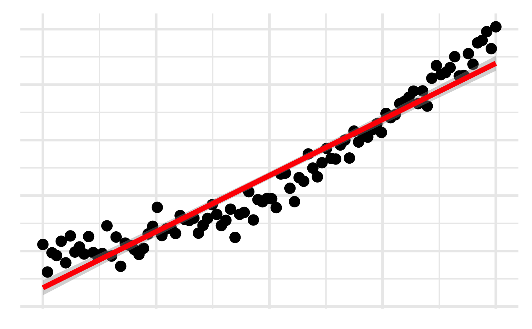
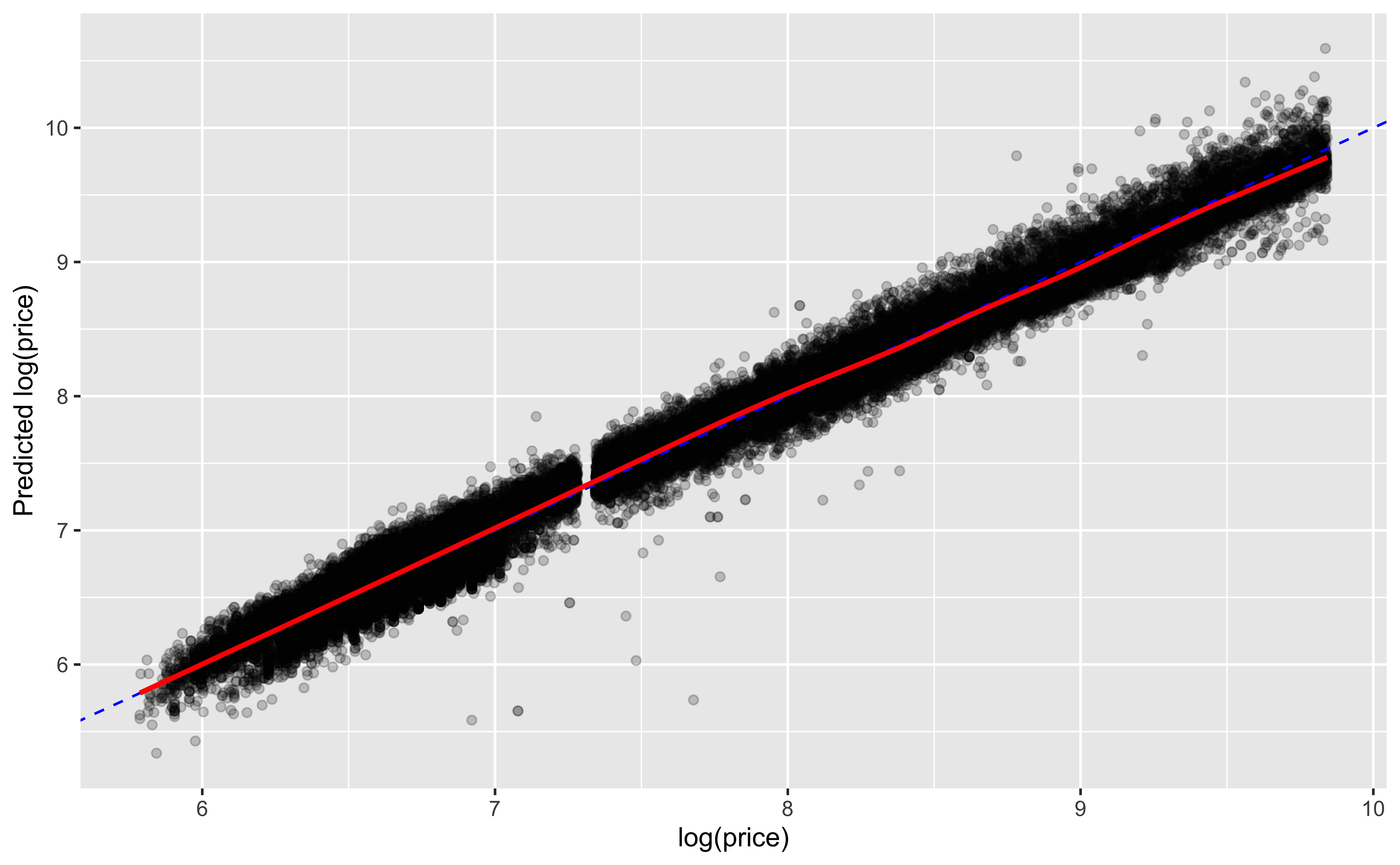
Prediction vs actual
This plot works well for continuous outcomes
We can see how well our predictions match the actual data
Code
ggplot(mod_aug, aes(x =`log(price)`, y = .fitted))+geom_point(alpha=0.2)+geom_abline(color='blue', linetype=2)+geom_smooth(color='red')+labs(y ='Predicted log(price)')
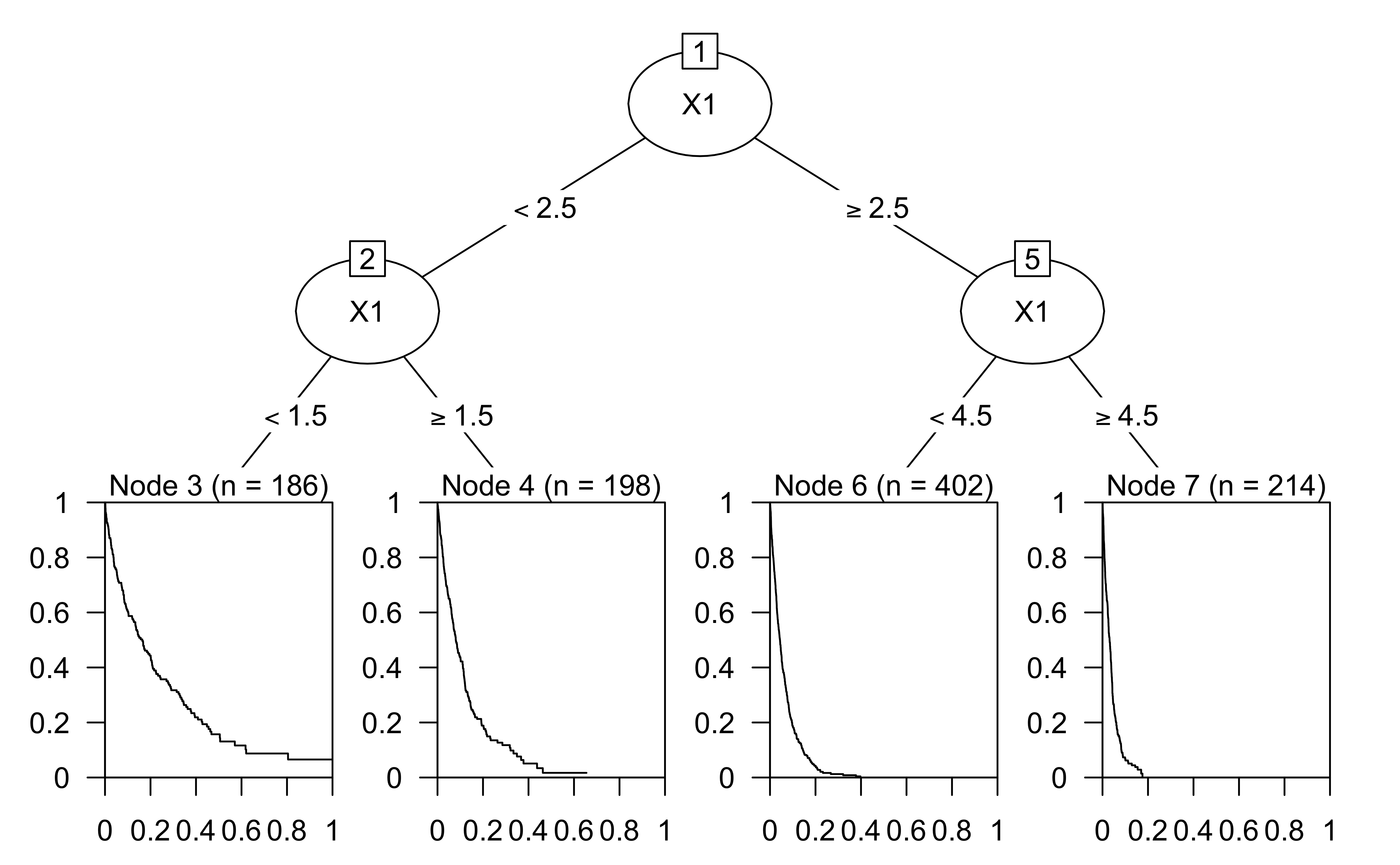
Survival/reliability models
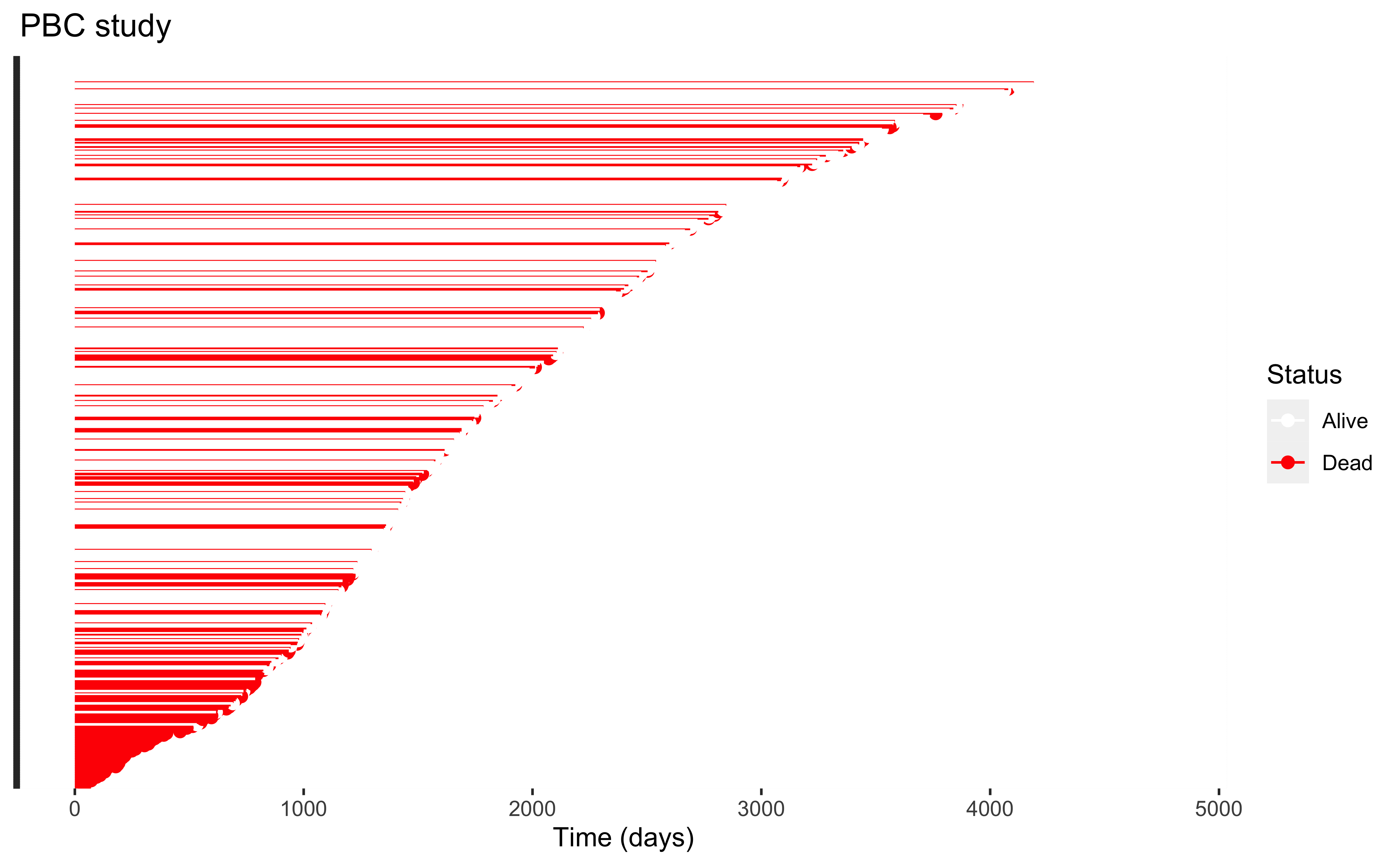
Lifetime plots
Survival analysis methods can be applied to a variety of domains:
Difference in death rate between two treatments
Failure rate of machines
Customer churn
Survival data is characterized by censoring, i.e. when an individual is lost to followup while still “alive”, and is assumed to be independent of “failure” (violations of this assumption requires different methods)
This plot looks at how long we followed each individual and whether they failed (red) or were censored (white) the last time we saw them
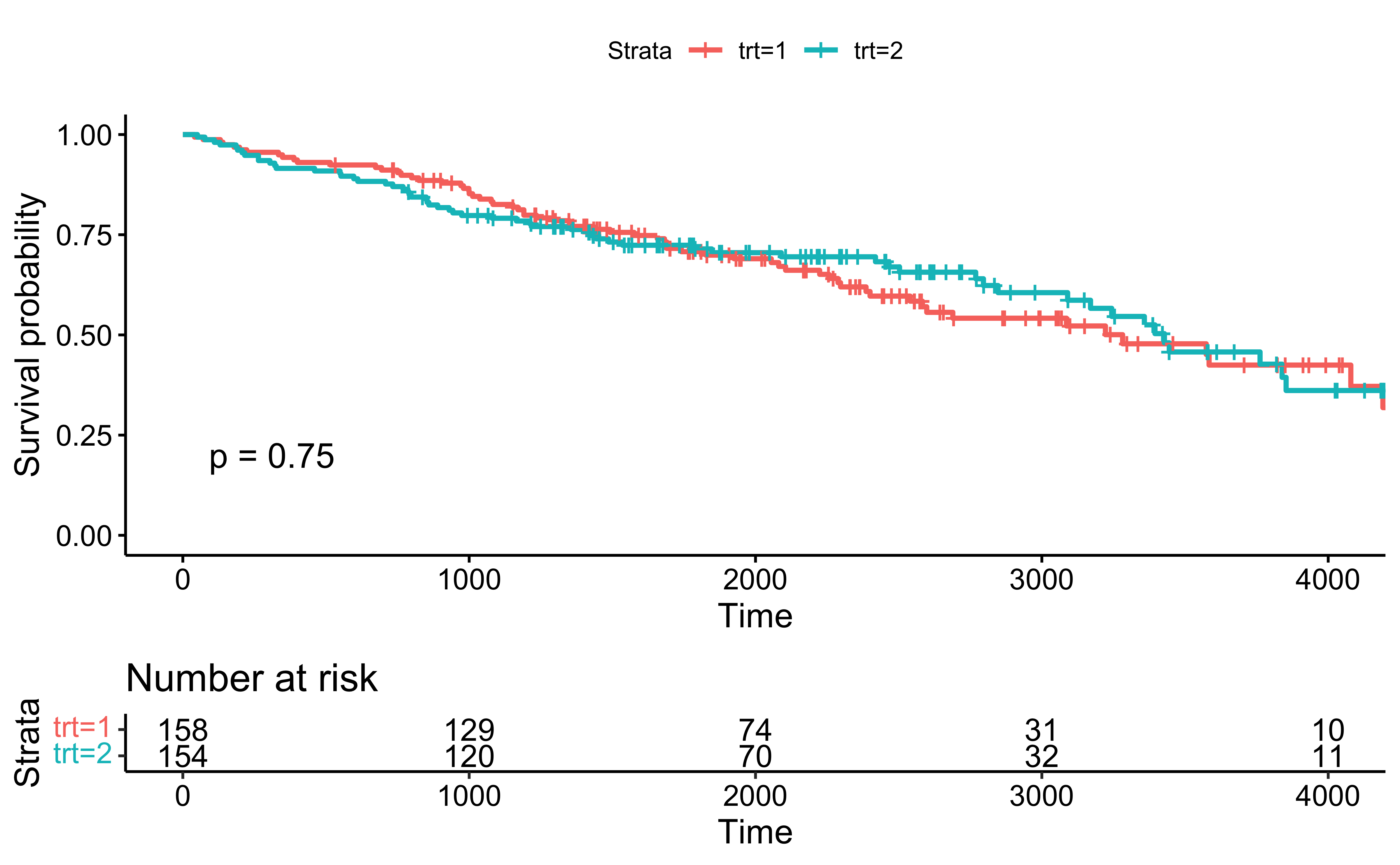
The Kaplan-Meier estimator is used to estimate the survival function \(\Pr(T > t)\), where \(T\) is the time to failure.
The visual representation of this function is usually called the Kaplan-Meier curve, and it shows what the probability of failure is at a certain point of time.
From the plot, at 1000 days, about 75% of patients are expected to survive.
Code
fit <-survfit(Surv(time, status==2)~trt, data=pbc)survminer::ggsurvplot( fit,data=pbc,pval = T, risk.table=T)