Abhijit Dasgupta, Jeff Jacobs, Anderson Monken, and Marck Vaisman
Georgetown University
Spring 2024
Agenda and Goals for Today
Lecture
Interaction providing a multi-dimensional view of the data
The purpose is to add context and understanding, primarily
Change the viewpoint
Look at subsets and linkages (filter, select, link)
Compare across visualization types and encodings
Providing users a modicum of control
Control structures
Linking multiple graphs (brushing/filtering)
Thematic elements and customization
Utilizing CSS via JS
Adding annotations, changing idioms
Lab
The coffee dataset to explore interactive visualizations
Discussing different decision choices to improve visualizations
A static multi-viewpoint approach
We’re quite familiar with this
facets, scatterplot matrices
layered graphics
This can get quite muddy, depending on how many things we’re trying to compare
This typically shows aggregate or overall patterns, which can be misleading
We can’t separate out individual observations from the whole
We can’t see the which points correspond to the same observations
Making sense in a cluttered visualization
Code
library(plotly)data(txhousing, package ="ggplot2")tx <-highlight_key(txhousing, ~city)base <-plot_ly(tx, color =I("black")) %>%group_by(city)time_series <- base |>group_by(city) |>add_lines(x =~date, y =~median) |>layout(title ="Housing prices in Texas",xaxis =list(title =""),yaxis =list(title ="Median house price ($)"),width =800,height=500 )highlight( time_series,on ="plotly_click",selectize=TRUE,dynamic=TRUE,persistent=TRUE)
We had seen this spaghetti plot earlier. We can use interactivity to select particular trajectories and identify the corresponding cities. We’ll see the reverse in a bit, when we can filter the cities to highlight them.
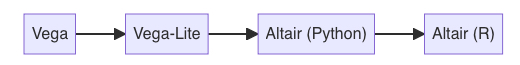
Vega-Lite/Altair work better with linked plots and some interactions
Note that you might be better directly dealing with Vega-Lite, since Altair imposes a somewhat artificial limit on the number of rows in your dataset
Interactivity and multiple views
A graphic is not ‘drawn’ once and for all; it is ‘constructed’ and reconstructed until it reveals all the relationships constituted by the interplay of the data. The best graphic operations are those carried out by the decision-maker themselves.
– Jacques Bertin
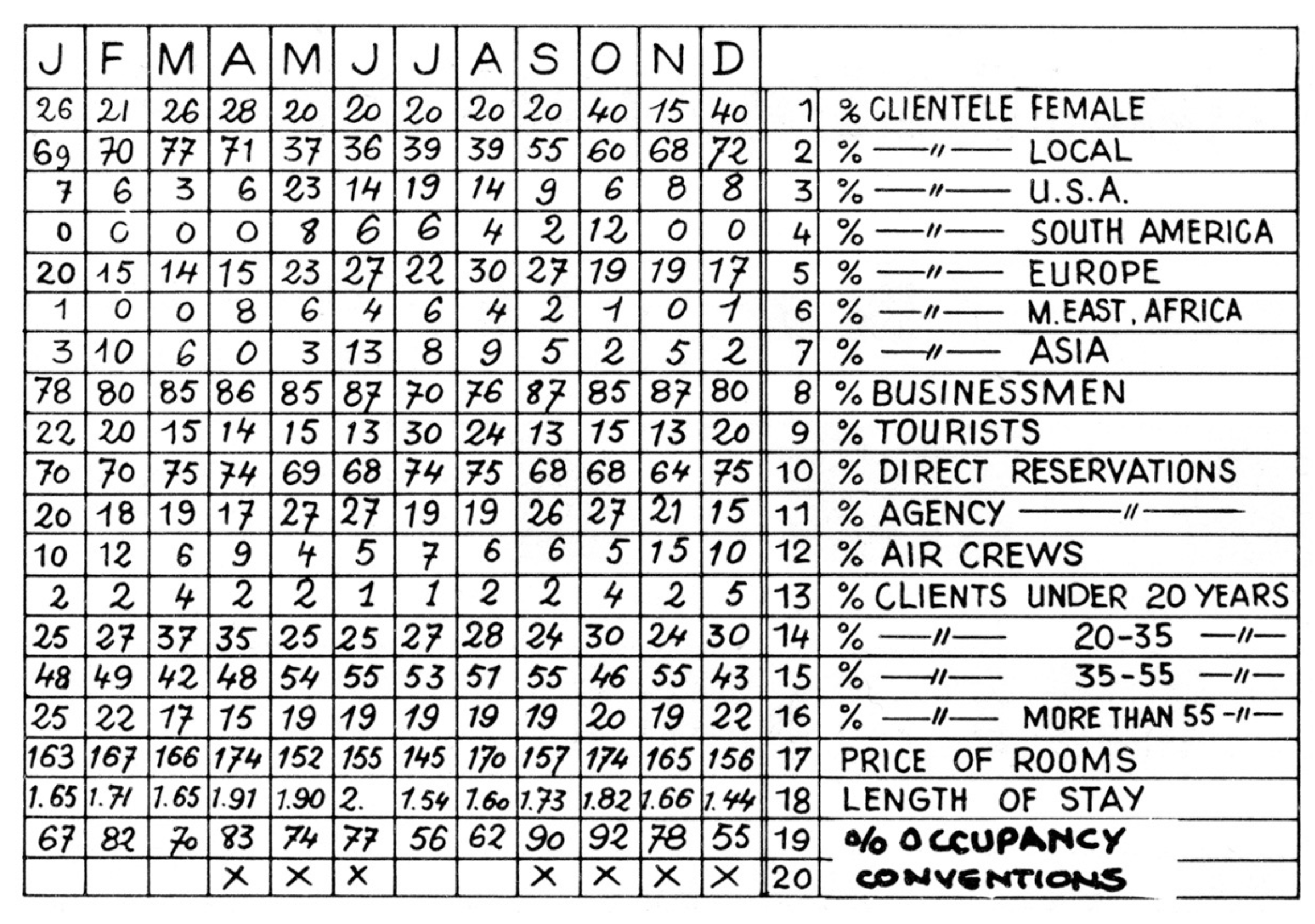
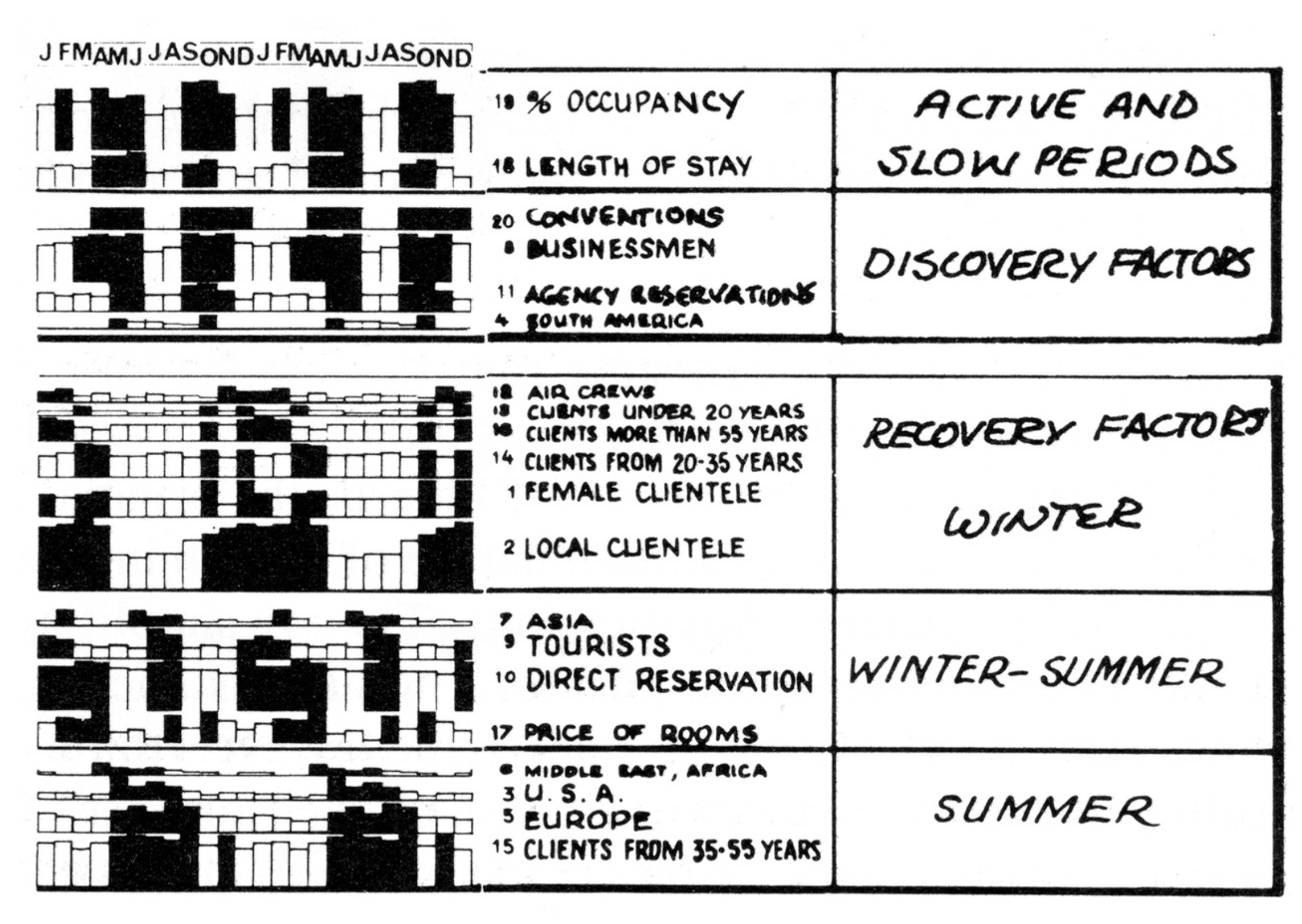
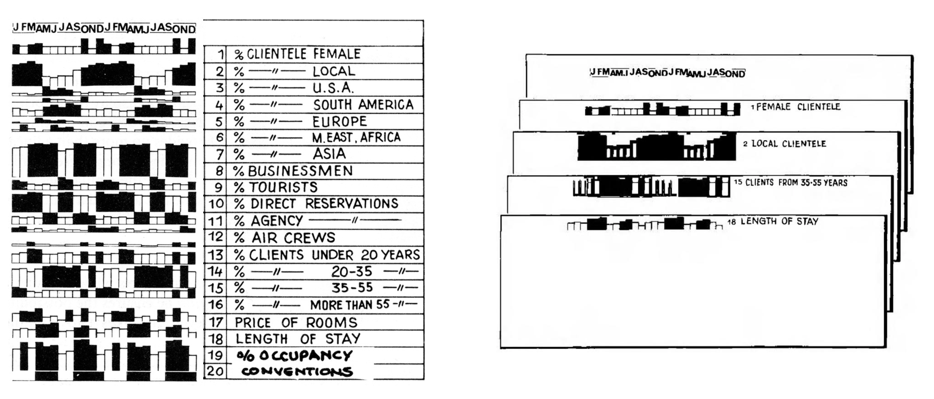
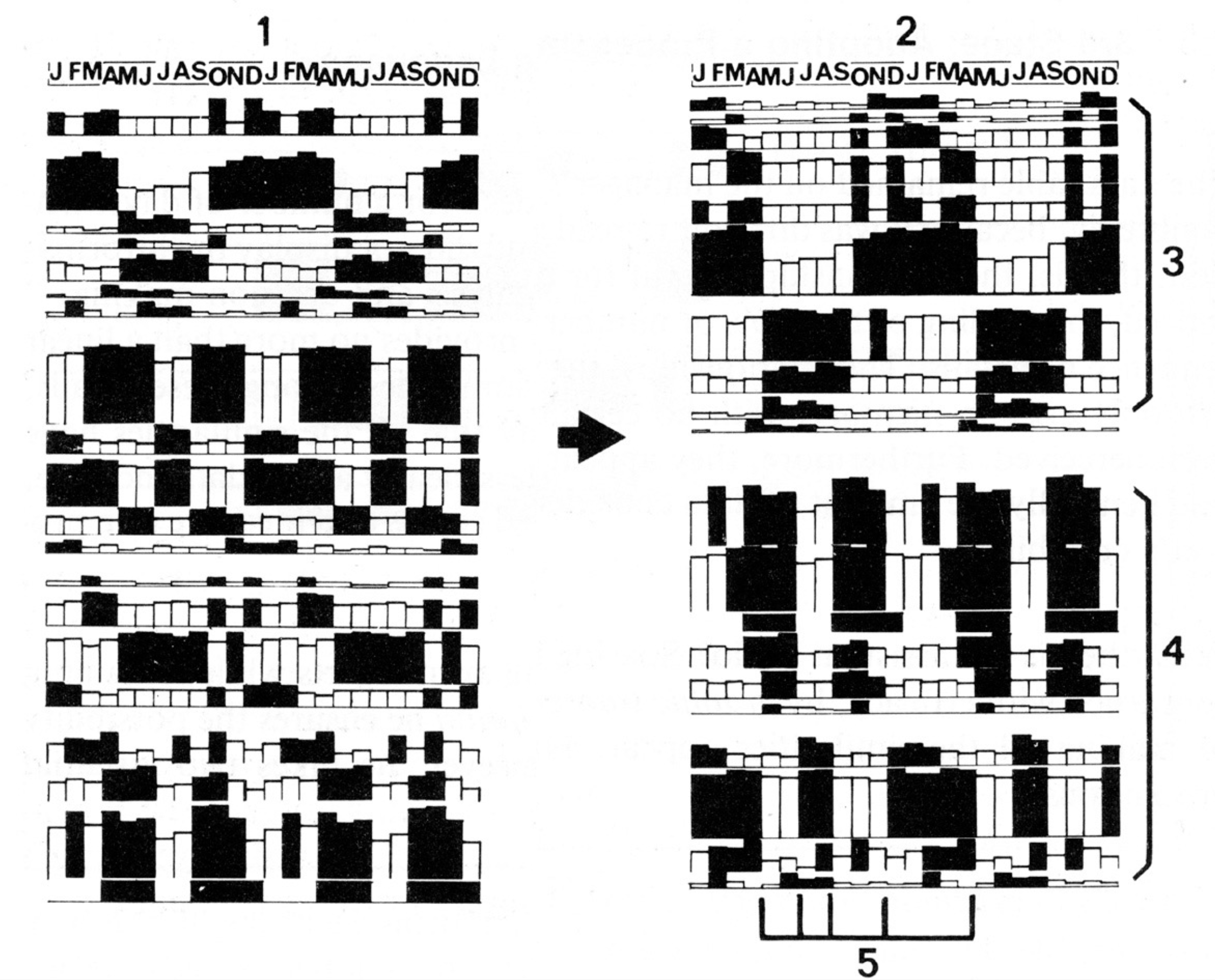
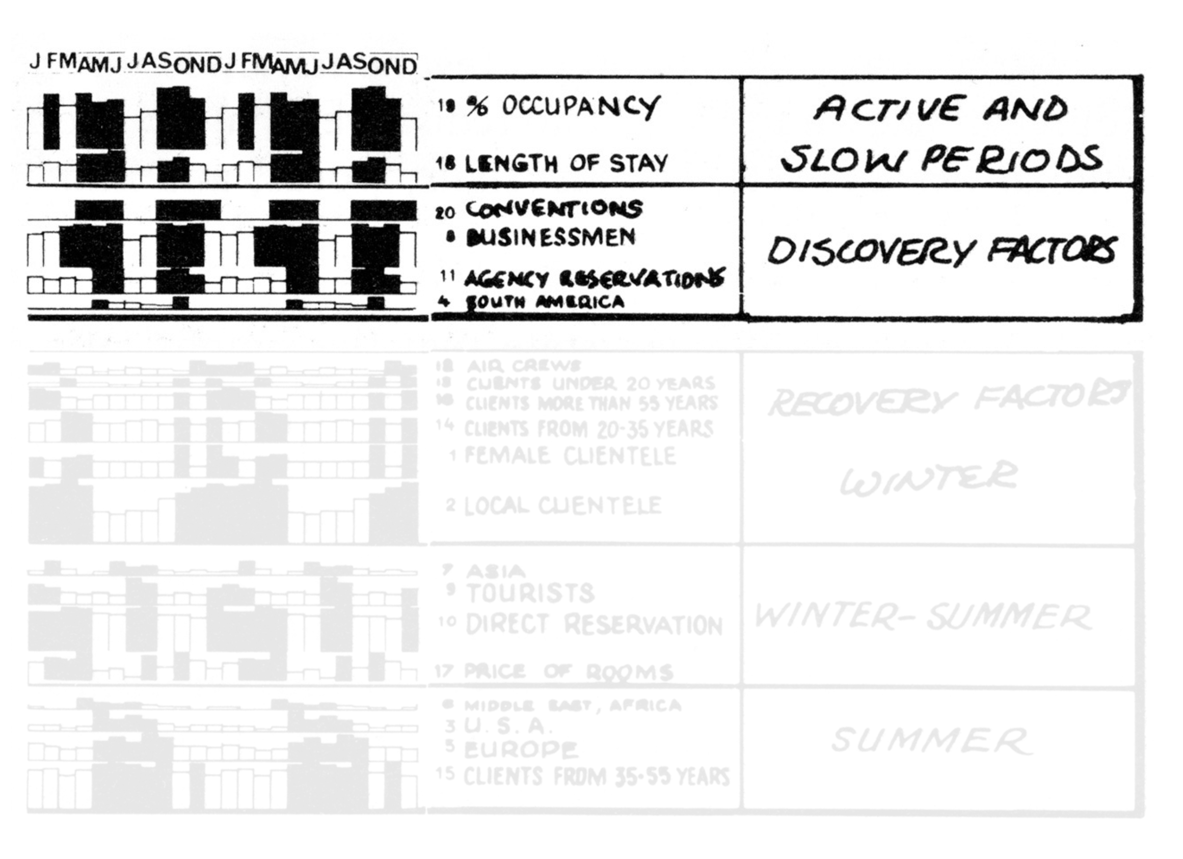
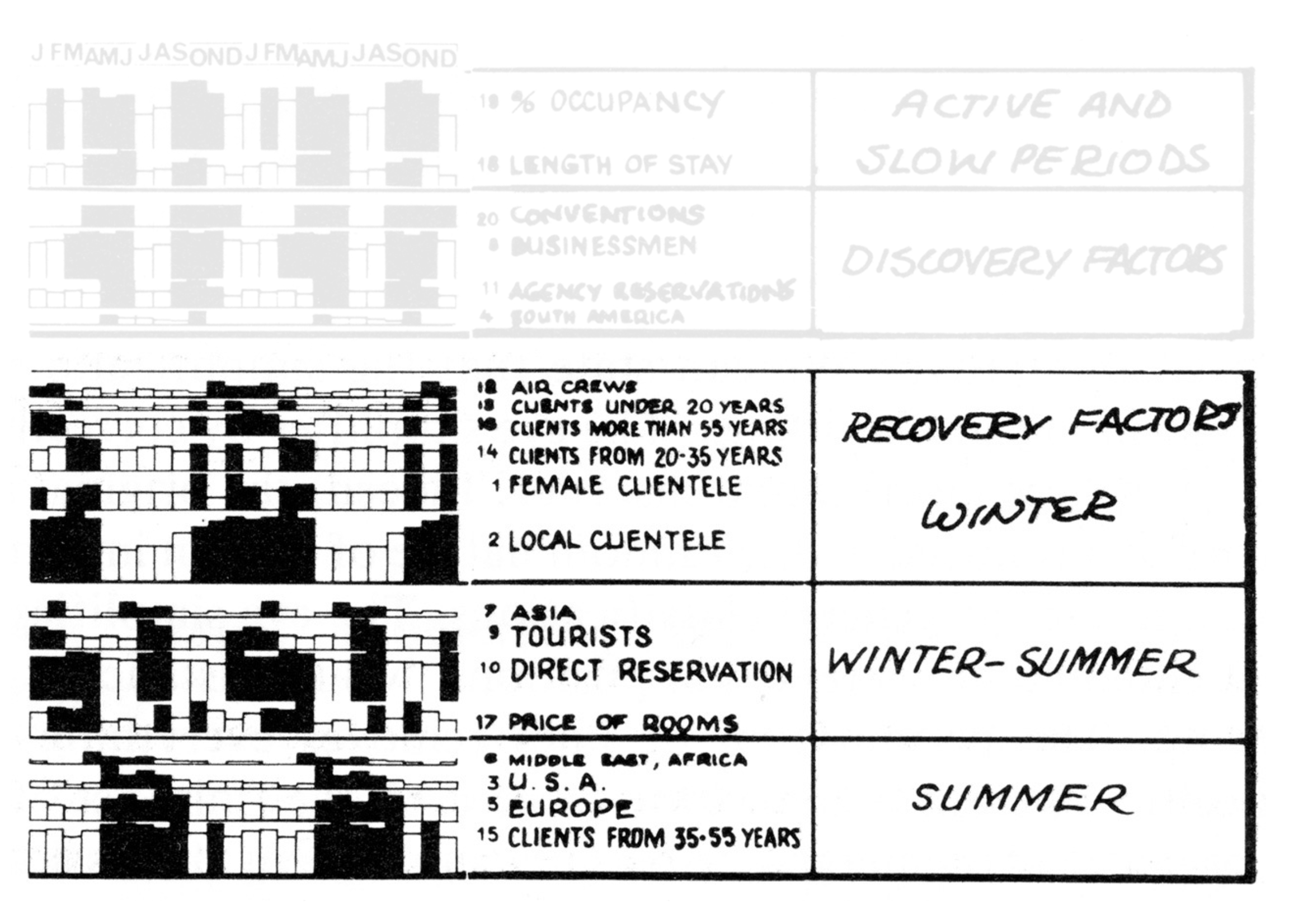
Hotels and multiple views
Hotels and multiple views
Hotels and multiple views
Hotels and multiple views
Re-arrange views to make sense …
and interpret
and interpret
Aspects of change
Change the idioms
Change parameters for idioms
Ordering or choice of spatial arrangement
Using different visual channels
color, size, shape, orientation, etc.
Level of aggregation
Data partitions
Zooming in and out
Note
There is a large variety of attributes that you can change in a visualization. The choice of which to change depends on the data and the story you want to tell. We also consider the transition effects from one choice to the next, to make the transitions less jarring
Multiple views and interactivity
Recall the three blind men and the elephant
You’re trying to shift your viewpoint (your camera, so to speak) so that you can get different and perhaps more complete views of your data
Data today is sufficiently rich and complex that a single view cannot do it justice. You either miss things or make things so cluttered that discerning detail becomes impossible
Reordering or sorting the data appropriately can give us insights into different patterns. This is especially true for categorical data
“The power of reordering lies in the privileged status of spatial position as the highest ranked visual channel”
However, you do want to still maintain the sanctity of the observation
We’re really interested in relationships between observations
We’ll see how filtering, brushing and linking allows this to happen
It is built on D3.js, but adds a layer of abstraction
It is still quite granular, providing building blocks like data loading and transformation, scales, maps, axes, legends, and marks.
Declarative programming
Declarative programming is a non-imperative style of programming in which programs describe their desired results without explicitly listing commands or steps that must be performed
– Wikipedia
Vega
The Vega specification is written in JSON
Recall that JSON provides a hierarchical structure to record data.
We will demonstrate the capabilities of Vega and Vega-lite through ojs cells in Quarto. These use the capabilities of Observable to embed Javascript graphics into Quarto documents.
JSON looks like a Python dictionary in many ways, but note that JSON is a data storage format while the dictionary is a Python object
Vega
We start by including the Vega definition in our document
One of the interesting things about Javascript libraries like Vega and Vega-Lite and Observable and D3 is that the order of the commands doesn’t matter. In fact, if you look at Observable notebooks, the call to Vega or Vega-Lite or D3 is often at the bottom of the notebook!!
Note we are calling a CDN, or content delivery network to access the Vega JS specification. Alternatives would be to download the specification locally and import it from there.
This method requires that you be connected to the internet.
Note also the different syntax for chunk options in ojs
Vega
We said that the definition for a Vega graph is written in JSON. Here’s an example of a full specification:
Since we’re using OJS, we first have to parse the input specification to a live dataflow.
parsedSpec = vega.parse(inputSpec)
This results in the following plot:
viewof view={const div =document.createElement('div'); div.value=new vega.View(parsedSpec).initialize(div).run();return div;}
Note, we’re using JS to
define a div
populate the div with a View of the parsed VegaJS specification
run Vega on that div
return the div to the web page
A note on parsing the Vega JSON specification
Vega parses an input specification to produce a dataflow graph
This graph is the basis of all necessary computations to visually encode the data
Nodes
These are operators that perform operations
calculate an aggregate
create a scale mapping
Edges
Dependencies between nodes
Once the input specification is parsed into a dataflow graph, you can instatiate a View component that makes an interactive graph using the vega-runtime library
A major advantage to modeling computation as a dataflow graph is the ability to perform efficient reactive updates. When parameters change or the input data is modified, the dataflow can re-evaluate only those nodes affected by the update.
There is a lot of granular specification possible in Vega
It’s not as granular as D3.js, in that there are some abstractions like loess and pivot and quantile
Developing in Vega
We’ve been using ojs chunks in a Quarto document to develop Vega graphics. This is a modern solution
Vega can be developed online using the Vega Editor
Solutions can be transferred to Github quite easily
A great listing of how to specify axes and legends in Vega is available here
Moving from Vega to Vega-Lite
Vega-Lite
Vega-Lite is a high-level grammar of interactive graphics
It uses a declarative JSON syntax to specify visualizations for data analysis and presentation
Differences with Vega
Automatically produces components like axes, legends and scales using carefully designed rules
Meant for quick visualization authoring
Supports data transformations (aggregation, filtering, binning, sorting) and visual transformations (stacking, faceting)
More concise specification
Can you still use Vega?
Yes. Vega-Lite :: Vega as seaborn :: matplotlib. You can create graphics quickly and then drop down for more fine control.
Using Vega-Lite in ojs
We have to first load the Vega-Lite specification into our environment.
```{ojs}//| echo: fenced//| code-fold: falseimport{vl} from "@vega/vega-lite-api-v5"```
import {printTable} from'@uwdata/data-utilities'
Data for Vega-Lite
Data is assumed to be a tidy data frame with named data columns. After importing, it is stored as an array of JavaScript objects.
As in Vega, you can import data as a URL, or an array of objects
You can play with a variety of standard “book” data available in the vega-datasets repo. These can be accessed in OJS by data = require('vega-datasets@1'). You can also access these from Python using pip install vega_datasets and then importing the vega_dataset library
Data types
There are four basic data types:
Type
Description
Function
Nominal (N)
Categorical data
fieldN
Ordinal (O)
Ordinal data
fieldO
Quantitative (Q)
Quantitative data
fieldQ
Temporal (T)
Temporal data
fieldN
These are specified in the encoding steps to ensure the right kind of plotting is done.
data =require('vega-datasets@1')seattle_temps = data['seattle-weather.csv']()printTable(seattle_temps.slice(0,5))
vl.markPoint().data(seattle_temps).encode( vl.x().fieldT('date').axis({title:"Date",format:"%b %Y"}), vl.y().fieldQ('temp_max').axis({title:"Maximum temperature (C)"}) ) .render()
Aggregation
vl.markPoint().data(seattle_temps).encode( vl.x().month('date').axis({title:"Month",format:"%b"}), vl.y().mean('temp_max').scale({domain: [-5,40]}).axis({title:"Average Maximum Daily Temperature (C)"}) ).render()
We can’t tell which observations are actually in which part of each subplot.
Adding more depth: selecting & linking
brush = vl.selectInterval().resolve('global');// resolve all selections to a single global instance legend = vl.selectPoint().fields('Cylinders').bind('legend');// bind to interactions with the color legend brushAndLegend = vl.and(brush, legend); vl.markCircle().data(cars).params(brush, legend).encode( vl.x().fieldQ(vl.repeat('column')), vl.y().fieldQ(vl.repeat('row')), vl.color().if(brushAndLegend, vl.fieldO('Cylinders')).value('grey'), vl.opacity().if(brushAndLegend, vl.value(0.8)).value(0.1) ).width(140).height(140).repeat({column: ['Acceleration','Horsepower','Miles_per_Gallon'],row: ['Miles_per_Gallon','Horsepower','Acceleration'] }).render();