Lecture 5

Enter the digital canvas: web technologies, interactivity, Plotly

Abhijit Dasgupta, Jeff Jacobs, Anderson Monken, and Marck Vaisman

Georgetown University

Spring 2024

Today’s plan

Lecture

Introduction to web technologies and interactive visualization

  • Principles to create interactive visualizations
  • The trinity: HTML, CSS, Javascript
  • The HTML Document Object Model (DOM)
  • Dipping a big toe into D3.js
  • Diving into plotly (JS, R and Python)

Lab

  • plotly in R and Python

A change of canvas

The web page, mouse clicks, swipes and movement

The internet, digital paper, mobile phones have completely transformed how we consume information in the last 30 years.

Traditional media

  • Journals, Magazines, academic articles, Billboards
  • Inherently passive consumption of static content

Modern media

  • web pages, videos digital paper, electronic billboards
  • Inherently active consumption of content with increased user engagement
  • Allows for data updates, modifications, interaction, animation, real-time visualization
  • Allows personalized, customizable data-driven visualization

Overview first, zoom & filter, then details on demand

– Ben Schneiderman, 1996

Interactive graphics allows you to add dimensions to your graph, while keeping the information organized and accessible

Of course you can still implement all the graphical principles we’ve already learned for making good visual encodings of data

  • Colors
  • Shapes/markers
  • Ink ratio
  • Size
  • Tooltips
  • On/off mechanisms
  • Panels (of time, for example)
  • Facets
  • Control mechanisms (buttons, menus, sliders)

Kinds of interactions

  1. Scroll and pan
  2. Zoom
  3. Open and close
  4. Sort and re-arrange
  5. Search and filter

Jennifer Tidwell

One can also consider increasing dimensions through interaction

  • Time
  • Location
  • Meta-data

Code
import plotly.express as px
import numpy as np
df = px.data.gapminder().query("year == 2007")
df["world"] = "world" # in order to have a single root node
fig = px.treemap(df, path=['world', 'continent', 'country'], values='pop',
                  color='lifeExp', 
                  color_continuous_scale='RdBu',
                  color_continuous_midpoint=np.average(df['lifeExp'], weights=df['pop']),
                  title = 'Treemap of life expectancy in the 2007 Gapminder dataset',
                  labels = {'world':'World', 'lifeExp':'Life expectancy',
                  'gdpPercap': 'GDP ($)'}
                  )
fig.update_traces(customdata=df,hovertemplate="Life Expectancy: %{color:.1f}<br>Population: %{customdata[4]:,}<br>GDP($): %{customdata[5]:.0f}");
fig.update_layout(width=1000, height=650);
fig.show()

Where do we see the advantages?

  • Being able to look at complex data in a targeted manner
  • Being able to contextualize complex data
  • Being able to clearly see patterns over time or over geographies
  • Being able to look at the full data while concentrating on a part

Toolsets

Web technologies to the fore

HTML

The markup language used to structure web content, e.g. paragraphs, headings, and data tables, or embedding images and videos in the page.

CSS

The language of style rules for customizing our HTML content, e.g. setting background colors, fonts, and laying content.

Javascript

The scripting language that enables programmatic modification of content, control multimedia, animate images, and pretty much everything else.


Static content (no interactivity)

  • HTML + CSS: Formatting and theming, but no user feedback or updating

Dynamic content (interactivity)

  • Javascript (JS) allows the browser to programmatically update the HTML content

Javascript

  • HTML can be dynamically and programmatically updated based on its Document Object Model (DOM)
  • Javascript (JS) can programmatically modify different components of the document
    • create/add
    • remove/delete
    • modify the content (HTML) or theme/look (CSS)
  • JS runs after the webpage is loaded and facilitates interactivity
  • Almost all the advanced visualization libraries we’ll describe in this class are JS libraries, that create dynamic data visualizations in the web browser

A quick word about the HTML DOM

The DOM

The Document Object Model (DOM) is the programming interface (API) to represent and interact with an HTML (or XML) document.

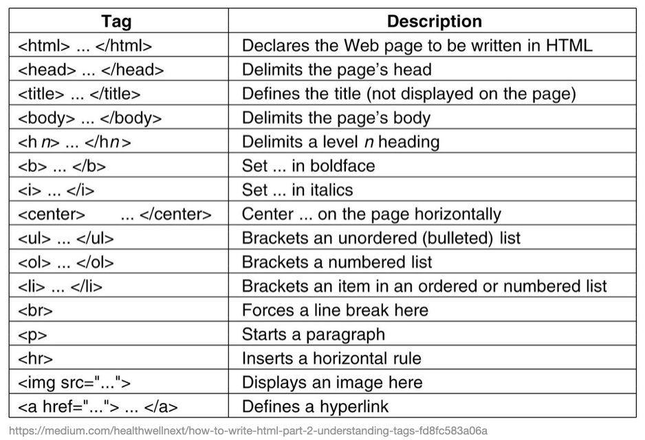
  • The fundamental building block of HTML is the element
    • This is defined by a start tag, some content, and an end tag
    • It is a form of text markup that can be translated into visual elements by the web browser
<p class="foo"> This is a paragraph </p>
  • <p is the start tag
  • class="foo" is an example of an attribute: value pair
  • </p> is the end tag
  • Anything between the start and end tags is the content
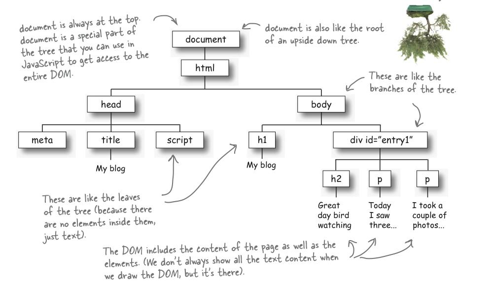
The DOM

The DOM represents the HTML document as a tree of nodes, where each node represents a part of the structure and content of the document

<!doctype html>
<html lang="en">
<head>
  <title>My blog</title>
  <meta charset="utf-8">
  <script src="blog.js"></script>
</head>
<body>
  <h1>My blog</h1>
  <div id="entry1">
    <h2>Great day bird watching</h2>
    <p>
      Today I saw three ducks!
      I named them
      Huey, Louie, and Dewey.
    </p>
    <p>
      I took a couple of photos ...
    </p>
  </div>
</body>
</html>

The DOM

The DOM serves as the API (Programming Interface) for Javascript

  • JavaScript can add/change/remove HTML elements
  • JavaScript can add/change/remove HTML attributes
  • JavaScript can add/change/remove CSS styles
  • JavaScript can react to HTML events
  • JavaScript can add/change/remove HTML events

The DOM

In Javascript, you can

Finding HTML elements by id document.getElementByID("intro") finds elements with id="intro"
Finding HTML elements by tag name document.getElementsByTagName("p") returns a list of all <p> elements
Finding HTML elements by class name document.getElementsByClassName("intro") returns a list of all elements with class="intro"
Finding HTML elements by CSS selectors document.querySelectorAll("p.intro") returns a list of all <p> elements with class="intro"
Finding HTML elements by HTML object collections

Javascript can then manipulate these elements

Change elements

  • element.innerHTML= new content
  • element.attribute = new value
  • element.style.property = new style
  • element.setAttribute(attribute,value)

Add and delete elements

  • document.createElement(element)
  • document.removeChild(element)
  • document.appendChild(element)
  • document.replaceChild(new, old)

The DOM

CSS (Cascading style sheets) represents a very rich language to style HTML elements. This language can provide very granular control over how each element in a page is displayed.

Javascript can manipulate the CSS specification of HTML elements, so inputs provided on a web page can change how elements look.

A couple of rich resources that can act as examples and reference for CSS are

An Opinionated Introduction to JavaScript

Enough to be dangerous

JavaScript is the programming language of the Web

  • One of the most popular and in-demand programming languages
  • Primary use by web developers to develop web servers and applications
    • JS is native to every modern web browser
      • which means every computer has it available and it can be used with no special installation requirements
    • JS can also run outside the browser using Node.js, a JavaScript runtime environment based on Google Chrome
  • For data scientists, JavaScript provides a powerful computer language for interactive data visualizations as well as general data science workflows that run in the browser

JavaScript for Data Scientists

There is an ever increasing case for using JavaScript for ML/AI

  • JavaScript is well known. All developers can use it.
  • Security is built in. JavaScript cannot access your files.
  • JavaScript is faster than Python.
  • JavaScript can use hardware acceleration.
  • JavaScript runs in the browser
  • JavaScript is easy to use, with nothing to install
  • JavaScript runs on more platforms, including mobile devices

Using JavaScript

  • We can write JavaScript directly in HTML files using the <script></script> element.
  • We can also separate the JavaScript from the HTML by writing JavaScript functions in a file (call it app.js, for example), and then load it into our HTML file using <script src="app.js"></script>
    • Much as we can separate the CSS from the HTML and load it using <link rel="stylesheet" href="mystyle.css">
  • JavaScript packages (like d3.js, plotly.js, arquero.js, and others) can be loaded into a HTML file. The specification is placed within the <head></head> tags in the HTML
    • Load a local copy of the package
      • <script src="plotly-2.27.0.min.js" charset="utf-8"></script>
    • Load the package from an online Content Delivery Network (CDN)
      • <script src="https://cdn.plot.ly/plotly-202.7.0.min.js" charset="utf-8"></script>
      • This requires that we are actually connected to the Internet

Using Javascript

  • We went through the fundamentals of JS and the beginnings of a workflow in the previous laboratory
  • We would like you to use JS where needed or when you are interested
  • Fortunately, for popular JavaScript visualization packages, there are very good wrappers and ports to and
  • For this class, we will also be using a Quarto-based workflow.
    • Recall that you can use raw HTML code and CSS within Quarto documents, as long as you render to a HTML document
    • We can also incorporate JavaScript using OJS chunks, in addition to using the <script></script> elements.

Toolkits

Static graphics

These output to PDF, PNG, TIFF, etc.

Client-side: interactive graphics

JavaScript libraries/wrappers
Typical output: HTML+CSS+JS

and derivatives:

wrapped in:

  • htmlwidgets in
  • plotly in and
  • Vega-lite in altair ( and )
  • bokeh in bokeh ( ) and rbokeh ( )

Server-side: Web apps

  • Shiny ( )
  • Dash ( )
  • Streamlit ( )

These require a server running R/Python with appropriate packages

Webassembly

This is actually a client-side infrastructure to run, among other languages, R and Python in the browser

D3.js

D3 is a JavaScript library for visualizing data. It is a low-level language and is very granular in terms of flexibility and control.

  • It was developed by Mike Bostock in 2011 as his PhD work under Jeff Heer at Stanford, and proved transformative in the field of data visualization
  • It is not a charting library per se, in that it can create and manipulate primitive graphical elements in a SVG or WebGL canvas (that lives in a HTML document) driven by data (D3 = Data Driven Documents)

To make a stacked area chart, you might use

  • a CSV parser to load data,
  • a time scale for horizontal position (x),
  • a linear scale for vertical position (y),
  • an ordinal scale and categorical scheme for color,
  • a stack layout for arranging values,
  • an area shape with a linear curve for generating SVG path data,
  • axes for documenting the position encodings, and
  • selections for creating SVG elements.

Source: What is D3?

  • Each of these elements needs to be specified separately
  • It appears to be aligned with the Grammar of Graphics model, but with more granularity

Use D3 if you think it’s perfectly normal to write a hundred lines of code for a bar chart

– Amanda Cox

  • “D3 is overkill for throwing together a private dashboard or a one-off analysis. Don’t get seduced by whizbang examples: many of them took an immense effort to implement!” – https://d3js.org/what-is-d3

Interactive visualization toolkits

  • d3.js is granular and complicated for starting out
  • Fortunately there are several alternatives built upon d3.js to make life easier for people

It’s better to have programs that are human-readable

Candidates

  • Vega and Vega-lite
    • Interfaced in Python using Altair
      • which is interfaced in R using altair
  • bokeh.js
    • Python package
    • Interfaced in R using rbokeh

Interactive visualization toolkits

  • d3.js is granular and complicated for starting out

It’s better to have programs that are human-readable

Candidates

plotly.js

  • Interfaces in both R (plotly) and Python (plotly)
  • Good documentation

Plotly

An introduction

What is Plotly?

Plotly is a technical computing company headquartered in Montreal, Canada

  • Develops tools for data visualization, analytics, and statistical tools, as well as graphing libraries for Python, R, MATLAB, Perl, Julia, Arduino, and REST
    • Dash, an open source Python, R, Julia framework for building analytic applications (competes with Shiny)
    • Chart Studio Cloud is a free, online tool for creating interactive graphics in a point-and-click interface. However, as with any online resource, data privacy is a concern
    • Figure converters that convert matplotlib, ggplot2 graphs into interactive JS-based graphics.

The base graphing toolkit is plotly.js which is built on top of d3.js and stack.gl

Plotly.js: Interactive controls

Plotly plots have interactive controls to do the following:

  • Pan: Move around in the plot.
  • Box Select: Select a rectangular region of the plot to be highlighted.
  • Lasso Select: Draw a region of the plot to be highlighted.
  • Autoscale: Zoom to a “best” scale.
  • Reset axes: Return the plot to its original state.
  • Toggle Spike Lines: Show or hide lines to the axes whenever you hover over data.
  • Show closest data on hover: Show details for the nearest data point to the cursor.
  • Compare data on hover: Show the nearest data point to the x-coordinate of the cursor.

Plotly.js: Fundamental components

```{ojs}
//| echo: fenced
//| output-location: column

plt = require("https://cdn.plot.ly/plotly-latest.min.js")

{var trace1 = {
    x: [1,2,3,4],
    y: [10,11,12,13],
    mode: "markers",
    marker:{
        size: [40, 60, 80, 100]
    }
};

var data = [trace1];

var layout = {
    title: "Marker size",
    showlegend: false,
    height: 500, 
    width: 500
};

const div = DOM.element('div');
plt.newPlot(div, data, layout);
return div;
}
```

Plotly.js: Fundamental components

plt = require("https://cdn.plot.ly/plotly-latest.min.js")

{var trace1 = {
    x: [1,2,3,4],
    y: [10,11,12,13],
    mode: "markers",
    marker:{
        size: [40, 60, 80, 100]
    }
};

var data = [trace1];

var layout = {
    title: "Marker size",
    showlegend: false,
    height: 500, 
    width: 500
};

const div = DOM.element('div');
plt.newPlot(div, data, layout);
return div;
}
  • Trace: Describes a collection of data and the specifications about how you want the data displayed on the plotting surface, which is described by the trace type (scatter, box, , etc).
  • Data: Collection (list) of traces
  • Layout: Controls various structural and stylistic components of the figure (e.g. title, font, size, etc)

The Python (or R) wrappers create JSON files that map from Python/R commands to the format needed by plotly.js with these fundamental components

Wrapping Plotly

Transforming ggplot

In , the plotly package allows you to directly transform ggplot graphics into plotly web graphics using the ggplotly function. This is fantastic, since developing graphs in ggplot is more familiar.

You may be stuck with default settings though

ggplotly(plt)

This is not great, since

  • the theme isn’t exactly copied
  • the default tooltips (see on mouseover) are unformated

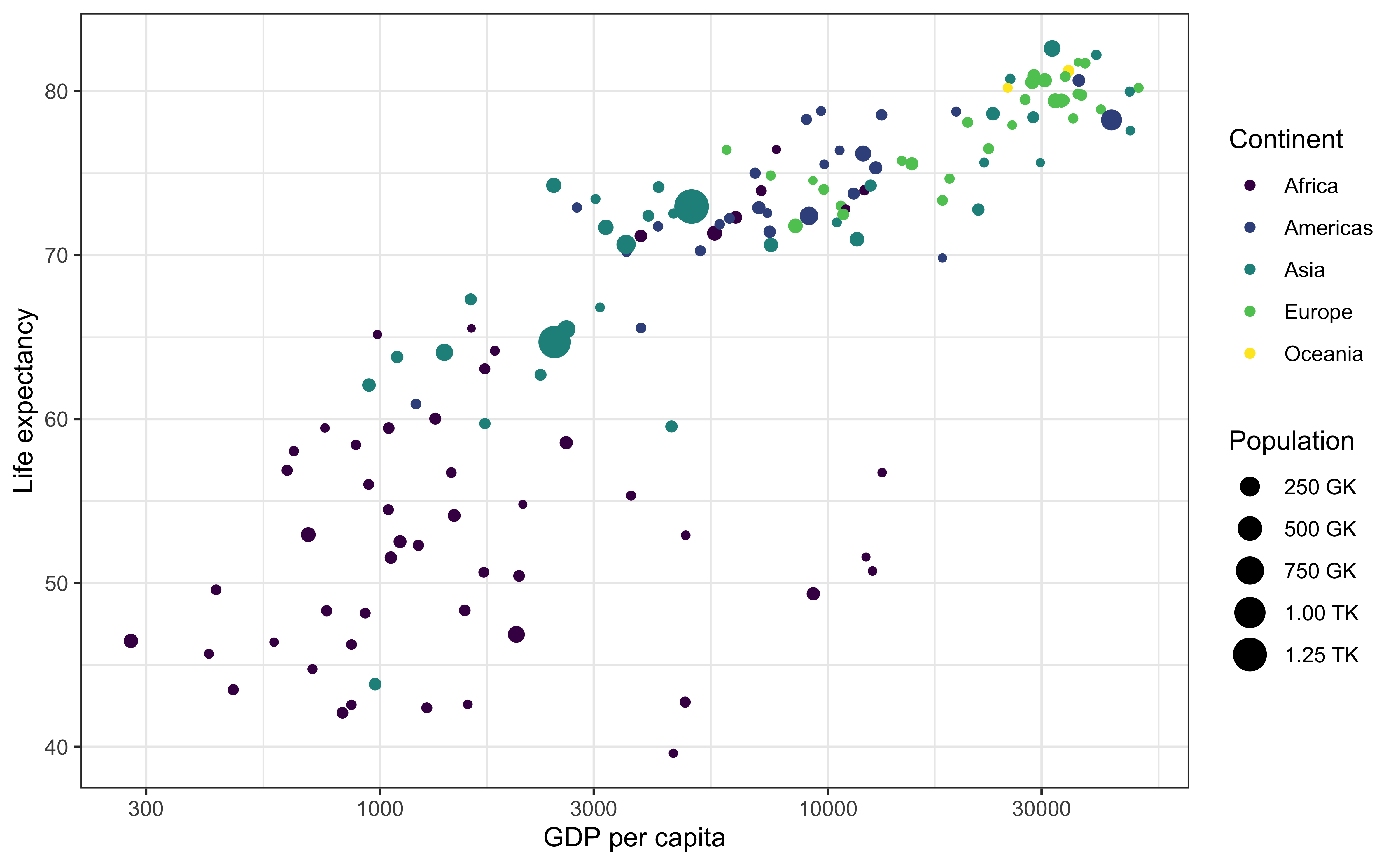
Transforming matplotlib

import plotly.express as px
import matplotlib.pyplot as plt
import seaborn as sns
import pandas as pd
import plotly.tools as tpl

gapminder = px.data.gapminder()
gm = gapminder.query("year==2007")

fig,ax = plt.subplots()
sns.scatterplot(gm, x = "gdpPercap", y = "lifeExp", size = "pop", hue = "continent", ax = ax)
ax.set_xlabel("GDP per capita ($)")
ax.set_ylabel("Life expectancy")
f = tpl.mpl_to_plotly(fig)
f.show()

Using Plotly wrappers

  • The input arguments for a Plotly express function are similar to other libraries.
  • The typical data input is a Pandas data frame, list, or numpy array
  • The x argument is a string naming the column to be used on the x-axis.
  • The y argument can either be a string or a list of strings naming column(s) to be used on the y-axis.
  • Basic customization is straight-forward
px.plotting_fn(dataframe, # Dataframe being visualized
    x = ["column-for-x-axis"], # Accepts a string or a list of strings
    y = ["columns-for-y-axis"], # Accepts a string or a list of strings
    title = "Overall plot title", # Accepts a string
    xaxis_title = "X-axis title", # Accepts a string
    yaxis_title = "Y-axis title", # Accepts a string
    width = width_in_points, # Accepts an integer
    height = height_in_pixels) # Accepts an integer

IMPORTANT: To make stylistic changes, e.g. figure-size, we can use fig.update_layout()

  • Plotly has an R-based API that covers most but not all of Plotly’s capabilities.
  • Furthermore, the concepts from the python section, e.g. data, traces, layout, etc, also apply to the R case

Scatter plots

import plotly.express as px
import seaborn as sns
penguins = sns.load_dataset('penguins')

fig = px.scatter(data_frame = penguins,
                 x = "bill_length_mm",
                 y = "body_mass_g",
                 width=500,
                 height=500,
                 labels = dict(bill_length_mm = "Bill length (mm)",
                    body_mass_g = "Body mass (g)")
)
fig.show()
library(plotly)
library(palmerpenguins)
df = penguins
fig <- plot_ly(df,
    x = ~bill_length_mm,
    y = ~body_mass_g,
    type = "scatter",
    mode = "markers",
    width=500, height=500) |> 
    plotly::layout(
        xaxis = list(title = "Bill length (mm)"),
        yaxis = list(title = "Body mass (g)")
    )
htmlwidgets::saveWidget(as_widget(fig), "plotly/plotly-R-scatter.html", selfcontained=TRUE)
```{ojs}
//| output-location: column
//| echo: fenced
//plt = require("https://cdn.plot.ly/plotly-latest.min.js")
penguins = transpose(peng)

{var data = [
{
    x: penguins.map(d => d.bill_length_mm),
    y: penguins.map(d => d.body_mass_g),
    type: "scatter",
    mode: "markers"
}
];
var layout = {
    title: "",
    xaxis: {title: "Bill length (mm)"},
    yaxis: {title: "Body mass (g)"},
    height: 500,
    width: 500
};
const div = DOM.element('div');
plt.newPlot(div, data, layout);
return div
}

```

Adding groups and annotations

import plotly.express as px
fig =px.scatter(data_frame=penguins, 
    x='bill_length_mm', 
    y = 'body_mass_g', 
    color = 'species',
    labels = dict(bill_length_mm="Bill length (mm)",
                  body_mass_g = "Body mass (g)",
                  species='Species'),
    title = "Palmer Penguins")
fig.update_traces(customdata=penguins,
  hovertemplate="Species: %{customdata[0]}<br>Island: %{customdata[1]}<br>Sex: %{customdata[6]}")
fig <- plot_ly(penguins,
  x = ~bill_length_mm,
  y = ~body_mass_g,
  color = ~species,
  type = "scatter", mode = "markers",
  hovertemplate = paste("Species:", penguins$species, "<br>Island: ", penguins$island, "<br>Sex:", penguins$sex)
) %>%
  plotly::layout(
    xaxis = list(title = "Bill length (mm)"),
    yaxis = list(title = "Body mass (g)"),
    title = "Palmer Penguins"
  )
htmlwidgets::saveWidget(as_widget(fig), "plotly/plotly-R-scatter2.html", selfcontained=TRUE)
{
    const species = ["Adelie", "Gentoo", "Chinstrap"];
    const colors = {"Adelie": "blue", "Gentoo": "green", "Chinstrap": "orange"};
    const unpack = (rows, key) => rows.map(row => row[key]);
    const specie = "Adelie";
    const data = species.map(specie => {
        const rowsFiltered = penguins.filter(row => row.species === specie);
        return {
            mode: "markers",
            type: "scatter",
            name: specie,
            sp: unpack(rowsFiltered, "species"),
            x: unpack(rowsFiltered, "bill_length_mm"),
            y: unpack(rowsFiltered, "body_mass_g"),
            isl: unpack(rowsFiltered, 'island'),
            customdata: unpack(rowsFiltered,'sex'),
            text: unpack(rowsFiltered, 'island'),
            hovertemplate: "Species: %{data.name}<br> Gender: %{customdata}<extra></extra> <br> Island: %{text}",
            marker: {
                color: colors[specie]
            }
}
});
    var layout = {
        xaxis: {title: "Life expectancy"},
        yaxis: {title: "GDP per capita ($)"},
        width: 500,
        height: 500,
        hovermode: "closest",
        showlegend: true
        };

const div= DOM.element('div')
plt.newPlot(div, data, layout, {showLink: false})
return div
}; 

Plotly Express: Available functions

Source: click here

Plotly inputs in Python

Plotly Express can take inputs in 3 different formats, which are all appropriately converted to JSON internally for plotting.

  1. A pandas DataFrame, where encodings are determined by column names
  2. Separate lists for each encoding
  3. A dictionary, where visual encodings are specified by the keys.

Suppose we have this toy dictionary

d =  {"dates": ["2020-01-01", "2020-01-02", "2020-01-03", "2020-01-04"], "y_vals": np.array([100, 200,300,400])}

We can easily convert this to a DataFrame and vice versa

d1 = pd.DataFrame(d)
d2 = d1.to_dict('list') # removes index
d1
        dates  y_vals
0  2020-01-01     100
1  2020-01-02     200
2  2020-01-03     300
3  2020-01-04     400
d2
{'dates': ['2020-01-01', '2020-01-02', '2020-01-03', '2020-01-04'], 'y_vals': [100, 200, 300, 400]}

A pairs plot

Code
import plotly.express as px
import seaborn as sns

df = sns.load_dataset("penguins")

fig = px.scatter_matrix(
    df,
    dimensions=[
        "bill_length_mm",
        "bill_depth_mm",
        "flipper_length_mm",
        "body_mass_g",
    ],
    color="species",
    width=900,
    height=900,
    labels=dict(
        bill_length_mm="Bill length (mm)",
        bill_depth_mm="Bill depth (mm)",
        flipper_length_mm="Flipper length (mm)",
        body_mass_g="Body mass (g)",
    ),
).update_traces(diagonal_visible=False)

fig.update_layout(template="plotly_white")
Code
fig.show()
Code
library(palmerpenguins)
fig <- penguins |> plot_ly()
fig <- fig |> 
    add_trace(
        type = "splom",
        dimensions = list(
            list(label = "Bill length (mm)", values = ~bill_length_mm),
            list(label = "Bill depth (mm)", values = ~bill_depth_mm),
            list(label = "Flipper length (mm)", values = ~flipper_length_mm),
            list(label = "Body mass (g)", values = ~body_mass_g)
        ), 
        text = ~species,
        marker = list(
            color = as.integer(penguins$species),
            size = 7, 
            line = list(width=1, color = 'rgb(230,230,230)'
                        )
        )
    )
fig <- fig |> layout(
    title = "Palmer penguins",
    hovermode="closest",
    dragmode= "select",
    plot_bgcolor = "rgba(240, 240, 240, 0.95)",
    xaxis = list(domain=NULL, showline=F, zeroline=F, gridcolor = '#fff', ticklen=4),
    yaxis = list(domain=NULL, showline=F, zeroline=F, gridcolor ='#ffff', ticklen=4)
)
fig
Code
{
    const unpack = (rows, key) => rows.map(row => row[key]);
    var axis = () => ({
        showline: false,
        zeroline: false,
        gridcolor: '#ffff',
        ticklen: 4
    })
    
    var data = [{
        type:"splom",
        dimensions: [
            {label: 'Bill length (mm)', values: unpack(penguins, 'bill_length_mm')},
            {label: 'Bill depth (mm)', values: unpack(penguins, 'bill_depth_mm')},
            {label: 'Flipper length (mm)', values: unpack(penguins, 'flipper_length_mm')},
            {label: 'Body mass (g)', values: unpack(penguins, 'body_mass_g')}
        ],
        text: unpack(penguins, "species"),
        marker: {
            size: 7,
            line: {
                color: "white",
                width: 0.5
            }
        }
    }]
    var layout = {
        title: "Palmer Penguins",
        height: 800,
        width: 800,
        autosize: false,
        hovermode: 'closest',
        dragmode: 'select',
        plot_bgcolor: 'rgba(240,240, 240, 0.95)'
    }
    const div= DOM.element('div')
    plt.newPlot(div, data, layout, {showLink: false})
    return div
}; 

Line plots

Code
import plotly.express as px

# EXAMPLE-1
df = px.data.gapminder()

fig = px.line(
    df,
    x="year",
    y="lifeExp",
    color="continent",
    line_group="country",
    hover_name="country",
    height=500,
    width=1000,
    template="presentation",
    labels={"lifeExp": "Life expectancy (years)", "year": "Time (years)"},
)
fig.update_layout(showlegend=True)
Code
library(gapminder)
df <- filter(gapminder, continent == "Asia")
fig <- plot_ly(df,
  x = ~year, y = ~lifeExp,
  color = ~country,
  type = "scatter", mode = "lines",
  hovertemplate = paste("<b>", df$country, "</b><br>Year=%{x}<br>Life Expectancy=%{y:.2f} yrs")
) %>%
  plotly::layout(
    xaxis = list(title = "Year"),
    yaxis = list(title = "Life Expectancy"),
    showlegend = FALSE,
    width=600,
    height=600
    
  )
fig

Marginal plots

Code
import plotly.express as px
import seaborn as sns

tips = px.data.tips()
# print(tips)

fig = px.density_heatmap(
    tips,
    x="total_bill",
    y="tip",
    marginal_x="histogram",
    marginal_y="histogram",
    color_continuous_scale=px.colors.sequential.Viridis,
    nbinsx=50,
    nbinsy=50,
    labels=dict(total_bill="Total bill", tip="Tip"),
    title="Joint distribution of tip and total bill",
    width=500,
    height=500,
)

fig

Themes

There are several built-in themes in plotly. These can be modified (see the documentation)

import plotly.express as px

df = px.data.gapminder()
df_2007 = df.query("year==2007")
k = 0
for template in [
    "plotly",
    "plotly_white",
    "plotly_dark",
    "ggplot2",
    "seaborn",
    "none",
    "simple_white",
]:
    fig = px.scatter(
        df_2007,
        x="gdpPercap",
        y="lifeExp",
        size=df_2007["pop"],
        color="continent",
        log_x=True,
        size_max=60,
        template=template,
        title="Gapminder 2007: '%s' theme" % template,
    )
    file_name = "./plotly/plotly-theme-" + str(k) + ".html"
    # print(file_name)
    fig.write_html(file_name)
    fig.show()
    k += 1

# from IPython.display import IFrame
# IFrame(src=file_name, width=1000, height=500)

Facets

import plotly.express as px

# import seaborn as sns

gap = px.data.gapminder()
fig = px.line(
    data_frame=gap,
    x="year",
    y="lifeExp",
    color="continent",
    facet_col="continent",
    # line_group="country",
    facet_col_wrap=3,  # << facet_col is the key
    labels={"lifeExp": "Life expectancy"},  # , "year" : 'Time (years)'},
    template="plotly_white",
    width=1000,
    height=1000,
).update_layout(showlegend=False)
fig.show()

Animations and controls

Code
px.scatter(
    px.data.gapminder(),
    x="gdpPercap",
    y="lifeExp",
    animation_frame="year",
    animation_group="country",
    size="pop",
    color="continent",
    hover_name="country",
    template="plotly_white",
    log_x=True,
    size_max=45,
    range_x=[100, 100000],
    range_y=[25, 90],
)

Note that animations can be cool, but you really need to think whether they are necessary. Animations are not the same as interactivity, and you really need to have a good story (usually changes over time) to make good animated data visualizations.