Abhijit Dasgupta, Jeff Jacobs, Anderson Monken, and Marck Vaisman
Georgetown University
Spring 2024
Where we’ve been
Designing for an audience
Visual encoding and graphical integrity
Building the right visualization
Finalizing conceptual and design considerations
Making readable graphics
HTML, CSS, JS and d3.js
Plotly, Altair, Vega/Vega-Lite, and Bokeh
Geospatial visualizations
Network visualizations
Today
Visualizing Big Data
Millions or even billions of observations
Looking for patterns, often multivariate
time series
geospatial orientation
closeness on networks
Not usually looking at univariate distributions or characteristics
Challenges of visualizing Big Data
Challenges
You’re dealing with millions, or even billions, of observations
You’re looking for patterns in a HUGE cloud of data
Primary issues
Computational speed: plotting large data sets results in very slow rendering and will likely crash/freeze the rendering from your plotting library
Image quality: Rendering, interactivity, overplotting, undersaturation, etc.
Challenges
The primary challenge is computation
You have to map every point to a location on your canvas
Depending on the visual encoding you want, this may be difficult
Compute inter-relationships and then figure out a way to place every point in a part of a network
Map each point to a latitude-longitude and then incorporate particular projections to make sure the map is proportionate and accurate
Even a scatter plot will require mapping millions of points to a coordinate system
On top of this coordinate system issue, you can certainly have more visual encodings to map, including shape and color of the marks, or computing summarising lines (like loess or regression lines)
Challenges
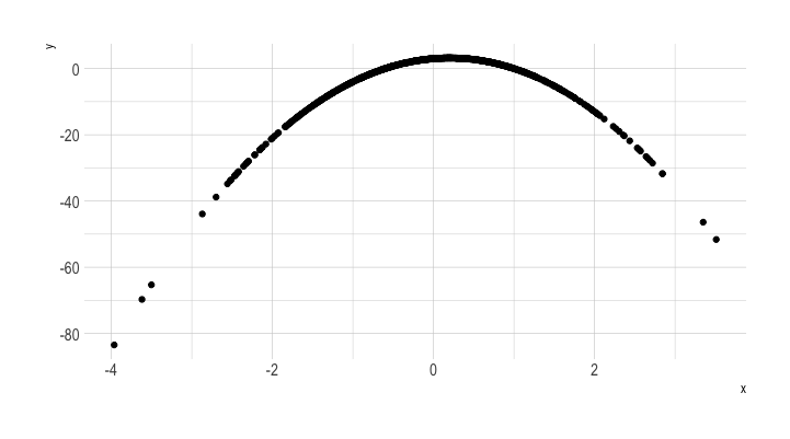
A simple experiment: Draw a scatter plot
Increase N from 10 to 100,000,000 (100 Million)
This is sort of the simplest challenge you could do.
With more complexity (like maps or networks), things fall apart much faster
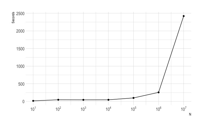
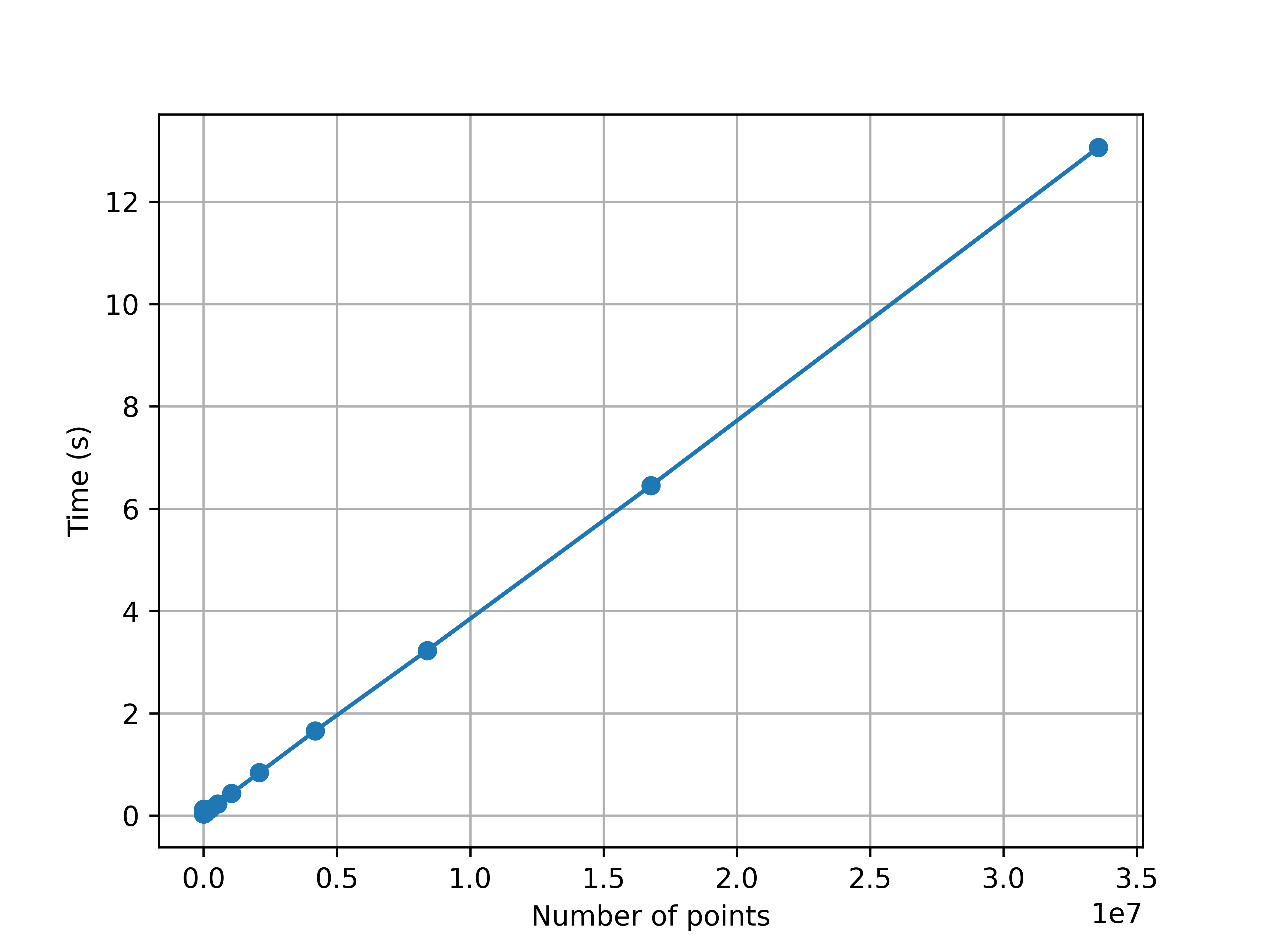
Another simple experiment
Timing summary: Trying to plotting sine curves with different N (\(2^k\), k=1,…,26)
Code
import matplotlib.pyplot as pltimport numpy as npimport timeN_i=[]; T_i=[]for i inrange(1,26): N=2**i# Data for plotting t = np.linspace(0.0, 2*np.pi, N) s = np.sin(2* np.pi * t)#START TIME to = time.process_time() fig, ax = plt.subplots() ax.plot(t, s,'-o') ax.set(xlabel='time (s)', ylabel='sin(x)') ax.grid() fig.savefig("big-data/img/test.png")# plt.show()#REPORT TIME NEEDED TO PLOT tf=time.process_time() - to#print(i,N,np.round(tf,2)) N_i.append(N); T_i.append(tf)#ONLY SHOW NEXT PLOT plt.close("all") #this is the line to be added#PLOT N VS TIMEfig, ax = plt.subplots()ax.plot(N_i, T_i,'-o')ax.set(xlabel='Number of points', ylabel='Time (s)')ax.grid()plt.show()
Some voodoo (or so it might appear)
x <-rnorm(1e8) # 100 Milliony <-3+2*x -5*(x^2)d <-data.frame('x'=x, 'y'=y)start =Sys.time()p <- d %>%rasterly(mapping =aes(x, y)) %>%rasterly_points()ptimes <- (Sys.time() -start)
This takes only 3.38 seconds!!!
Note we don’t have axes or the like, but we’ll fix that in a bit.
We’ll also be able to create interactive visualization using this voodoo
This is a data set of Uber trips in New York City between April and September, 2014 (Source)
This data has 4,534,327 rows and 3 columns
p <- rides %>%rasterly(mapping=aes(x = Lon, y = Lat)) %>%rasterly_points() p
This takes 0.26 seconds
This voodoo creates a compressed representation of the data (details coming up), but doesn’t actually display the data it generates. We can use ggplot2, if we like.
rides <- rides |>mutate(hour = lubridate::hour(`Date/Time`))ggRasterly(data = rides, mapping =aes(x = Lat, y = Lon, color = hour),color = hourColors_map) +labs(title ="New York Uber",subtitle ="Apr to Sept, 2014",caption ="Data from https://raw.githubusercontent.com/plotly/datasets/master")+ hrbrthemes::theme_ipsum()
We can make this interactive!!!
plot_ly(rides, x =~Lon, y =~Lat) |>add_rasterly_heatmap()
What are the colors representing?
The represent the frequency of rides (on a log scale)
Zoom in
Introducing a Python toolset: HoloViz
HoloViz
HoloViz is a set of Python packages that makes data visualization easier, more accurate and more powerful
Panel for making apps and dashboards
hvPlot to quickly generate interactive plots from data
HoloViews to help make all your data easily visualizable
leverages matplotlib, bokeh and plotly
GeoViews extends HoloViews to geographic data
Datashader for rendering even the largest datasets
Lumen for building data-driven dashboards from YAML specifications
Param to create delarative user-configurable objects
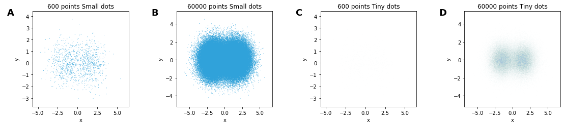
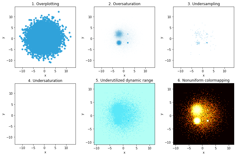
This is a common issue when you have many points/curves/densities to plot.
You’re overlaying one data point on top of the other, and so you’re hiding data.
Another common example:
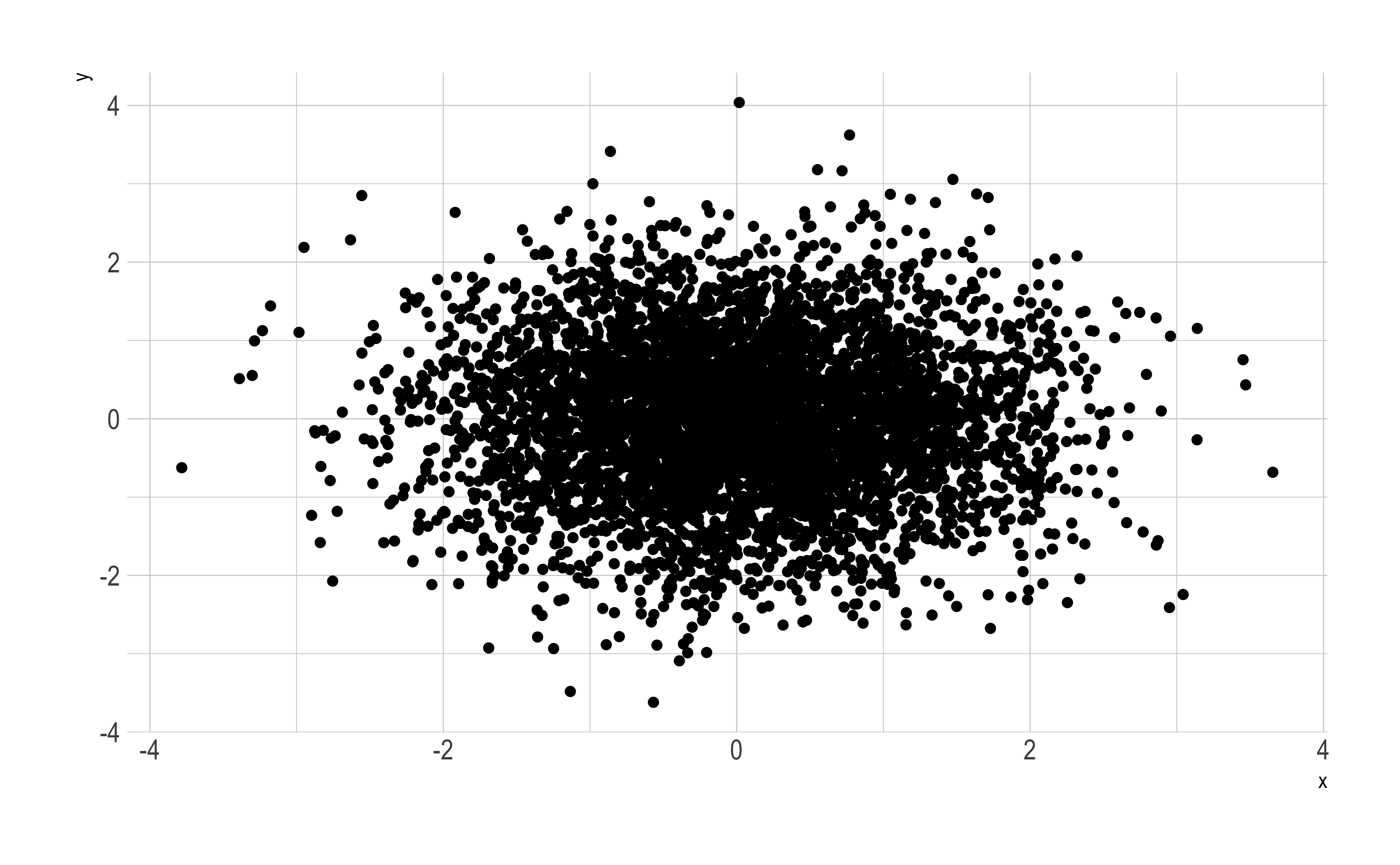
n <-5000d2 <-data.frame(x =rnorm(n), y =rnorm(n))ggplot(d2, aes(x, y))+geom_point()
There is a greater mass of points towards the center, but all you see is one relatively uniform blob, because of overplotting
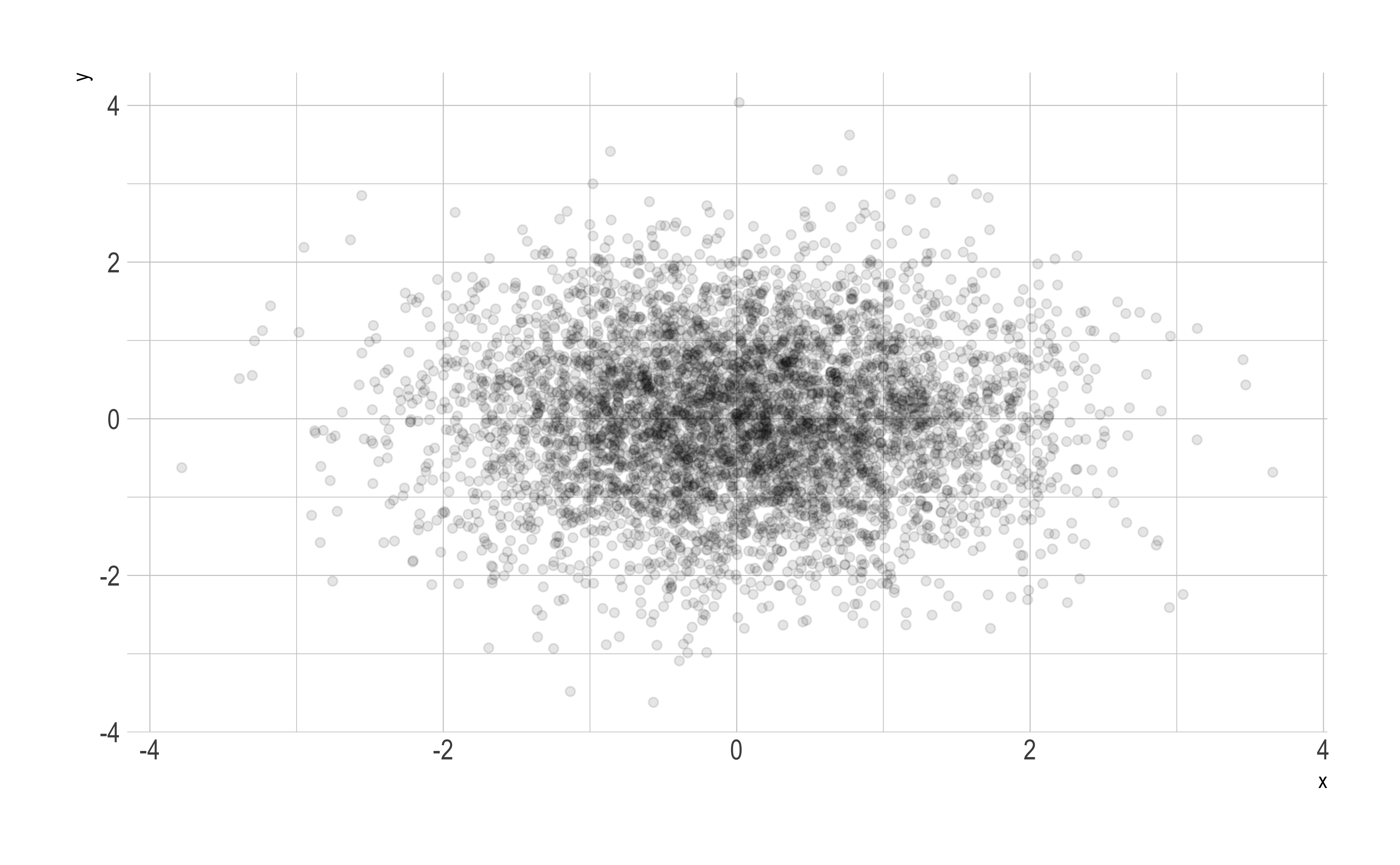
A solution to overplotting: Transparency
You can play with the transparency or opacity of your plot to somewhat reduce the problems created with overplotting
ggplot(d2, aes(x,y))+geom_point(alpha =0.1)
You get a better sense of where the data is, and, more importantly, how much there is,
A solution to overplotting: Transparency
Transparency
There are still problems:
If alpha = 0.1, then 10 overlayed points will lead to full saturation, again making it harder to see individual points
Only the last 10 points plotted over each other influences the color (for alpha = 0.1)
A good alpha setting is conditional on the data; even small changes in the data can lead to oversaturation in regions at particular alpha levels
So,even for a small dataset, these issues come to the fore.
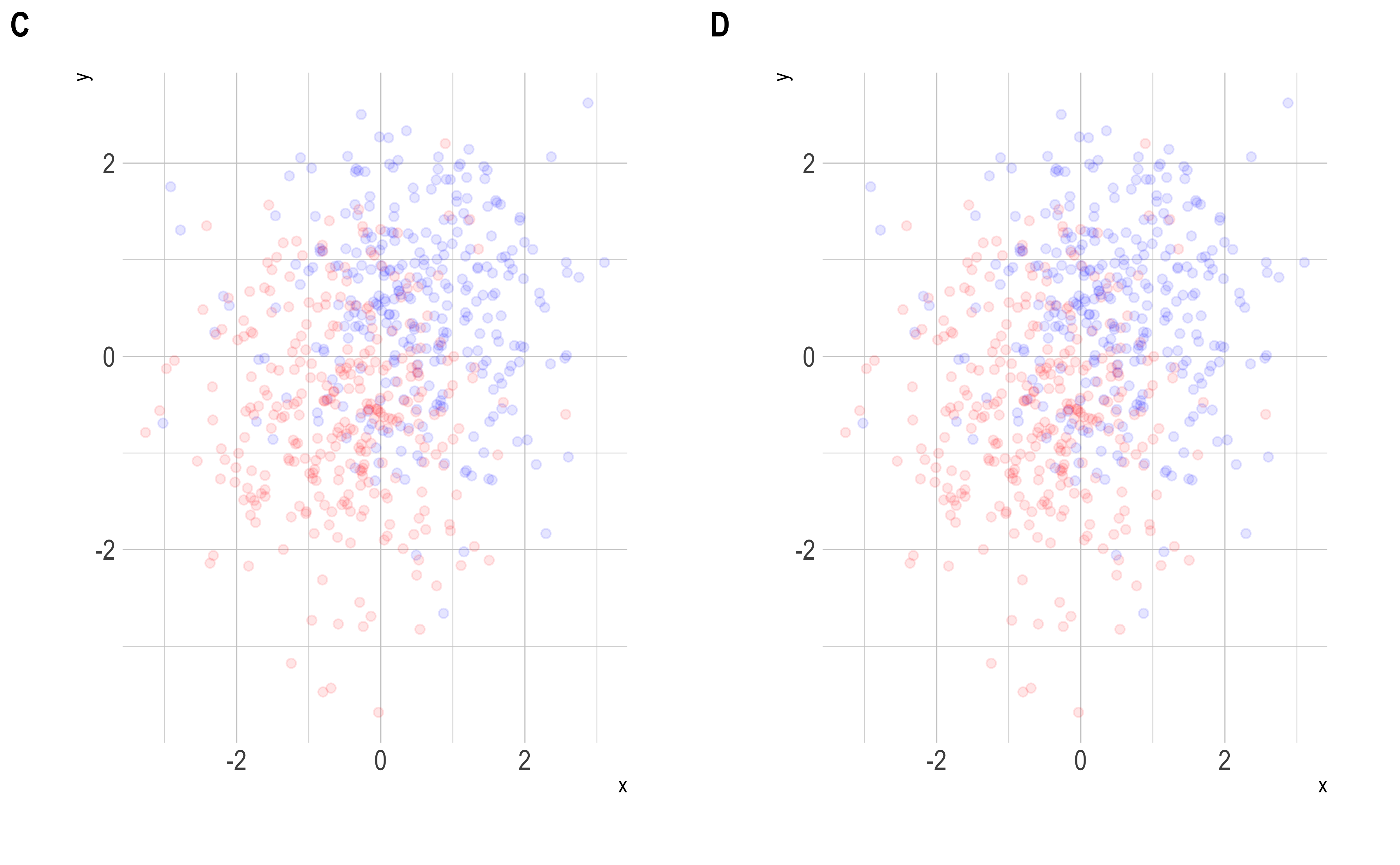
Sampling (and undersampling)
Another strategy with large data is to sample the data and visualize a representative subset.
You can also make the actual points smaller so that there is less chance of overlap.
Both strategies work sometimes
The “small dots” setting (size = 0.1, alpha = 1) has serious overplotting with 60K points
The “tiny dots” setting (size 0.01, alpha = 0.1) makes the 600 points disappear
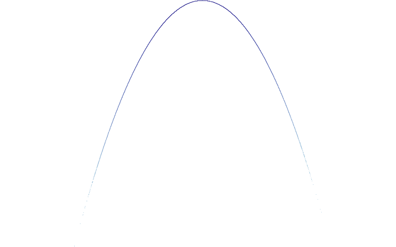
Remember this one?
When we zoom in, we see the strategy we’ll explore from here on
Rasterization
Rasterization
Derived from the German Raster (Framework, schema), from the Latin rastrum, “scraper” – Wikipedia
Rasterization (or rasterisation) is the task of taking an image described in a vector graphics format (shapes) and converting it into a raster image (a series of pixels, dots or lines, which, when displayed together, create the image which was represented via shapes)
We don’t just rasterise typically in data visualization, but also summarise or aggregate the data.
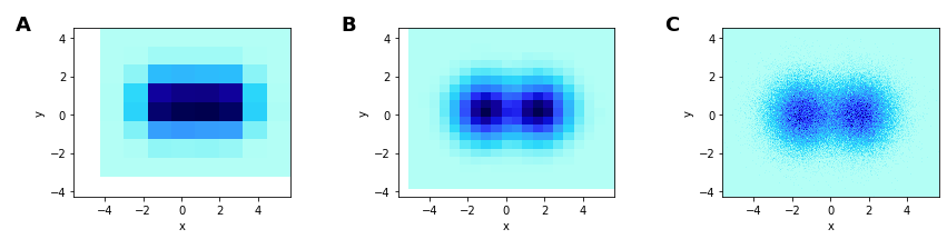
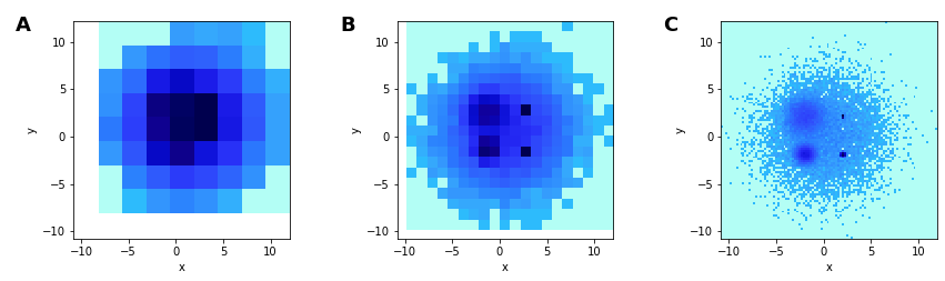
Resolving overplotting and undersampling: heatmaps
These are 2D histograms visualized as heatmaps
Provides a fixed-size grid regardless of data size
The chosen grid determines the resolution you can see
Coarser heatmaps average out noise to reveal signal
Finer heatmaps can show more structure
A is too coarse
B is able to show the distributions (2 circular Gaussians)
C can approximate a scatter plot
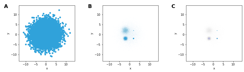
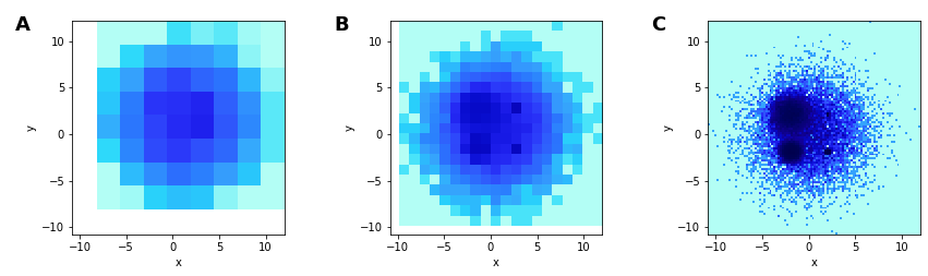
Breaking the heatmap: undersaturation
Both heatmaps and alpha-based scatterplots can suffer from undersaturation
Plotting a composite of 5 Gaussian distributions (n = 10K, each) with different centers and spreads
In A, the large spread of one dominates
In B and C, we can start seeing the structure
B has the medium spread Gaussian dominate, despite identical sample sizes
C makes the grid size smaller & adds transparency, making the large spread Gaussian disappear (undersaturation)
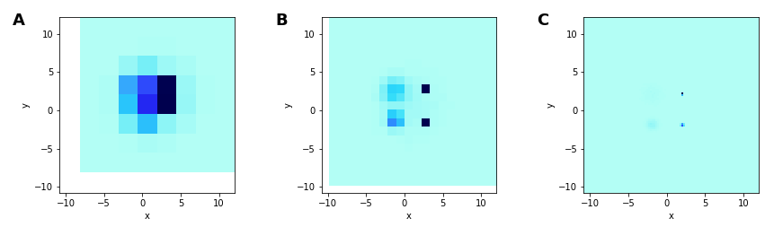
Breaking the heatmap: undersaturation
Using heatmaps isn’t much help.
Narrow-spread distributions lead to pixels with very high count, which now dominates
Wide-spread distribution disappear
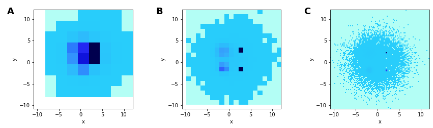
Breaking the heatmap: undersaturation
A possible solution: Add an offset, so that all points are represented and distinguished from background
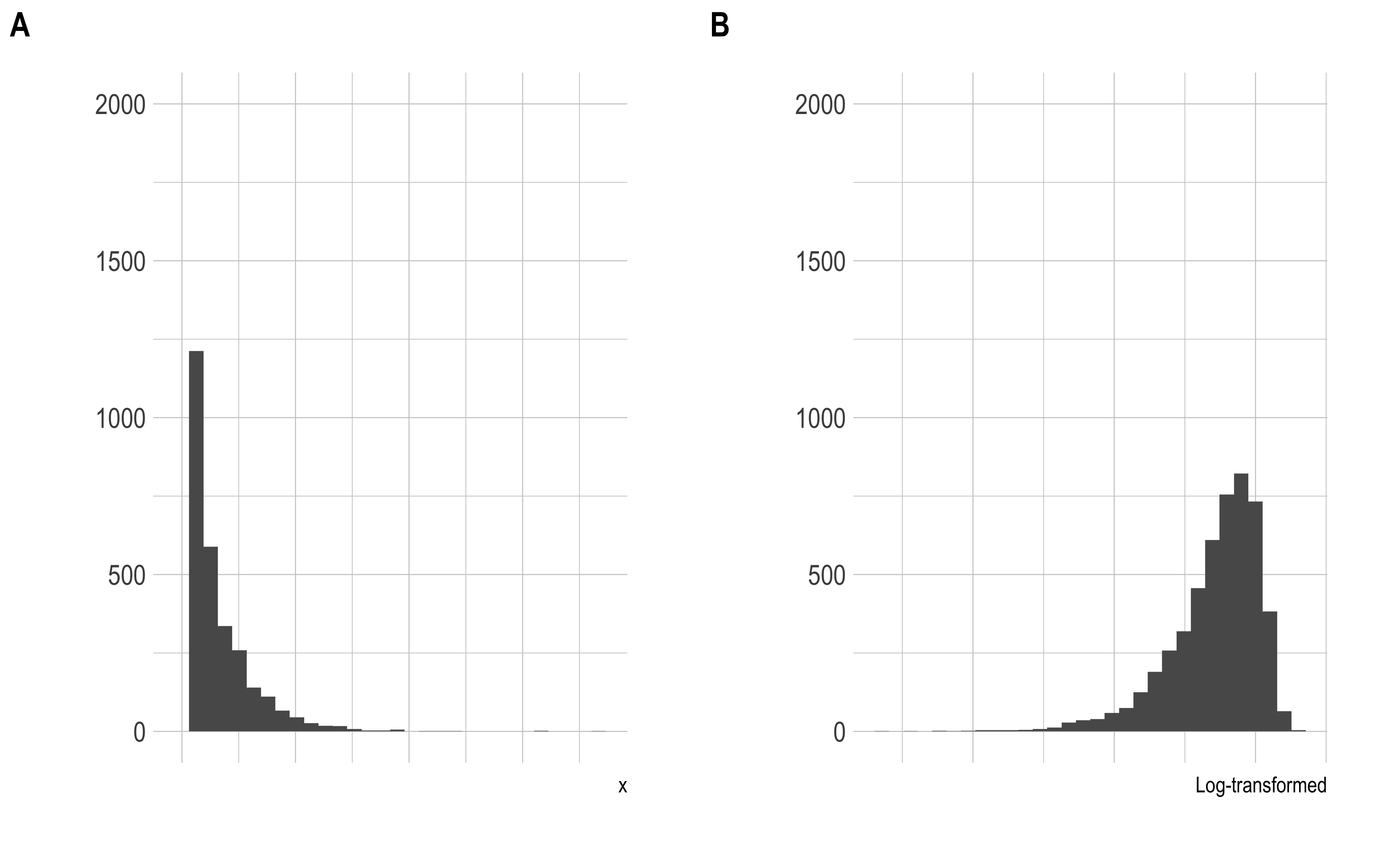
Not using the full range
The distribution of the counts is strongly skew, with some points having very large values. When this is converted to a color- or gray-scale, the entire range is not fully utilized.
One way to deal with this is to make the distribution less skew. One way of doing this is using a log-transform (among many other choices)
Not using the full range
We can now see the structure of all 5 Gaussians, in B and C, and relative spreads in C.
Further improvements: histogram equalization
Instead of binning and determining colors based on the actual value, one can select the color based on percentile of the counts. If you have 100 gray values, you map the lowest 1% of the data values to the first color, and the largest 1% of the data to the last color, and so on
This then creates a rank-order plot, preserving the order but not the magnitudes of the counts
Now things pop
Note that you can’t reconstruct the original data from this anymore.
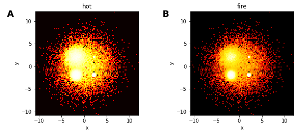
One more piece: colormaps
One problem with many colormaps is that they are perceptually non-uniform, so that you can’t visually distinguish colors over a large range of values. A prototypical example is the jet colormap, once the default in matplotlib and Matlab.
The figure B allows more detail to be shown, than in the A figure, which uses a non-uniform colormap.
There are several perceptually uniform colormaps available
viridis and friends in R and Python
the Python colorcet package and the R cetcolor package
Summarizing the pitfalls
datashader
Introduction
Datashader is a Python package for analyzing and visualizing large datasets
The basic strategy is to use the bin-summarize paradigm to rasterize or aggregate datasets into regular grids
These grids are essentially a data reduction/compression method, reducing millions of points into a 400x400 grid, say
Some good default choices to avoid the pitfalls described earlier allows visual analysis of large data sets quickly
datashader produces an image, that can then be embedded within other plotting tools like matplotlib, plotly, and bokeh
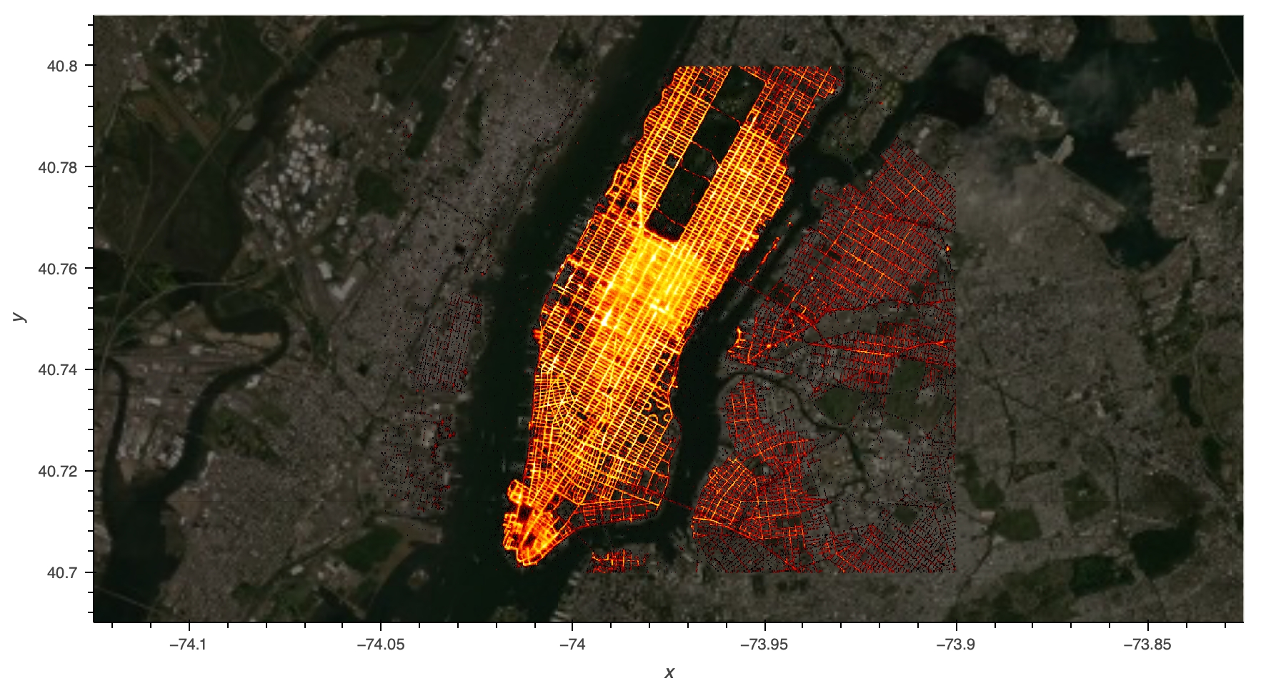
Taxi trips in New York City, 2014. 12 million pickup/dropoff locations with passenger counts
Introduction
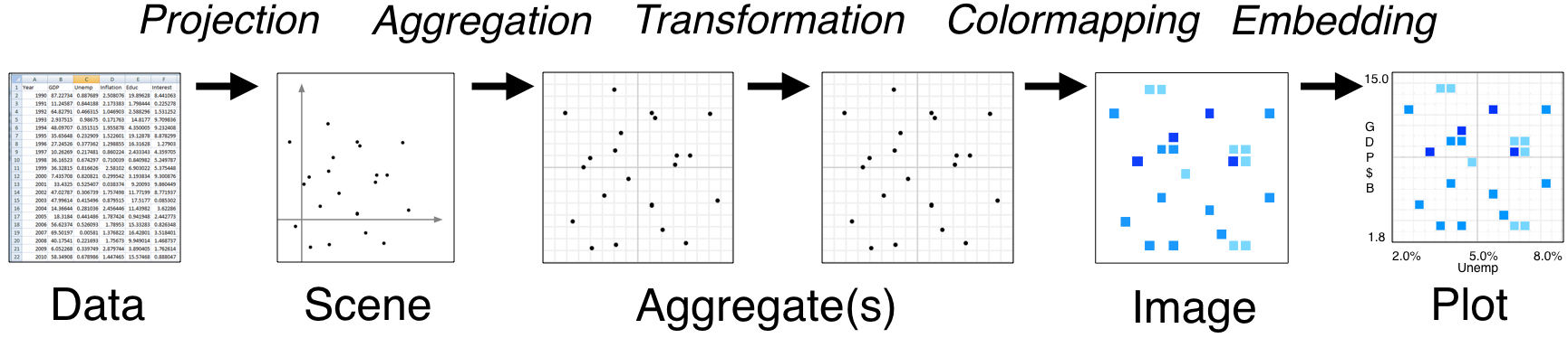
datashader basically runs an analytic pipeline to transform data into a rasterized image.
The ultimate deliverable for the datashader package is the image, which can then be plotted by embedding it into a plotting system.
We will also look at rasterly, which essentially does the same thing in the R ecosystem
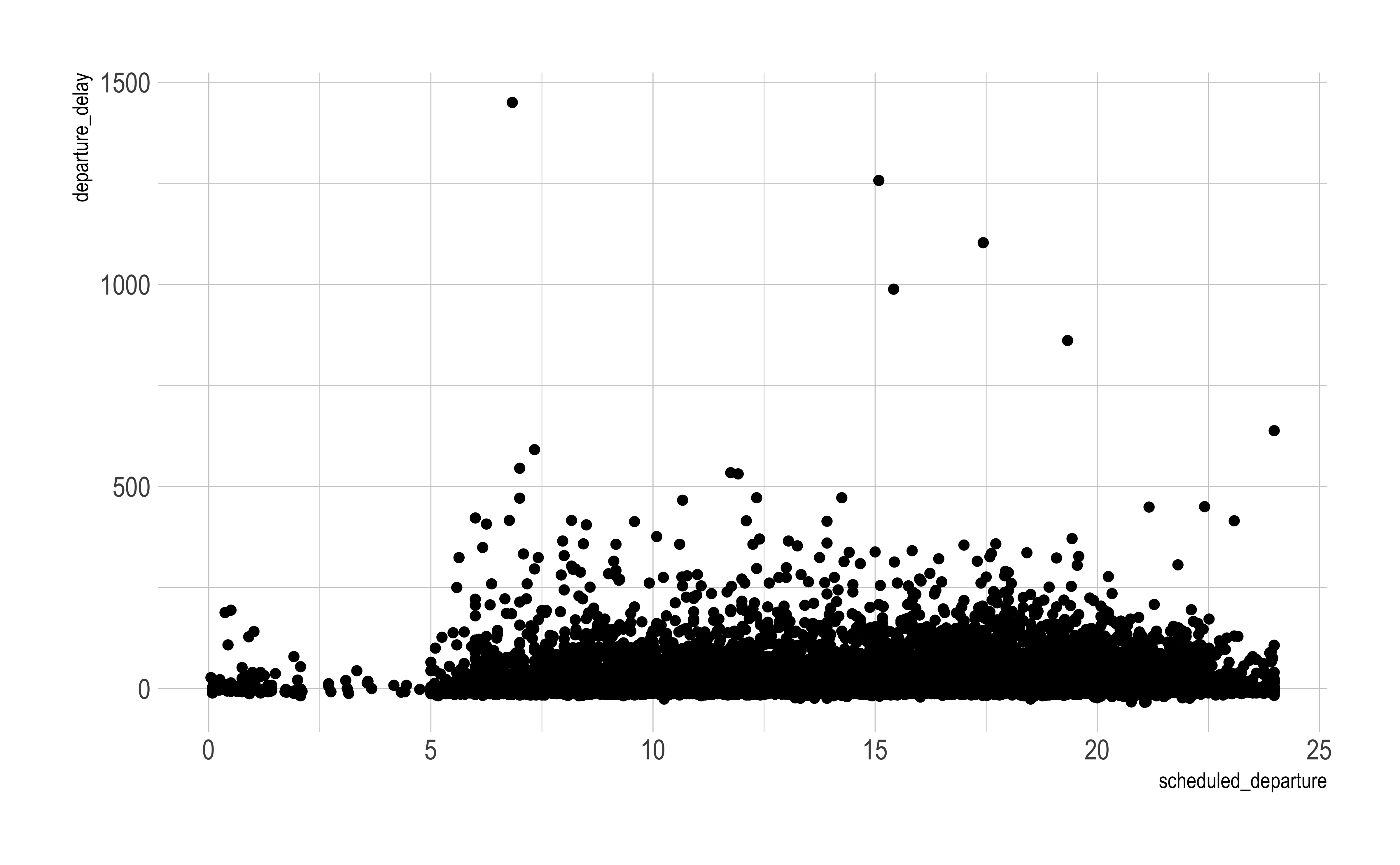
Example: Flight delays (Kaggle)
This dataset comprises 5.8 million rows
import plotly.express as pximport pandas as pdimport numpy as npimport datashader as dsdf = pd.read_parquet('https://raw.githubusercontent.com/plotly/datasets/master/2015_flights.parquet')df.shape
(5819079, 4)
Example: Flight delays (Kaggle)
Interest is in whether whether departure delays are dependent on when flights are scheduled to leave.
df_sub = df[::200] # take 200th row, so 29K rowsfig = px.scatter(data_frame = df_sub, x ="SCHEDULED_DEPARTURE", y ="DEPARTURE_DELAY")fig.show()
Aggregate within each pixel (default is count(), but others possible)
If a pixel has 0 counts (or no data), make it a missing value (np.nan) and mask it
Optionally, we have also
log-transformed the counts so that we make better use of the dynamic range of values
There are other aggregates that you can plot using datashader. Several examples are provided here, including maximum and minimum values for data represented in each pixel.
All datashader is enabling is reducing this large dataset into an aggregated dataset over a smaller, manageable grid of points, which is stored as a matrix (technically an xarray)
We will first make a static visualization using ggplot2
theme_set(hrbrthemes::theme_ipsum())ggplot( df %>%filter(row_number() %%200==1), aes(x=scheduled_departure, y = departure_delay))+geom_point()
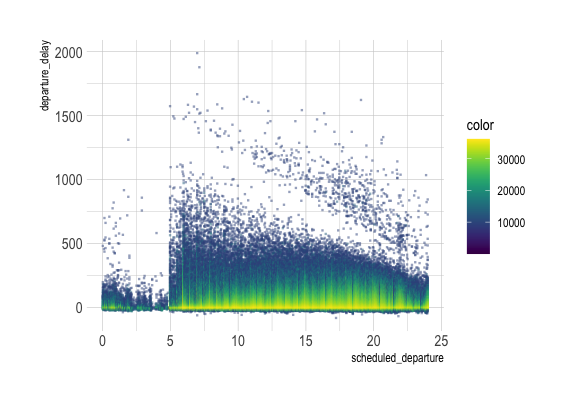
rasterly
We will now put rasterly to use
ggRasterly(df, aes(x=scheduled_departure, y = departure_delay),
           color=viridis_map)
rasterly
We can also make it interactive using plotly
plt <-plotRasterly(df, aes(x=scheduled_departure, y = departure_delay), color=viridis_map)
Leveraging modern tools for big data visualization
Data tools
You’ll see many of these in DSAN 6000
Need: Scalable storage and processing of big data
Two tools:
The parquet format for efficient columnar storage, compression and parallelization.
Standard in the Hadoop ecosystem
Can be read using functions in the Apache Arrow project (arrow in and pyarrow in )
The DuckDB in-process analytical database
Uses SQL for processing
Deep integration with various tools (including Python, R, tidyverse, WASM)
Super-fast
Leveraging these tools for visualization
The main approach to big data visualization is the bin-summarize method to create raster images showing data relationships.
There is also the need for interaction and cross-filters, which require quick data processing, re-evaluation and re-rasterization
Using parquet for data storage, streaming it into DuckDB and re-processing the data makes “real-time” interactions possible
Mosaic is an extensible framework for linking databases and interactive views, developed recently by the Heer lab at University of Washington in collaboration with the Perer/Moritz lab at Carnegie Mellon.
Interface components (visualizations, tables, widgets, etc) publish data needs as queries
Queries managed by a central coordinator
Queries issued to a back-end data source (DuckDB by default)
Mosaic comes with several front end packages for developers:
vgplot: A grammar of graphics-based package for plotting and building interactive visualizations and dashboards. It renders visualizations in SVG output using Observable Plot.
mosaic-spec: Declarative specification of Mosaic visualizations using YAML or JSON (much like Vega and Vega-Lite)
duckdb-server: A Python-based server running a local DuckDB instance, supporting queries over Web Sockets or HTTP, returning data in either Arrow or JSON formats
mosaic-widget: A jupyter widget for Mosaic to render vgplot visualization sin Jupyter notebook cells, processing data by DuckDB in the Python kernel
Looking at cross-filtering of 50,000 sample points
// import vgplot and configure Mosaic to use DuckDB-WASMvg = {const vg =awaitimport('https://cdn.jsdelivr.net/npm/@uwdata/vgplot@0.5.0/+esm'); vg.coordinator().databaseConnector(vg.wasmConnector());return vg;}
Cross-filtering histograms derived from 10 million flights: arrival delays, departure times and distance flown
In this example, we read the data as a Parquet file residing in GitHub, and create 3 linked histograms that allow cross-filtering.
viewof flights = {// load flights data from external parquet fileawait vg.coordinator().exec(`CREATE TABLE IF NOT EXISTS flights10m AS SELECT GREATEST(-60, LEAST(ARR_DELAY, 180))::DOUBLE AS delay, DISTANCE AS distance, DEP_TIME AS time FROM 'https://uwdata.github.io/mosaic-datasets/data/flights-10m.parquet'`);// create a selection with crossfilter resolutionconst brush = vg.Selection.crossfilter();// helper method to generate a binned plot filtered by brush// a plot contains a rectY mark for a histogram, as well as// an intervalX interactor to populate the brush selectionconst makePlot = column => vg.plot( vg.rectY( vg.from("flights10m", { filterBy: brush }),// data set and filter selection { x: vg.bin(column),y: vg.count(),fill:"steelblue",inset:0.5 } ), vg.intervalX({ as: brush }),// create an interval selection brush vg.xDomain(vg.Fixed),// don't change the x-axis domain across updates vg.marginLeft(75), vg.width(600), vg.height(130) );// generate dashboard with three linked histogramsreturn vg.vconcat(makePlot("delay"),makePlot("time"),makePlot("distance") );}
Code
viewof flights = {
  // load flights data from external parquet file
  await vg.coordinator().exec(`CREATE TABLE IF NOT EXISTS flights10m AS
    SELECT
      GREATEST(-60, LEAST(ARR_DELAY, 180))::DOUBLE AS delay,
      DISTANCE AS distance,
      DEP_TIME AS time
    FROM 'https://uwdata.github.io/mosaic-datasets/data/flights-10m.parquet'`);

  // create a selection with crossfilter resolution
  const brush = vg.Selection.crossfilter();

  // helper method to generate a binned plot filtered by brush
  // a plot contains a rectY mark for a histogram, as well as
  // an intervalX interactor to populate the brush selection
  const makePlot = column => vg.plot(
    vg.rectY(
      vg.from("flights10m", { filterBy: brush }), // data set and filter selection
      { x: vg.bin(column), y: vg.count(), fill: "steelblue", inset: 0.5 }
    ),
    vg.intervalX({ as: brush }), // create an interval selection brush
    vg.xDomain(vg.Fixed), // don't change the x-axis domain across updates
    vg.marginLeft(75),
    vg.width(600),
    vg.height(130)
  );

  // generate dashboard with three linked histograms
  return vg.vconcat(
    makePlot("delay"),
    makePlot("time"),
    makePlot("distance")
  );
}
NYC Taxi Rides
Pickup and dropoff points for 1M NYC taxi rides on Jan 1-3, 2010 (this may take a bit of time to load)
Filter on the bar plot and see updates in the maps