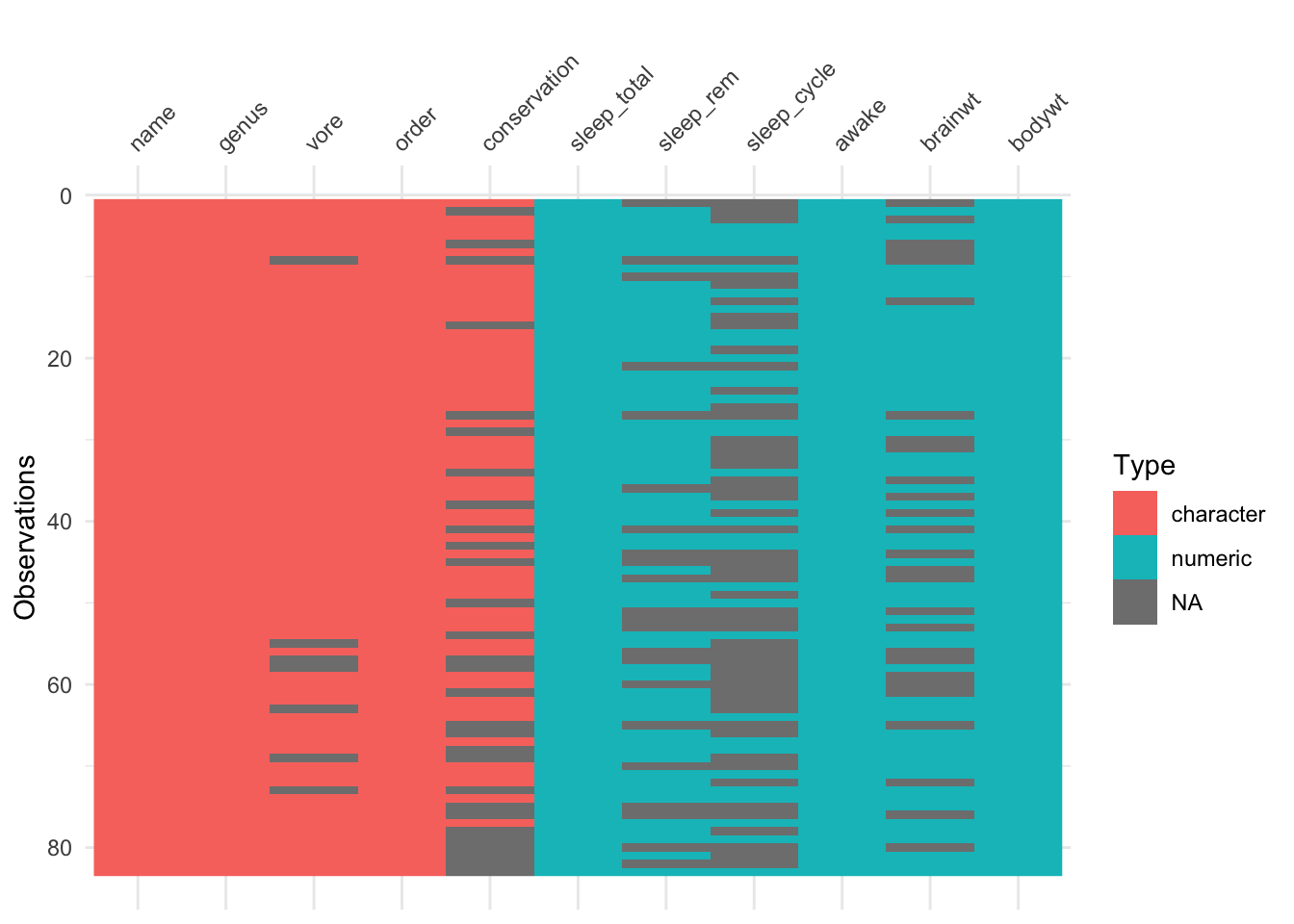
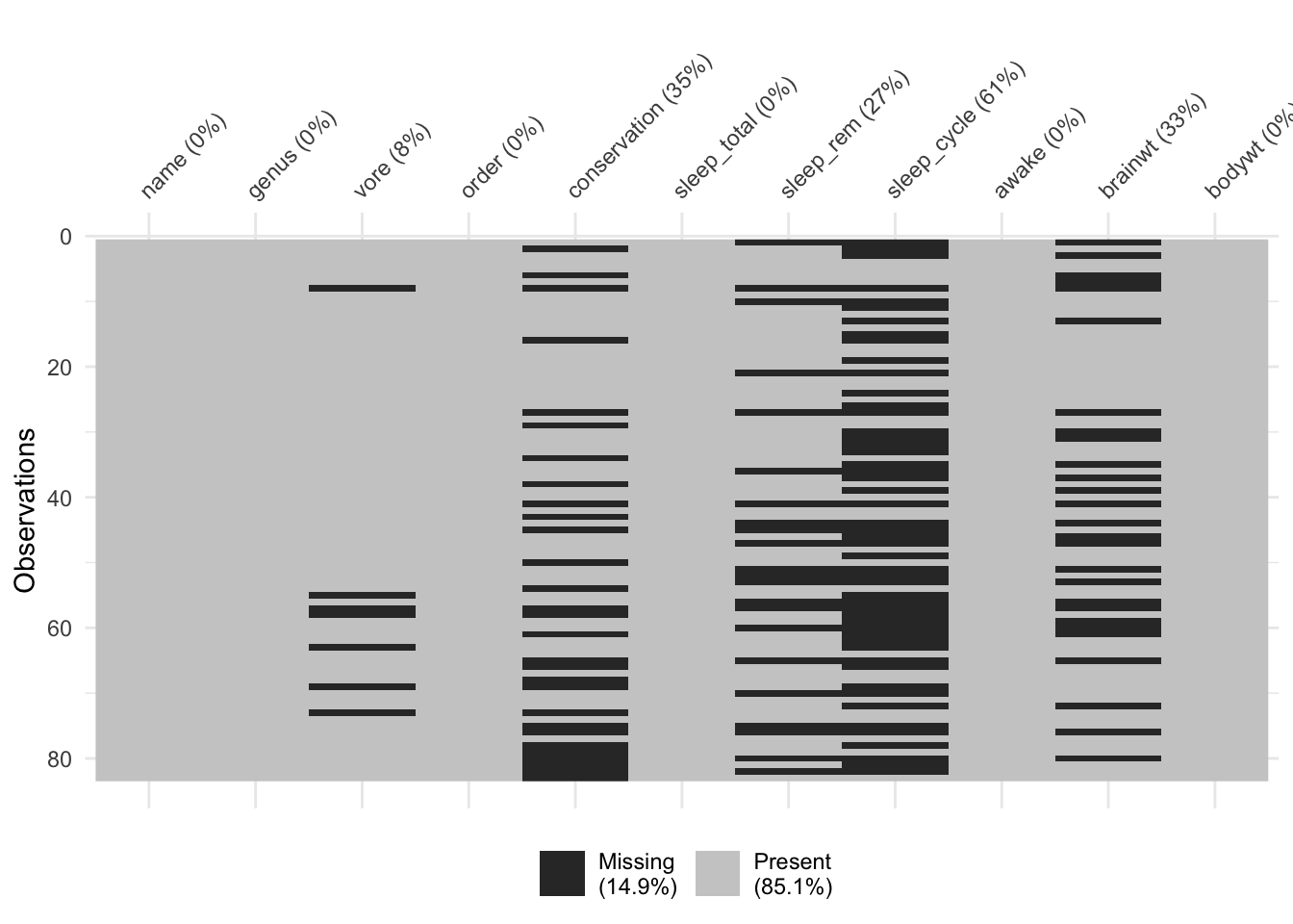
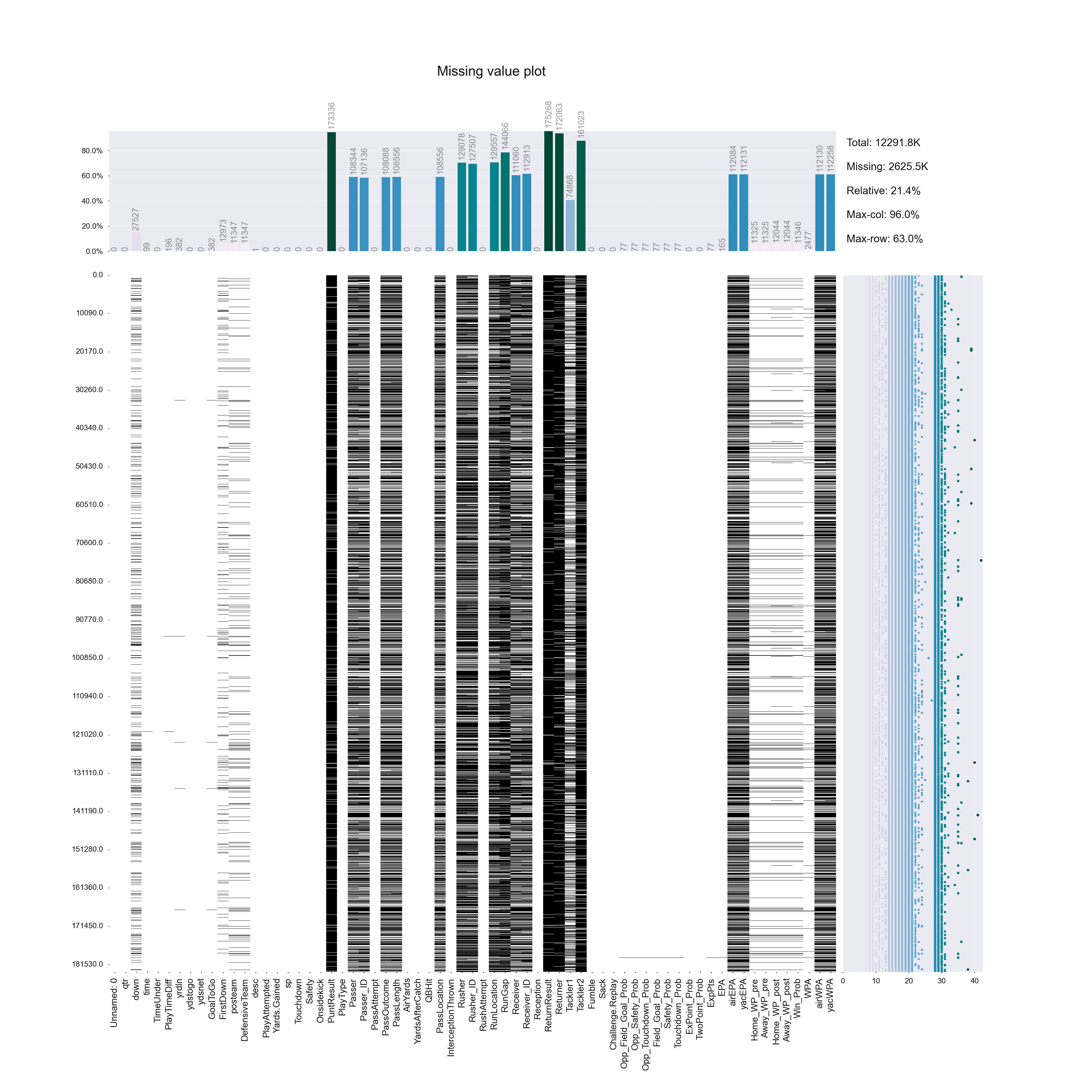
Lecture 3

Choosing the right visualization, finalizing conceptual design, exploratory data analysis, and data validation through visualizaiton

Abhijit Dasgupta, Jeff Jacobs, Anderson Monken, and Marck Vaisman

Georgetown University

Spring 2024

Agenda and Goals for Today

Lecture

Finalizing conceptual design

  • Munzner’s what?
  • More good design guidelines from Tufte and more
  • Choosing the right visualization

Exploratory data analysis

  • Understanding your data
  • Understanding the structure and validity of your data

Lab

  • 25 ways

There are several sets of principles for good visualization design

Nathan Yau

Adjustment rules

  • Explain the encodings
  • Provide context
  • Focus on readability
  • Develop aesthetics

7 basic rules for making charts and graphs

  1. Check the data
  2. Explain encodings
  3. Label axes
  4. Include units
  5. Keep your geometry in check
  6. Include your sources
  7. Consider your audience

Ed Tufte

Integrity principles

  • Show data variation, not design variation
  • Do not use graphics to quote data out of context
  • Use clear, detailed, thorough labeling
  • Representation of numbers should be directly proportional to numerical quantities
  • Don’t use more dimensions than the data require

Design principles

  • Show comparisons
  • Show causality
  • Use multivariate data
  • Completely integrate modes (like text, images, numbers)
  • Establish credibility
  • Focus on content

Noah Illinsky

Four pillars of visualization

A succesful visualization:

  1. Has clear purpose (why this visualization)
  2. Includes (only) the relevant content (what to visualize)
  3. Uses appropriate structure (how to visualize it)
  4. Has useful formatting (everything else)

Last week

Munzner’s The What?: Abstracting the Data

The How?: Marks and Channels

Today - The Why?: Abstracting Tasks

Why abstract the tasks?

  • Abstract tasks are domain-independent
  • Two different domain problems same task abstraction same solution
  • Visualization idioms are good for some tasks and bad for others

Constructing the tasks combines actions and targets

Action (verb)

Target (noun)

  • Continuation of Yau’s guidelines
    • Provide context
    • Focus on readability
    • Develop aesthetics
  • Building the right visualization
    • All about asking questions
    • Decomposing your chart
    • Understanding encodings
  • Finalizing conceptual and design considerations
    • Making readable graphics
    • More Tufte principles
  • Bringing it all together

Choosing the right graph

Guidelines for good graphical construction

Common questions to ask yourself

  • What is the best way to visualize your data?

  • What do you want to show?

    • What do you want to emphasize?
  • Why do you want to show it?

    • What is the message you want to convey?
  • Who are you showing it to?

    • Understand what your audience will be receptive to
    • What is their context?

Is choosing the right visualization straightforward?

Smaller datasets

  • Look at the data
  • Use multiple “views” to understand the data
  • Choose which patterns you want to visualize

Larger datasets

  • Use random sampling to look at smaller sub-samples
  • Experiment
  • Methods are advancing to enable big data visualization (later this semester)

The chart selection process is not mechanical

Just as you can’t

  • randomly place a bunch of words together to make a book
  • randomly record videos and get a finished film out of them
  • randomly grab ingredients from the pantry, toss them in the pan and expect a great meal…

You cannot just put a chart together as a sequence of steps.

However, there is still a method and a mental model

Ask and answer questions

  • There are many different ways to express a story from data
    • Blind men and the elephant (different perspectives)
    • Changing vantage points (different views)
    • You can change your vantage point and how you want to see the data
    • Nathan Yau shows 25 ways to see a data
  • Meaningful analysis requires
    • context,
    • background, and
    • a human in the loop
  • Different questions can lead to different chart types and focus

Some recipes for selecting the right chart (think about Munzner’s action and tasks)

However,

It is not an if this, then that scenario

There can be multiple views that show different aspects of the data

All can be useful, and equally “correct”

The real question is: does the visualization convey your story in a way that is accurate and that your audience can receive, digest and understand?

No chart is made completely in a single pass

  • A chart is not a single monolithic element, so don’t think of it as one

  • Perhaps this thought (single element) may work for standard charts like bar charts, line charts and scatterplots because most software tools provide quick ways of creating them, with reasonable defaults

  • What do you do when even a basic chart or a single element is off?

You split the chart into components

  • The basic mental model is that charts are compositional
    • There are building blocks and ways to put them together
    • If you understand the relevant parts, you can compose charts by mixing and matching and layering and joining

This is a very powerful model

Plane and retinal variables

A plane is like the coordinate system that defines how geometries are placed in a space. A retinal variable defines how to encode data into visuals.

Jacques Bertin, Semiology of Graphics, 1967

The Grammar of Graphics

William S. Cleveland, in his 1994 book The Elements of Graphing Data, lists the “basic elements of graph construction” as scales, captions, plotting symbols, reference lines, keys, labels, panels, and tick marks.

In The Grammar of Graphics, published in 2005, Leland Wilkinson built off the work by Bertin and more formally defined the components of a graphic:

Statistical graphic specifications are expressed in six statements:

Statement Description
DATA a set of data operations that create variables from datasets
TRANS variable transformation (e.g. rank)
SCALE scale transformations (e.g. log)
COORD a coordinate system (e.g. polar)
ELEMENT graphs (e.g. points) and their aesthetic attributes (e.g. color)
GUIDE one or more guides (axes, legends, etc.)

Hadley Wickham implemented Wilkinson’s grammar in R with the popular ggplot2 package.

Strategies for breaking charts into individual components

  • The data drives all decisions
    • The purpose is to convey the information in the data
  • The visual encodings dictate the geometry and/or colors of a graphic
    • This forms the aesthetics of the visualization
    • This most influences how the visualization is received
  • The coordinate system (Cartesian, polar, or geographic) specifies the space in which the visual encodings reside.
    • This provides the canvas, scales and orientations upon which we visualize
  • The context communicates what the data is about, where it is from, and why it exists.
    • This can be provided through textual annotations, legends, etc.

Readability

Motivation

  • Improving readability is very important
  • Charts should read like text. At the most basic level, it should be obvious what the chart is about and how to interpret it.
  • If your charts are ugly or messy, then the audience will likely ignore them which will negatively effect your reputation.

What makes a readable graphic?

  • It depends on who you ask

  • Many go by the data-ink ratio as described by Tufte:

A large share of ink on a graphic should present data-information, the ink changing as the data change. Data-ink is the non-erasable core of a graphic, the non-redundant ink arranged in response to variation in the numbers represented.

Data-Ink

  • Tufte embraced a minimalist perspective
  • These are guidelines, not rules, and answers differ depending who you ask.

A large share of ink on a graphic should present data-information, the ink changes as the data changes.

Data-ink is the non-erasable core of a graphic, the non-redundant ink arranged in response to variation in the numbers represented.

How to maximize the data-ink ratio, within reason:

  1. Erase non-data-ink, within reason
  2. Erase redundant data-ink
  3. Revise and edit

Example: Too much ink

Data is fluid and visualization represents that fluidity

  • Real world is complicated
  • There are visualization rules that cannot be broken related to the technical aspects of how a chart is constructed
  • However, there are principles and guidelines (fuzzier aspects of chart design) that you need to adapt to the data and the context:
    • The baseline always needs to start at zero. But what if the data has no zeros?
    • Pie charts are terrible, never use them. But people know how to read pie charts and it’s fine for this specific dataset.
    • A bar chart would have been better. Insert some snarky remark here.

Tradeoffs

When visualizing for an audience there are always factors to consider that can conflict with visual efficiency

A readable chart:

  • Provides clarity (removes confusion)

  • Has a clear purpose

  • Uses visual encodings that make sense for the context of the data

  • Has a clear direction for how to interpret

Visual hierarchy

What is visual hierarchy?

Definition

Visual hierarchy is the principle of arranging elements to show their order of importance. Designers structure visual characteristics. By laying out elements logically and strategically, designers influence users’ perceptions and guide them to desired actions. 1

Elements of the visual hierarchy

  • Alignment
  • Repetition
  • Leading lines
  • Rule of thirds
  • Perspective
  • Size and Scale
  • Color and contrast
  • Typographic Hierarchy
  • Spacing
  • Proximity 2

Motivating example: Why is it important?

  • When you make a chart using default settings, you usually get a flat graphic where everything — from the tick marks, to the encoded data, to the title — gets the same amount of importance visually

If lines, colors, border box, etc. are on the same hierarchy level as the data itself, nothing stands out!

Can you discern the data from the background?

Small adjustments help the data appear more prominently and the other parts move back to support.

  • The grid was made lighter, The font was made smaller
  • Notice how the variance and noise in data is emphasized more than the trend

This is Better, but still not great.

Is it more obvious now what is data and what part is background context?

  • The fit line’s thickness was increased
  • The data points were made transparent
  • In this case the Trend in data is emphasized, rather than the noise

Color and contrast

  • Color choice is a key element in Graphic Design, it makes parts of chart stand out
  • Content creators can drive the viewer’s attention to specific graphic elements by color selection
  • The “protagonist” of the story is in bold black color - Federer
  • Brighter and bolder appear more prominent than greyed or faded colors
  • To increase the visibility of your data, make it appear higher in the visual hierarchy

Highlighting

  • Highlighting, is closely related to color, however in this case we vary the intensity not hue to emphasize select aspects of the chart
  • Using highlighting to calls out specific areas of a visualization to direct readers’ eyes to what is important

Size and relative scale

  • Scale and proportion refer to the size of one graphic element in relation to another in design or artwork
  • Objects that use more space on the screen or paper will naturally draw more attention
  • Vary the sizes in your chart to bring more attention to points of interest
  • One obvious case is the size of text

The golden ratio

  • The Golden Ratio, also known as the divine ratio is a fundamental ratio in nature, and creates an aesthetically pleasing balance between dimensions.

  • Here we see the mathematical construction of the

  • Often we’ll see rectangles where the longer side and shorter side are in this ratio.

Proximity and placement

  • Things that are related should be close together
  • Conversely, things that don’t have any relationship should be placed further away.
  • Where you put your data — top, bottom, left, right — also affects visual hierarchy
  • Things placed at the top of a chart appear more important than things placed at the bottom.
  • For example, in government and politics, left and right might be linked to certain ideologies

Rule of thirds

  • Choosing the placement of important objects in your figure can be done using the ‘rule of thirds’.
  • Imagine dividing your image into nine equal parts by two equally spaced horizontal lines and two equally spaced vertical lines
  • The important compositional elements should be along these lines or their intersections.

Layering

  • Think of the visual hierarchy as “layers of increasing importance”
    • The most important items gets placed on the top of the stack
    • Items that are less important, or rather, more boilerplate, can fall to the back
  • The layering metaphor is especially helpful when you implement or design your visualization.
  • For example, Adobe Illustrator or Inkscape already uses layers, so you can stack things on top of each other based on your goals
  • If you’re using code, the code for a bottom layer tends to run before the top layers.
  • From the reader perspective, it’s more obvious where to focus attention. They can spend less time trying to interpret the chart and the data and more time understanding your own interpretations of the data.

Concluding example

  • So how can we use visual hierarchy to make a chart more readable?
  • Consider the following plot before and after applying the previous recommendations

  • Much better!!!

Providing Context

Methods for providing context

  • Annotation
  • Tone
  • Direct Labeling
  • Font Selection
  • Point of Reference

Some definitions

  • Label: Provides positive identification of a particular data element or grouping. The purpose is to make it easy for the viewer to know the name or kind of data illustrated.

  • Annotation: Augments the information the viewer can immediately see about the data with notes, sources, or other useful information. In contrast to a label, annotation is meant to extend the viewer’s knowledge of the data rather than simply identify it.

  • Legend: Presents a listing of the data groups within the graph and often provides cues (such as line type or color) to make identification of the data group easier. For example,red points belong to group A, while blue points belong to group B.

Source

Annotation

  • Annotation is the quickest and most straightforward way to add context to your charts. However, under the false security of “letting the data speak”, oftentimes these words are missing from default charts.
  • Add the extra layer of information, and you draw attention to specific areas and points, help explain visual encodings, and describe what a reader is seeing.
  • Words can set expectations, so that readers know what they’re about to see. Here’s Hidy Kong on her group’s research on visualization titles:
    • Visualization titles influence how people interpret, perceive bias in, and trust data visualizations.
    • Sometimes it doesn’t even matter that a title contradicted the chart. The title could say that something increased over time when the chart showed a clear decrease, and the reader would take away the context of the title over the chart.

Example: without-annotation

  • Annotations help the reader understand the context of the data.
  • Here is an example of a bad graph with lacks context.

Example: with annotation

  • The graph can be improved significantly by adding annotation

Tone

  • The words you use describe your data can change the tone of your charts, which can change how people interpret them
  • Using casual language could signal to readers that your chart presents a less serious topic
  • Using more technical language might seem like it was meant for a technical audience
  • Choose your words wisely

Direct Labeling

  • Most visualization software lets you add legends to your charts to describe what each visual encoding represents
  • The challenge for readers is that they have to refer to the legend and look away from the actual chart
  • Try to directly label visual encodings

However…

  • Most statistical software (R, Python, MATLAB, etc) require time consuming steps for words on graphics and typography
    • This situation is improving with newer packages
  • For speed, additional post-processing can also be done with Illustrator or some other tool. Though you sacrifice reproducibility!

Font Selection

There are two basic classes of annotations:

  • Labels that help readers decode the visualization (axis, tick, and category labels)
  • Annotations that explain the data, which is usually required to provide context for a specific dataset/audience

Nathan Yau uses monospace fonts for general labels and an italicized serif font for contextual annotation.

See Lab 2 and https://gu-dsan.github.io/5200-spring-2024/resources/theming/theme-elements.html for more resources/insights into typography in visualization.

Point of Reference

  • Points of reference tether the audience’s mind to something familiar, which increase interpretability
  • Visualization is all about comparison
  • If it is difficult to compare visual encodings, then it is difficult to interpret a chart, much less get anything useful out of it
  • Providing a point of reference is a straightforward remedy
  • With time series data, it can be useful to use a specific time as a point of reference

Aesthetics

Recommendations for good aesthetic design

Aesthetics are subjective and can provide more clarity

Put effort into aesthetics, and it can help readers understand your charts better and also differentiate your own style

Aesthetics can provide the following benefits:

  • Beauty
  • Readability
  • Identity
  • Expectations

Elements of aesthetics:

  • Organization and arrangement
  • Sizes and weights
  • Color palette
  • Medium

Tufte’s Principles

Fundamental principles of design

  1. Show comparisons
  2. Show causality
  3. Use multivariate data
  4. Completely integrate modes (like text, images, numbers)
  5. Establish credibility
  6. Focus on content

Principles of graphical integrity

  1. Show data variation, not design variation
  2. Do not use graphics to quote data out of context
  3. Use clear, detailed, thorough labelling
  4. Representation of numbers should be directly proportional to numerical quantities
  5. Don’t use more dimensions than the data require

Minimalism

  • Tufte guidelines often boils down to embracing a minimalist’s prospective

Avoid Overload!

  • The goal is audience comprehension not confusion!
  • Keep it simple!!!: Remove redundant/un-needed information.

Spark-lines

Tufte, May 27, 2004

Tufte, May 27, 2004

A sparkline is a small intense, simple, word-sized graphic with typographic resolution. Sparklines mean that graphics are no longer cartoonish special occasions with captions and boxes, but rather sparkline graphic can be everywhere a word or number can be: embedded in a sentence, table, headline, map, spreadsheet, graphic.

Spark-lines: Key features

  • Usually small resolution so they can be included anywhere in text

  • Typically drawn without axes or coordinates.

  • presents the general shape of the variation

  • Often used to show multiple time series (i.e. stock information)

  • highly condensed representation

  • The Idea was developed by Tufte in 2004

Code example: Sparklines

import matplotlib.pyplot as plt
import numpy as np

# create some random data
x = np.cumsum(np.random.rand(1000)-0.5)

# plot it
fig, ax = plt.subplots(1,1,figsize=(10,3))
plt.plot(x, color='k')
plt.plot(len(x)-1, x[-1], color='r', marker='o')

# remove all the axes
for k,v in ax.spines.items():
    v.set_visible(False)
_ = ax.set_xticks([])
_ = ax.set_yticks([])

#show it
plt.show()

Small Multiples

What is it? “Illustrations of postage-stamp size, are indexed by category or a label, sequenced over time like the frames of a movie, or ordered by a quantitative variable not used in the single image itself.” (Tufte, Envision Information, page 67)

Small multiples method is often used by Tufte to portray variation using multiple graphs.

At the heart of quantitative reasoning is a single question: Compared to what? Small multiple designs, multivariate and data bountiful, answer directly by visually enforcing comparisons of changes, of the differences among objects, of the scope of alternatives. For a wide range of problems in data presentation, small multiples are the best design solution.

Example: Small multiples

  • Small plots, indexed by category, each subplot has the same underlying graphical unit
  • Shows multi-variable variation in the data across individual snapshots/slices.
  • Avoids “over-plotting” by spreading the information across multiple sub-plots
  • One major benefit is that they are easily digestible and intuitive

Small multiples: Guidelines

  • Principle: Show something instead of showing everything

Code example: Small multiples

#https://www.python-graph-gallery.com/125-small-multiples-for-line-chart

# libraries
import matplotlib.pyplot as plt
import numpy as np
import pandas as pd
    
# Make a data frame
df=pd.DataFrame({'x': range(1,11), 'y1': np.random.randn(10), 'y2': np.random.randn(10)+range(1,11), 'y3': np.random.randn(10)+range(11,21), 'y4': np.random.randn(10)+range(6,16), 'y5': np.random.randn(10)+range(4,14)+(0,0,0,0,0,0,0,-3,-8,-6), 'y6': np.random.randn(10)+range(2,12), 'y7': np.random.randn(10)+range(5,15), 'y8': np.random.randn(10)+range(4,14), 'y9': np.random.randn(10)+range(4,14) })
    
# Initialize the figure style
plt.style.use('seaborn-v0_8')
    
# create a color palette
palette = plt.get_cmap('Set1')
    
# multiple line plot
num=0
for column in df.drop('x', axis=1):
    num+=1
    
    # Find the right spot on the plot
    plt.subplot(3,3, num)
    
    # plot every group, but discrete
    for v in df.drop('x', axis=1):
        plt.plot(df['x'], df[v], marker='', color='grey', linewidth=0.6, alpha=0.3)
    
    # Plot the lineplot
    plt.plot(df['x'], df[column], marker='', color=palette(num), linewidth=2.4, alpha=0.9, label=column)
    
    # Same limits for every chart
    plt.xlim(0,10)
    plt.ylim(-2,22)
    
    # Not ticks everywhere
    if num in range(7) :
        plt.tick_params(labelbottom='off')
    if num not in [1,4,7] :
        plt.tick_params(labelleft='off')
    
    # Add title
    plt.title(column, loc='left', fontsize=12, fontweight=0, color=palette(num) )
<Axes: >
[<matplotlib.lines.Line2D object at 0x2a9828250>]
[<matplotlib.lines.Line2D object at 0x17b63a390>]
[<matplotlib.lines.Line2D object at 0x17b63b110>]
[<matplotlib.lines.Line2D object at 0x17b63bdd0>]
[<matplotlib.lines.Line2D object at 0x17b648b50>]
[<matplotlib.lines.Line2D object at 0x17b649990>]
[<matplotlib.lines.Line2D object at 0x17b64a750>]
[<matplotlib.lines.Line2D object at 0x17b64b450>]
[<matplotlib.lines.Line2D object at 0x2aa0bc250>]
[<matplotlib.lines.Line2D object at 0x17b611590>]
(0.0, 10.0)
(-2.0, 22.0)
Text(0.0, 1.0, 'y1')
<Axes: >
[<matplotlib.lines.Line2D object at 0x17b612690>]
[<matplotlib.lines.Line2D object at 0x2aa0f3690>]
[<matplotlib.lines.Line2D object at 0x2aa0fc0d0>]
[<matplotlib.lines.Line2D object at 0x2aa0fcbd0>]
[<matplotlib.lines.Line2D object at 0x17b620690>]
[<matplotlib.lines.Line2D object at 0x2aa0e3390>]
[<matplotlib.lines.Line2D object at 0x2aa0fdb50>]
[<matplotlib.lines.Line2D object at 0x2aa0fe810>]
[<matplotlib.lines.Line2D object at 0x2aa0ff490>]
[<matplotlib.lines.Line2D object at 0x2aa10c110>]
(0.0, 10.0)
(-2.0, 22.0)
Text(0.0, 1.0, 'y2')
<Axes: >
[<matplotlib.lines.Line2D object at 0x2aa126c50>]
[<matplotlib.lines.Line2D object at 0x2aa13b710>]
[<matplotlib.lines.Line2D object at 0x2aa13bf50>]
[<matplotlib.lines.Line2D object at 0x2aa144ad0>]
[<matplotlib.lines.Line2D object at 0x2aa145590>]
[<matplotlib.lines.Line2D object at 0x2aa146090>]
[<matplotlib.lines.Line2D object at 0x2aa146b90>]
[<matplotlib.lines.Line2D object at 0x2aa1476d0>]
[<matplotlib.lines.Line2D object at 0x2aa1501d0>]
[<matplotlib.lines.Line2D object at 0x2aa150b50>]
(0.0, 10.0)
(-2.0, 22.0)
Text(0.0, 1.0, 'y3')
<Axes: >
[<matplotlib.lines.Line2D object at 0x2aa15ce50>]
[<matplotlib.lines.Line2D object at 0x2aa187490>]
[<matplotlib.lines.Line2D object at 0x2aa187e50>]
[<matplotlib.lines.Line2D object at 0x2aa1948d0>]
[<matplotlib.lines.Line2D object at 0x2aa1953d0>]
[<matplotlib.lines.Line2D object at 0x2aa195f50>]
[<matplotlib.lines.Line2D object at 0x2aa196a50>]
[<matplotlib.lines.Line2D object at 0x2aa1974d0>]
[<matplotlib.lines.Line2D object at 0x2aa197e90>]
[<matplotlib.lines.Line2D object at 0x2aa1a07d0>]
(0.0, 10.0)
(-2.0, 22.0)
Text(0.0, 1.0, 'y4')
<Axes: >
[<matplotlib.lines.Line2D object at 0x2aa1bff90>]
[<matplotlib.lines.Line2D object at 0x2aa1d3610>]
[<matplotlib.lines.Line2D object at 0x2aa1d3f10>]
[<matplotlib.lines.Line2D object at 0x2aa1dca10>]
[<matplotlib.lines.Line2D object at 0x2aa1dd550>]
[<matplotlib.lines.Line2D object at 0x2aa1dde10>]
[<matplotlib.lines.Line2D object at 0x2aa1de950>]
[<matplotlib.lines.Line2D object at 0x2aa1df350>]
[<matplotlib.lines.Line2D object at 0x2aa1dfd90>]
[<matplotlib.lines.Line2D object at 0x2aa1ec7d0>]
(0.0, 10.0)
(-2.0, 22.0)
Text(0.0, 1.0, 'y5')
<Axes: >
[<matplotlib.lines.Line2D object at 0x2aa1f8990>]
[<matplotlib.lines.Line2D object at 0x2aa21ea90>]
[<matplotlib.lines.Line2D object at 0x2aa21f490>]
[<matplotlib.lines.Line2D object at 0x2aa21fe50>]
[<matplotlib.lines.Line2D object at 0x2aa230950>]
[<matplotlib.lines.Line2D object at 0x2aa231410>]
[<matplotlib.lines.Line2D object at 0x2aa231e10>]
[<matplotlib.lines.Line2D object at 0x2aa232910>]
[<matplotlib.lines.Line2D object at 0x2aa2333d0>]
[<matplotlib.lines.Line2D object at 0x2aa233d90>]
(0.0, 10.0)
(-2.0, 22.0)
Text(0.0, 1.0, 'y6')
<Axes: >
[<matplotlib.lines.Line2D object at 0x2aa248090>]
[<matplotlib.lines.Line2D object at 0x2aa26e690>]
[<matplotlib.lines.Line2D object at 0x2aa26f010>]
[<matplotlib.lines.Line2D object at 0x2aa265fd0>]
[<matplotlib.lines.Line2D object at 0x2aa27c410>]
[<matplotlib.lines.Line2D object at 0x2aa27cf50>]
[<matplotlib.lines.Line2D object at 0x2aa27d990>]
[<matplotlib.lines.Line2D object at 0x2aa27e450>]
[<matplotlib.lines.Line2D object at 0x2aa27ef10>]
[<matplotlib.lines.Line2D object at 0x2aa27f9d0>]
(0.0, 10.0)
(-2.0, 22.0)
Text(0.0, 1.0, 'y7')
<Axes: >
[<matplotlib.lines.Line2D object at 0x2aa291a10>]
[<matplotlib.lines.Line2D object at 0x2aa2ba010>]
[<matplotlib.lines.Line2D object at 0x2aa2ba890>]
[<matplotlib.lines.Line2D object at 0x2aa2bb350>]
[<matplotlib.lines.Line2D object at 0x2aa2bbdd0>]
[<matplotlib.lines.Line2D object at 0x2aa2c8850>]
[<matplotlib.lines.Line2D object at 0x2aa2c92d0>]
[<matplotlib.lines.Line2D object at 0x2aa2c9d10>]
[<matplotlib.lines.Line2D object at 0x2aa2ca850>]
[<matplotlib.lines.Line2D object at 0x2aa2c8350>]
(0.0, 10.0)
(-2.0, 22.0)
Text(0.0, 1.0, 'y8')
<Axes: >
[<matplotlib.lines.Line2D object at 0x2aa2d73d0>]
[<matplotlib.lines.Line2D object at 0x2aa2fd310>]
[<matplotlib.lines.Line2D object at 0x2aa30a250>]
[<matplotlib.lines.Line2D object at 0x2aa30ac90>]
[<matplotlib.lines.Line2D object at 0x2aa30b6d0>]
[<matplotlib.lines.Line2D object at 0x2aa318290>]
[<matplotlib.lines.Line2D object at 0x2aa318cd0>]
[<matplotlib.lines.Line2D object at 0x2aa319710>]
[<matplotlib.lines.Line2D object at 0x2aa31a1d0>]
[<matplotlib.lines.Line2D object at 0x2aa31ab90>]
(0.0, 10.0)
(-2.0, 22.0)
Text(0.0, 1.0, 'y9')
# general title
# plt.suptitle("How the 9 students improved\nthese past few days?", fontsize=13, fontweight=0, color='black', style='italic', y=1.02)
    
# Axis titles
plt.text(0.5, 0.02, 'Time', ha='center', va='center')
Text(0.5, 0.02, 'Time')
plt.text(0.06, 0.5, 'Note', ha='center', va='center', rotation='vertical')
Text(0.06, 0.5, 'Note')
# Show the graph
plt.show()

Graphical Integrity

  • The representation of numbers, as physically measured on the surface of the graphic itself, should be directly proportional to the numerical quantities represented
  • Clear, detailed, and thorough labeling should be used to defeat graphical distortion and ambiguity. Write out explanations of the data on the graphic itself. Label important events in the data.
  • Graphics must not quote data out of context. Graphics should not distort the data. Graphics should not mislead. Graphics should not be used to make the data look better than it is

Chartjunk

  • Forego chartjunk, including moiré vibration, the grid and the duck
  • The interior decoration of graphics generates a lot of ink that does not tell the viewer anything new.
  • The purpose of decoration varies — to make the graphic appear more scientific and precise, to enliven the display, to give the designer an opportunity to exercise artistic skills.
  • All non-data- ink or redundant data-ink is often chartjunk.

Multifunctioning Graphical Elements

  • Mobilize every graphical element, perhaps several times over, to show the data.
  • The graphical element that actually locates or plots the data is the data measure.
  • The complexity of multifunctioning elements can sometimes turn data graphics into visual puzzles, crypto- graphical mysteries for the viewer to decode.

Escaping Flatland

  • Introduce multiple dimensions on a two-space surface
  • Focus more on the point than on the presentation, good design strategies are transparent.
  • Find pattern
  • Words may not be the most appealing to everyone but symbols are universal and understood by all
  • More small images in sequence allow more comparison with your eyes and a better understanding

Avoid design fixation

Bringing it Together

So far you’ve learned about

  • Designing for an audience

  • Picking the right visualization

  • Making readable graphics

Now what?

Practice, practice, practice

You make awesome charts

You are a Dataviz G.O.A.T.

nah!

You work with MORE data!

  • more complexity
  • larger files
  • missing values
  • incorrect encodings

However, too much leads to overload

Start asking questions

ASK -> ANSWER -> ASK NEW -> ANSWER AGAIN -> REPEAT

  • What does the data look like?
  • Does anything stand out?
  • What is the mean and median?

Start simple and work your way up to more complex questions

Visual exploratory analysis (EDA)

History

The ideas behind visual EDA dates back over 100 years

  • Arthur Lyon Bowley, one of the early statisticians, used precursors of the stemplot and the five-number summary, using instead a seven-number summary (maximum, minimum, median, quartiles and two deciles)1
  • The modern concept of EDA traces back to John Tukey’s seminal book Exploratory Data Analysis (1977), based on his work at the famour Bell Labs.

Exploratory data analysis can never be the whole story, but nothing else can serve as the foundation stone –- as the first step

John Tukey, 1977

A more modern description

An approach/philosophy for data analysis that employs a variety of techniques (mostly graphical) to maximize insight into a data set, uncover underlying structure, extract important variables, detect outliers and anomalies, test underlying assumptions, develop parsimonious models and determine optimal factor settings.

U.S. National Institute of Standards and Technology

Industry views

  1. Get a look at data before making any assumptions
  2. Screen data and identify obvious errors
  3. Better understand patterns within the data
  4. Detect outliers or anomalous events
  5. Ask questions and check/validate your assumptions
  6. Find interesting relations among the variables

Maximize the analyst’s insight into a data set and into the underlying structure of a data set, while providing all of the specific items that an analyst would want to extract from a data set

  1. a good-fitting, parsimonious model
  2. a list of outliers
  3. a sense of robustness of conclusions
  4. estimates for parameters
  5. uncertainties for those estimates
  6. a ranked list of important factors
  7. conclusions as to whether individual factors are statistically significant
  8. optimal settings

EDA is used in many contexts

Data profiling
(graphical and non-graphical)

  • Determine if there are any problems with your dataset
  • Data structure
  • Missing data and remedies
  • Simple counts
  • Checking for duplicate entries

Data explorations and insights

  • Determine whether the question you are asking can be answered by the data that you have
    • Assess hypothesis
  • Understand underlying patterns and trends
    • Univariate distributions and summaries for numeric and categorical data
    • Data transformations.
    • Bivariate relationships
      • numeric-numeric
      • numeric-categorical
      • categorical-categorical
  • How to best present your data visually

What are we looking for?

Start by looking at …

  • Distributions & relationships
  • Anomalies / Outliers
  • Groupings
  • Missing data patterns

to figure out…

  • Models
  • Presentation graphics
  • Stories

How do we approach this task?

  • Visual analytics
    • Quick prototyping and iteration
  • Broad approaches
    • Univariate visualizations for distribution, outliers
    • Bivariate and multivariate visualizations for relationships

Visual summaries of data

There is of course a lot of univariate and bivariate visualizations you can do to understand you data, including histograms, density plots, scatter plots and the like.

  • This is looking through a magnifying glass
  • You mostly know how to do this from other classes (though this is a good time to ask questions)

Not mistaking the forest for the trees

Our first steps should be to get an overall view of the dataset to see if

  • we see what we expect to see
  • are there any early surprises
    • incomplete data
    • associations
    • outliers

We’ll look at some tools that summarize the whole data

Why are missing data patterns important

  1. From a completeness perspective, it gives a sense of the amount of usable data on hand
  2. From an analytic perspective, there’s actually a bit more
    • A fundamental idea in handling missing data is that the missingness happens at random
    • If the missingness is at random, we can ignore it for the purposes of analysis and modeling
    • If it isn’t at random, it’s considered informative or non-ignorable missingness and has to be dealt with analytically, either via imputation or as an explicit component in any modeling strategy
    • If some variables tend to be missing together, it points to flaws in the data collection process as well as an issue with correlated missingness.
    • If some variables have “too much” missing, should we consider tossing them?

Visualizating datasets

The msleep dataset

Mammals sleeping data, available as ggplot2::msleep

glimpse(msleep)
Rows: 83
Columns: 11
$ name         <chr> "Cheetah", "Owl monkey", "Mountain beaver", "Greater shor…
$ genus        <chr> "Acinonyx", "Aotus", "Aplodontia", "Blarina", "Bos", "Bra…
$ vore         <chr> "carni", "omni", "herbi", "omni", "herbi", "herbi", "carn…
$ order        <chr> "Carnivora", "Primates", "Rodentia", "Soricomorpha", "Art…
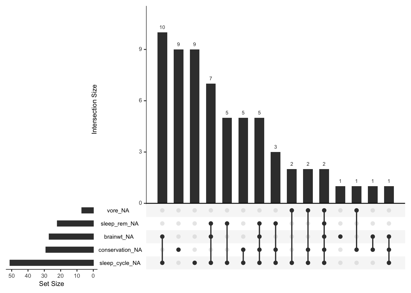
$ conservation <chr> "lc", NA, "nt", "lc", "domesticated", NA, "vu", NA, "dome…
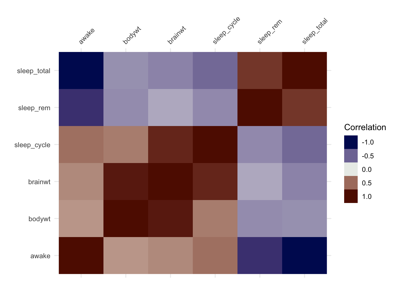
$ sleep_total  <dbl> 12.1, 17.0, 14.4, 14.9, 4.0, 14.4, 8.7, 7.0, 10.1, 3.0, 5…
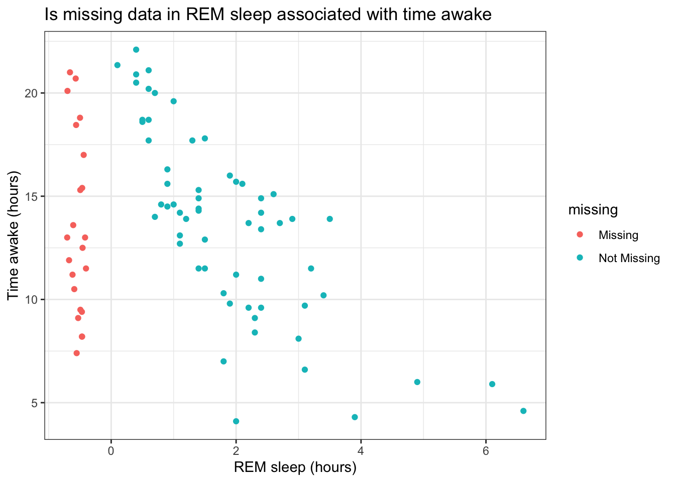
$ sleep_rem    <dbl> NA, 1.8, 2.4, 2.3, 0.7, 2.2, 1.4, NA, 2.9, NA, 0.6, 0.8, …
$ sleep_cycle  <dbl> NA, NA, NA, 0.1333333, 0.6666667, 0.7666667, 0.3833333, N…
$ awake        <dbl> 11.9, 7.0, 9.6, 9.1, 20.0, 9.6, 15.3, 17.0, 13.9, 21.0, 1…
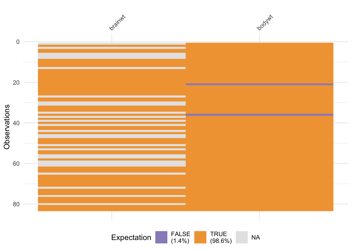
$ brainwt      <dbl> NA, 0.01550, NA, 0.00029, 0.42300, NA, NA, NA, 0.07000, 0…
$ bodywt       <dbl> 50.000, 0.480, 1.350, 0.019, 600.000, 3.850, 20.490, 0.04…

Not very useful, since we can’t see much information

The msleep dataset

summary(msleep)
     name              genus               vore              order          
 Length:83          Length:83          Length:83          Length:83         
 Class :character   Class :character   Class :character   Class :character  
 Mode  :character   Mode  :character   Mode  :character   Mode  :character  


 conservation        sleep_total      sleep_rem      sleep_cycle    
 Length:83          Min.   : 1.90   Min.   :0.100   Min.   :0.1167  
 Class :character   1st Qu.: 7.85   1st Qu.:0.900   1st Qu.:0.1833  
 Mode  :character   Median :10.10   Median :1.500   Median :0.3333  
                    Mean   :10.43   Mean   :1.875   Mean   :0.4396  
                    3rd Qu.:13.75   3rd Qu.:2.400   3rd Qu.:0.5792  
                    Max.   :19.90   Max.   :6.600   Max.   :1.5000  
                                    NA's   :22      NA's   :51      
     awake          brainwt            bodywt        
 Min.   : 4.10   Min.   :0.00014   Min.   :   0.005  
 1st Qu.:10.25   1st Qu.:0.00290   1st Qu.:   0.174  
 Median :13.90   Median :0.01240   Median :   1.670  
 Mean   :13.57   Mean   :0.28158   Mean   : 166.136  
 3rd Qu.:16.15   3rd Qu.:0.12550   3rd Qu.:  41.750  
 Max.   :22.10   Max.   :5.71200   Max.   :6654.000  
                 NA's   :27                          

A little better, but not great. Good univariate summaries

The msleep data

visdat::vis_dat(msleep)

In one shot you can see

  • data types
  • proportion of missing data
  • common missing data patterns

The msleep data

We can also look as how correlated the numerical variables are to each other using a correlation heatmap

visdat::vis_cor(
  msleep |> select(where(is.numeric))
)

The msleep data

We can also look at whether the data meets expectations, or are their “outliers” or potential issues in particular observations

msleep |> select(ends_with('wt')) |> visdat::vis_expect(~.x < 1000)

From R 4.1 there is a concept of an anonymous function, much like lambda functions in Python. This can be used here, and so the code would look like

msleep |> select(ends_with('wt')) |> visdat::vis_expect(\(x) x < 1000)

A closer look at missing data patterns

visdat::vis_miss(msleep)

This visualization provides both missing data patterns and summary statistics about the missing data

A closer look at missing data patterns

The naniar package by Nicholas Tierney provides more detailed looks at missing data patterns

library(naniar)
ggplot(msleep, aes(sleep_rem, awake)) + 
  naniar::geom_miss_point() + 
  labs(x = "REM sleep (hours)",
       y = "Time awake (hours)",
       title = "Is missing data in REM sleep associated with time awake")+
  theme_bw()

ggplot(airquality, 
       aes(x = Solar.R, 
           y = Ozone)) + 
  naniar::geom_miss_point() +
  labs(x = "Solar radiation (Langleys)",
       y = "Mean ozone (ppb)",
       title = "Are there missing data patterns",
       caption = "Data obtained from `datasets::airquality`")+
  theme_bw()

This is a clever use of a standard visualization where the red dots show the values of one variable when the other variable is missing. This can show

  • particular patterns in missingness, or a lack of pattern :white_check_mark:

Doing this in Python

The klib package

There are a couple of packages in Python for visually looking at full datasets and missing patterns: klib and missingno.

  • The klib package is more feature rich
    • it is faster than the corresponding R packages and can handle larger datasets
    • Under current development
import pandas as pd
import matplotlib.pyplot as plt
from pathlib import Path 
import klib

nfl = pd.read_csv("https://github.com/anly503/datasets/raw/main/NFL_DATASET.csv")
nfl.shape
(183460, 67)
_ = klib.missingval_plot(nfl)
plt.show()

#plt.savefig('img/missingval.png')

Missing value correlations

Code
import missingno as msno

nfl = pd.read_csv("https://github.com/anly503/datasets/raw/main/NFL_DATASET.csv")
_ = msno.heatmap(nfl)
plt.show()
#plt.savefig("img/msno_heatmap.png")

UpSet plots

Looking at multivariate relationships among categorical variables
applied to missing data

UpSet plots

The UpSet plot was originally developed at Harvard in 2014.

The main purpose was to solve the problem of set visualizations when you have more than one set (so an extension of Venn Diagrams), in an intuitive manner

It tries to solve the problem created by the following visualization looking at the intersection of 6 sets

D’Hont et al, The banana (Musa acuminata) genome and the evolution of monocotyledonous plants. Nature 488, 213-217 (2012)

D’Hont et al, The banana (Musa acuminata) genome and the evolution of monocotyledonous plants. Nature 488, 213-217 (2012)

Example

UpSet plots

Let’s look at this from a missing data perspective. Each “set” is the missing/non-missing annotation of each variable in a data set, and we’re interested in when the missing data co-occur.

gg_miss_upset(msleep) 

The msleep data

The msleep data
  • The left barplot gives the number of missing data for each variable (here showing the top 5)
  • The “barbells” show the different co-occurrence patterns
  • The top barplot gives the frequencies of each co-occurrence pattern

UpSet plots (R)

Using the UpSetR package

library(UpSetR)
d <- msleep |> 
  select(vore, sleep_rem, brainwt, conservation, sleep_cycle)
d <- as.data.frame(is.na(d)*1)
upset(d, nsets=4)

Using the ComplexHeatMap package

library(ComplexHeatmap)
m <- make_comb_mat(d)
UpSet(m)

UpSet plots (Python)

conda install -c conda-forge upsetplot

from upsetplot import UpSet

msleep = pd.read_csv('https://github.com/gu-dsan5200/datasets/raw/main/msleep.csv')
d = pd.isna(
  msleep[['vore','sleep_rem','brainwt','conservation','sleep_cycle']]
)
D = d.groupby(['vore','sleep_rem','brainwt','conservation','sleep_cycle'], as_index=True).size()
D
vore   sleep_rem  brainwt  conservation  sleep_cycle
False  False      False    False         False          20
                                         True            9
                           True          False           9
                                         True            5
                  True     False         False           1
                                         True           10
                           True          False           1
                                         True            1
       True       False    False         True            5
                           True          True            3
                  True     False         True            7
                           True          True            5
True   False      False    False         True            2
                           True          False           1
                                         True            2
       True       True     True          True            2
dtype: int64
UpSet(D).plot();
#plt.show()

UpSet plots (Javascript)

A bit of a look to the future

The UpSet.js library is a JS re-implementation of the UpSetR R package. This is wrapped in htmlwidget and provided as the R package upsetjs

library(upsetjs) # install.packages('upsetjs')
tmp <- msleep |> 
  select(vore, sleep_rem, brainwt, conservation, sleep_cycle) |> 
  is.na() |> as.data.frame()
upsetjs() |> fromDataFrame(tmp)

Lab