Avocado Violence
An Exploration into the Impact of Cartel Violence on the Avocado Trade


Blood Guacamole?
Avocado Sales
Figure 1: Yearly Hass Avocado Sales Per Capita In High Consumer Metropolitan Areas (2015-2021)
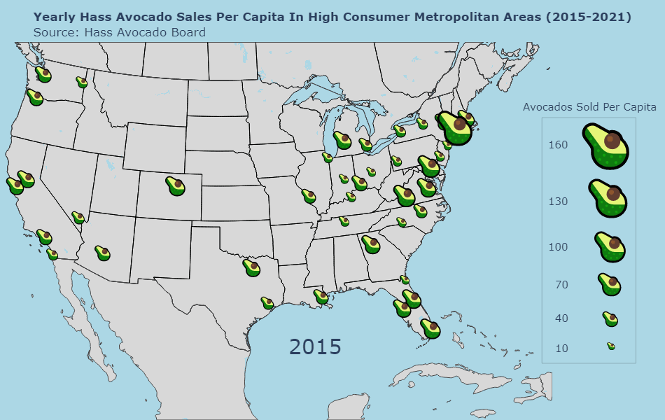
The very start of this project requires educating the viewer about the backstory of this project - why are avocados so important? To answer this question we need to investigate the evolution of demand for avocados across the continental United States. This is no small task, but thankfully the Hass Avocado Board (HAB), a group dedicated to expanding the popularity of the Hass Avocado in the United States, has a trove of data about this very question. This organization has a wide spread, maintaining longitudinal data about supply changes and market data, ongoing nutrition research, engagement with health professionals, and a variety of other variables. In this regard, they are the go-to for all things avocado in the United States, and therefore the natural source of data for our project.
From this group we were able to obtain extensive data about the sale of avocados across the United States. We chose to focus our analysis on a subset of this - high consumer metropolitan areas. Demand for avocados is evolving nationally, but to plot all this at once is impossible. By focusing on large population hubs in the United States we’re able to provide insight about the evolution of avocado sales in these key cities without getting lost in the minutia. Thankfully, the data obtained for these hubs is incredibly rich. HAB provides extensive variables about all aspects of the sales themselves, including average price, location sold, volume of the sale, and other variables, down to even a description of if the avocados were bought in bulk or in a bag sized for grocery store display. From this data only a few key variables were needed to analyze sales over time, but having that abundance of variables for future analysis is a huge benefit to the project.
Our team focused on the variables of Date, Geography, and Total Volume from this dataset to enable our analysis. The geography column made it easy to mesh this dataset with a copy of ESRI’s geographic population data for major US cities. This provided an important piece of the puzzle, enabling us to combine our understanding of avocado volume with the amount of people in a major city, to determine an accurate count of avocado sales per capita. Meshing this information resulted in the creation of a dataset of avocado sales that was both geospatially and temporally referenceable for easy visualization.
There were many options for how this information could be presented to the audience. After much deliberation and experimenting, a GIF format was decided upon. The GIF was designed to cycle through successive years of data, highlighting how per capita avocado sales evolved in these metropolitan areas. Although not strictly interactive by the user, presenting this information in a GIF format presents an innovative approach to visualizing data, and does so in a way that takes advantage of the temporal and geospatial aspects of this data. This format lacks a time slider for the viewer to interact with, but taking it out, the process becomes much simpler. In this sense it offers more of a guided experience, walking the viewer through the data and helping them understand the ever-growing nature of the avocado trade.
From a design perspective, careful consideration was put into choosing factors that would lead towards simple and effective transfer of information, while also trying to stay within an avocado-esque theme. With that in mind, an avocado emoji was used to convey the differences in per capita sales. By scaling this emoji up and down in response to changing sales, one is able to quickly see differences in the demand for avocados across different regional hubs, while also being reminded of the focus of this project through the topical choice of marker. This marker is more complex than those often used in mapping applications, and so a simple background theme was chosen to not distract the viewer from the main point of the project. The simple blue and gray backdrop effectively captures the different states, as well as the water around them, while following that same principle. Together, these design choices create a visualization that is visually appealing, easy to understand, and succinctly captures the point it is supposed to make.
Price Change Over Time
Figure 2: Avocado Price Change Over Time
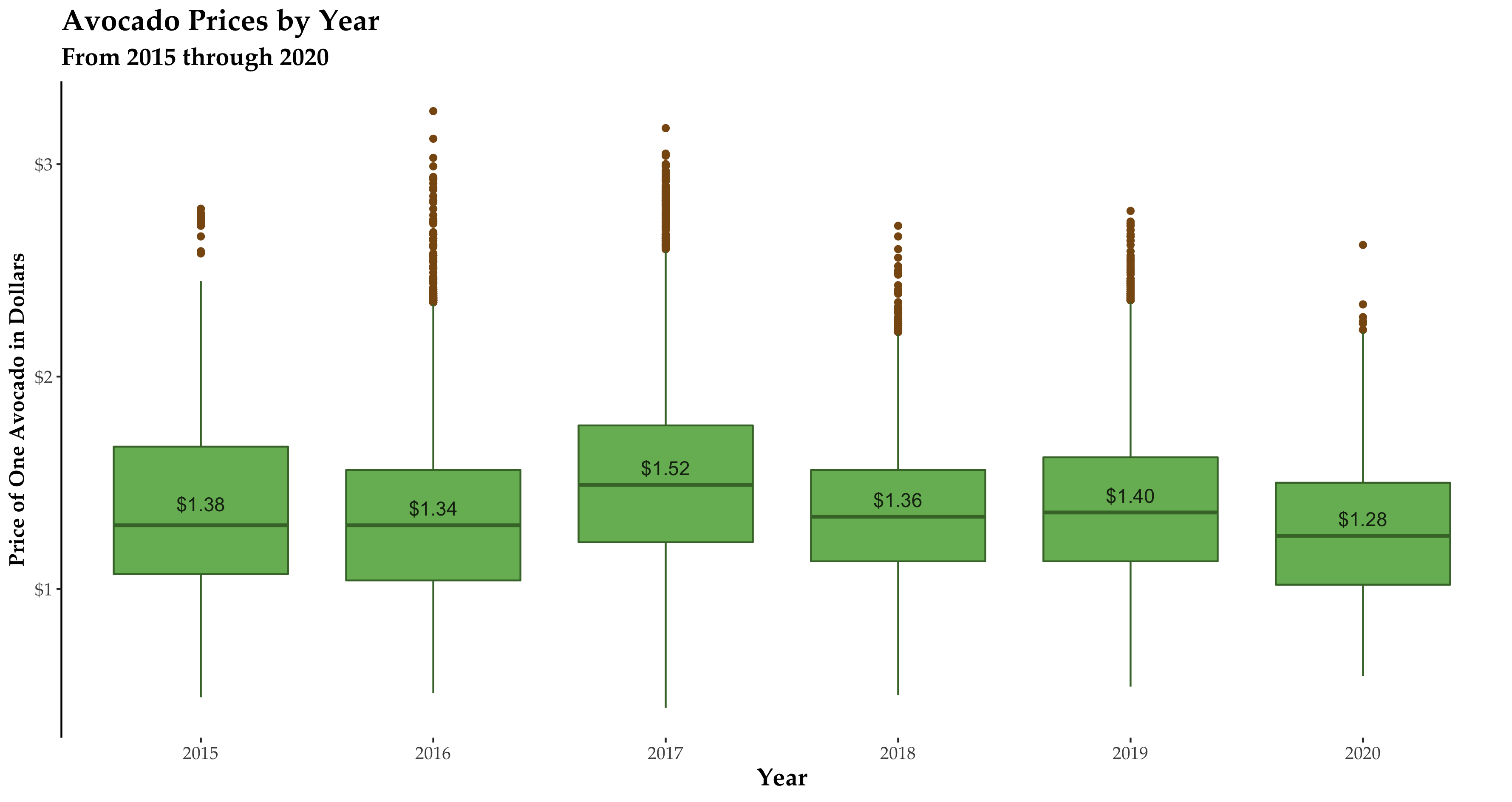
Understanding the fluctuation in demand signal for avocados is important, but the narrative is incomplete without a consideration of price. There is of course a natural connection between the demand for a product and its price on the global market, but visualizing this data is a key step in understanding the data, and therefore, the larger context of this project. As the global leader in tracking avocado-related data, the Hass Avocado Board (HAB) was again relied upon for data. Their data catalog contains an extensive set of variables concerning the state of the avocado market in the United States, including the pricing information necessary for constructing a longitudinal assessment of their market price.
Understanding the fluctuation in demand signal for avocados is important, but the narrative is incomplete without a consideration of price. There is of course a natural connection between the demand for a product and its price on the global market, but visualizing this data is a key step in understanding the data, and therefore, the larger context of this project. As the global leader in tracking avocado-related data, the Hass Avocado Board (HAB) was again relied upon for data. Their data catalog contains an extensive set of variables concerning the state of the avocado market in the United States, including the pricing information necessary for constructing a longitudinal assessment of their market price.
Understanding the fluctuation in demand signal for avocados is important, but the narrative is incomplete without a consideration of price. There is of course a natural connection between the demand for a product and its price on the global market, but visualizing this data is a key step in understanding the data, and therefore, the larger context of this project. As the global leader in tracking avocado-related data, the Hass Avocado Board (HAB) was again relied upon for data. Their data catalog contains an extensive set of variables concerning the state of the avocado market in the United States, including the pricing information necessary for constructing a longitudinal assessment of their market price.
Avocado Growth
Figure 3: Shows where the majority of the worlds avocado production takes place.
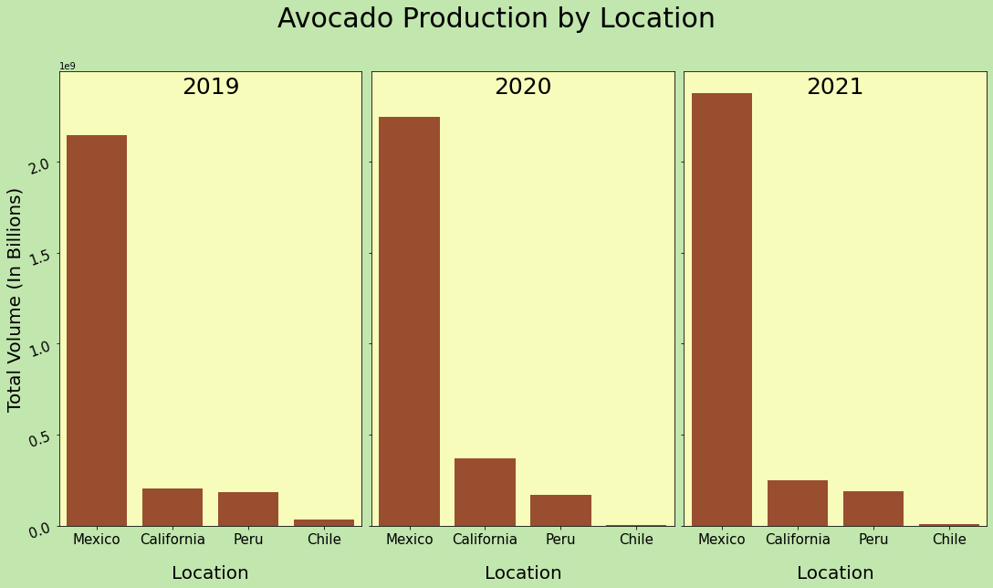
Engaged viewers may ask themselves - why Mexico? After all, the growing conditions needed for avocados likely exist in other countries around the world. Although other countries are certainly involved in the production and export of avocados, Mexico is by far the global leader in this sector. In fact, Mexico produces more than a third of the world's avocados. It is one thing to state this fact, but for the purposes of the narrative we’re attempting to build, it is important to visually highlight the sheer magnitude of their production. By visualizing Mexico’s role in the global avocado trade one can begin to understand the vast importance of a select number of Mexican states in keeping the global market supplied with avocados.
To get this story across we relied on data from the Hass Avocado Board (HAB) again, a group dedicated to expanding the popularity of the Hass Avocado in the United States. From this group we were able to obtain projections about the volume of avocados produced by each of the market leaders in the avocado trade. These countries include Mexico, The United States, Peru, and Chile. From this data we were able to get the total volume of avocados produced by these countries across successive years, enabling us to show the disparity in global avocado production.
A bar chart was used to visualize this data, tiled across three successive plots to represent the different time periods in our data. Given the relative simplicity of this data set a bar chart seemed best suited to visualizing the change over time of production. In this case the X axis was used to represent each of the different countries in the dataset, while the Y axis was used to represent the overall volume of produced avocados in billions of pounds. Given the disparity in production, this visualization fit very well with the overall narrative of the story, and enables the viewer to very quickly understand just how vital Mexico is to the global avocado trade.
Although bar plots are in some ways a more simple visualization type, it is still essential to incorporate a clear design for the visualization, to ensure it fits the larger vision of the project. Towards this end we designed a set color palette that mimics the colors of an avocado - green, brown, and tan. These colors were used throughout our website and the individual visualizations that contribute to it, to ensure the unity of our visual narrative. Careful attention was also spent on selecting the proper font size, color, and positioning to ensure that it adds to the visualization, rather than distracts the viewer from its overall message.
Avocado Production
Figure 4: Yearly Production of Avocados in Metric Tons by States
Our project exists at the intersection of two disparate sources of data; avocado production & export, and cartel violence. With this in mind, connecting these two aspects requires a careful and methodical progression from big picture context about the avocado trade itself, to granular details. One step on this journey is explaining the nature of avocado production in Mexico to the viewer. Like the production of any agricultural crop, there are pockets within Mexico whose climate and geography suit the growth of avocados. Avocados grow well in temperate subtropical locations, which have a long and frost-free growing season, and offer plenty of consistent sunlight to the trees. Besides climate, there are also other considerations, such as proximity to processing and shipping hubs, to prep the crop for export.
With these considerations in mind, this visualization interactively walks the viewer through the Mexican countryside, and highlights regional trends in avocado growth. After all, without this perspective, we are unable to move the narrative forwards about why these areas may have ties to cartel violence. The data that serves as the foundation of this visualization was sourced from the Mexican government’s own Servicio de Información Agroalimentaria y Pesquera (SIAP), which roughly translates to The Agriculture and Fisheries Information Service. This organization is in charge of designing and coordinating the operations of the Mexican government in regards to agriculture and fisheries, and also plays a large role in promoting sustainable rural development across the country. From this organization we were able to obtain information about the overall avocado production (in metric tons) of each of Mexico’s 32 states.
Our team used Python to interact with the data, relying on the robust and scalable Plotly package to develop our visualization for the production data. The goal here was to develop a map product that would engage the viewer on two levels. The first, to provide a high level, and very visual, summary of where we see most Mexican avocados grown. This should provide at-a-glance information to the viewer to get them interested in the project and ensure they understand the importance of these key growing regions. Second, the visualization should support more in-depth exploration, providing interactive tooltips that quickly deliver more specific information to the viewer. With these two perspectives in mind, the visualization should therefore be useful to a wide audience, and ensure that this key step in our narrative engages the viewer, regardless of their expertise or knowledge of this topic.
The data itself is relatively straightforward, and required minimal cleaning to be useful. Three key pieces of information are contained in it, the year (2005-2020), the state in question, and the number of tons of avocados grown in that state over that given period. This information was mapped to a geoJSON of Mexican states that was obtained from https://exploratory.io/map. By combining this information we were able to make a choropleth map with Plotly Express and OpenStreetMap that contains the different production metrics for each state and year. This temporal range is controlled by the viewer through a time slider, to enable them to focus their analysis on a given year if needed. This also highlights yet another avenue of interactivity built into this visualization. Not only were tooltips used for mouse-over events, but this time slider also offers new avenues for the viewer to explore the data.
Careful attention was paid to the visual design of this map. As mentioned early, OpenStreetMap provided a fantastic basemap for this visualization. This is an incredibly useful service, as it provides contextual information about the geography and infrastructure of a region at varying scales, making it perfect for visualization. The amount of avocados produced were mapped to a continuous white to green color scale, to quickly visually highlight differences between states’ production. At the same time, this color scale is different enough from the OpenStreetMap basemap to highlight to the viewer what the area of interest for this project is - namely, Mexico. Together these design decisions make interacting with, and learning from, this visualization a straightforward and seamless process.
Cartel Activity from the Avocado Trade
Figure 5: Activity of Cartels Associated with Avocado Trade (2019-2022)
With a clear understanding of the importance of avocados in the United States and new insight on where they’re grown in Mexico, the next step is beginning to tie this to the narrative of cartel violence. Cartel violence is widespread in Mexico, with many powerful cartels staking claim to different areas and industries across the country. Avocados have recently gained the unofficial title of “green gold” in Mexico, due to the lucrative nature of the avocado trade. Jobs in this business are known to often provide wages up to 12 times the Mexican minimum wage, making them extremely sought after. The cartels followed this craze, hoping to add other sources of revenue to their operations. With this in mind, the purpose of this visualization is to map incidents of cartel violence in the context of Mexico’s avocado growing regions, to highlight the connection between cartel violence and the avocado trade.
The Armed Conflict Event & Location Data Project (ACLED) provides an impressive range of data for reported political violence and protest events around the world, which makes it an ideal source of data for this type of visualization. ACLED was used to pull data about incidents of cartel violence that occured in Mexico over our study period. The goal would therefore be to develop a visualization that provides key insight to the viewer about the distribution and magnitude of cartel violence across Mexico (in essence summarizing what is a big data problem), in a way that is accessible, highly visual, and informative for casual viewers and those looking for more in-depth information.
ACLED contains a wide range of information about these recorded events, including a timestamp, location information, the actors involved, and fatalities recorded. By using all these variables together, a highly interactive visualization can be created to give users a high level understanding of the spatial distribution of cartel violence across Mexico. Historically, cartels in Mexico have exerted influence over relatively consistent areas. With that in mind, the best way to understand the overlap of territories, and therefore interests, between different cartels is to map this information. For this task, we rely on Plotly Express and OpenStreetMap as the foundation of this visualization.
To say that cartel violence exists is not enough. An important aspect of this project is categorizing cartel violence by the number of fatalities associated with events. This information is encoded through our map markers, which use circles of varying sizes to convey the number of casualties recorded after an event. These are also color-coded according to the main actor responsible for the event, which enables us to keep track of the activities of the different cartels involved in the avocado trade. By incorporating variable sizing and consistent color coding across the visualization, viewers can quickly gain an understanding of the current situation in Mexico, the evolution of cartel control across the country, and hot spots of violence.
Displaying country-wide data is no easy feat, as the sheer number of records tend to overlap and run into one another. With that in mind, proper design is of the utmost importance in this situation. The color palette was carefully chosen for this visualization, since the number of cartels operating in this region necessitates a specific color palette to ensure their differentiation. A high degree of interactivity was added to this map product to ensure the usability of this graphic at both a country-wide scale, as well as at a more granular level. User’s can zoom and pan readily to traverse the map, enabling rapid transition between these two types of analysis. An additional layer of interactivity is added through tooltips which provide additional information about recorded incidents of cartel violence. By mousing over an event, one can quickly gain context about an incident, including details about location, casualties, and other key pieces of information. Through this blend of interactivity and purposeful design the final map product engages the viewer in the narrative easily, providing at-a-glance information about cartels operating in avocado growing areas, and advancing the story one more step.
Comparing Avocado Prices and Cartel Activity
Figure 6: Average U.S. Avocado Prices and Jalisco New Generation Cartel Actions Over Time
In the previous visualization we explored geospatial drivers of cartel violence, providing an interactive view of where different cartels are operating, and overlaying this information with relevant avocado growing areas. This is not the only way to make sense of this information, as we can also explore this information from a temporal perspective, seeking to understand how the situation in Mexico has evolved over time. In this regard the data remains much the same, only our perspective changes to account for this new approach.
There are several ways one can model a timeseries; we chose to display it as a line chart to display the evolution of the data over time. Extensive data augmentation was undertaken to extract the maximum amount of value from the ACLED dataset. From this dataset we were able to construct weekly aggregates of activity for the Jalisco New Generation Cartel, the primary cartel operating in the avocado-growing center of Mexico. By shedding light on their activities over time, and connecting this perspective with changes in the price of avocados, we hope to better understand the interplay between cartel violence and the avocado trade. With this in mind, we build out additional variables from the ACLED data, splitting up incidents of Violence Against Civilians, Strategic Developments, Battles, and Fatalities. All these variables were split up to better determine their connection with the price of avocados over time, an analysis we will continue to expand upon more extensively over the next few weeks. However, the current work still lends credence to the existence of a connection between market price and incidents of violence in the data.
To visualize all this information each independant line chart was overlaid to create a multiple line plot, where each category previously mentioned was included. This information was augmented with a customizable selection window to enable increased user interaction throughout the visualization. This selection window was purposefully separated from the rest of the visualization, to enable the viewer to keep track of where they are in the overall dataset, and zoom or pan as needed to look at the subset of data needed. By looking at the interaction of each different variable over time in these areas, the user can then gain insight about how each of those different categories may interact to affect the price over time. In this sense the visualization is open-ended and user-driven, inviting the user to build their own narrative of these incidents and investigate the connections that speak to them the most.