Introduction
With the emergence of data analytics in sports, teams are now able to collect and analyze vast amounts of data in order to gain an advantage on their opponents. As a result, teams are investing heavily in data science to gain an advantage on the field, diamond, pitch, grid, and other arenas of top competition. In particular, in recent years, the National Football League (NFL) has rapidly expanded their use of data, introducing Next Gen Stats (NGS) (“NFL Next Gen Stats” 2023) and other data-driven, real-time analytics.
Through our visual analysis, we aim to explore what makes an NFL team successful. With large amounts of data starting from the NFL Combine and going all the way to the postseason, we will analyze all facets of NFL players, teams, and games. By visualizing this data, we hope to investigate emerging trends in the NFL, gain insight, and discover what truly makes a team successful in this league.
About the Data
The bulk of the data used in this project were extracted from the open source project nflverse (Carl et al. 2022), which hosts a repository of a wide variety of NFL-related statistics and data, ranging from detailed statistics regarding individual plays to summary statistics spanning entire seasons, for both individual players and teams as a whole. In this project, we primarily analyzed season wide data relating to entire teams as well as an analysis of NFL combine data. These data were accessed through nflverse’s R and Python packages: nflreadr (Ho and Carl 2023) and nfl-data-py (Adams 2023).
Team Analysis
The first facet of our analysis involves NFL teams and what contributes to team-wide success.
Team Win Totals
The first and foremost measure of success for NFL teams, as banal as it may be, is wins. As with any other sport, winning is the ultimate goal in the NFL, and teams measure their success by their numbers of wins and losses across each season accordingly. In Figure 1, we visualize the win totals of each NFL franchise since 2003 (when the league expanded to the current 32 teams), providing a simple measure of success for each team over the past 20 seasons.
- Division Filtering: Use the dropdown menu to select one of eight NFL divisions.
- Team Filtering: Click team names in the legend to filter for specific teams within a division.
- Time Filtering: Drag across the visualization to filter for a specific time range.
- Tooltip: Hover over the visualization to observe the season, team, win total, and season outcome for each data point.
We can see from the figure that certain franchises tend to have consistent patterns of winning (e.g., New England Patriots, Pittsburgh Steelers, Seattle Seahawks), losing (e.g., Jacksonville Jaguars, Cleveland Browns, Las Vegas Raiders), as well as extreme inconsistency (e.g., the NFC South, Dallas Cowboys, San Francisco 49ers).
In direct correspondence with the number of wins a team obtains in a season is their overall season outcome - missing the playoffs, winning the Super Bowl, and everything in-between. In Figure 2, we explore the percentage of NFL teams who have made the playoffs (left) and won the Super Bowl (right) as a function of the number of regular season wins obtained over each of the last 20 seasons. We find that teams obtaining 10 or more wins in a season are extremely likely to make the playoffs, while teams obtaining 6 or less wins have never made the playoffs. Similarly, a considerable percentage of teams who have obtained 14 wins in a single season have gone on to win the Super Bowl, while teams with 8 or less wins have never accomplished this feat.
- Linked Views: Click a bar in either visualization to highlight corresponding bars across visualizations.
By utilizing both Figure 1 and Figure 2, we can gain a better understanding of how the number of wins in a single season relates to a team’s overall season outcome. However, these figures only depict league-wide trends of the ultimate regular season goal - winning - and do not tell the whole story of team success. We analyze this more deeply as our analysis progresses.
Team Scoring
Team success can be measured simply by the number of wins obtained in a single season, but should be further explored by the manner in which teams obtain these wins. One way to decompose this measure of success is by examining the number of points by which teams win or lose their games. Two teams that obtain the same number of wins in a season can still express varying levels of success in this regard if one team often wins by many points and the other often wins by few points. In Figure 3, we gather a cumulative representation of team scoring across all seasons from 1999 to 2022. Here, we can start to see how teams perform throughout various seasons with regard to scoring. In Figure 4, we visualize this data.
- Data Filtering: Use the dropdown menus and sliders to filter for different data attributes.
- Search Bar: Use the search bar to manually search for features of the data.
- Season Filtering: Use the dropdown menu to select one of many NFL seasons.
- Week Filtering: Use the slider to select one of many weeks of an NFL season.
- Data Filtering: Drag across the visualization to filter for specific data ranges.
- Tooltip: Hover over the visualization to observe the season, week, team, average points for, and average points against for each data point.
Figure 4 shows the changes in a team’s average points scored (Average Points For) versus the average number of points they allowed their opponents to score (Average Points Against) on a weekly basis for every season from 1999 through 2022. Teams that are above the dashed gray line tend to have worse offensive and defensive performance, while teams that are under the gray line had better average offensive and defensive performance.
Initially, teams’ average offensive and defensive performances are far apart from one another, with Cleveland in 1999 being a prime example of a team with low offensive output with a poor defensive performance. As the season progresses, however, most teams tend to regress toward the mean – but there is still a clear split between teams that perform well and teams that perform poorly.
This information is valuable both for prospective draft picks and for NFL viewers, as it can show how a team changes over each week in each season as a result of draft picks developing and mid-season trades – providing valuable insight into how well a certain team drafts and builds over time. (this sentence is a bit wordy, maybe split into two?). Still, points scored and allowed by a team can be attributed to both offensive and defensive efforts, so it’s important to analyze success on both sides of the ball, especially in terms of offensive efficiency.
Offensive Efficiency
An interesting dynamic in the NFL is how certain teams differentiate themselves from others in terms of level of play. One way in which we can observe this is by evaluting each team’s offensive efficiency as a function of the number of the plays run by that team. The metric that we use for this is the Expected Points Added, or EPA. This metric is essentially a way to aggregate many offensive success metrics - such as the result of a play and the number of yards gained or lost - into one value. In Figure 5, we visualize each team’s cumulative EPA across all plays in the 2022 season.
- Linked Team Filtering: Click a time series in the top visualization or a team logo in the bottom visualization to highlight a specific team across both. Hold
Shiftwhile doing so to highlight multiple teams.
The more efficient offensive teams, such as the Kansas City Chiefs, can be observed in the plot diverging upward as they conduct many successful offensive plays. Similarly, the less efficient offensive teams, such as the Houston Texans, can be observed diverging downward as they conduct many unsuccessful offensive plays. It can also be seen that offensive efficiency is strongly linked to division standings, as most division standings maintain the same ordering with respect to cumulative team EPA, from top to bottom. For instance, the division ordering of the NFC West manifests itself in the same way with regard to cumulative team EPA.
Still, offensive EPA does not necessarily reflect defensive efforts made by a team, as a team may have an efficient offense, yet an inefficient defense. This encourages us to dive even deeper into the contributors to team success, moving to receiving efficiency - one facet of a team’s offensive efficiency.
Receiving Efficiency
From the comprehensive picture of offensive efficiency above, we can delve further into the specifics of offensive efficiency. One of the principal components of an NFL offense is passing, and thus receiving. Various positions are eligible to receive the ball, most notably wide receivers, tight ends, and running backs. The nature of the receptions and resulting statistics vary by these positions, as shown in Figure 6 below, which depicts the average expected points added per game per season by receiving position.
- This visualization is not interactive.
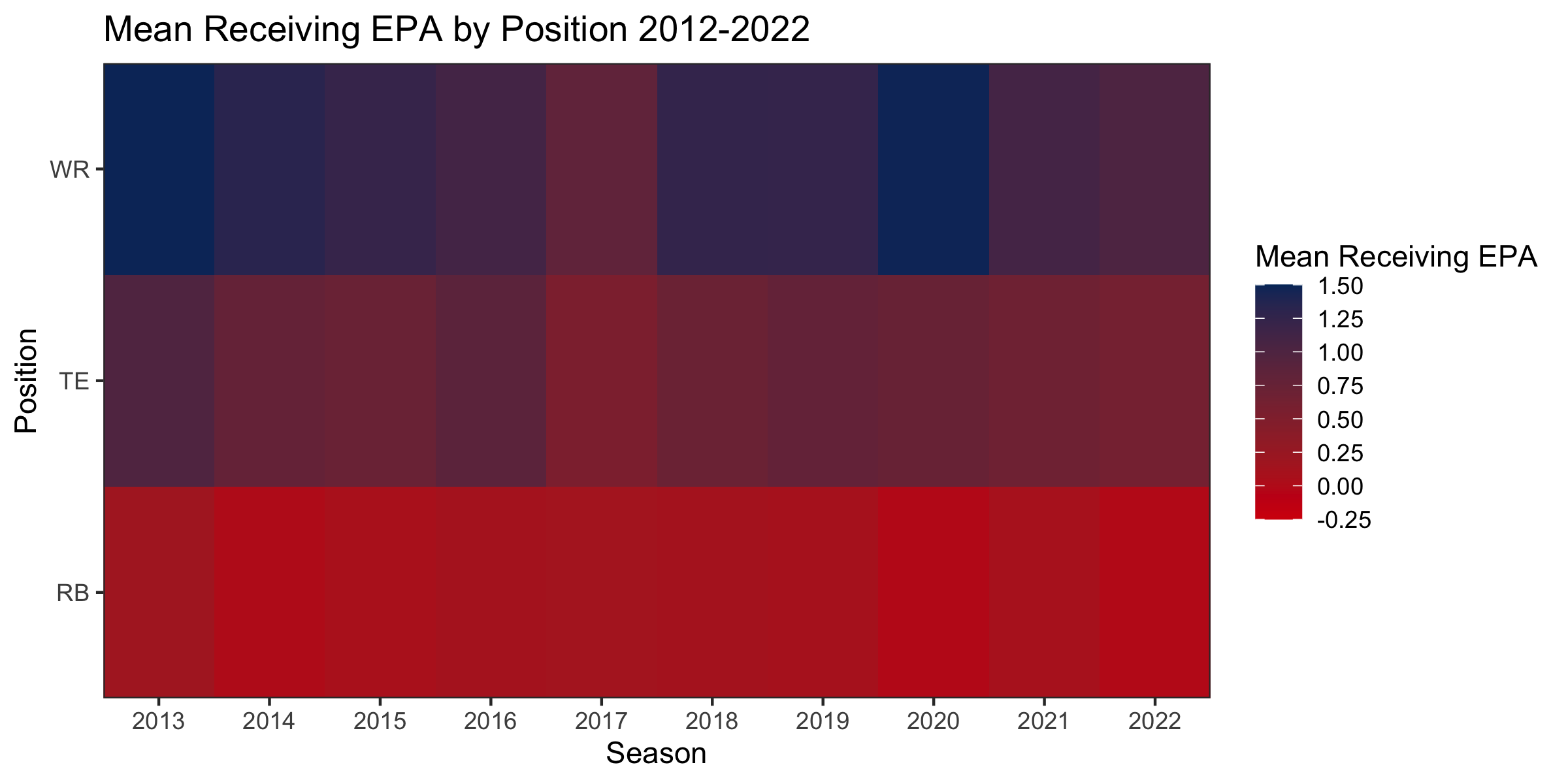
From the figure, it is clear that wide receivers, unsurprisingly, have the highest average EPA contributions due to receptions compared to both tight ends and running backs. Running backs are understandably used the least in the passing game, but their impact is still noticeable. The EPA production of tight ends has varied a lot over the course of the seasons shown above, yet never exceeds those of the wide receiver or slips below those of the running back position. Tight ends and running backs generally play a more varied role in the offense compared to wide receivers, such as blocking for or carrying the ball in running plays, so these disparities are not surprising.
Combine Analysis
The second facet of our analysis involves NFL players and how individual players contribute to team-wide success.
Player Position
From an analysis of team success in the NFL, we move to the NFL Combine. The NFL Combine is essentially a skills examination, where prospective NFL players perform certain tasks that are supposed to assess the physical capabilities and skills that each Combine participant possesses. The Combine is aimed at assisting NFL teams with choosing who to select in the NFL Draft to pave the way for future team success. Each team needs a different set of new players to replace aging or declining players of given positions, so they use the NFL Combine results to determine which players are the best fit physically for each position. Below, in Figure 7, is a radar chart that shows how these physical performance metrics vary by player-professed position.
- Player Position Filtering: Use the dropdown menu to select one of many NFL player positions. Use the legend to select multiple positions.
- Tooltip: Hover over the visualization to observe the player position, physical combine event, and percentile for each data point.
It is evident in the figure that certain positions typically have players that are strong in certain aspects of the NFL Combine. For instance, players such as running backs (RB), wide receivers (WR), and safeties (S) are typically more agile and perform well in the 20-yard shuttle, 40-yard dash, and vertical jump. On the other hand, players such as offensive linemen (OL), defensive linemen (DL), and defensive tackles (DT) are typically more physical and perform well in the bench press. Players of these positions often exhibit greater height and weight than the more nimble players as well.
Draft Position
The beginning of a team’s success starts on draft night, and the linked plots shown in Figure 8 explore whether a player’s performance at the NFL Combine impacts where a player is drafted. Furthermore, they can help teams identify trends to better analyze talent. The first plot (left) shows the distribution of performances, allowing for groupings by position and performance metric. The second plot (middle) is a trellis plot that is linked to the filtering performed from the histogram (left) and scatter plot (right). The third plot (right) is a scatter plot showing draft position compared to playing time with a tooltip that shows information about individual players such as their name, height, weight, and draft team. Linking each of these three plots can show teams a clear story beginning with combine performance, showing a player’s draft position compared to performance, and ending with whether a player was able to get playing time, helping teams better understand the combine, draft better, and eventually perform better on the field.
- Linked Views: Scroll horizontally to view a set of three linked visualizations realting to the NFL combine.
- Player Position Filtering: Use the dropdown menu to select one of many NFL player positions.
- Combine Metric Filtering: Use the dropdown menu to select one of many physical NFL combine events.
- Tooltip: Hover over the visualizations to observe numerous details about each data point.
- Linked Data Filtering: Drag across the visualizations to filter for specific data points, reflected across all visualizations.
The three plots in this figure allow teams to perform a lot of creative analysis to gain insight into the combine, draft, and subsequent playing time. While the combine seems to have little impact on top performers, one of the most interesting ways to use this view, subjectively speaking, is to select a position, running back for example, and select players in the top right corner of the scatter plot. This allows teams to look at players that have successfully garnered playing time but weren’t highly valued in the draft, such as Aaron Jones, and then attempt to recreate those picks. Allowing teams to gain as much value for their pick as possible, leading to on-field success.
Conclusions
The success of an NFL team is measured and influenced by a variety of factors. In this analysis, visualizations demonstrating some of these factors, like offensive efficiency, defensive efficiency, and win totals were created to begin telling the story of what goes into a team’s success. Notably, it was found that, as the season progressed, teams that developed stronger offensive efficiencies throughout the season tended to have higher point and win totals - leading to a higher level of team success.
With the advancements in the use of data science in the NFL, being able to visualize a team’s offensive efficiency similarly to this analysis will provide teams with in-the-moment information that can be crucial to turning a season around, as it may influence teams to make trades, sign free agents, or adapt their play calling to further improve efficiency. These insights are also crucial for teams during the draft, as teams can make data-driven decisions on draft day to draft the players that will most influence the factors that will contribute to their season’s success.