What Makes a Great Buffet Restaurant in Florida?
Group20: Hyuksoo Shin, Junlin Liu, Minglei Cai, Zhibao Li
Cover Figure
Why Buffets? Compared to a general restaurant analysis, we think diving deeper into a specific type of restaurant can obtain more interesting and practical insights. In this project, we choose to study the buffet restaurant market because it is a niche market with great popularity. Buffet restaurants normally offer a large variety of food and all-you-can-eat for a set price. With this business model, restaurant owners can provide significantly different food and services. This project aims to explore what influences a buffet restaurant's rating.
Yelp Data
The dataset we use is made available by Yelp. It consists of six separate files including businesses, reviews, etc. The business data provides general information about the entity, while reviews data contain a large amount of customer reviews of a specific business. We will mainly use these two datasets in the later sections.
The Yelp dataset contains about 30 thousand restaurants, 7000 restaurant categories, and more than 7 million reviews from customers.
Number of Restaurants by State
FIGURE 1.
Number of Restaurants by Top Category
FIGURE 2.
Figure 1 and 2 show high-level distributions of the restaurants in the Yelp data. Pennsylvania and Florida have the largest number of restaurants. "Bars" and "Nightlife" are the two most common restaurant categories.
Why We Are Interested in Florida Buffets?
Florida Has the Largest Number of Buffet Restaurants in Yelp Data
Number of Buffet Restaurants by State
FIGURE 3. The numbers of buffet restaurants in different states are plotted using Choropleth. The color scale indicates the percentage of buffet restaurants in the Yelp dataset.
Compare to the Other States, Florida Buffet Restaurants Are Getting More Attention From Customers
# of Reviews by State Time Series and Bar Chart
FIGURE 4. (Select/Multi-Select/Brush) This plot is designed to show the change in buffet restaurants' review counts and stars.
Colors are used for different states. In the first line chart, it is easy to find Florida (blue line) with the most review counts after 2013, followed by Massachusetts (red line). The bar chart at the bottom is connected to the line chart. The interactive method allows users to select specific bars (states) in the bar chart, and then observe the change of review counts for a specific group of states in the line chart.
Besides, the line chart is connected to the bar chart (the second one), which makes a bridge between review counts and rating stars of these restaurants in different states. Specifically, users could select the specific time in the line chart and see the comparison of the average stars of these restaurants in each state. Also, it is allowed to click specific bars (states) in the bar chart, and then observe the change in restaurants' review counts in these states in another chart. It is interesting to compare the review counts and star change of buffet restaurants in states by the interactive method!
Location of Buffet Restaurants in Florida
Buffet Locations Open Street Map
FIGURE 5. (Zoom/Click) This chart aims to show where the studied buffet restaurants are located.
The Open Street Map shows that the majority of buffet restaurants in this dataset are located in the downtown area of Orlando. Clicking on the restaurant symbols shows their rating and address information.
Analytics
The goal of the analysis is to find out the key factors that drive buffet restaurant ratings. As seen by the plots included in the previous section, buffet restaurants in Florida are getting more popular among customers and they have more reviews available that can be utilized for deeper analysis. This data leads to some questions about the buffet restaurant market. Some example questions include:
- Which country category is the most popular to the customers? American? Japanese?
- What are some attributes of buffet restaurants that are related to high review stars?
- Buffet restaurants have a variety of food. What kind of food leads to a higher rating?
- ...
The analysis starts by displaying the following innovative plot. Figure 6 combines the restaurant information, stars, review counts, and the actual reviews in a single bubble plot. The best reviews and worst reviews are sampled from their corresponding restaurant.
Florida Buffet Restaurants Overview
The Innovative View: Buffet Restaurant Bubble Chart
FIGURE 6. (Select/Drag) This restaurant bubble chart shows detailed information about each studied restaurant. The review count can be related to the popularity of the buffet restaurant. The colors of the bubbles represent the stars of each restaurant. And the tooltip shows detailed restaurant information.
Higher Price Leads to Better Customer Satisfaction, While Parking, Reservation, and Wifi Have Little Effect
Qualitative Attributes of Buffet Restaurant Boxplots
FIGURE 7. (Double-Click) The boxplots show the relationship between the attributes of restaurants and the review stars. The exploding interactive method transitions between the boxplot and the distribution of the values.
The analysis starts with attributes other than the food and service qualities. While the parking, reservation, and WiFi availability seem not to affect the review stars, the price of each buffet restaurant seems to be related to the overall satisfaction of the customers.
Yelp data is notorious for lacking quantitative measurement. We find a way to use "Aspect Extraction" together with "Sentiment Analysis" to score each item in customer reviews. For example, if we have two reviews from a restaurant "I love the sushi in this restaurant." and "The service is awful here." Our algorithm will give "sushi" a positive score between 0 and 1, and give "service" a score between 0 and -1.
Finally, categorizing items from each review into different dimensions generates a series of factors.
Buffet Restaurant Factor Analysis from Yelp Review
Quantitative Attributes Parallel Coordinate Chart
FIGURE 8. Parallel Coordinate Chart can be a good starting point for adding more factors to the analysis. This plot is used for plotting multivariate numerical data and finding out the relationship between them. The price variable is added to the plot. The price axis is placed in parallel to the food score and the service score axis. Each line shows an individual observation (restaurant) and the color of the line represents the star rating of the restaurant.
Restaurant Stars Are Most Correlated with Number of Reviews, Food Score, Service Score, and Environment Score
Correlogram Between Quantitative Factors
FIGURE 9. Correlogram of the factors, extracted from the Yelp reviews. The red color scale represents a positive correlation. The blue color scale represents a negative correlation
As seen in Figures 8 and 9, it's clear that a deeper analysis into the food factor is important. Therefore, we break down the food factor into two categories: restaurant category and served food.
Buffet Restaurant Category Analysis
Category Distribution Upset Chart
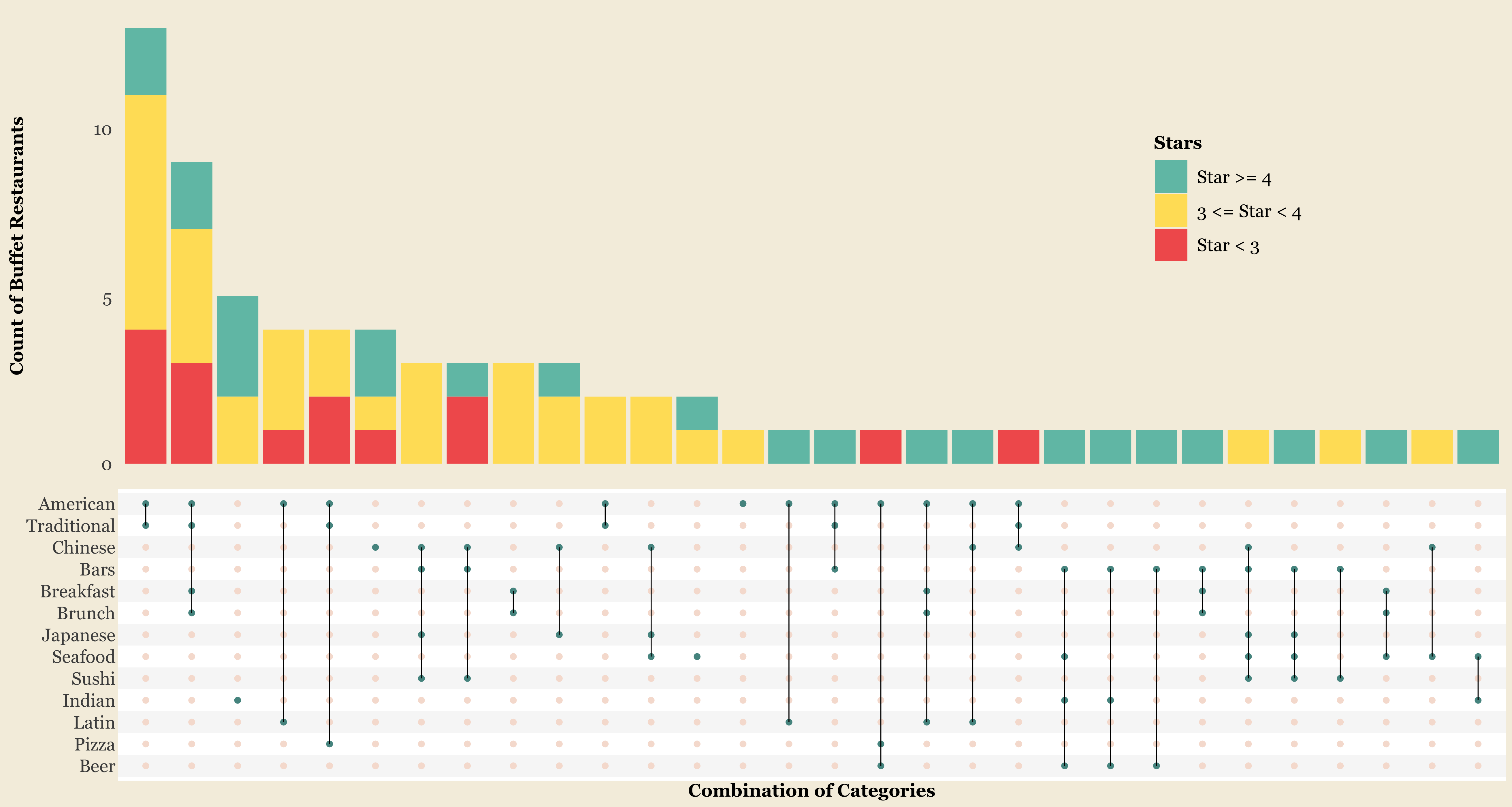
FIGURE 10. The upset plot is designed in a clear and intuitive way to show rich information with color, dot, bar, and line mapping. The number of buffet restaurants based on the combination of categories is shown in the plot. The review stars are encoded as the colors of the bars.
Figure 10 gives us an overview of the category distribution of Florida buffet restaurants and their ratings. As the plot shows, there are more than 20 kinds of buffet restaurants in Florida with different category combinations. Traditional American, Chinese, and Japanese buffets are the most popular in Florida, followed by Indian and Latin buffets with relatively better reviews. Also, both brunch and bar buffet restaurants are common, but the former is more popular. Among food and drinks, seafood, sushi, pizza, and beer buffets are very hot!
Next, we further utilize the category analysis with factors from customer reviews.
American, Chinese, and Japanese Buffet Restaurants Have the Greatest Popularity, while Indian, Brazilian, and Halal Restaurants Enjoy the Highest Ratings
Country Score Radar Chart
FIGURE 11. The radar plot is used to visualize the multivariate quantitative data. The area indicates the overall satisfaction of the customers.
Country Distribution Bar Chart
FIGURE 12. Number of Restaurants by country.
From Figures 11 and 12, an interesting finding is that there are more American, Chinese, and Japanese buffet restaurants than other types, but they are rated worse than the others. It also shows in their factor scores. Typically, people give higher scores to Brazilian, Halal, and Indian buffets, especially for their food, service, and environment. As for variety, Latin, American, and Chinese buffets receive more good reviews, while Halal buffets get significantly better comments on drinks.
People Prefer Vegetarian Buffet Over Pizza and Sushi Buffet
Food Category Score Radar Chart
FIGURE 13. The radar plot is used to visualize the food category scores. The area indicates the overall satisfaction of the customers.
Food Category Distribution Bar Chart
FIGURE 14. Number of Restaurants by food category.
Figures 13 and 14 show the distribution of buffet restaurants in terms of food categories. A similar finding from these two plots is seafood, sushi, and pizza buffets are more popular in Florida, but they are rated worse than steakhouses, barbeque, and vegetarian buffets. Specifically, Vegetarian buffets get the highest stars (4.0), and are rated quite well in the environment (0.51), sauce (0.2), and drink (0.14). It indicates that people potentially like healthy buffets more. On the other hand, steakhouse buffets are mentioned more in good food and service. Besides, barbeque buffets are recommended more for their variety.
From the above four charts, we can see that the more-restaurants categories tend to have lower ratings than the less-restaurants categories. Perhaps, people are inclined to give mediocre ratings to common food types in buffet restaurants.
Beer, Chili, Curry, Lamb Lead to Higher Restaurant Rating
Food in Reviews Boxplots
FIGURE 15. (Double-Click)The boxplots show the relationship between weather customers commented on specific food and the rating stars. The interactive methods provide the transition between the boxplot and the distribution of the values.
Finally, the food provided in the buffet restaurants is extracted from the customer reviews. This idea comes from the experience that even though buffet restaurants provide various foods, some dishes stand out.
Conclusion
Various visualization techniques are used to get insights from the Florida buffet restaurant market. When exploring the Yelp dataset, many aspects can be analyzed. This project has studied some factors that differentiate good-rating buffet restaurants from bad-rating ones.
At first, it examines some qualitative factors including parking availability, price, category, etc. Secondly, since the Yelp dataset provides a rich collection of customer reviews, we utilize them to extract quantitative measurements on different dimensions including food, service, environment, etc. Finally, because of food score's strong correlation with buffet restaurant rating, different food categories , and food items are further investigated. Given the above analysis, conclusions regarding what makes good buffet restaurants are garnered, such as:
- American, Chinese, and Japanese buffet restaurants have the greatest popularity, while Indian, Brazilian , and Halal restaurants enjoy the highest ratings
- People prefer vegetarian buffets over pizza and sushi buffet
- Beer, Chili, Curry, and Lamb lead to higher restaurant rating
- Higher price leads to better customer satisfaction, while parking, reservation, and wifi has little effect